CJMQG Fall Retreat

I spent last weekend at the Central Jersey Modern Quilt Guild Retreat at the Hyatt House in Branchburg, New Jersey. This is my fourth year at this retreat and my fifth year with the guild.

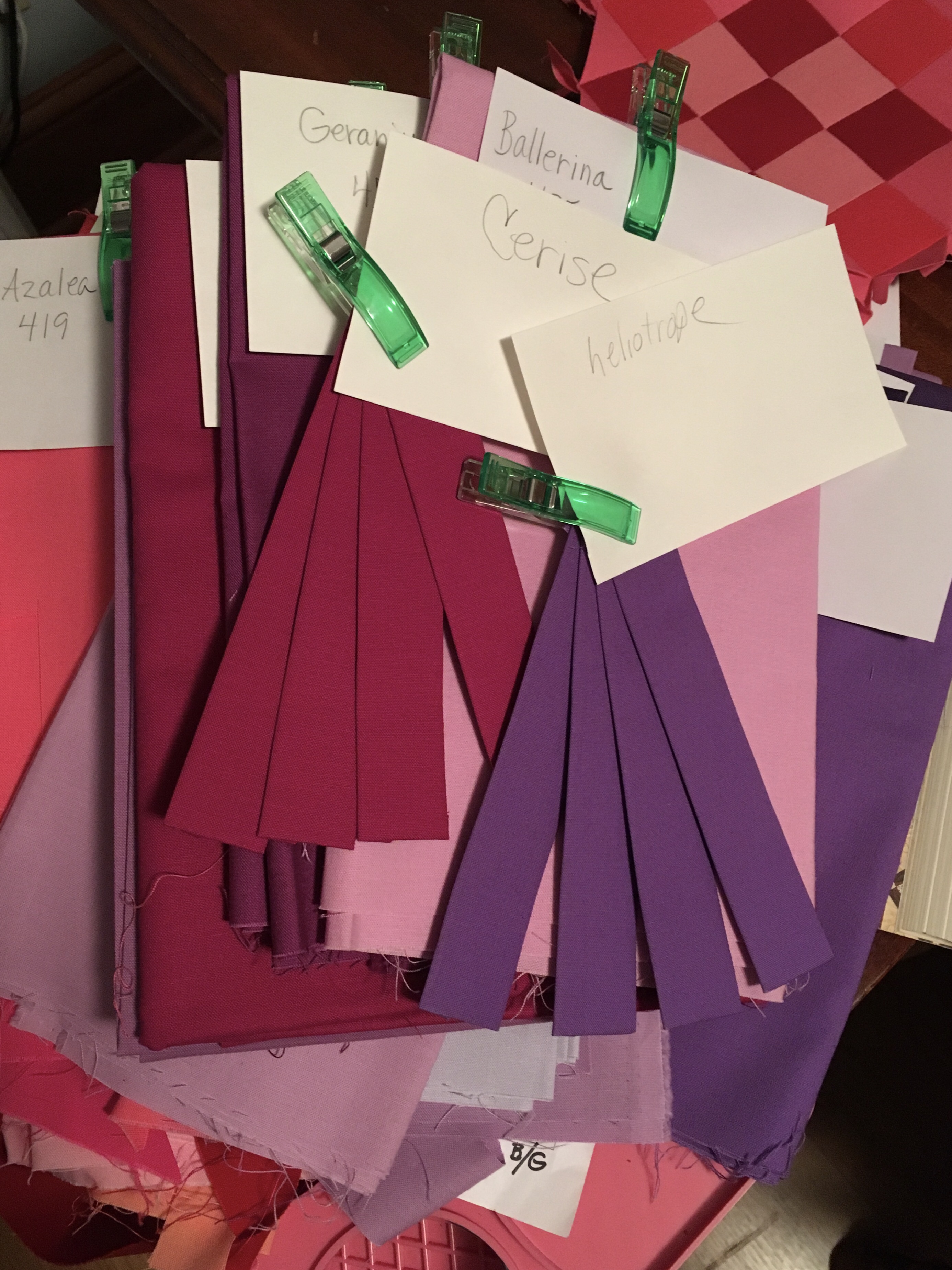
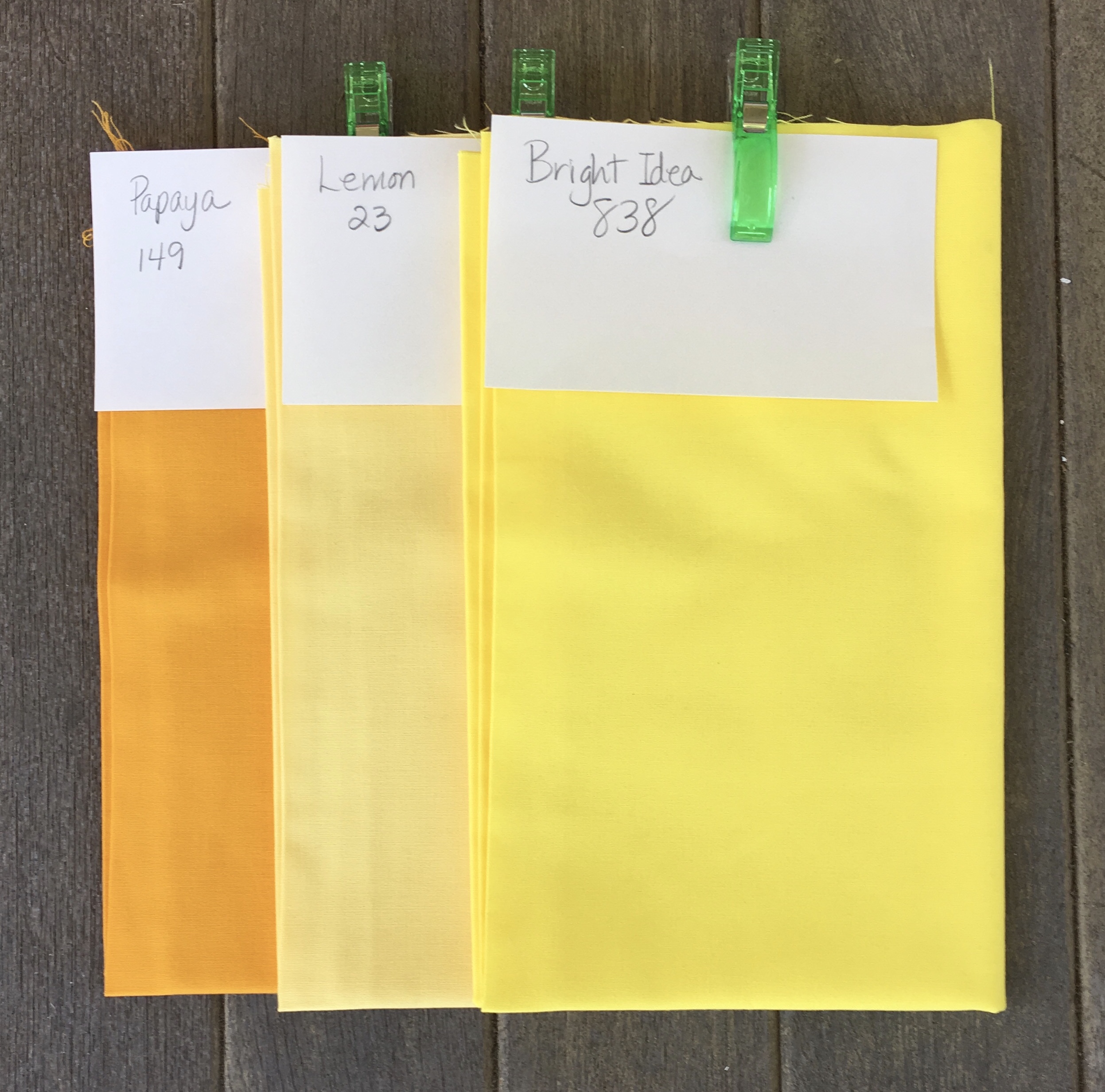
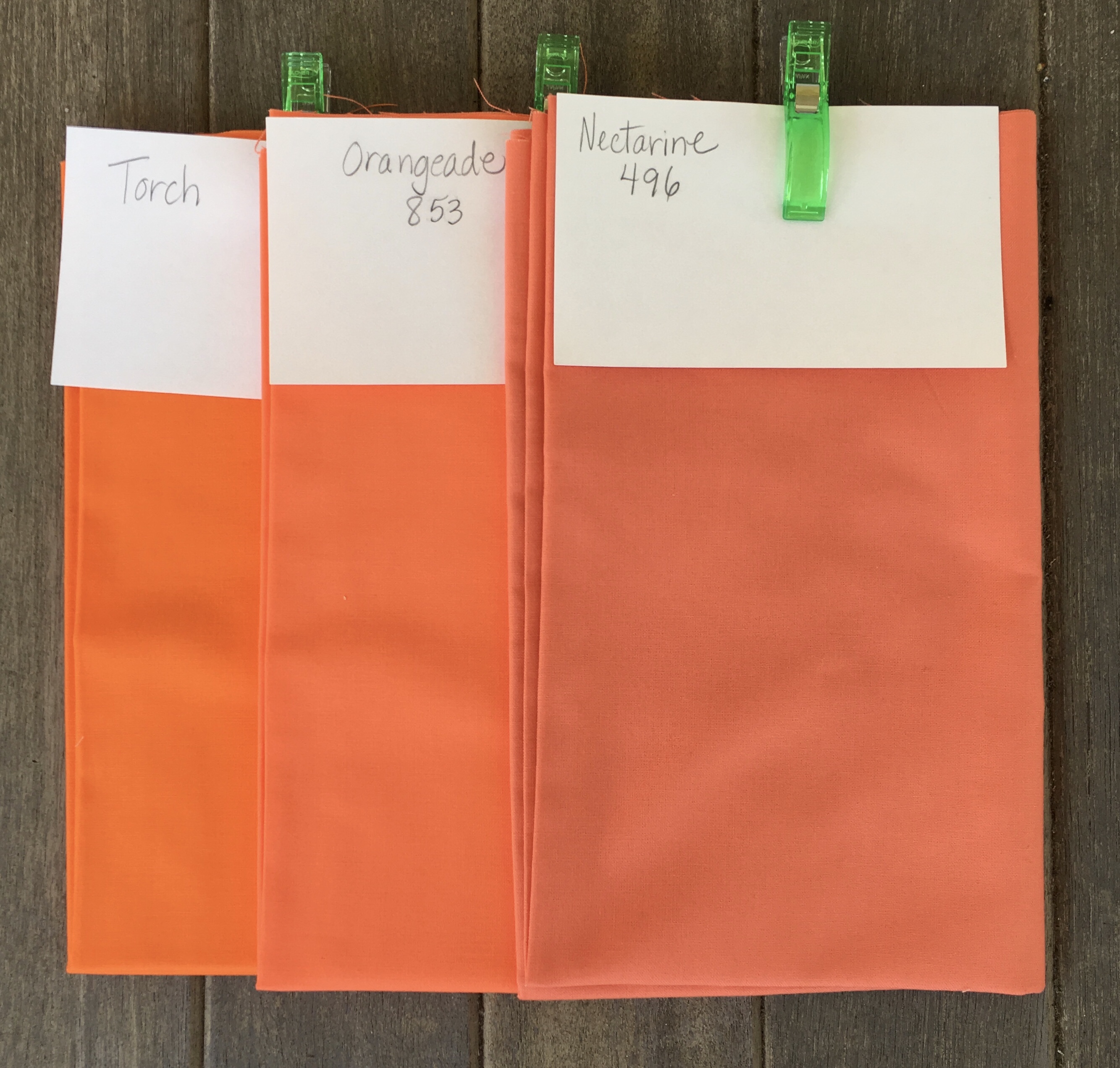
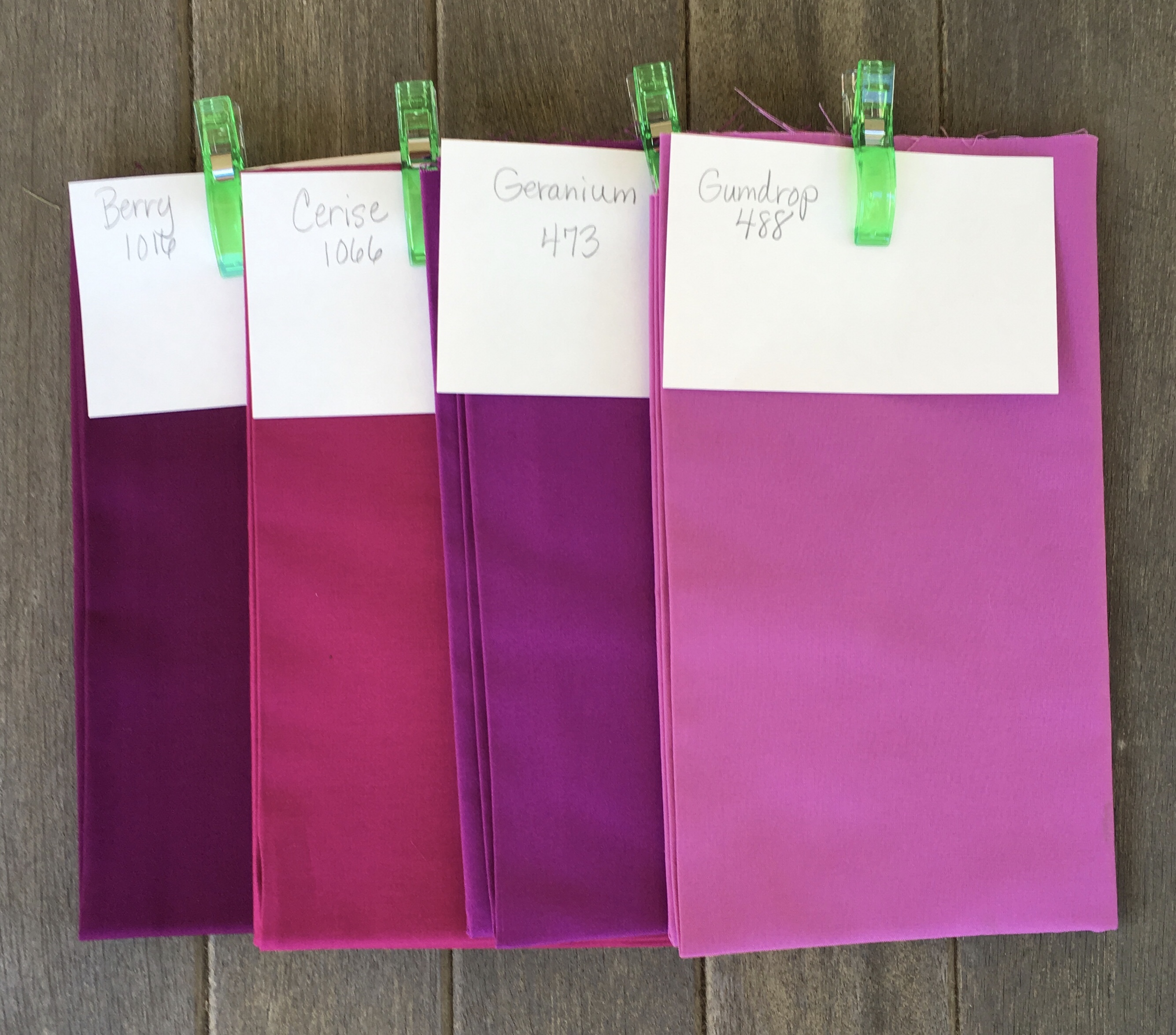
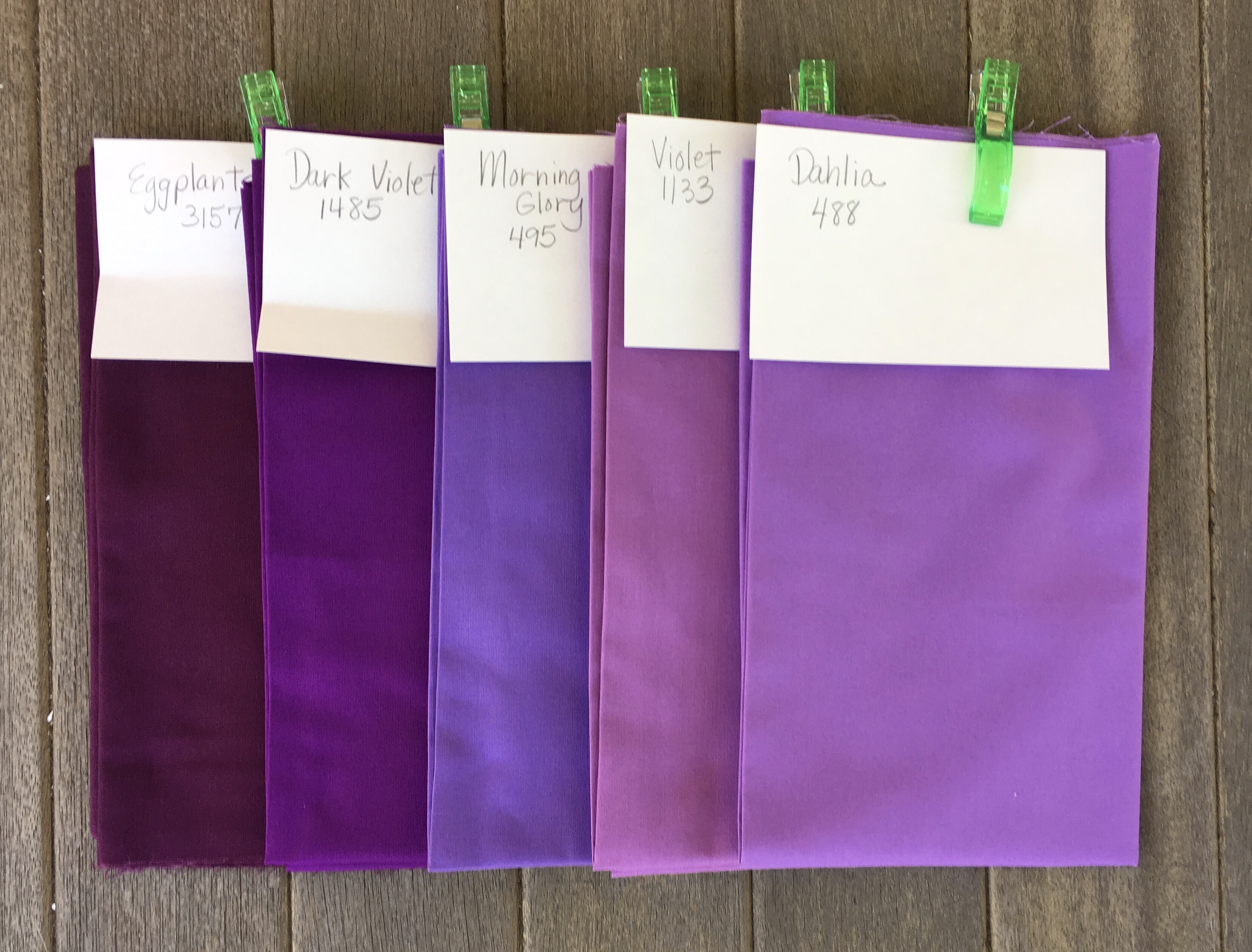
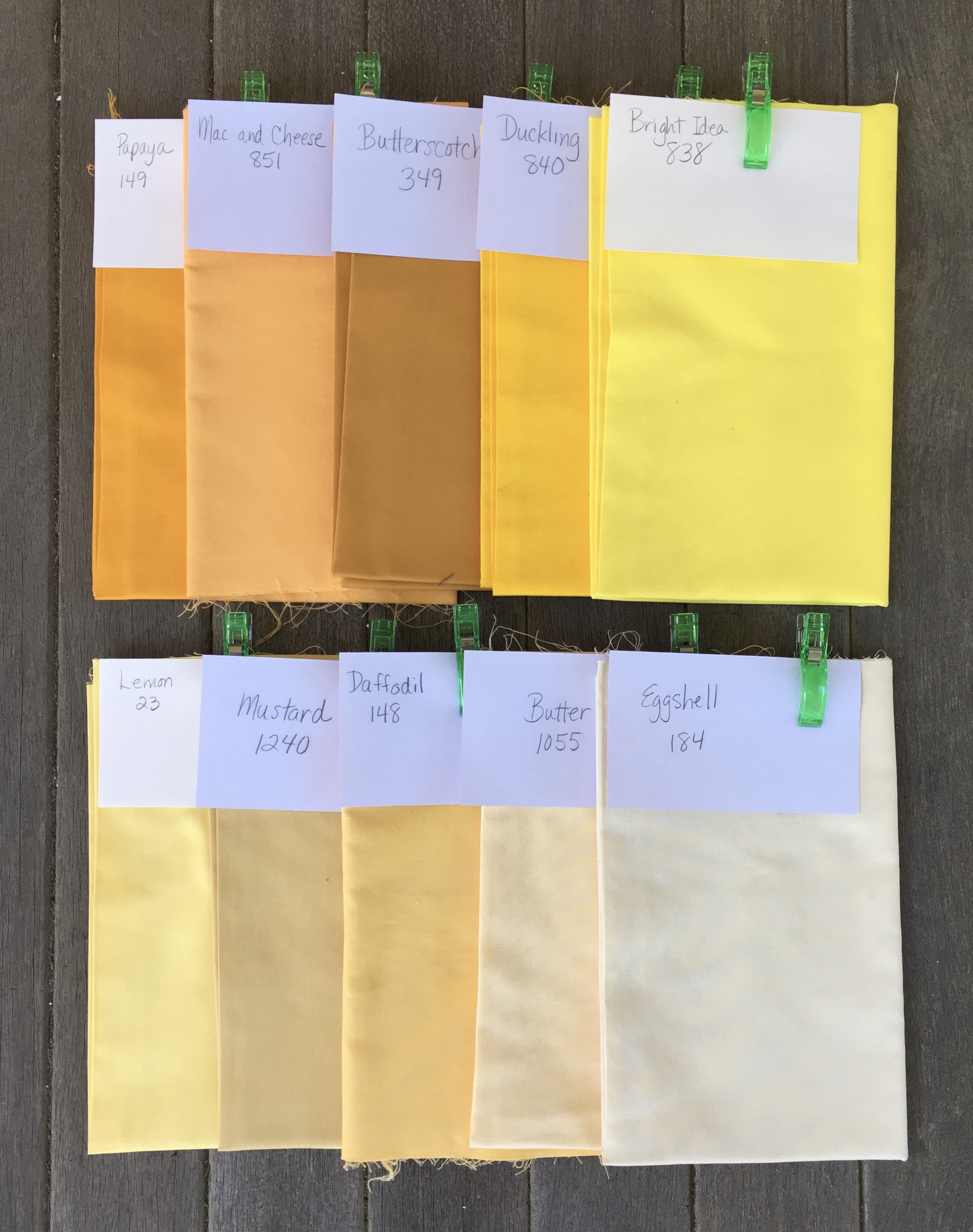
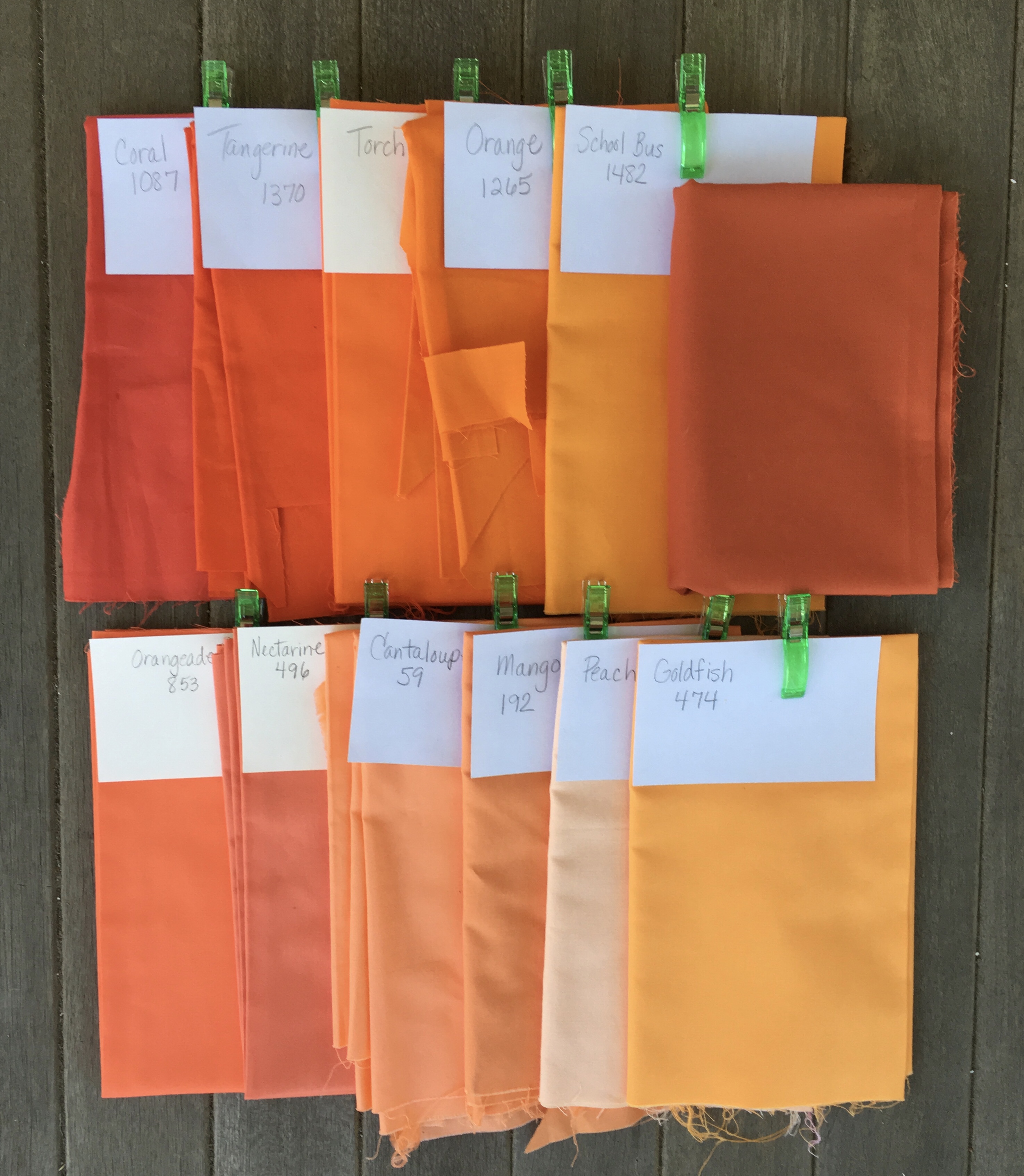
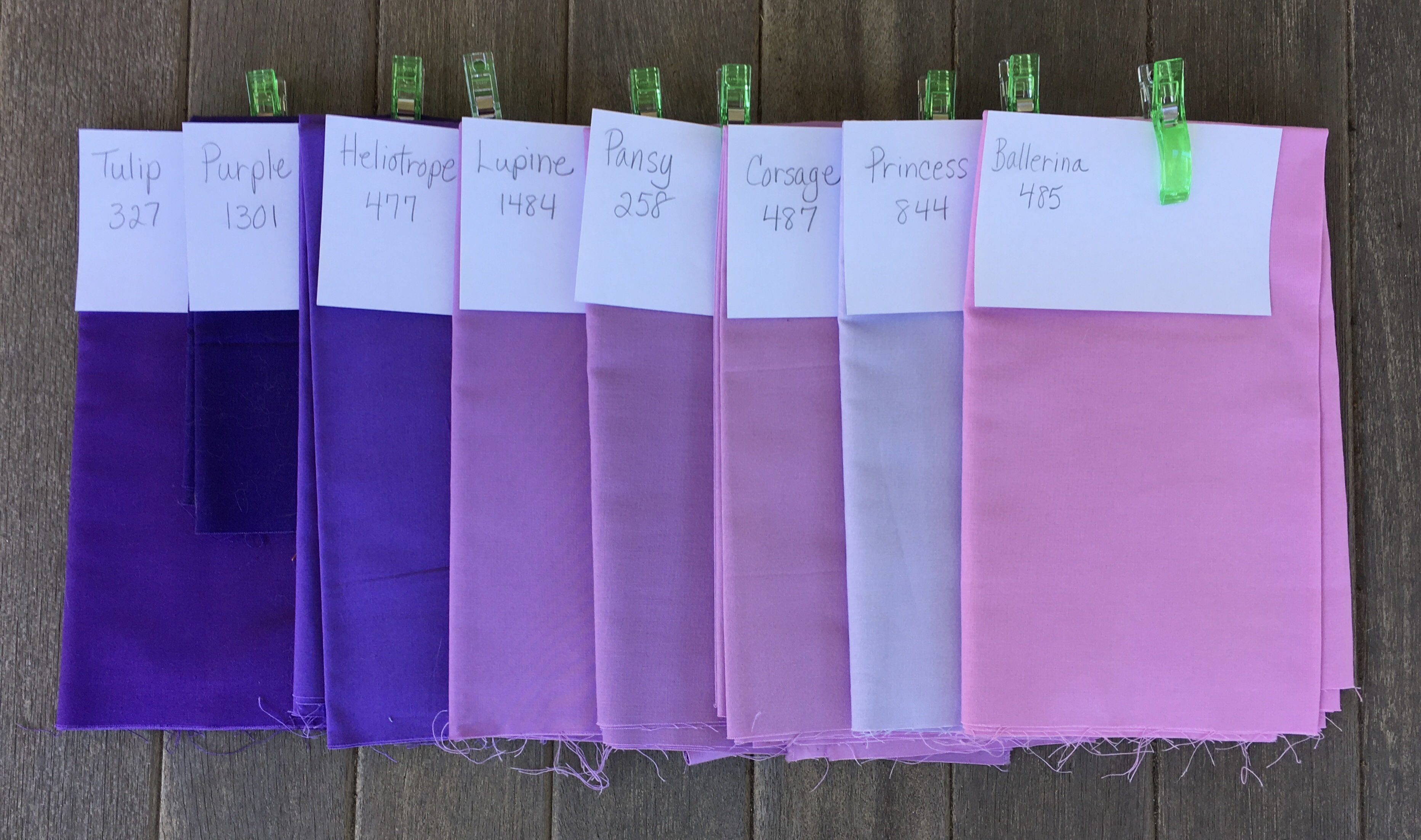
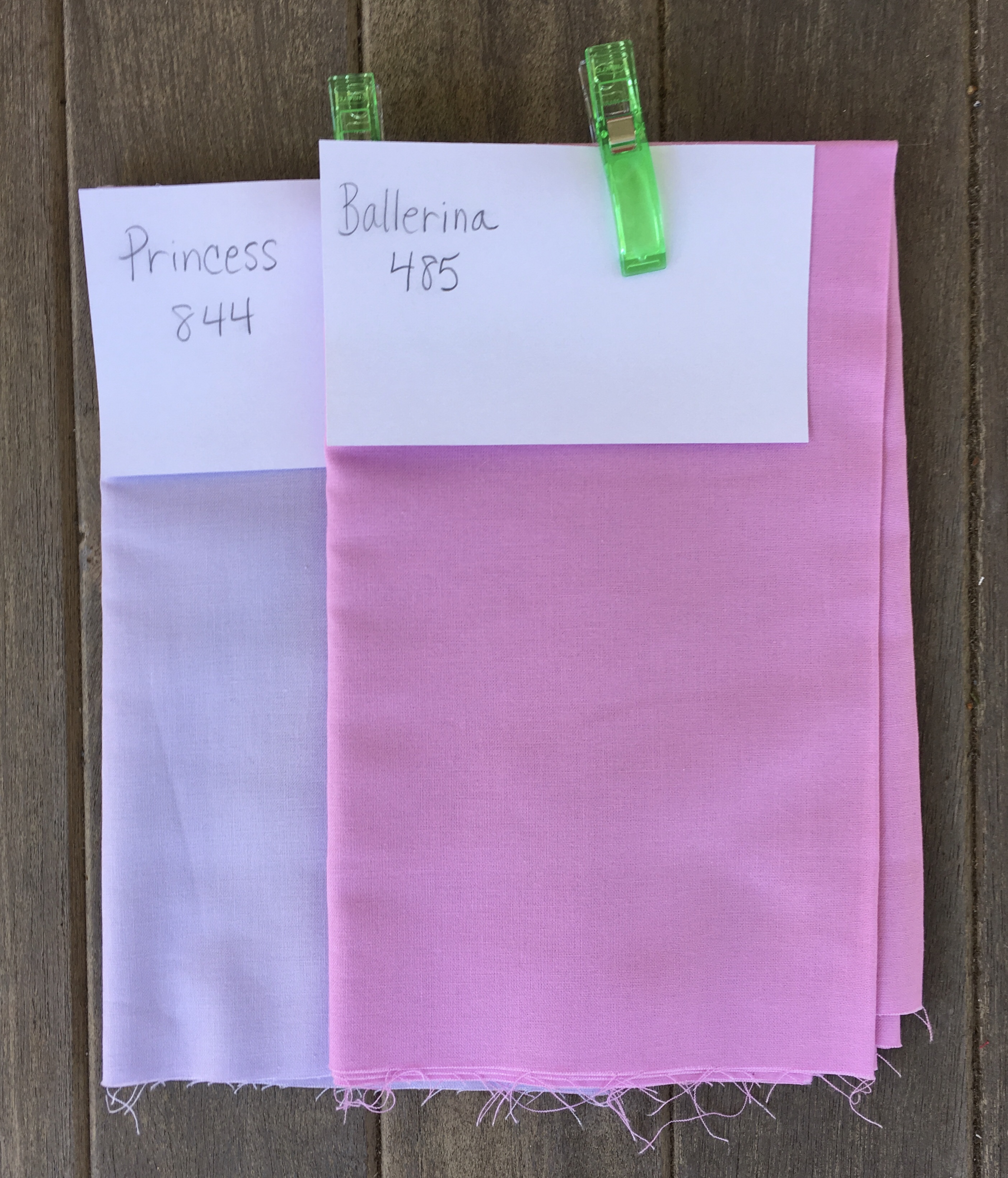
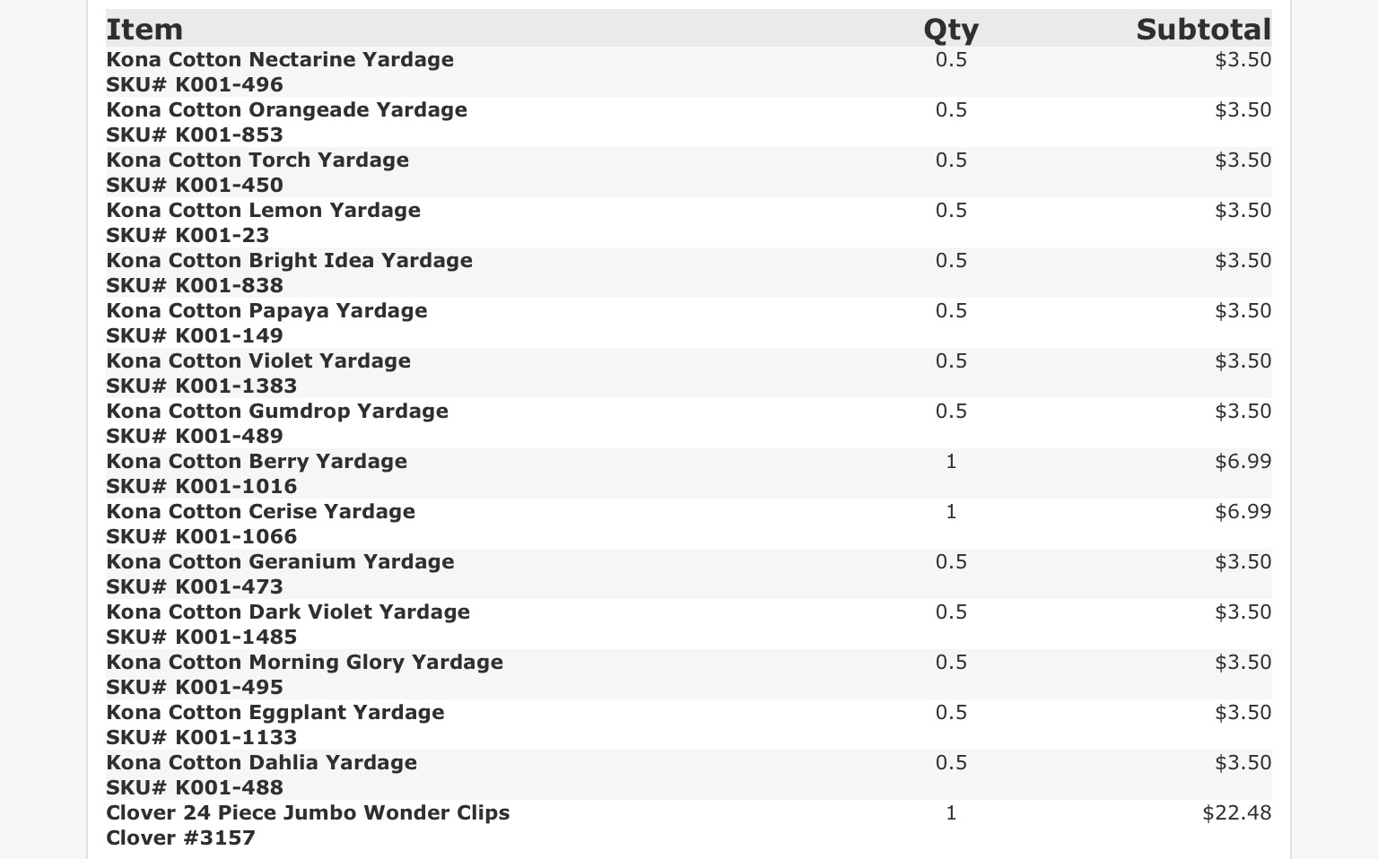
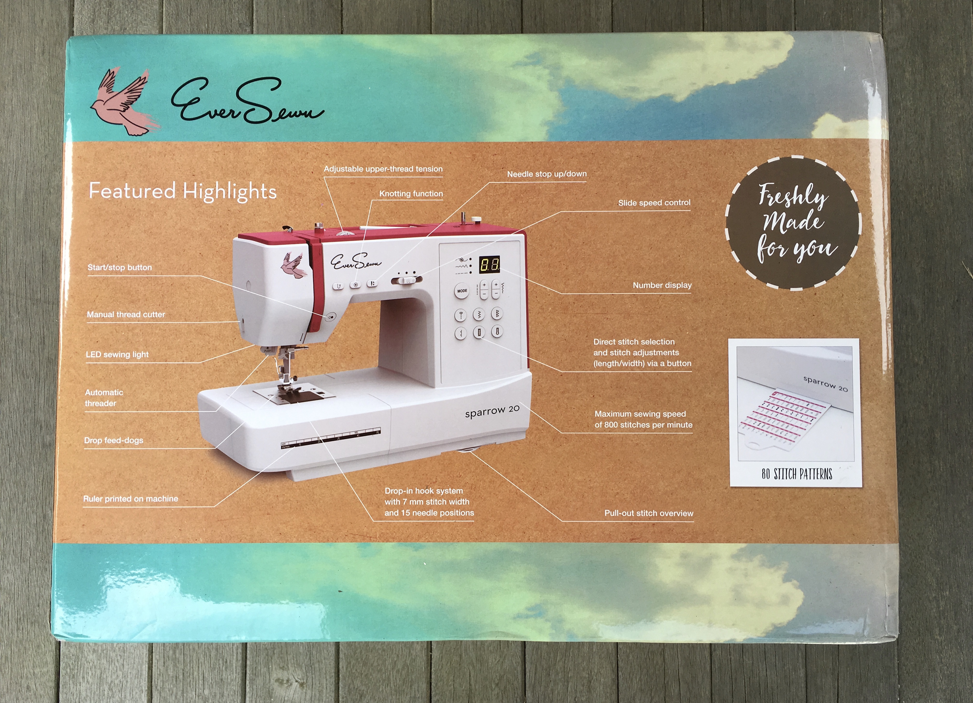
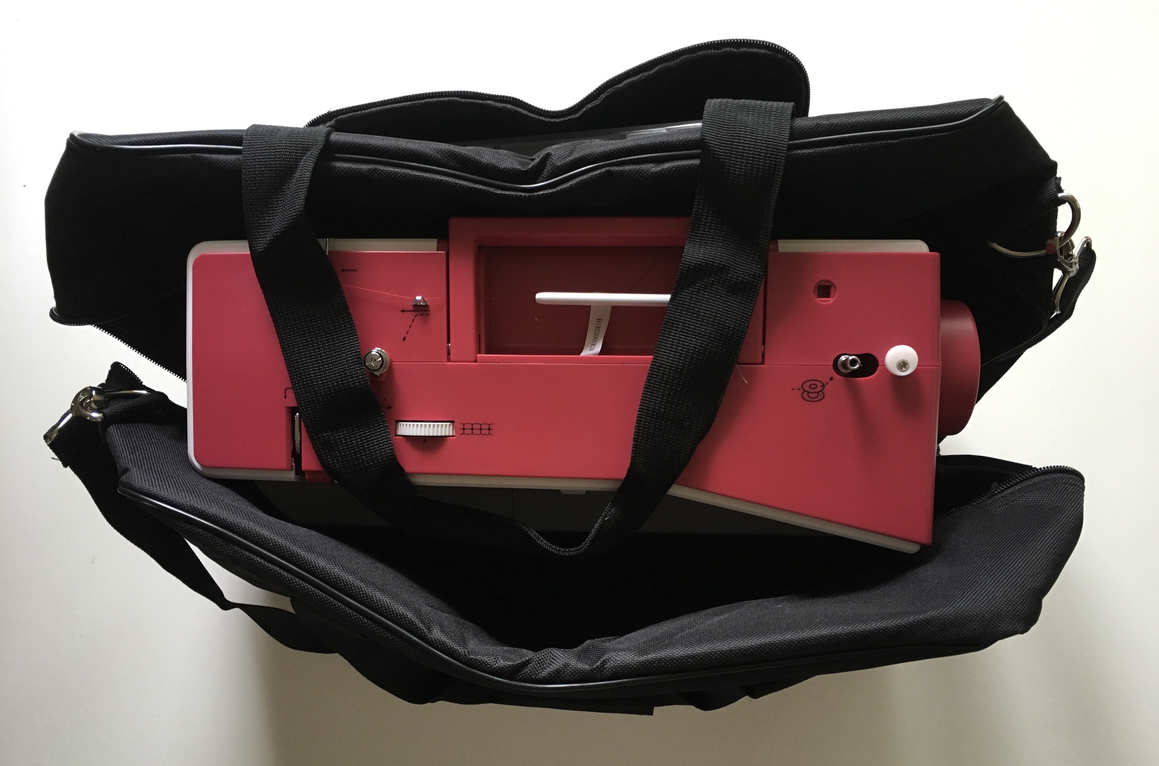
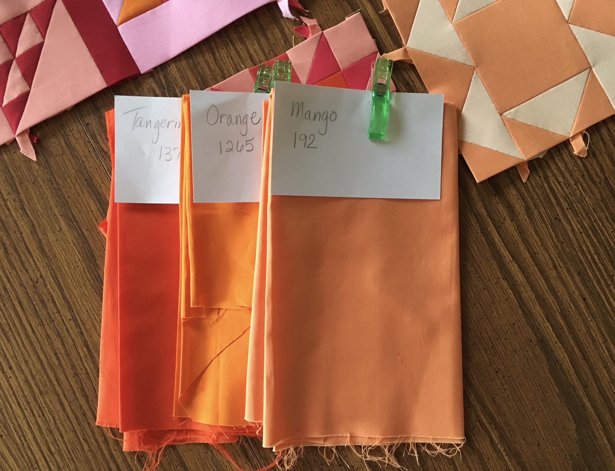
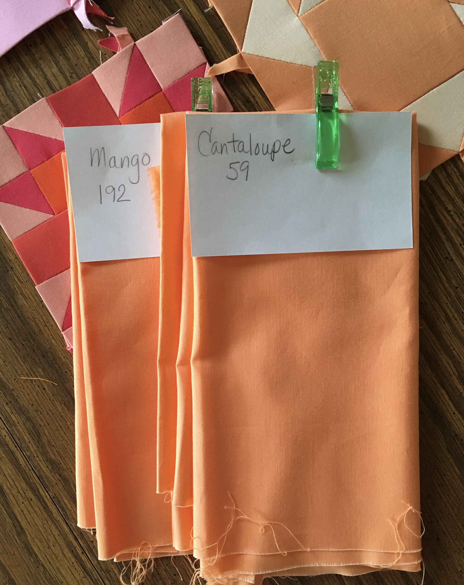
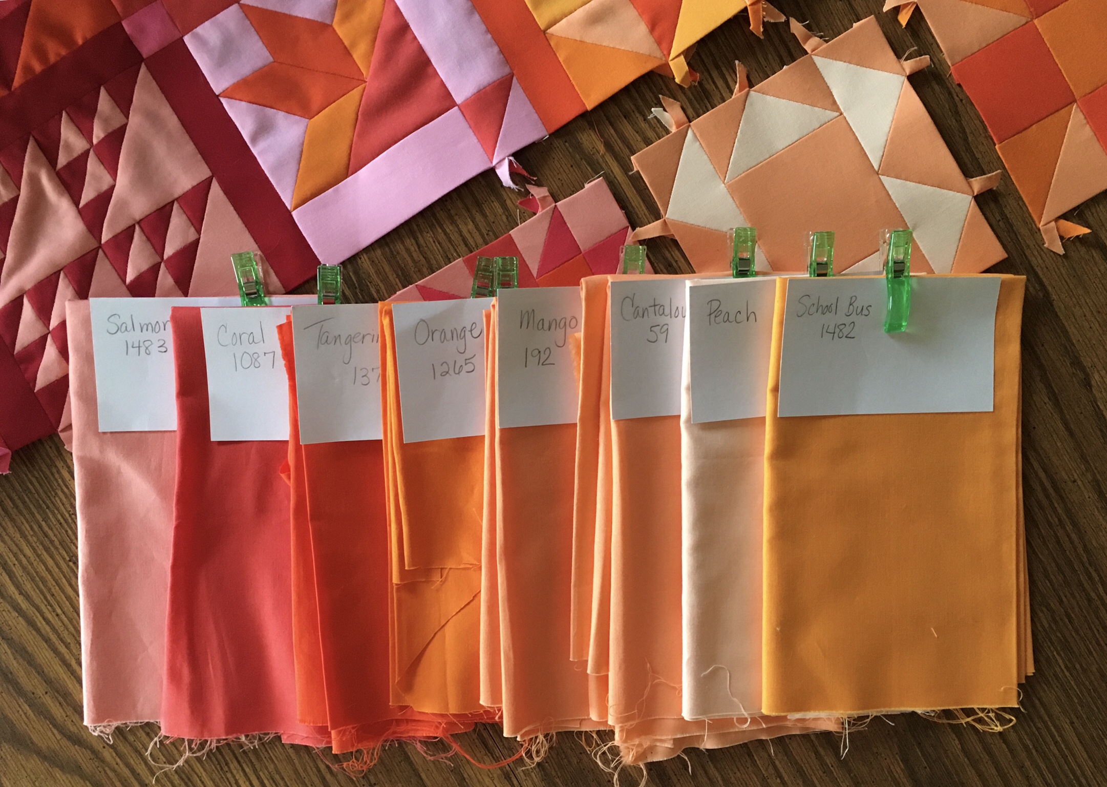
I prepared for this retreat by finishing most of the blocks necessary for the fifth row of my Farmer’s Wife Quilt. I also organized papers for my violet area incase I had a chance to do more blocks after finishing with the fifth row. My new Eversewn Sparrow 20 sewing machine got packed up so I could use her if my shoulders tensed up from too much hand work. I brought my reds, oranges, yellows, and violets with me in bins. I knew I would not need the greens or blues. I was prepared.

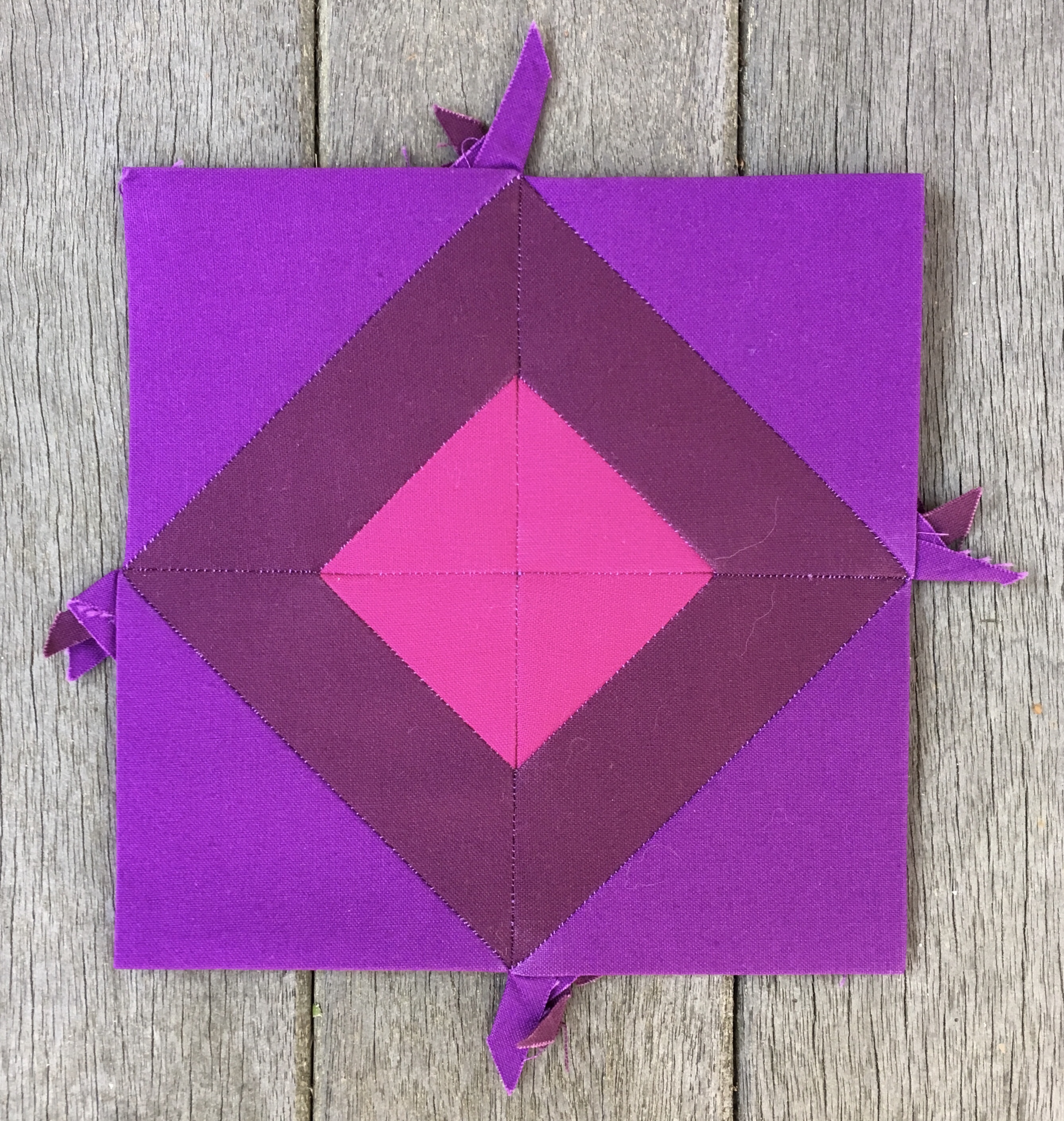
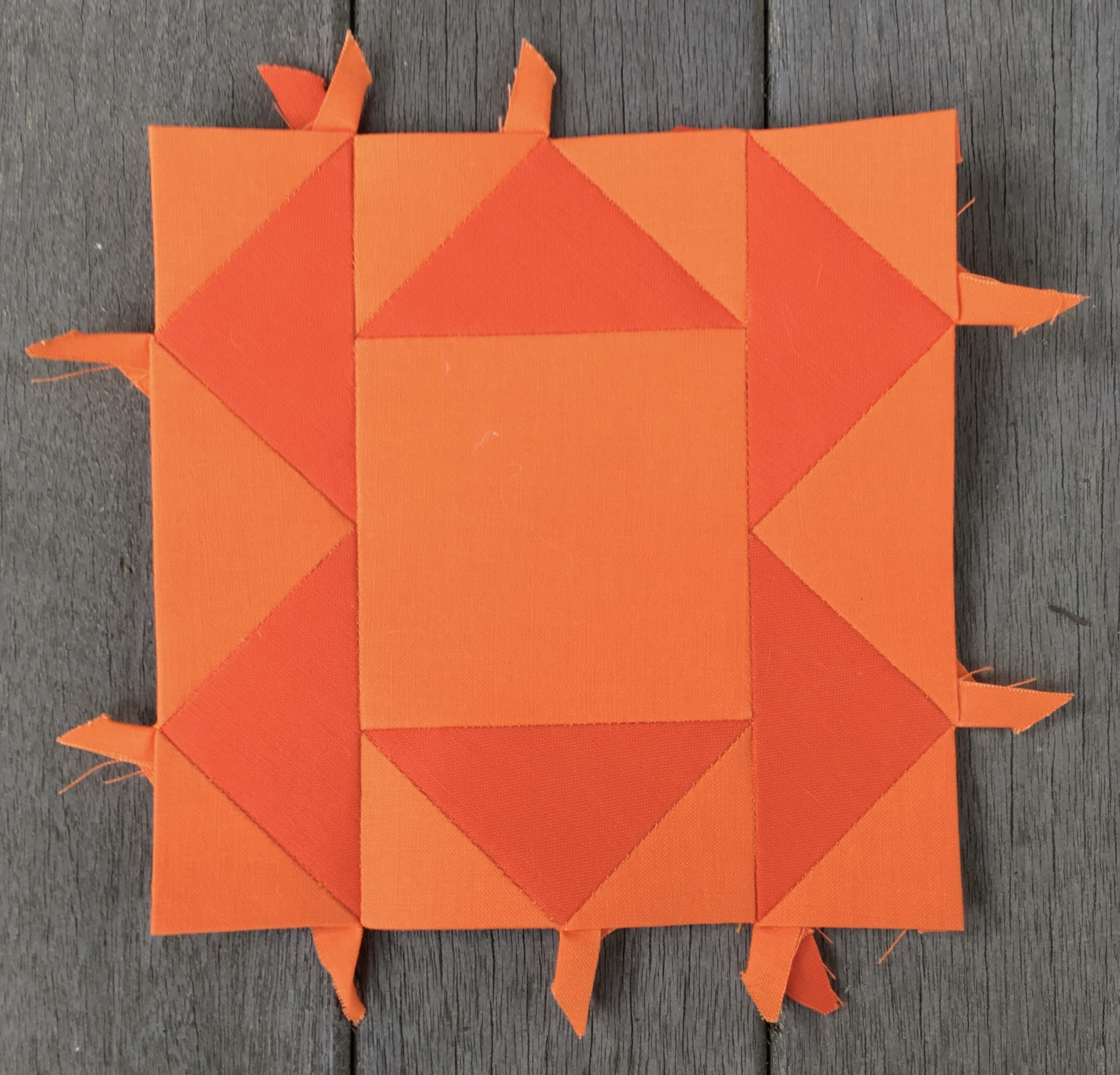
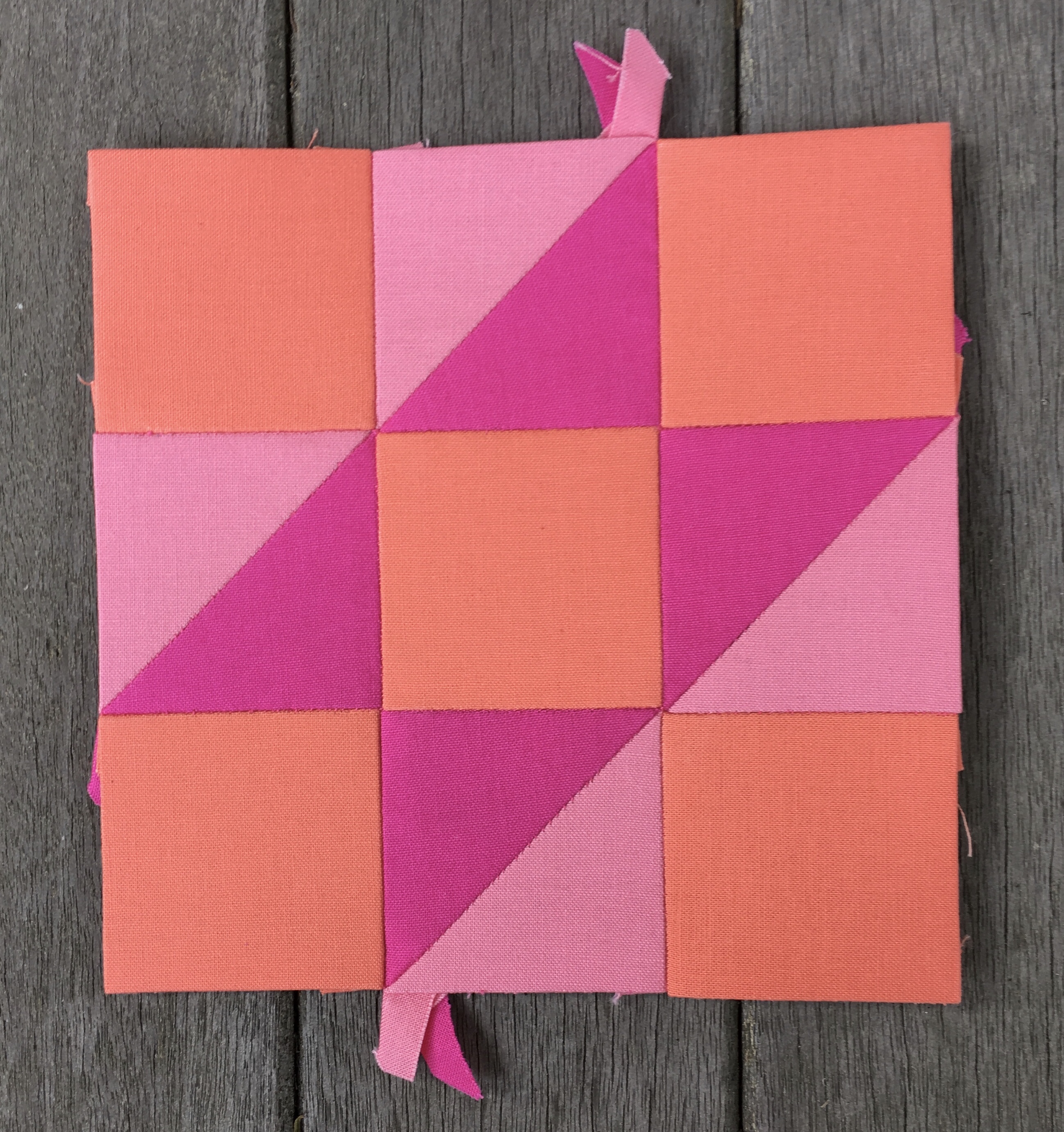
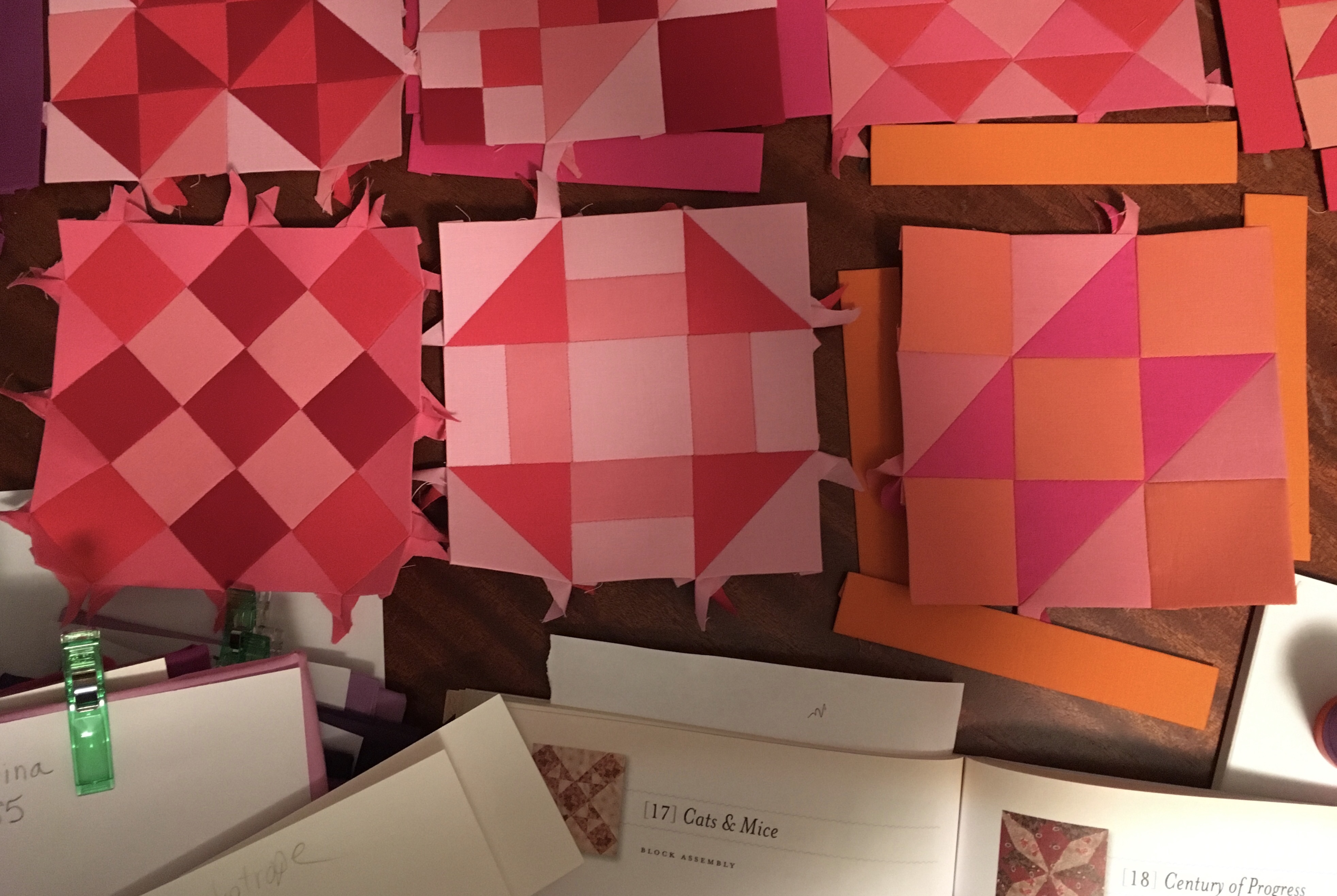
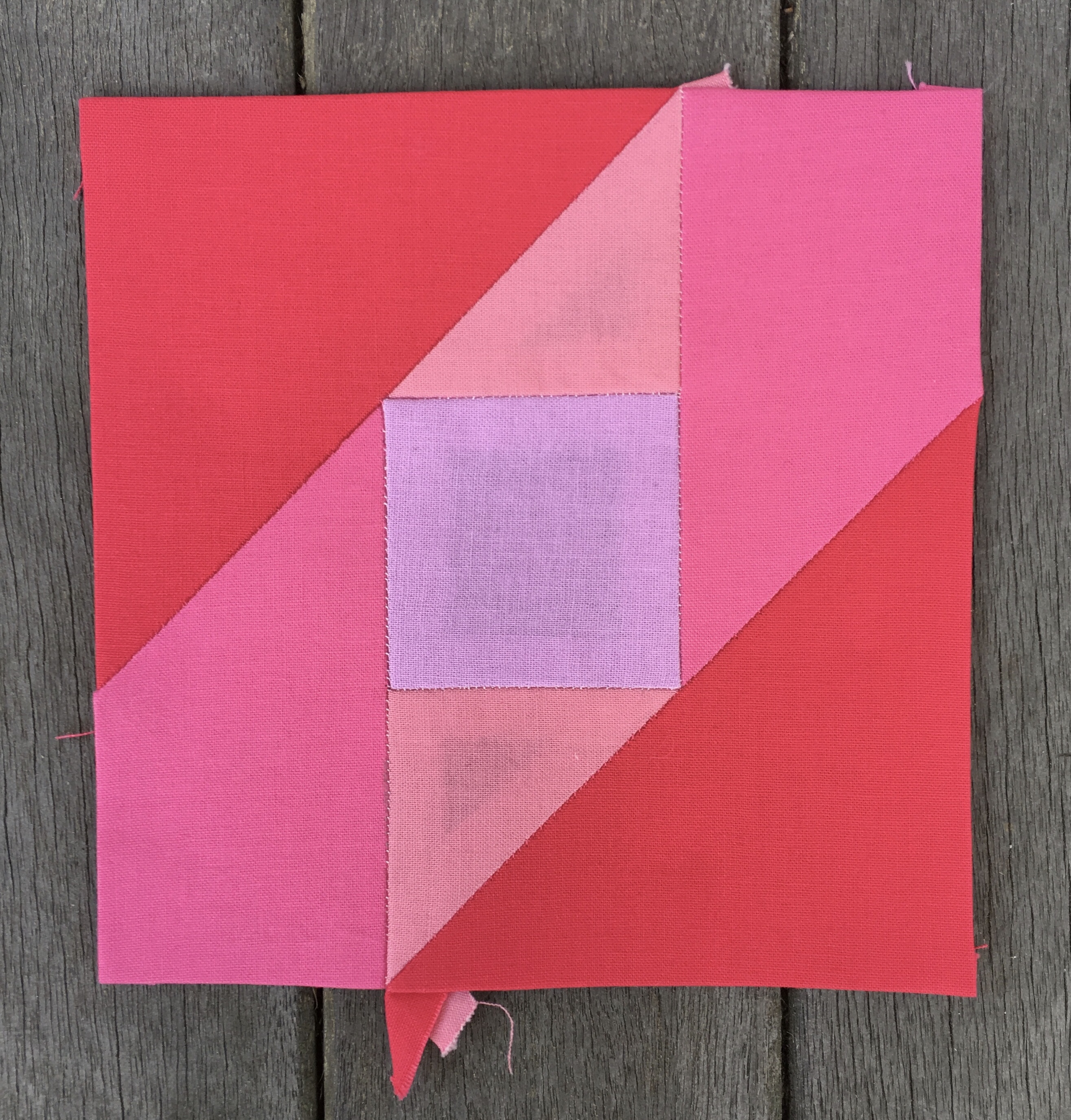
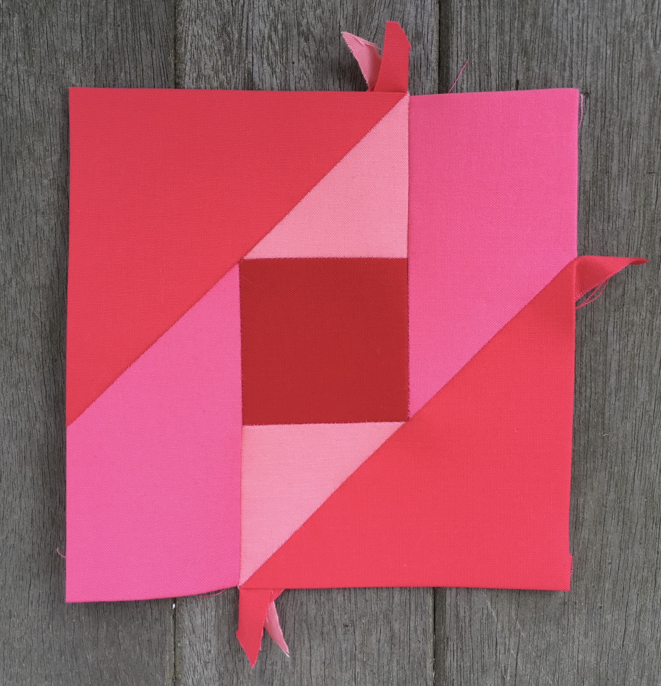
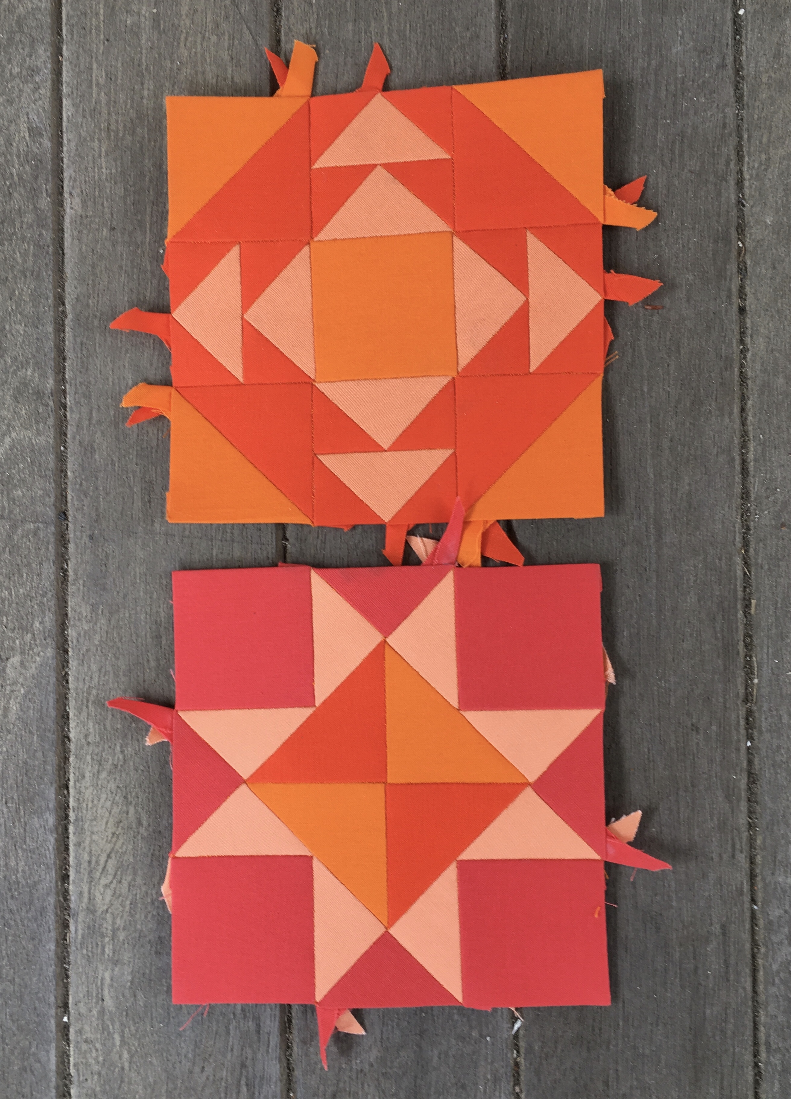
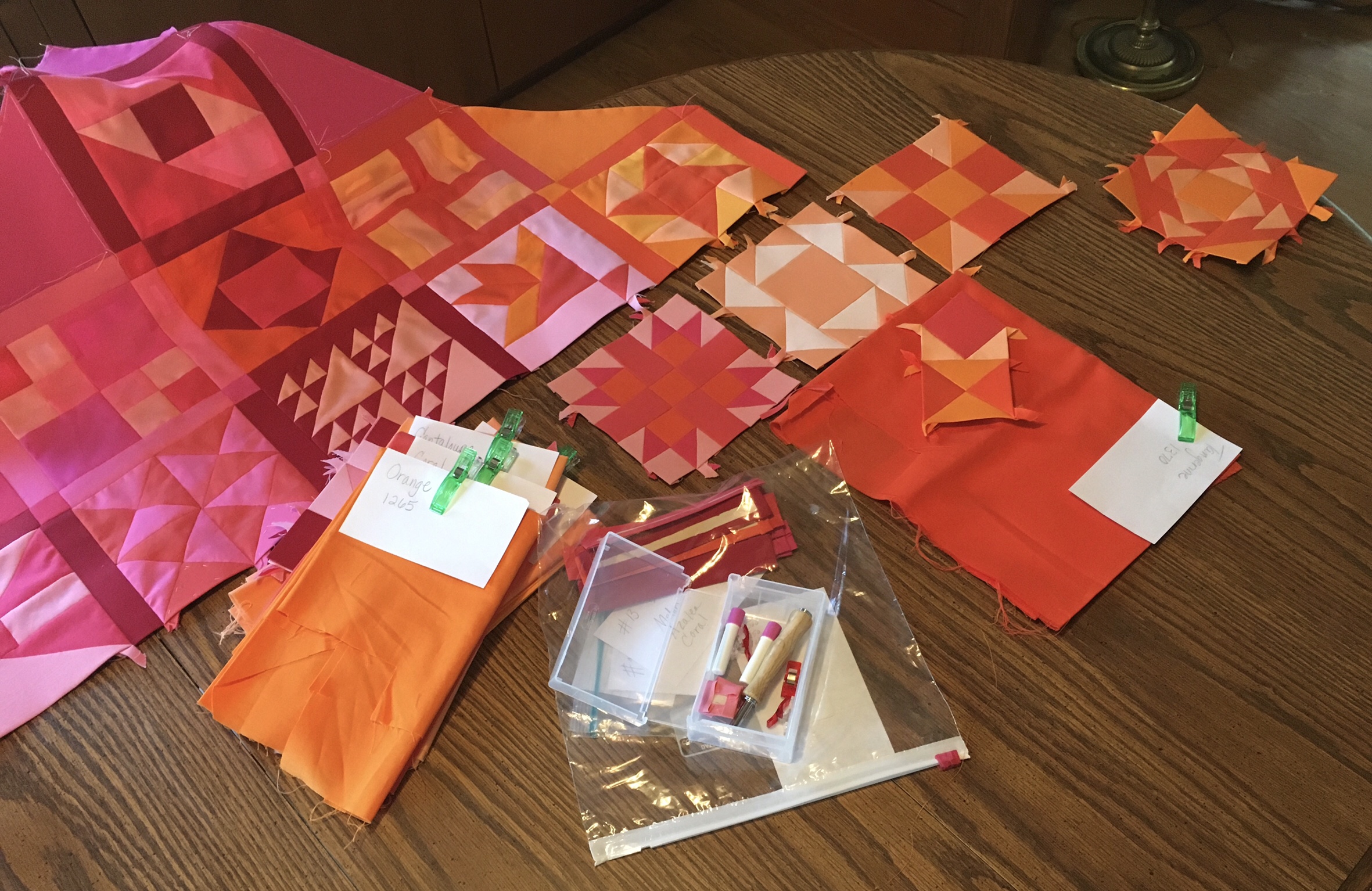
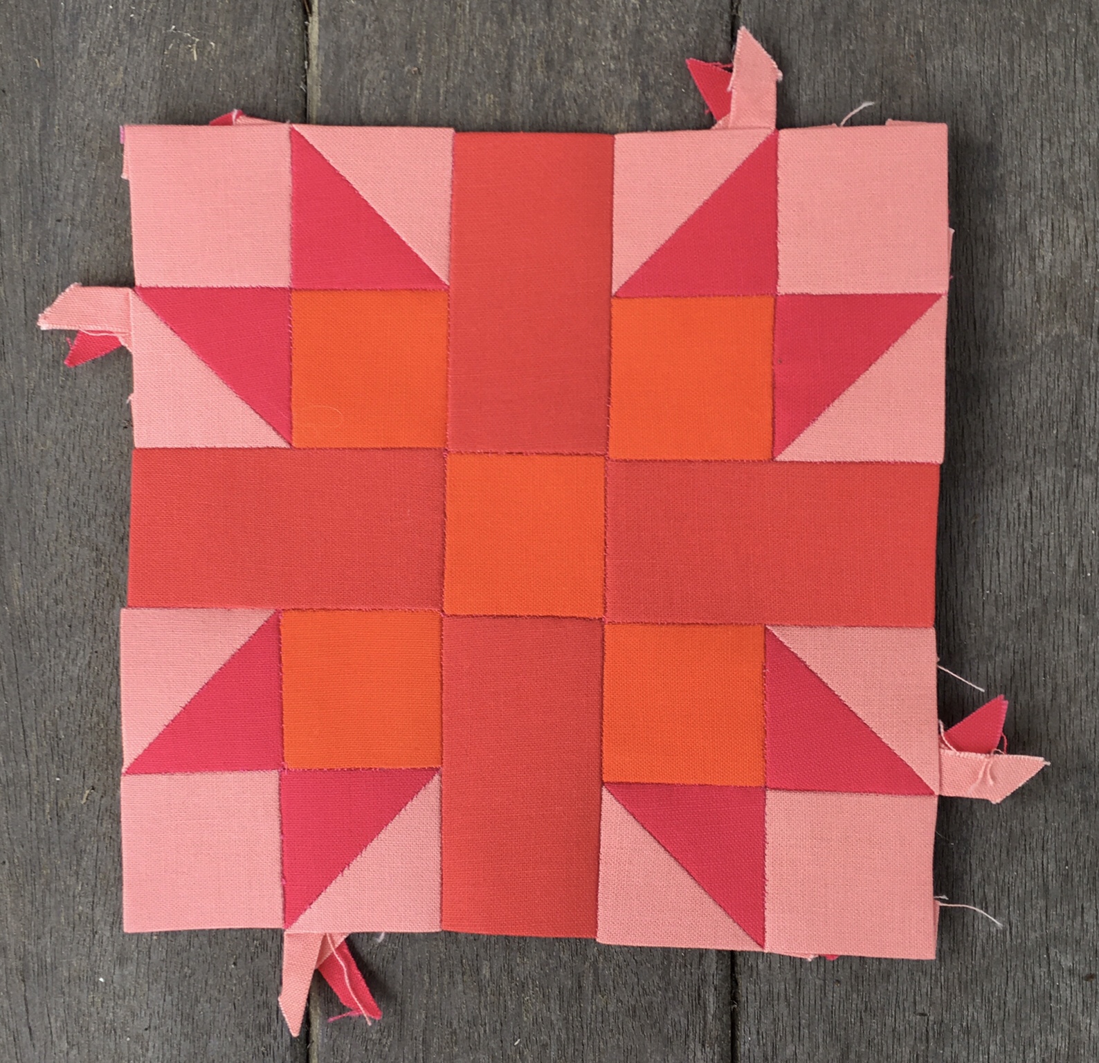
I fell short of completing #22 Corn & Beans before leaving the house. So my first order of business was to complete that block and document her. I did not have access to my usual staging area, my front porch, so I used the concrete stoop leading to the outdoor entrance right next to our work room. I kind of like the color and texture of this staging area.

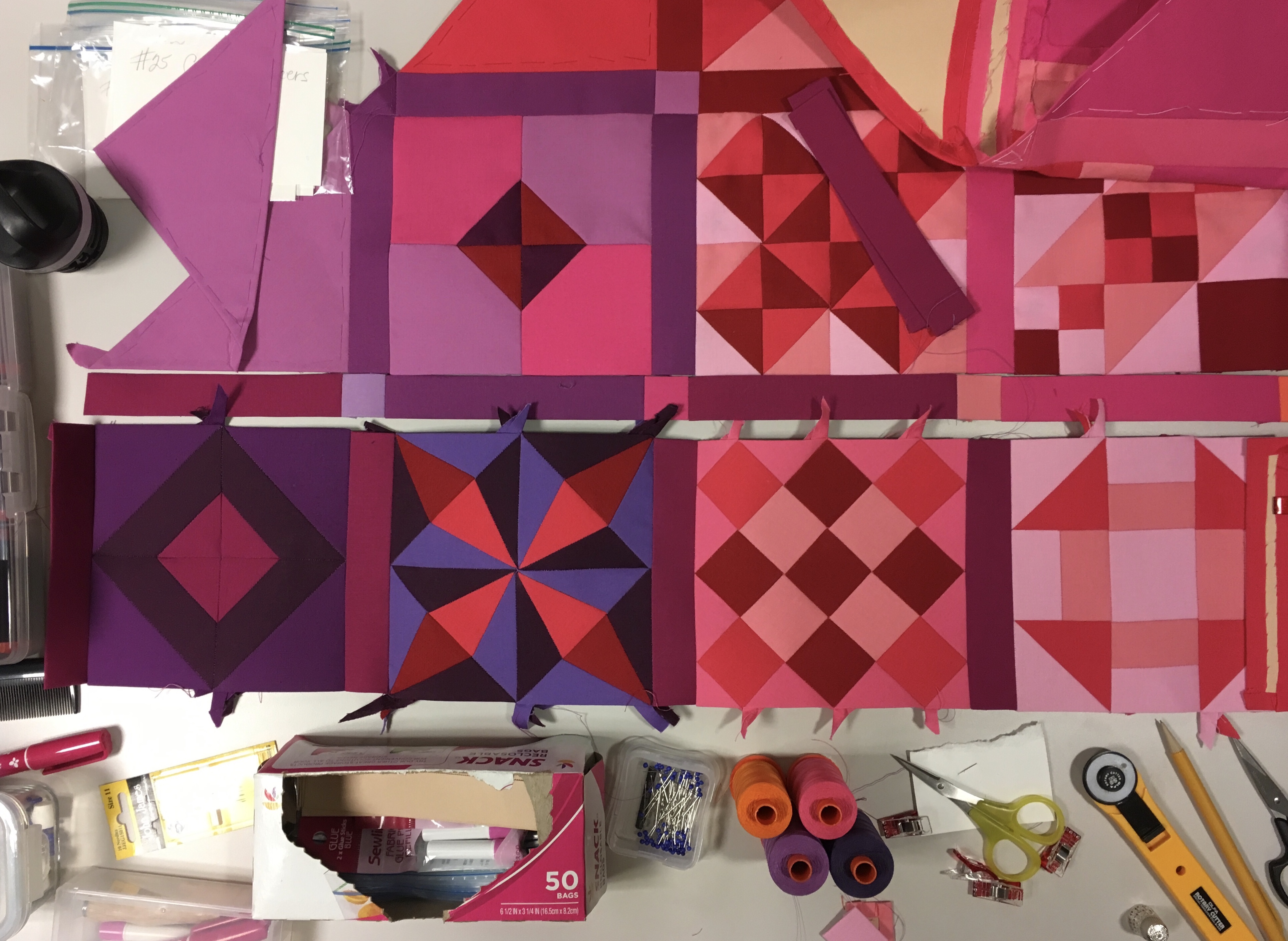
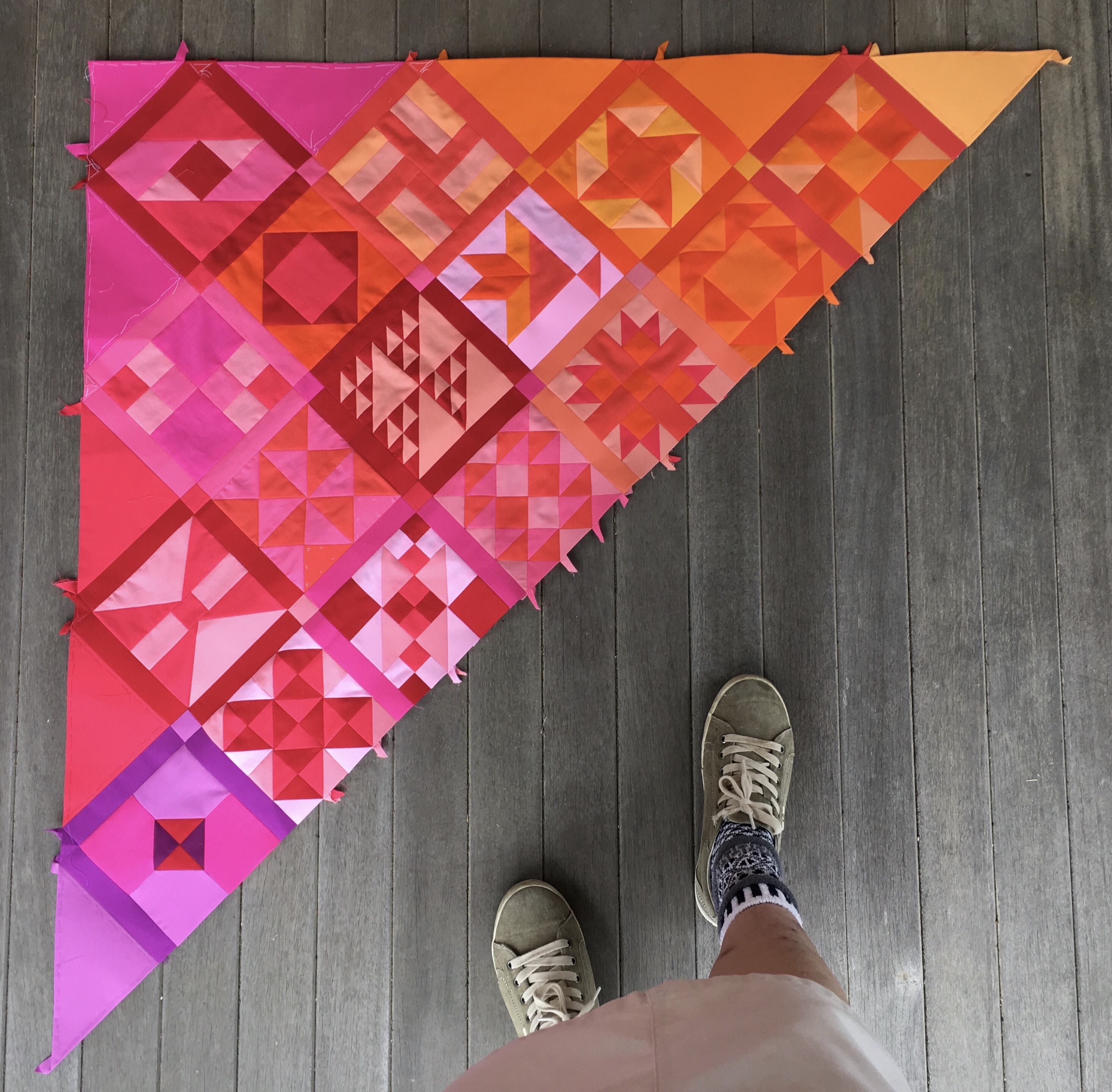
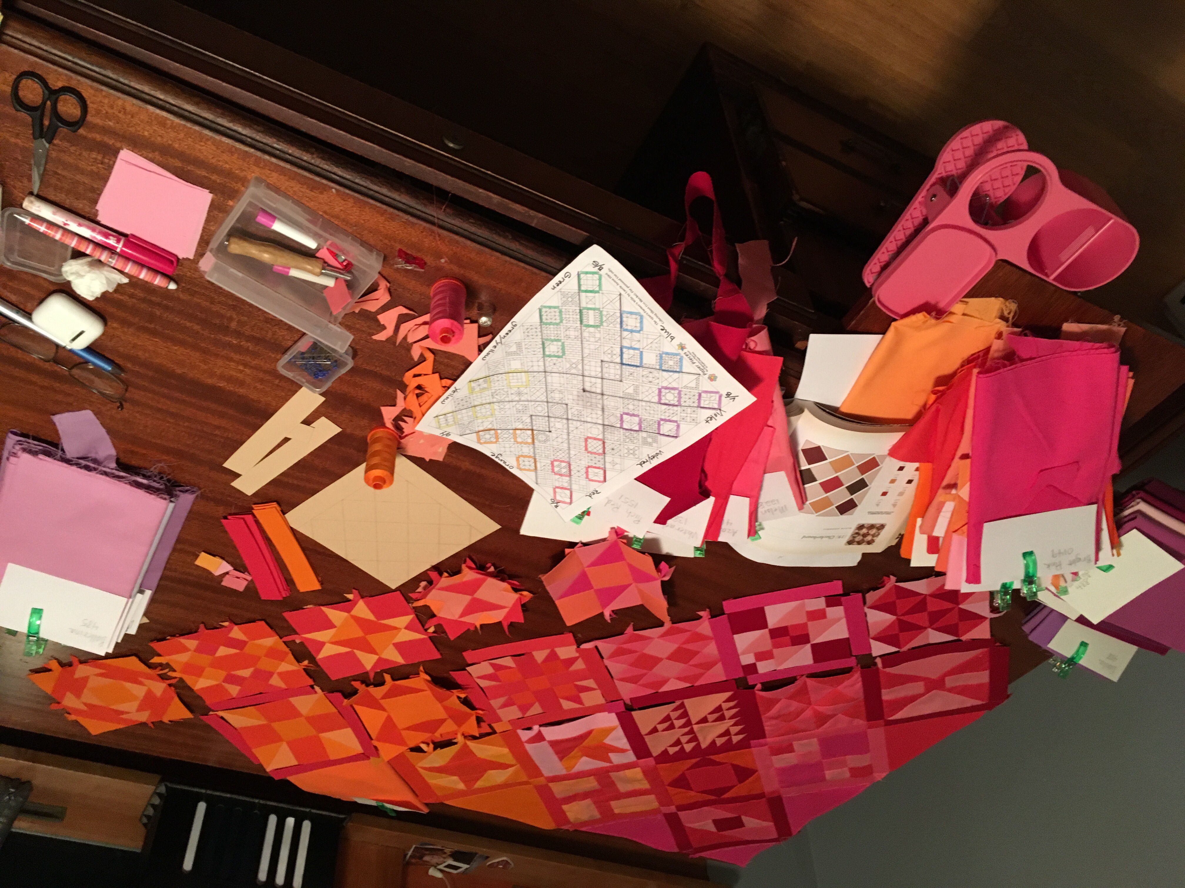
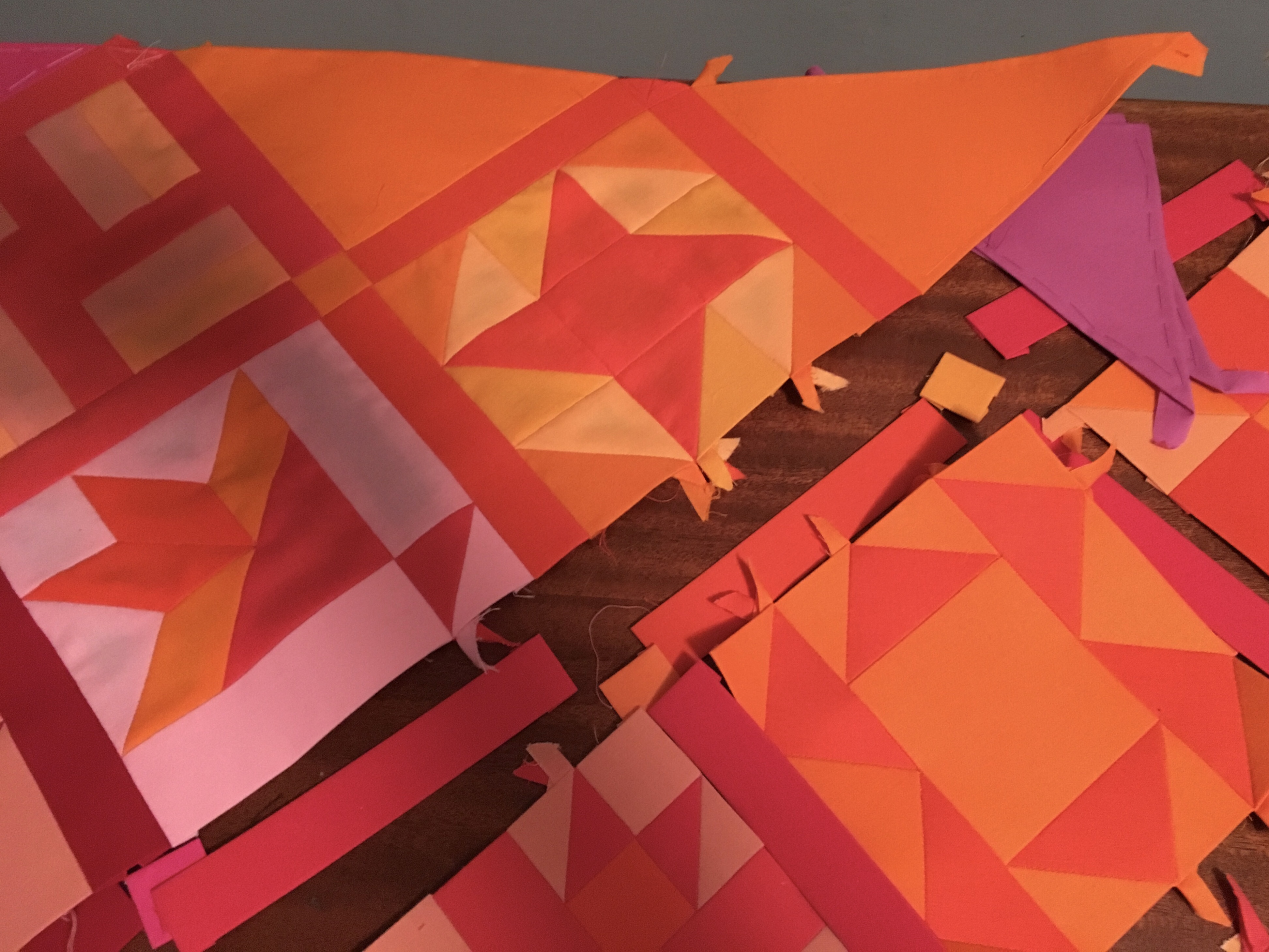
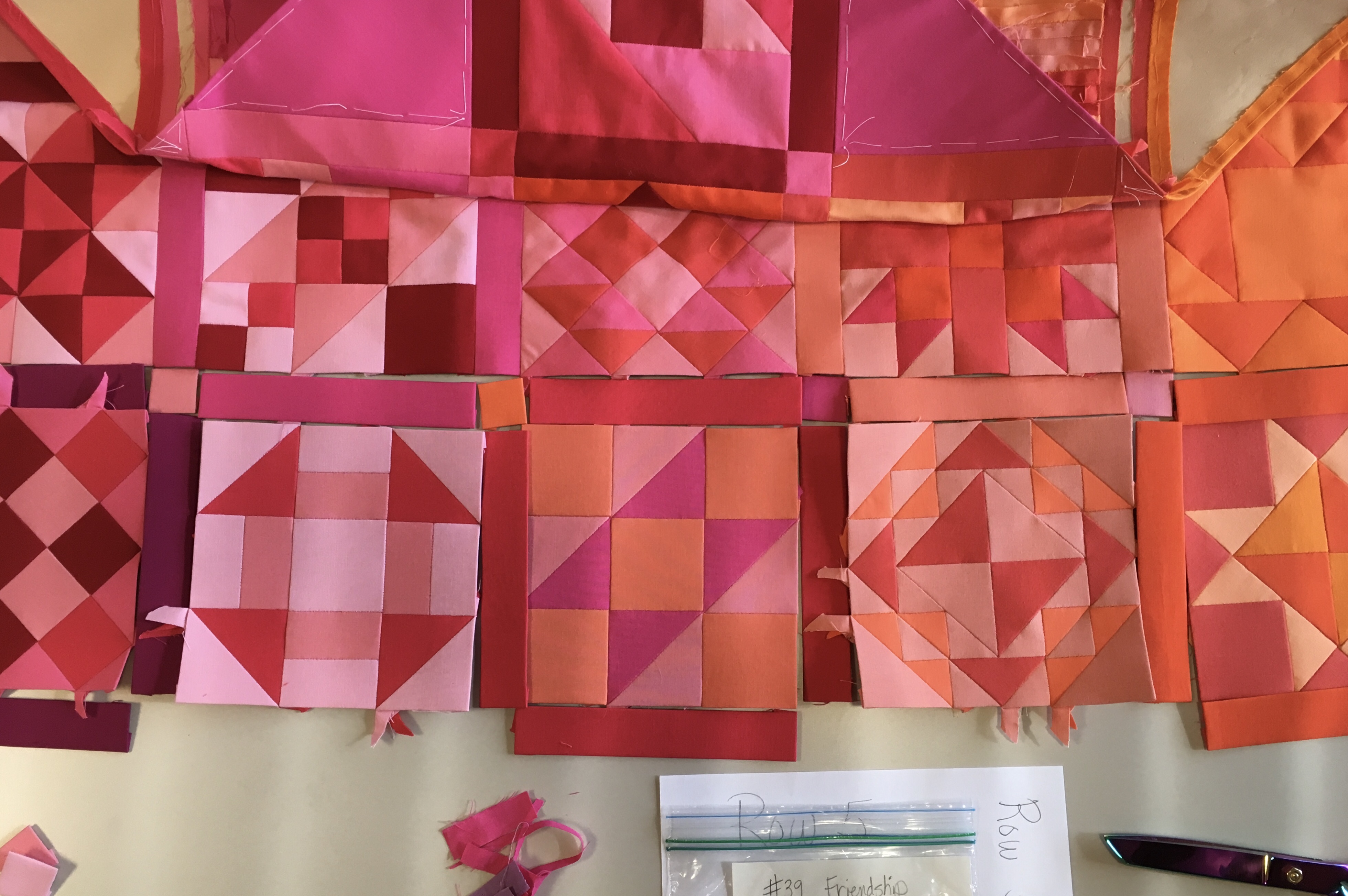
After that I placed my blocks, sashing, and corner stones out, and took photos of the upcoming assembly. Well actually I did some assembly first as you can see from the first photo.

By the time I took these photos mid day light was streaming through semi closed blinds, clearly visible in the last photo.

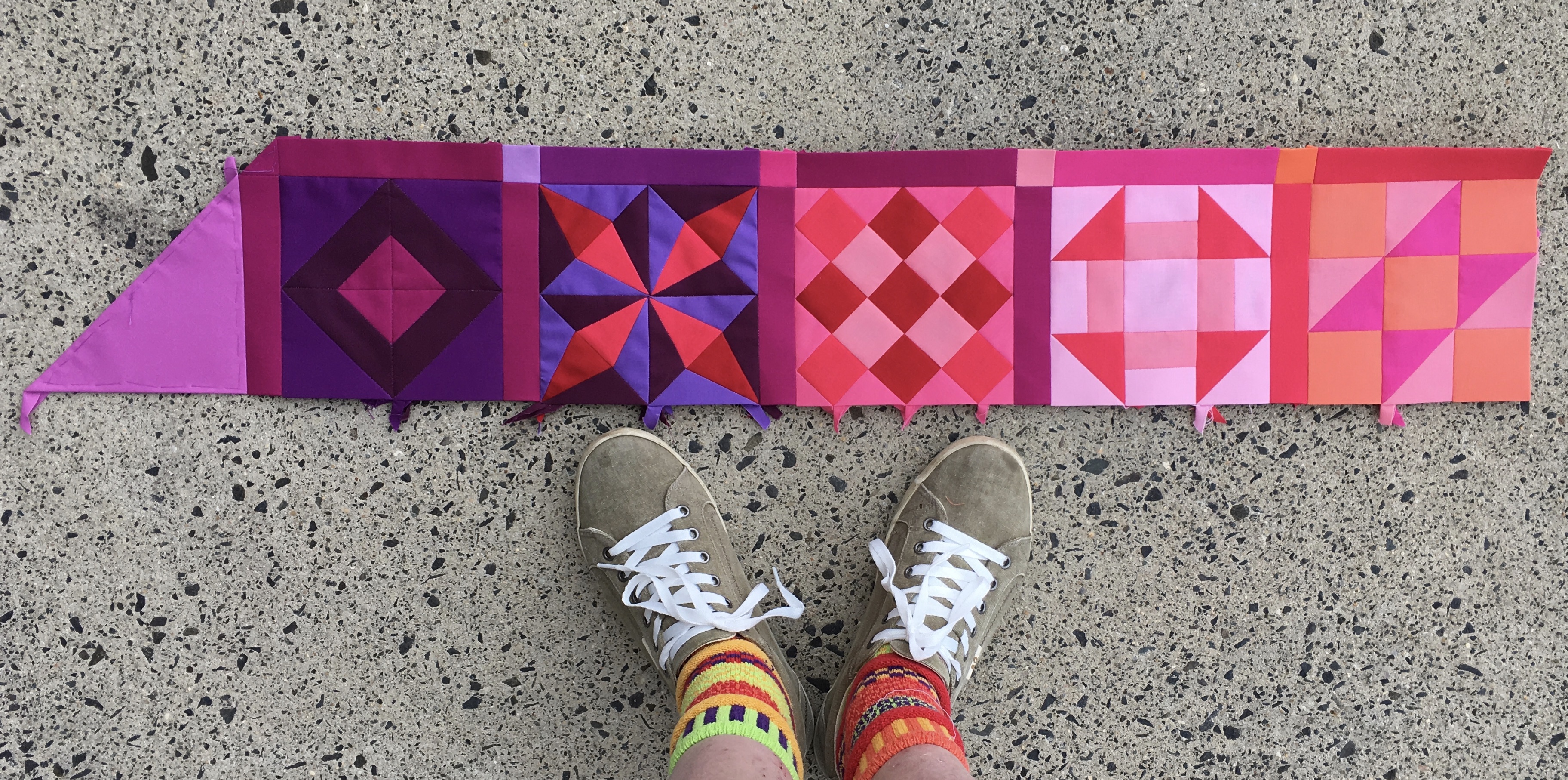
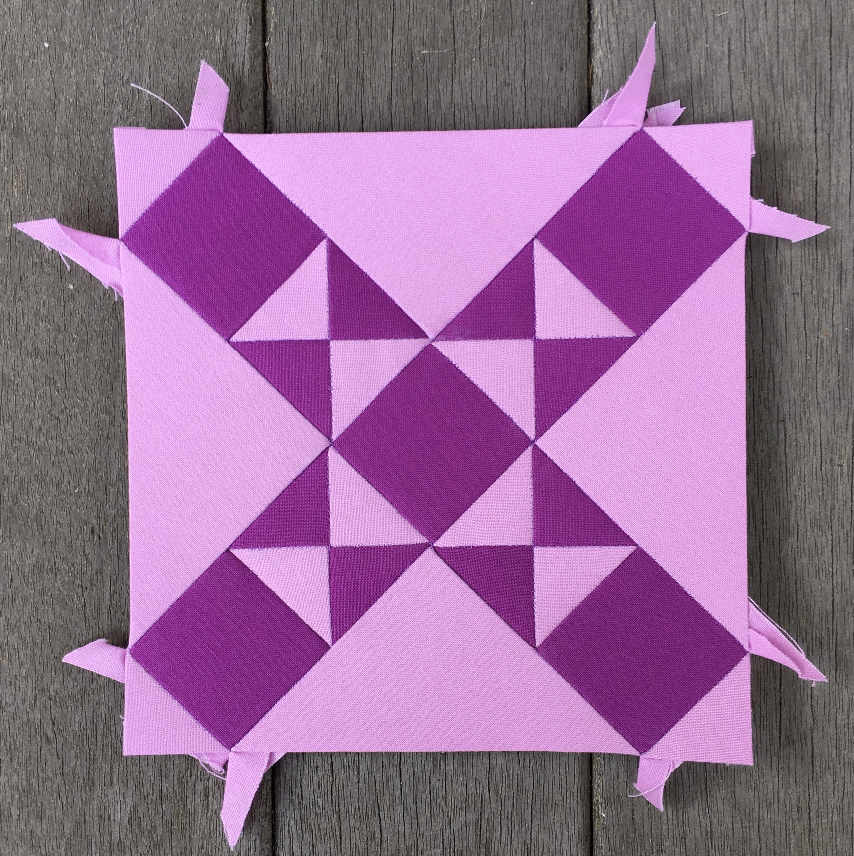
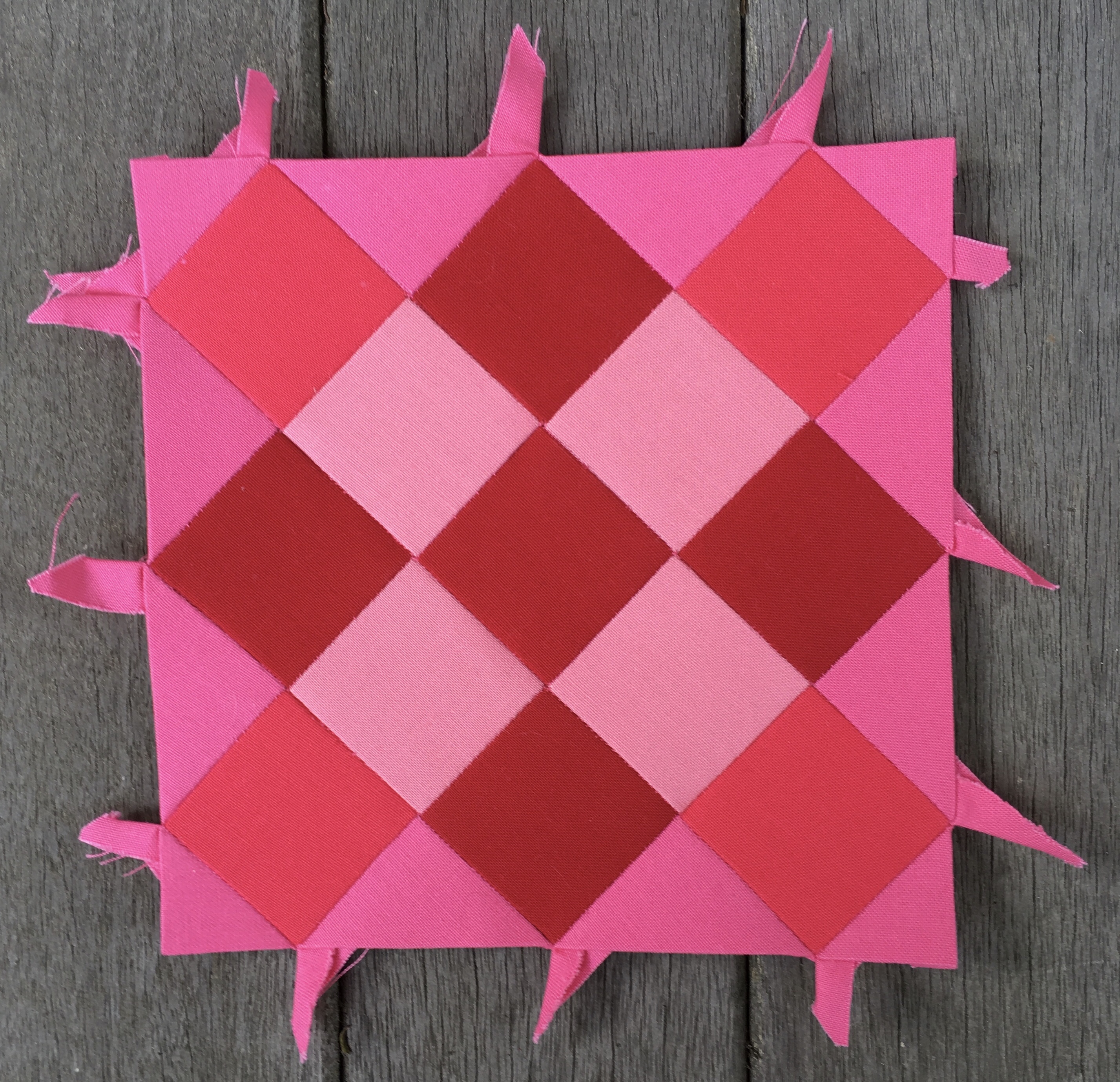
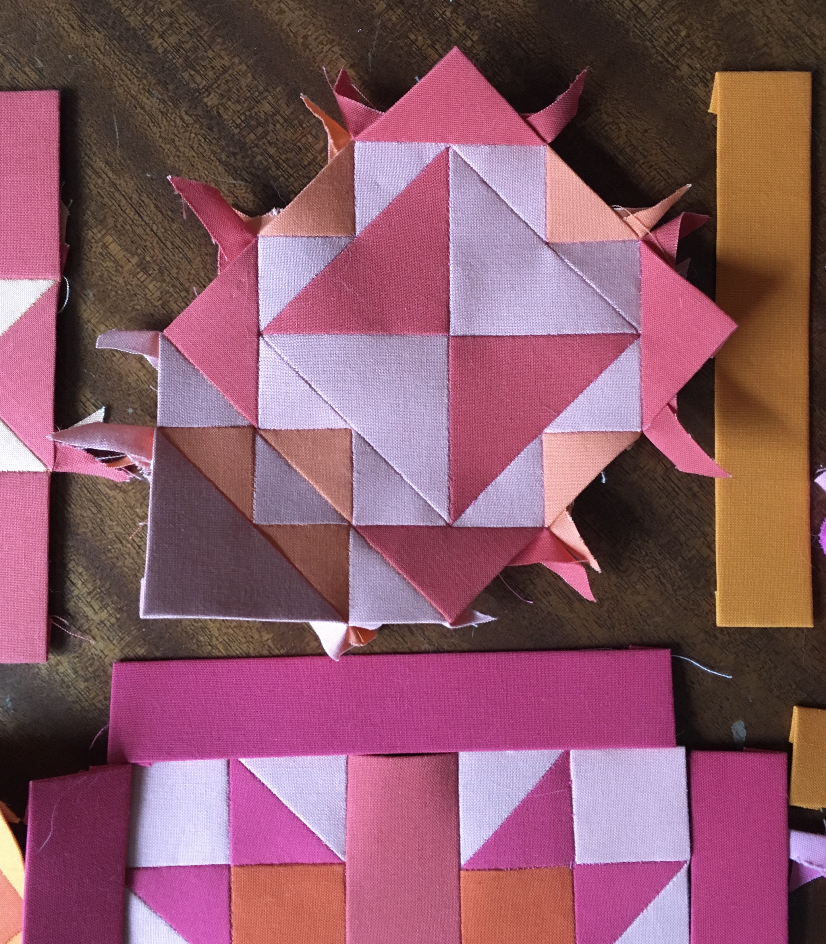
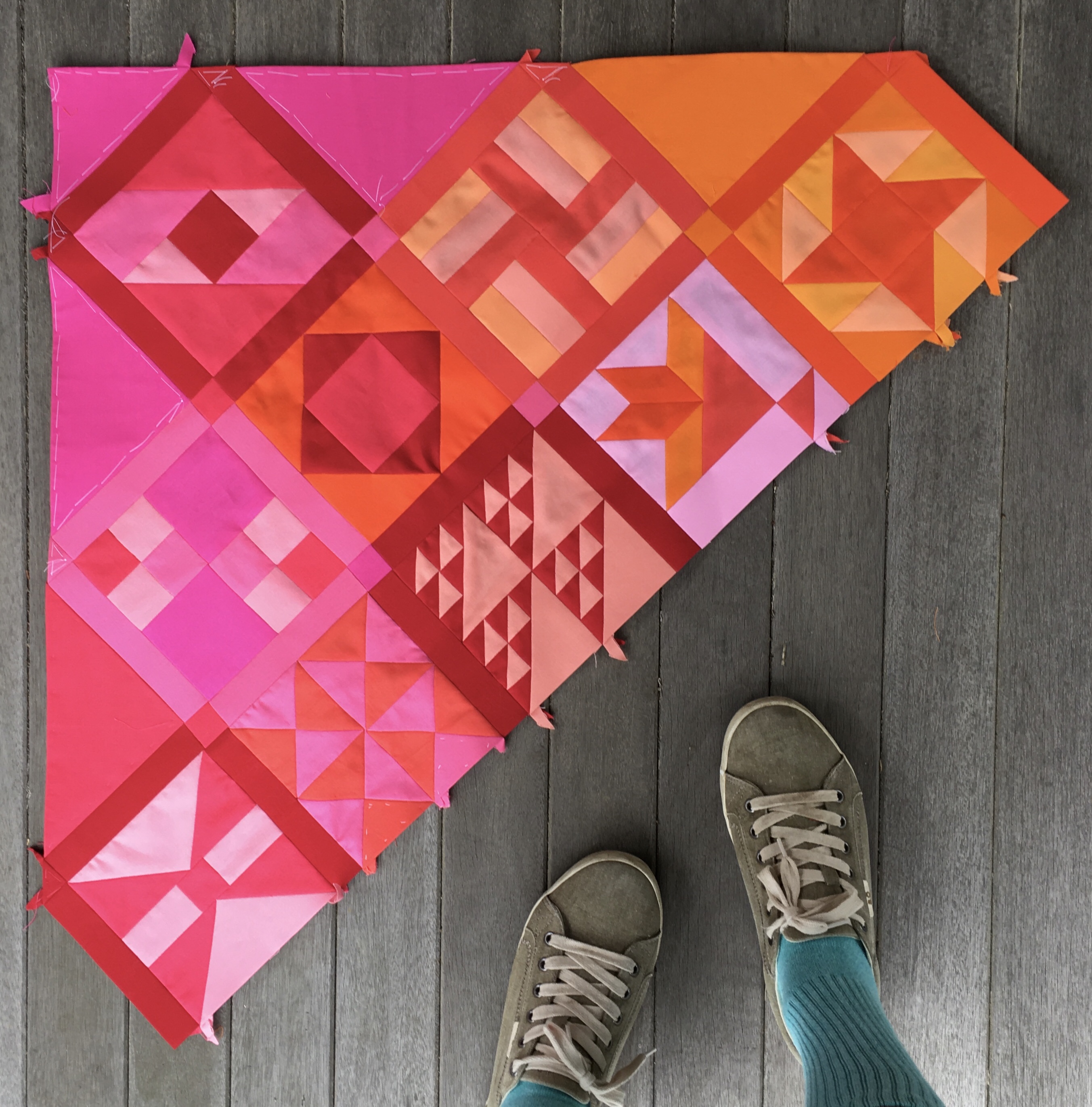
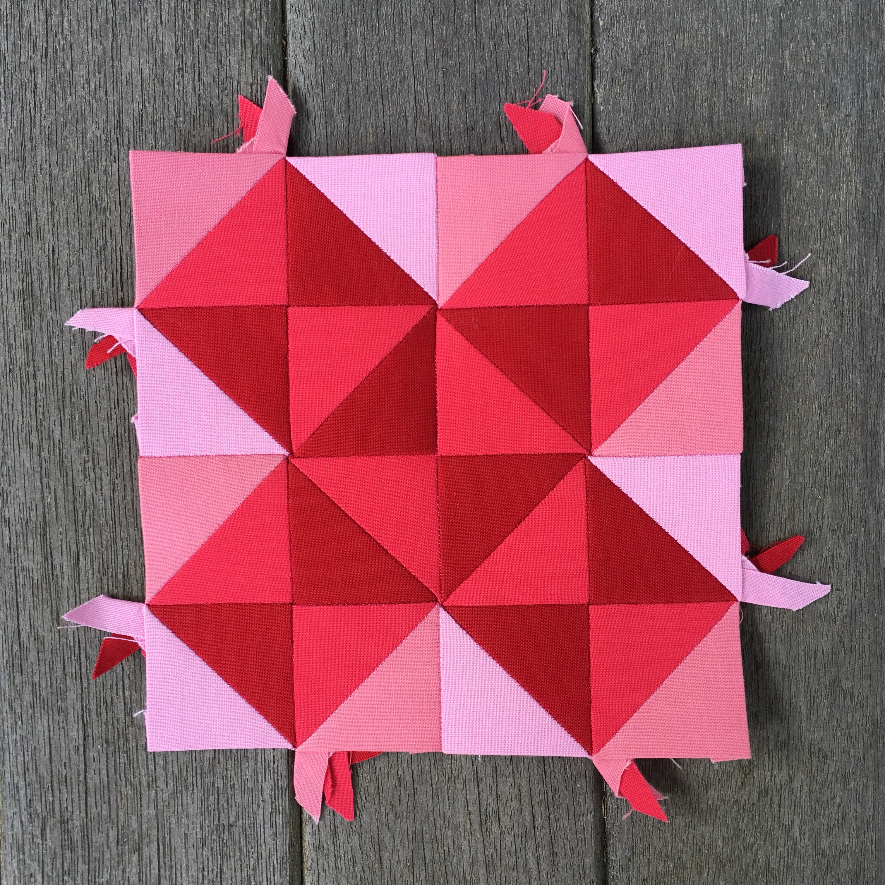
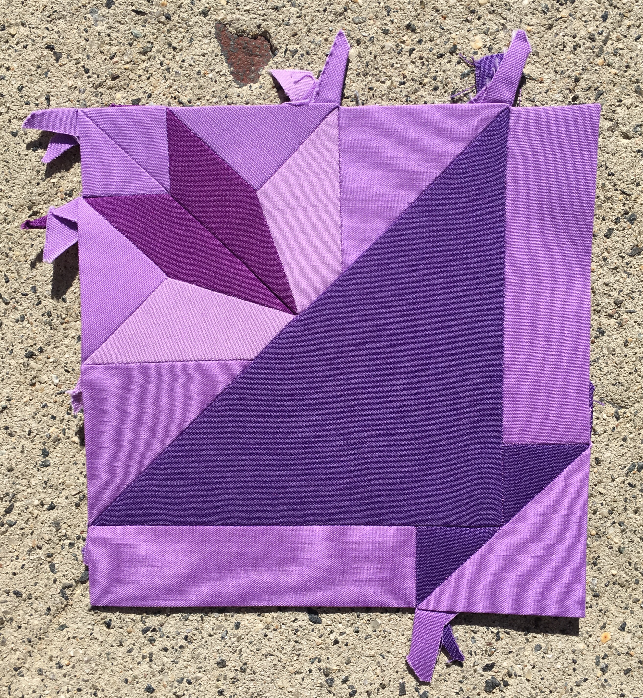
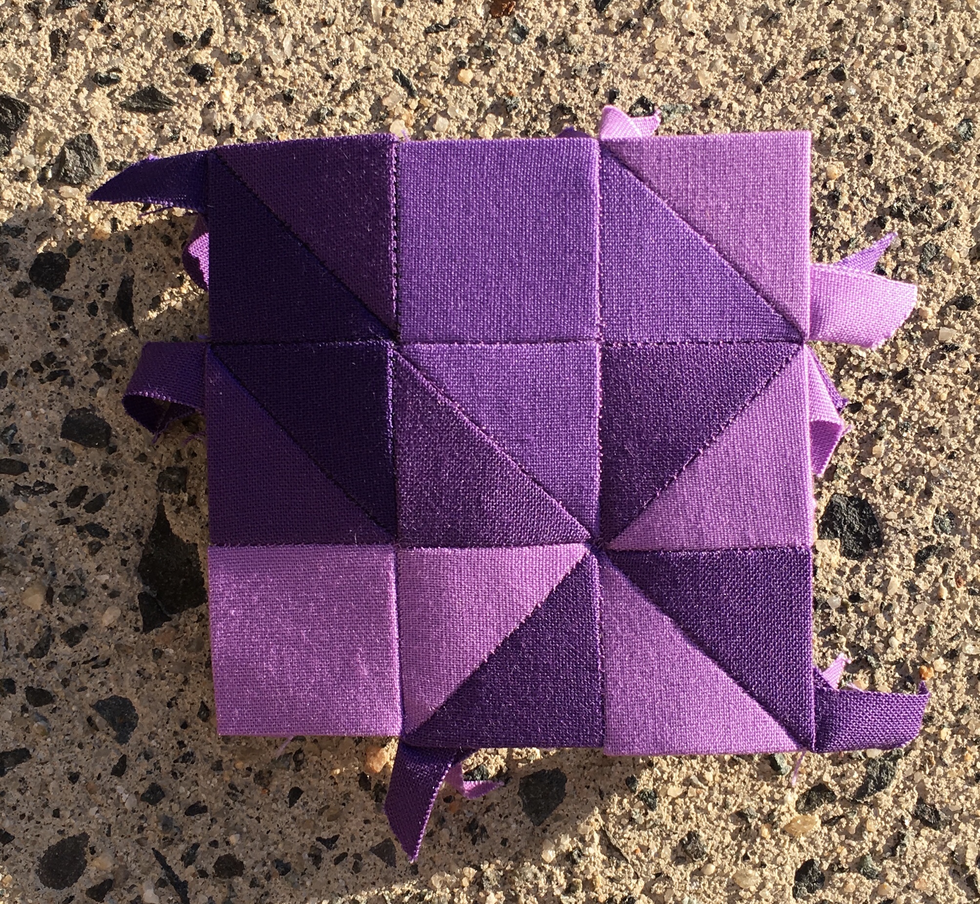
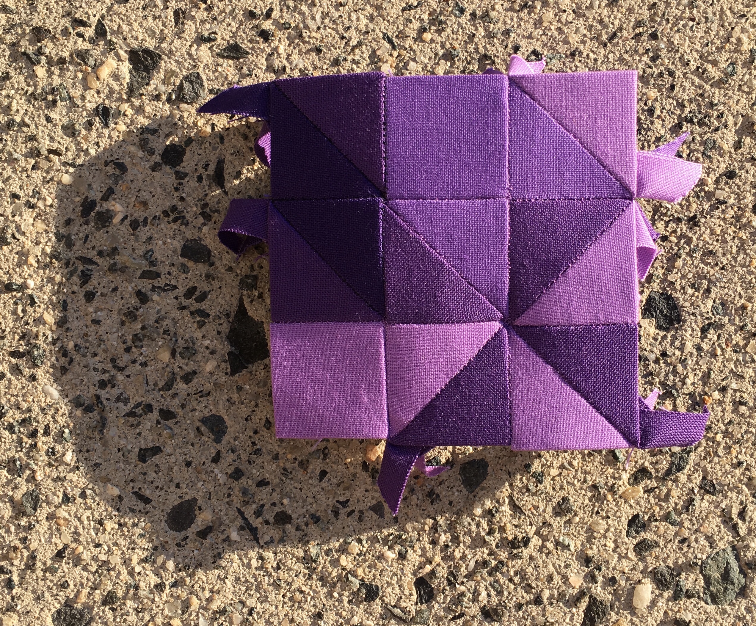
I labored long and hard on the first five blocks of the fifth row. They were completed by the end of the first day. I rested and at the beginning of the second day I documented my work. This is starting to sound biblical.

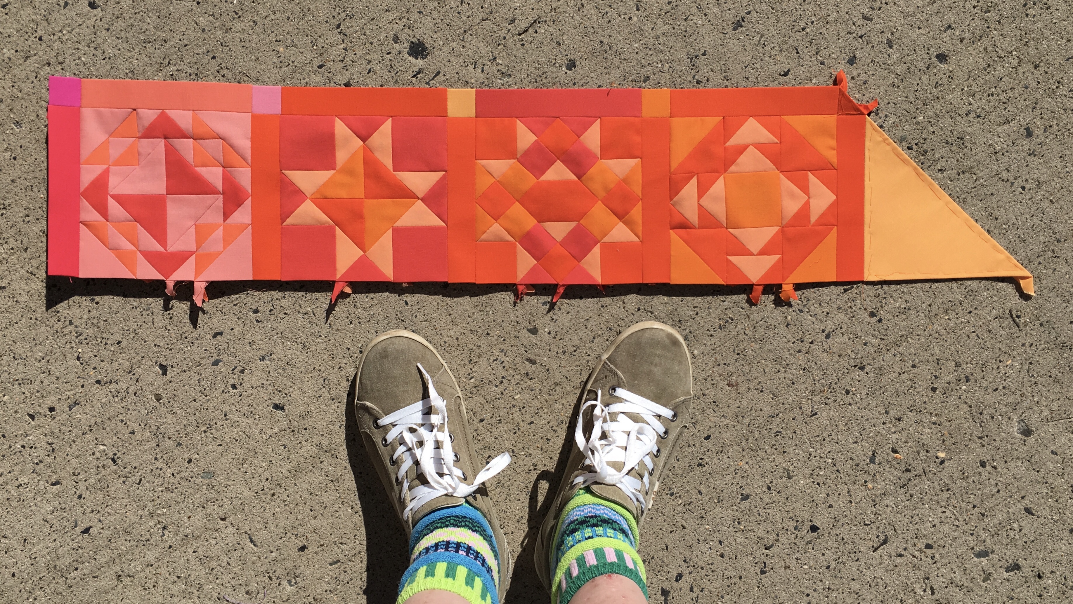
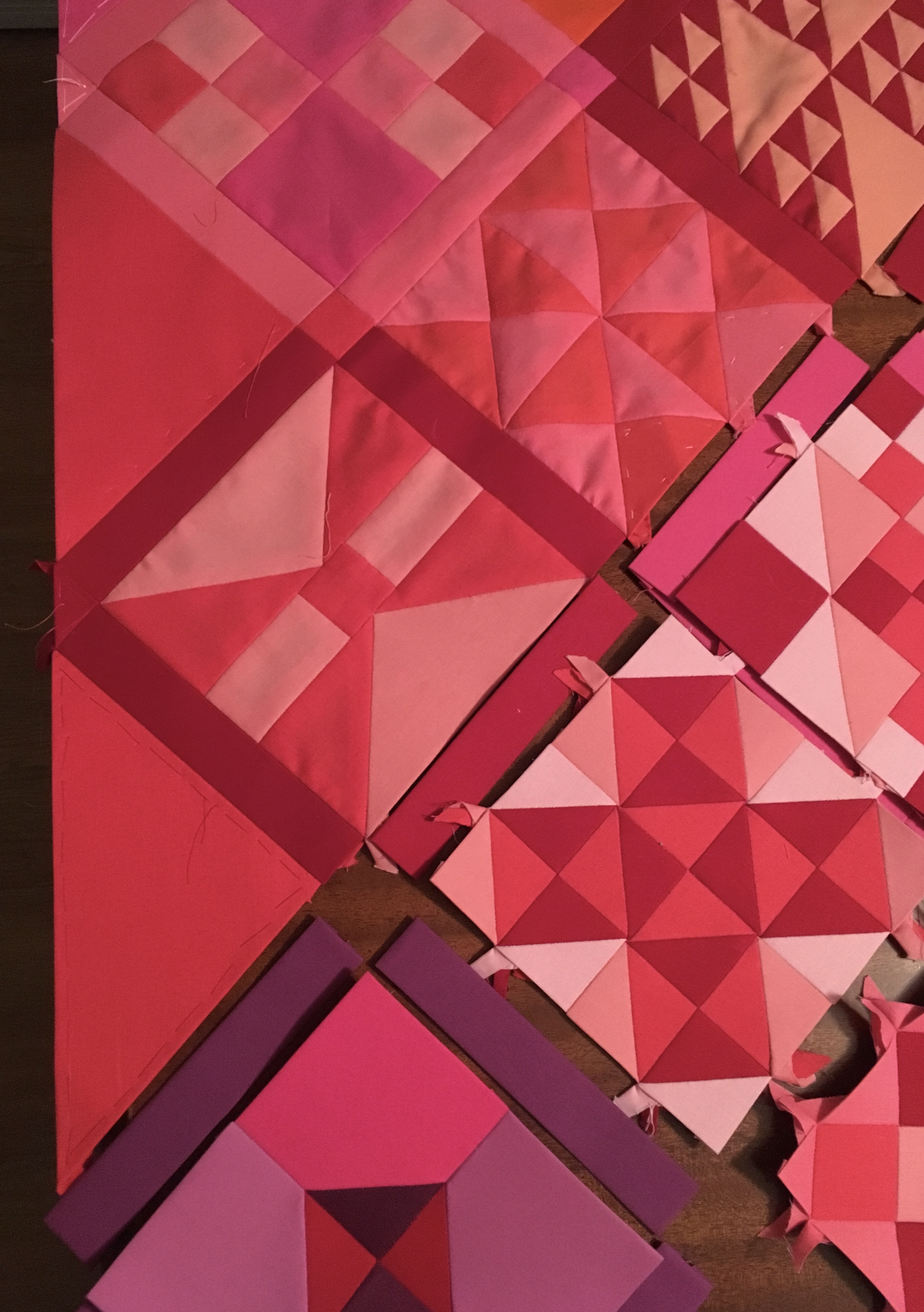
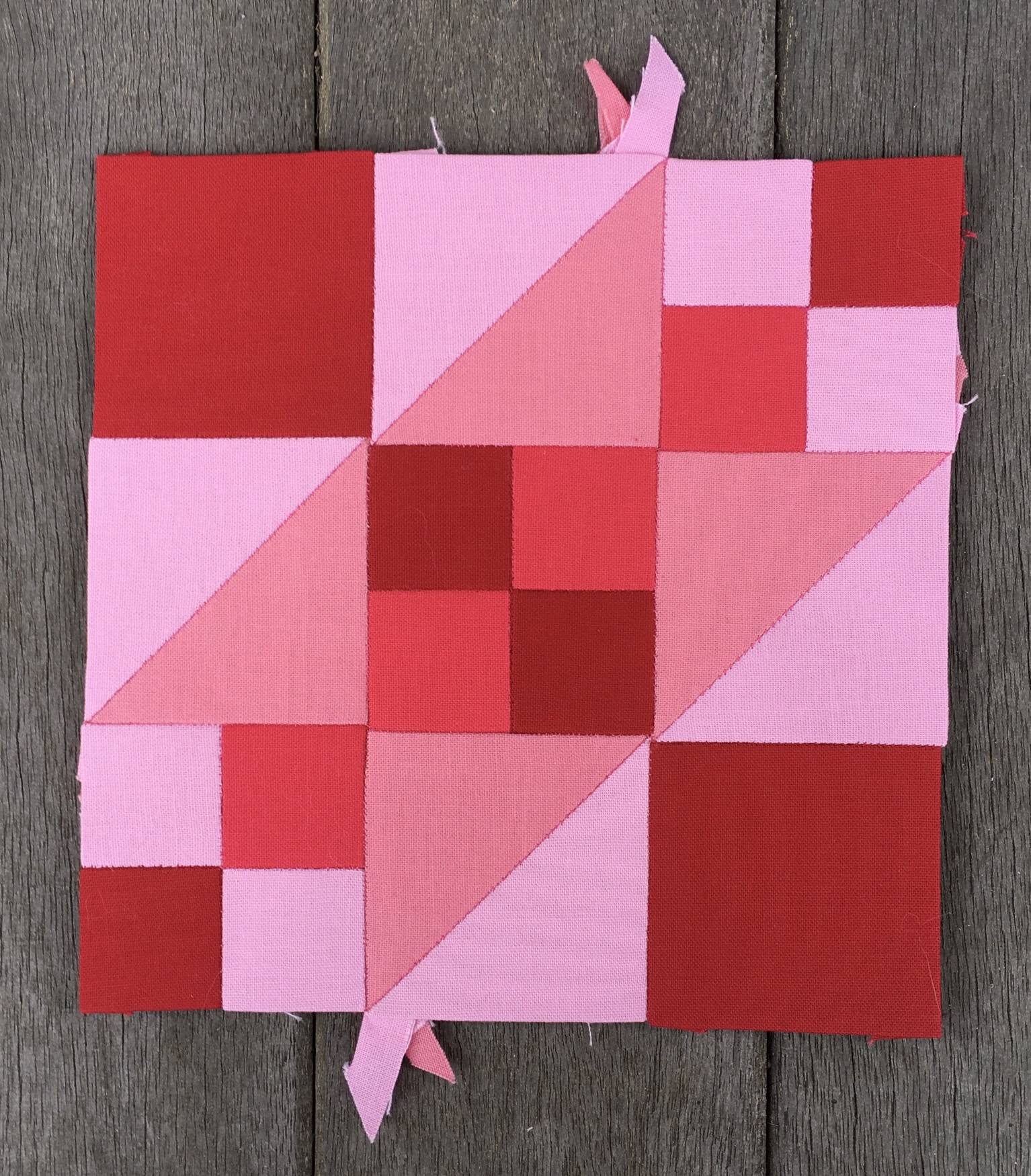
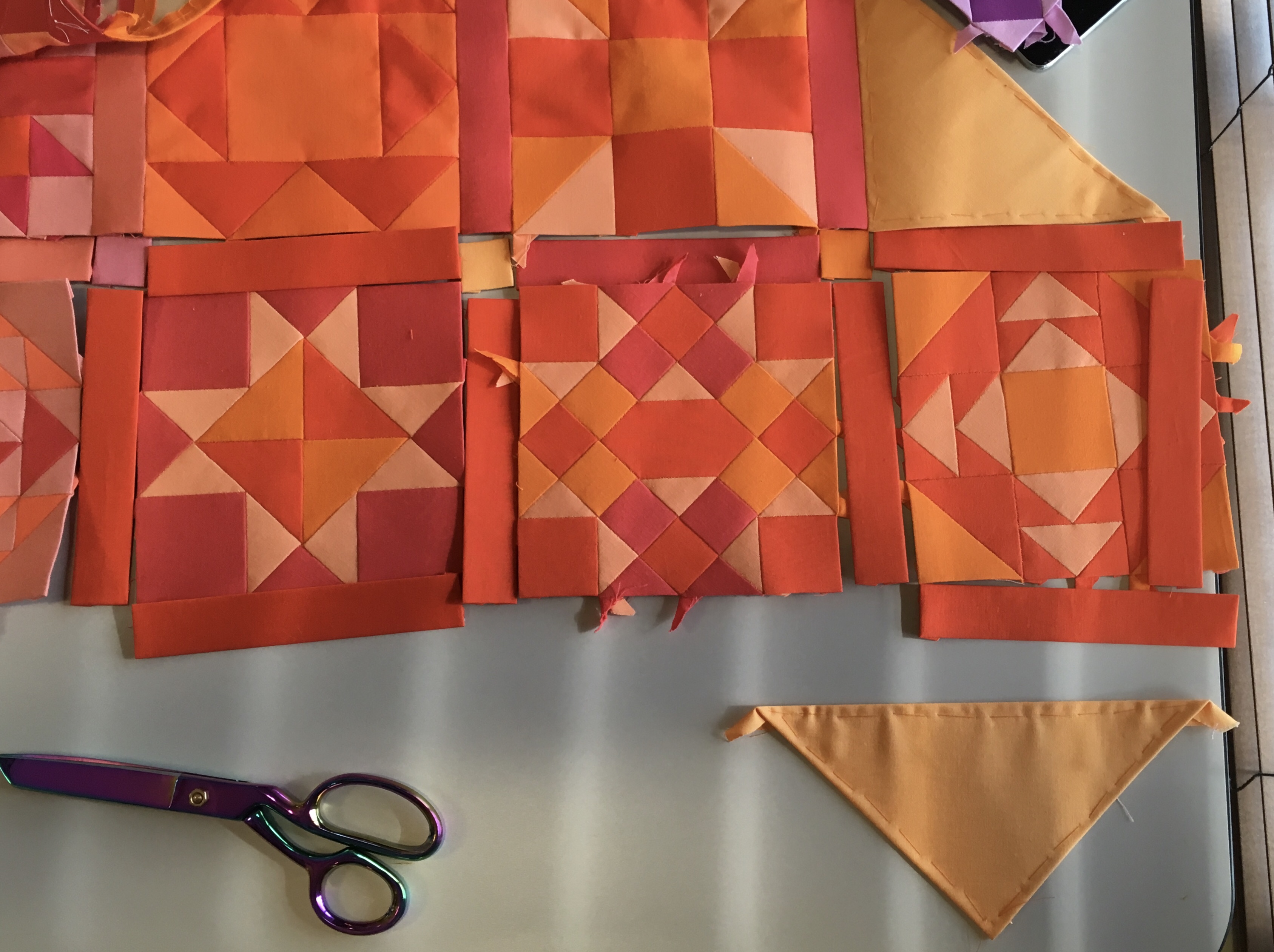
On the second day I assembled the last four blocks of the fifth row. I managed to finish that work, and document it, in mid day glaring light. I should have waited until later in the day to take this photo, but I have learned something here. Even the concrete suffers from the strong light. You get the idea though.

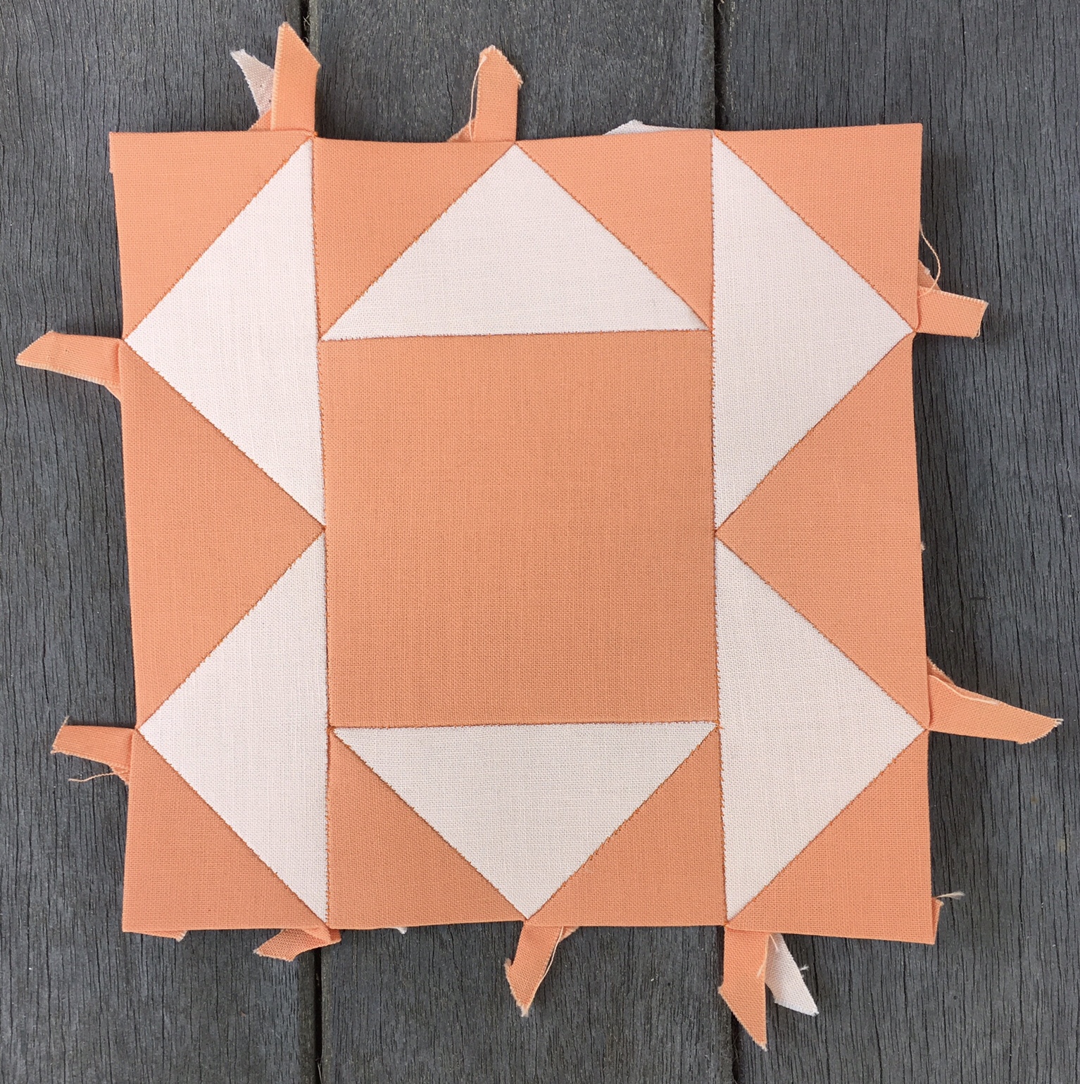
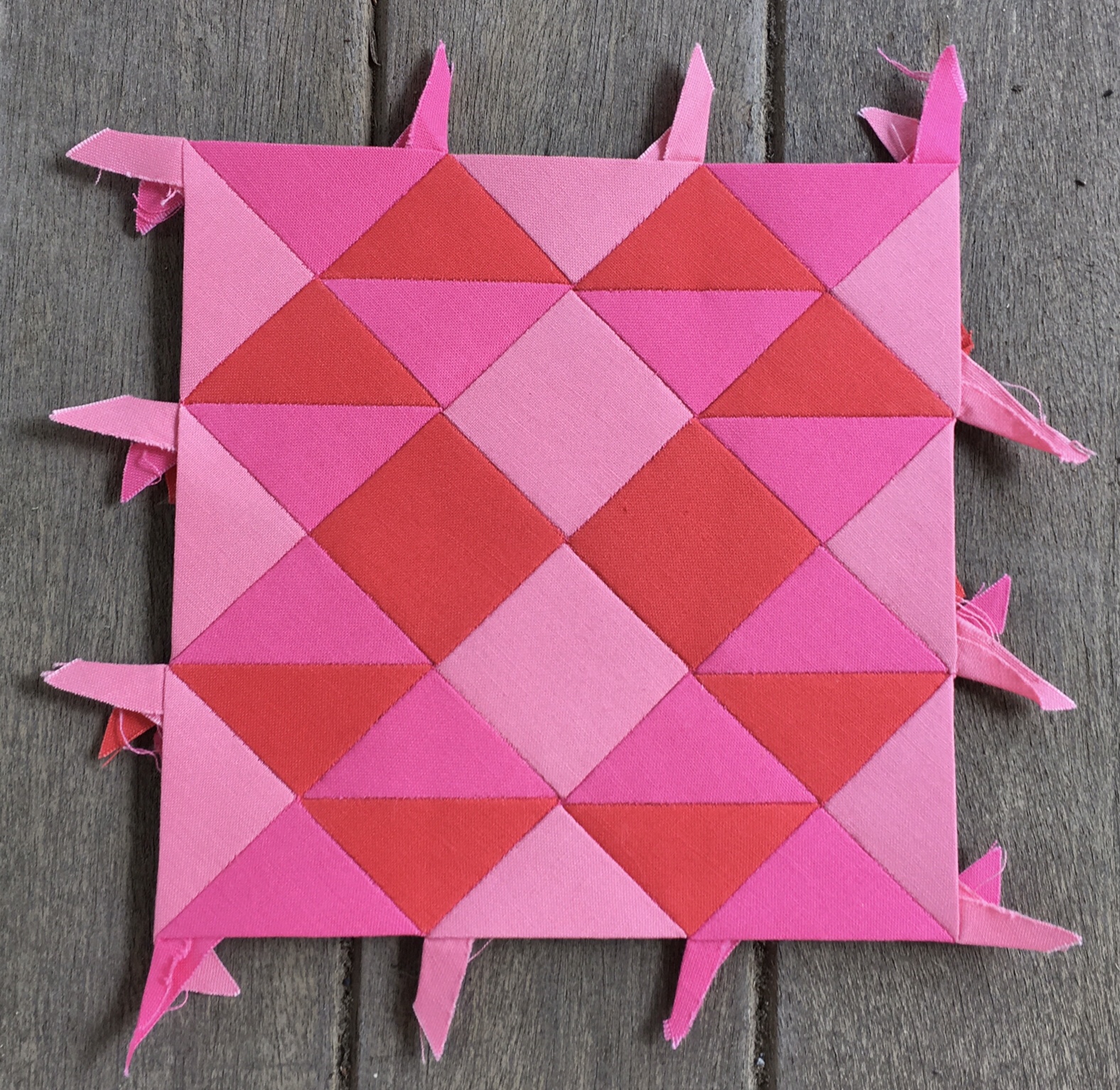
Edit: I took this photo a few days after getting home.

It shows off the second half of the row better.

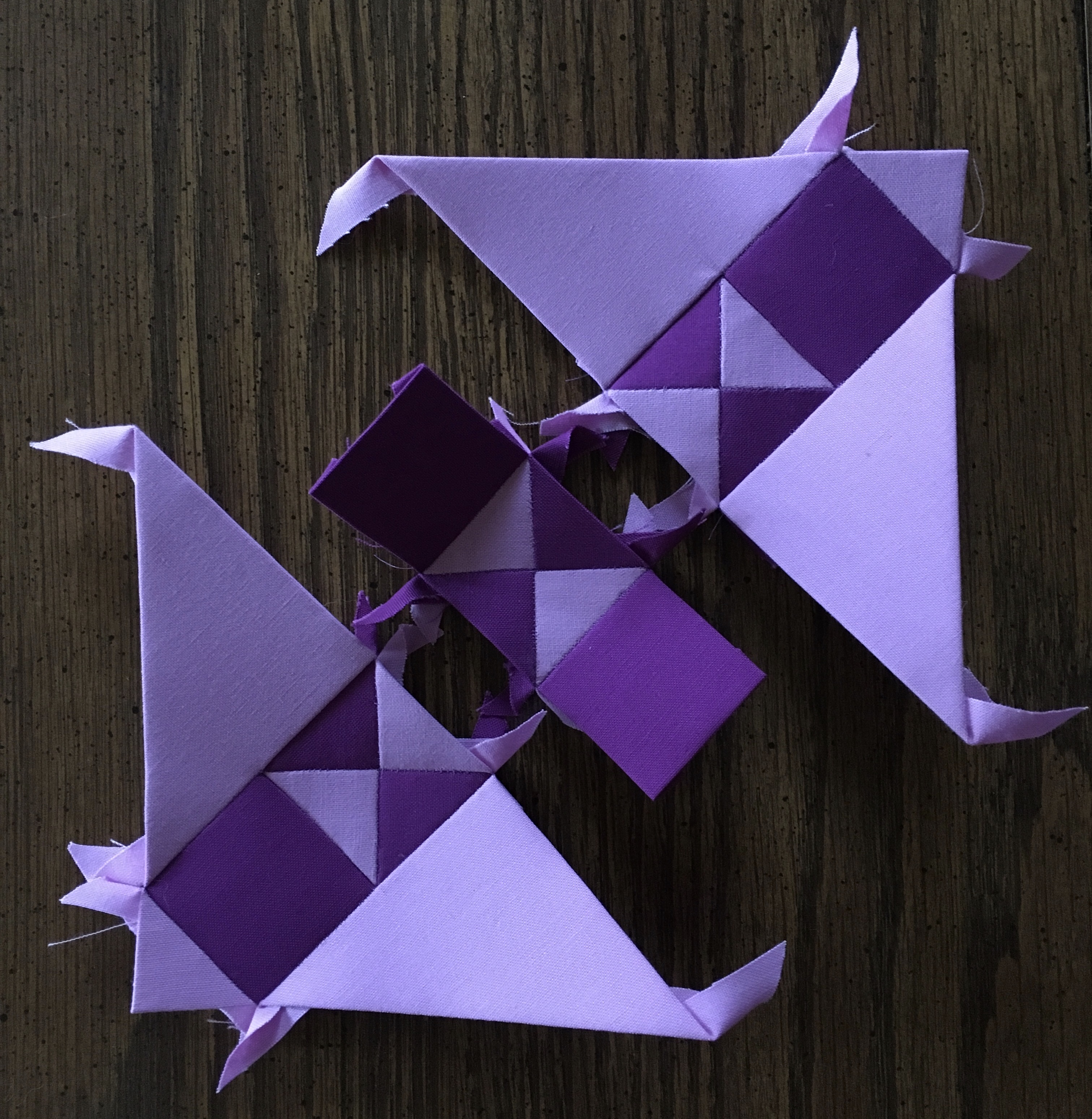
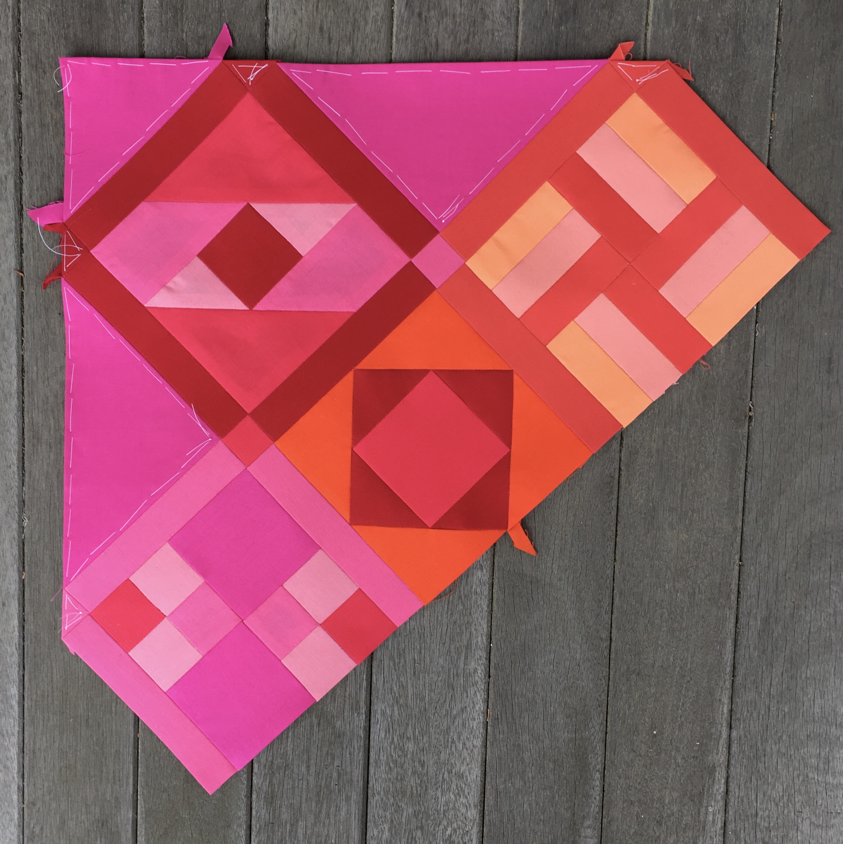
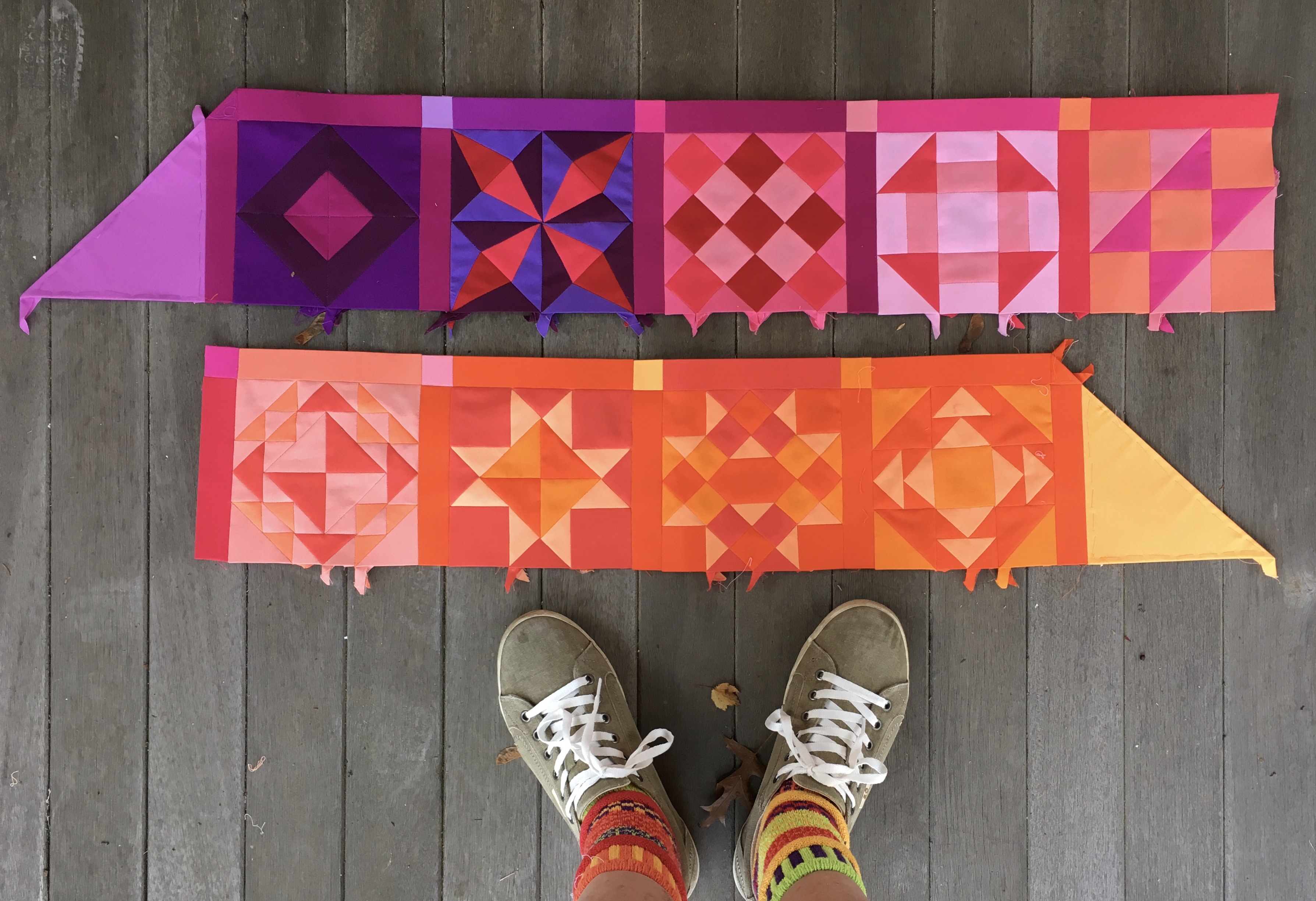
My initial plan was to join the two halves of row five and join the row to the body of the quilt. Remember her?

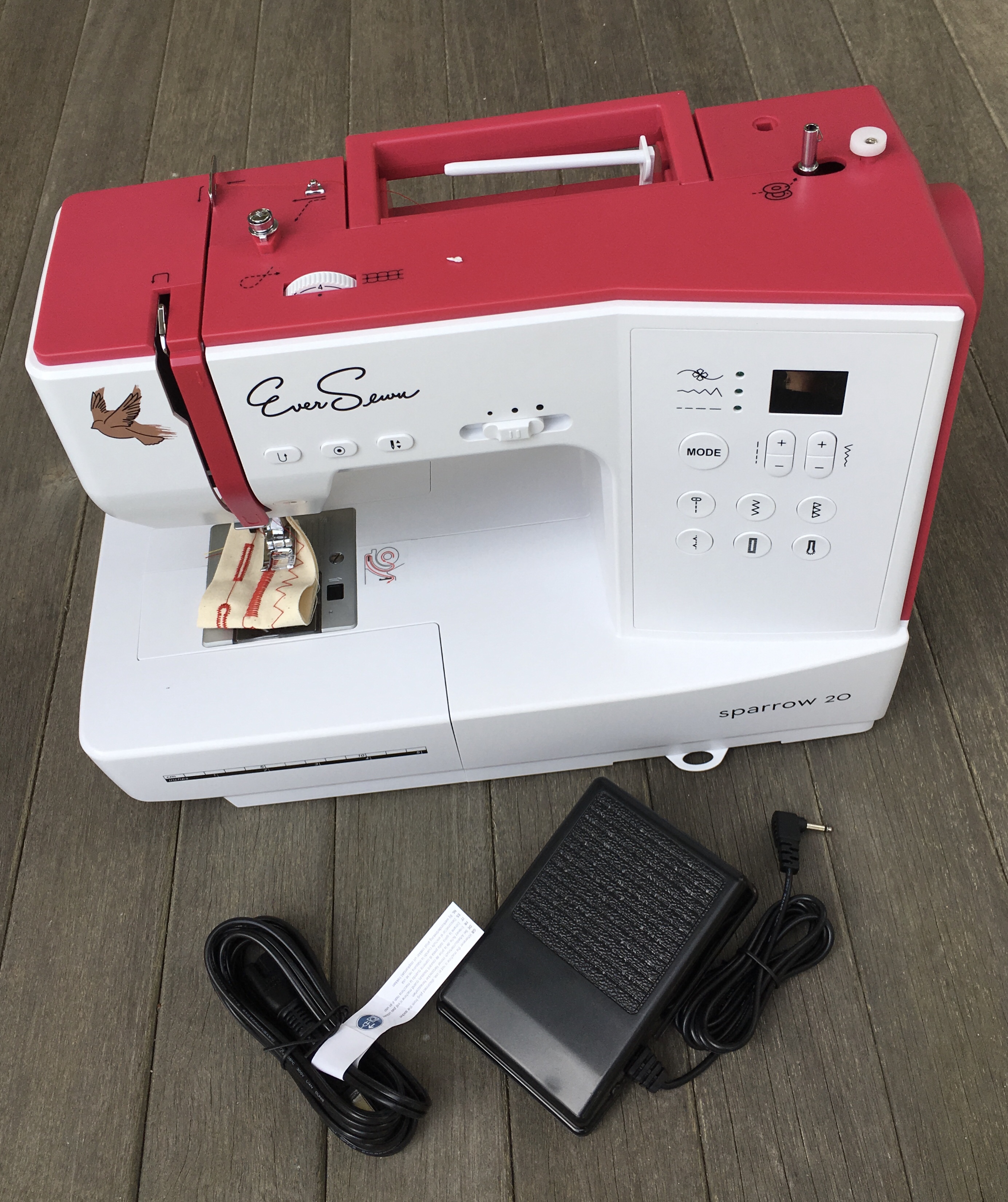
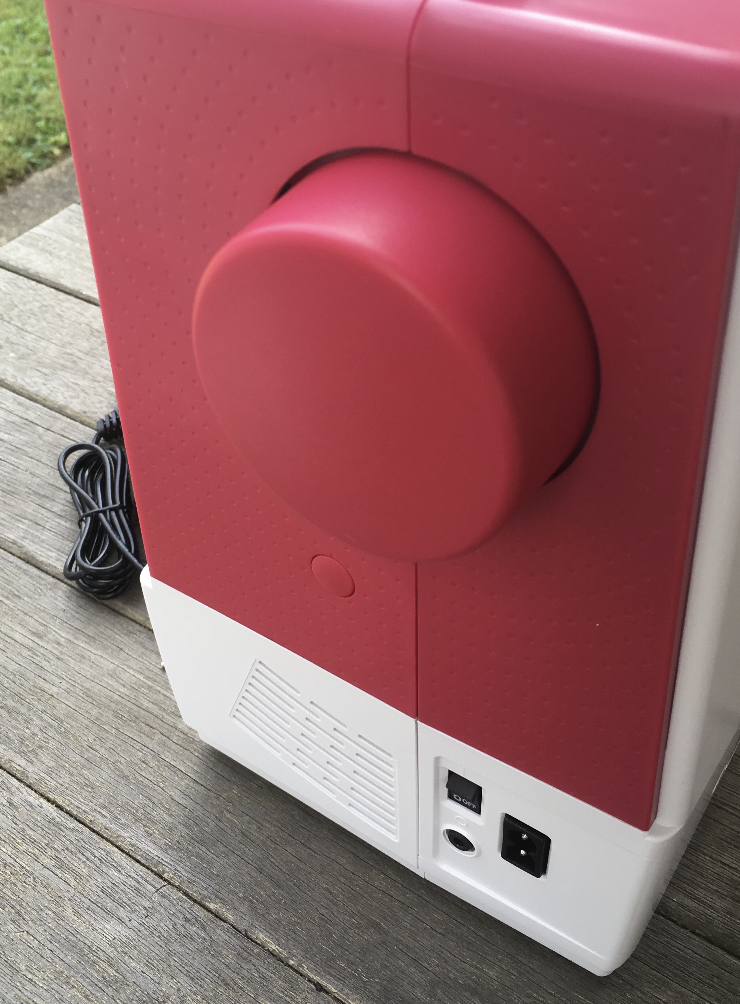
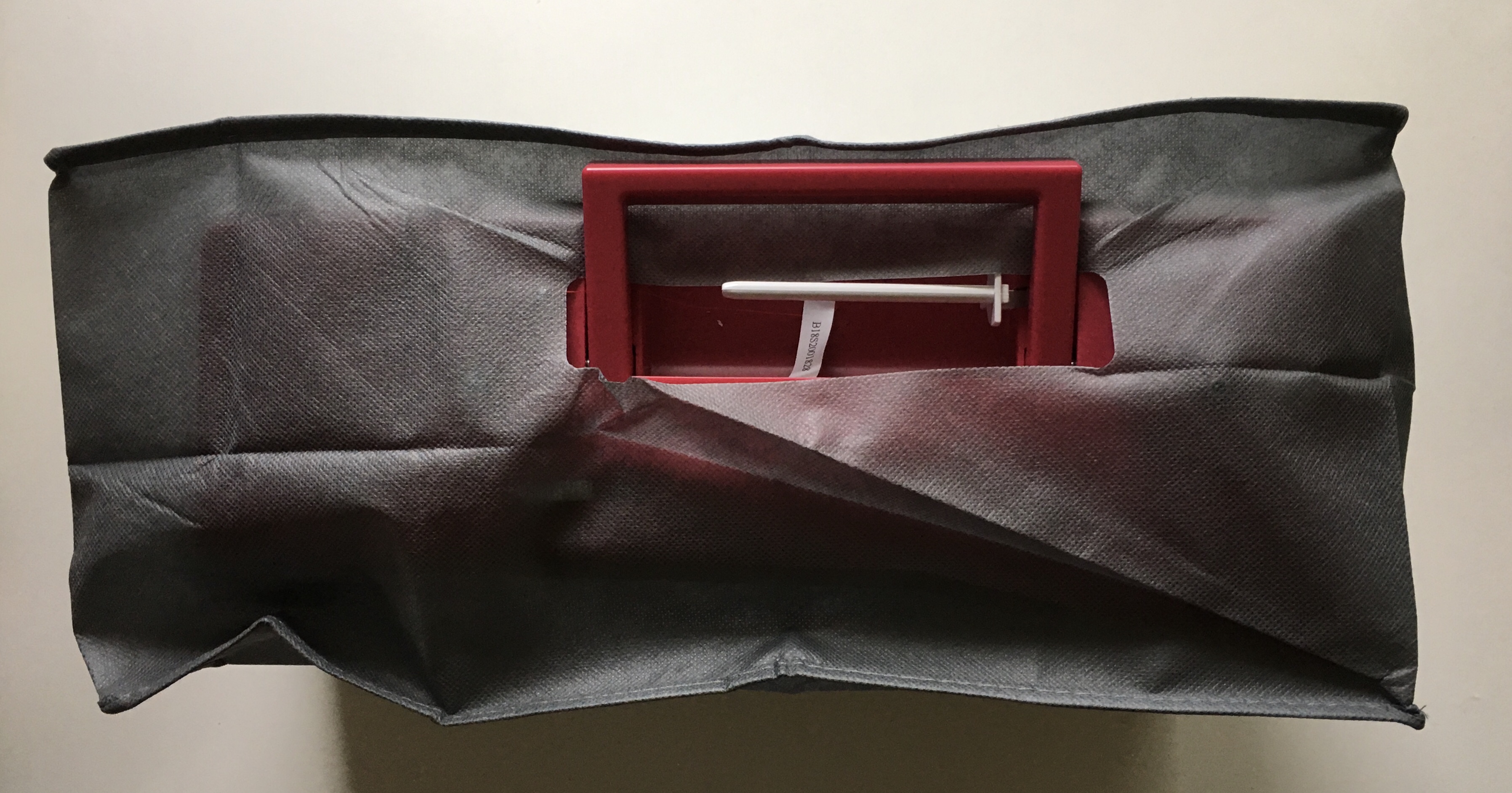
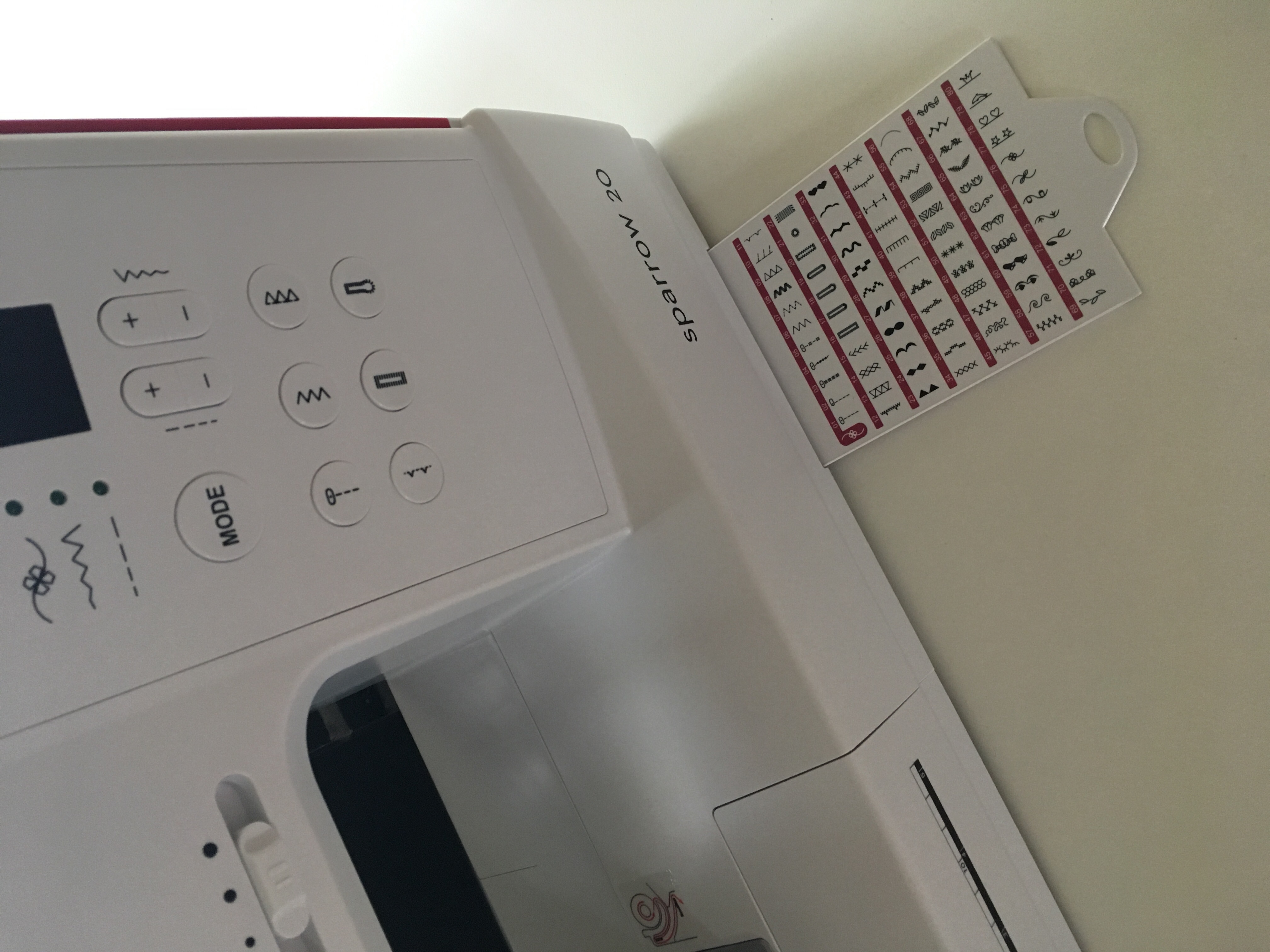
However, after nearly two days of easing sashing I decided I needed a change of pace so I moved my Sparrow front and center, opened the documentation, hooked her up and got to work getting to know her. It was our first time together.

She had been sitting in the upper left corner of my work area while I did hand stitching for nearly two days.

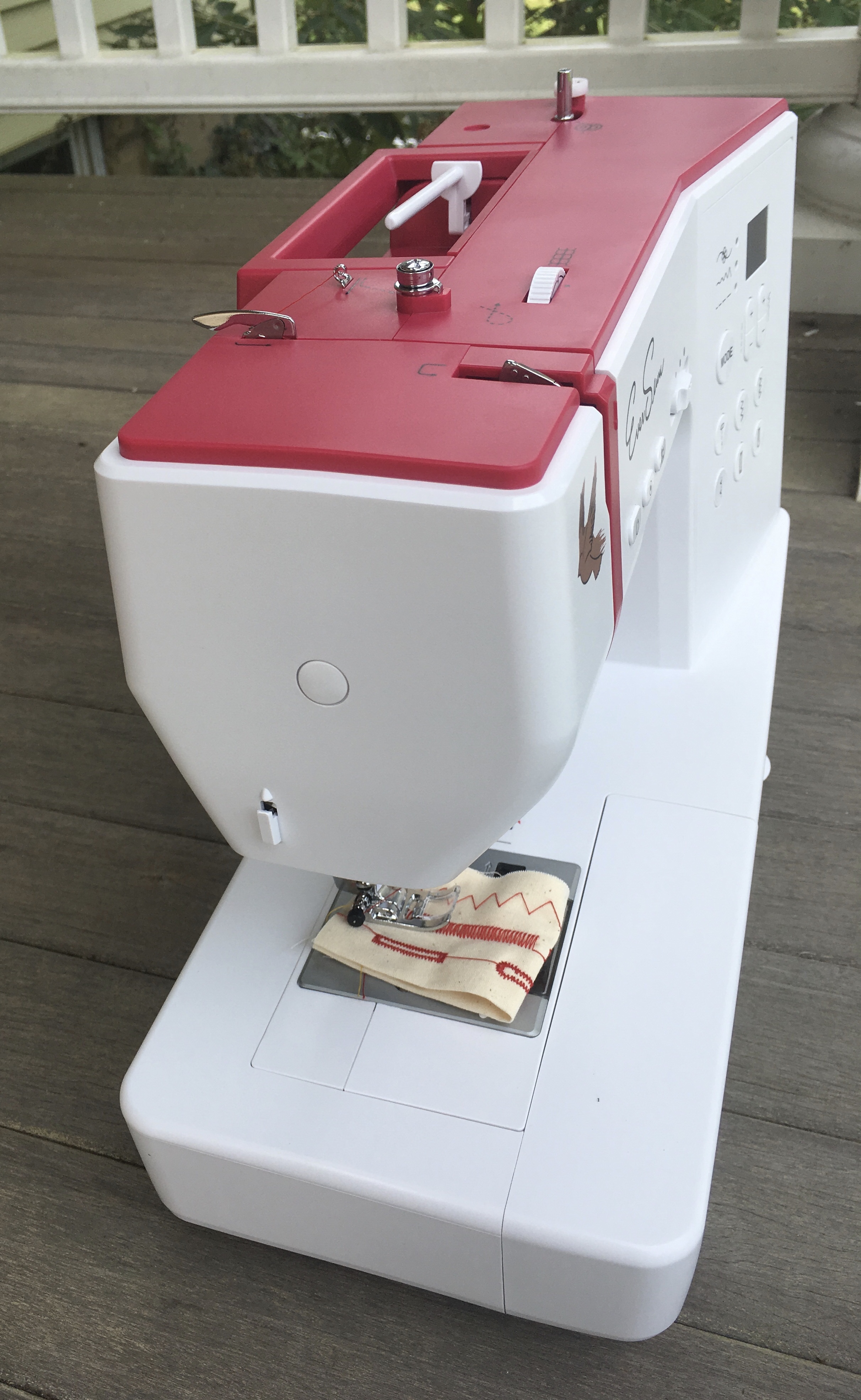
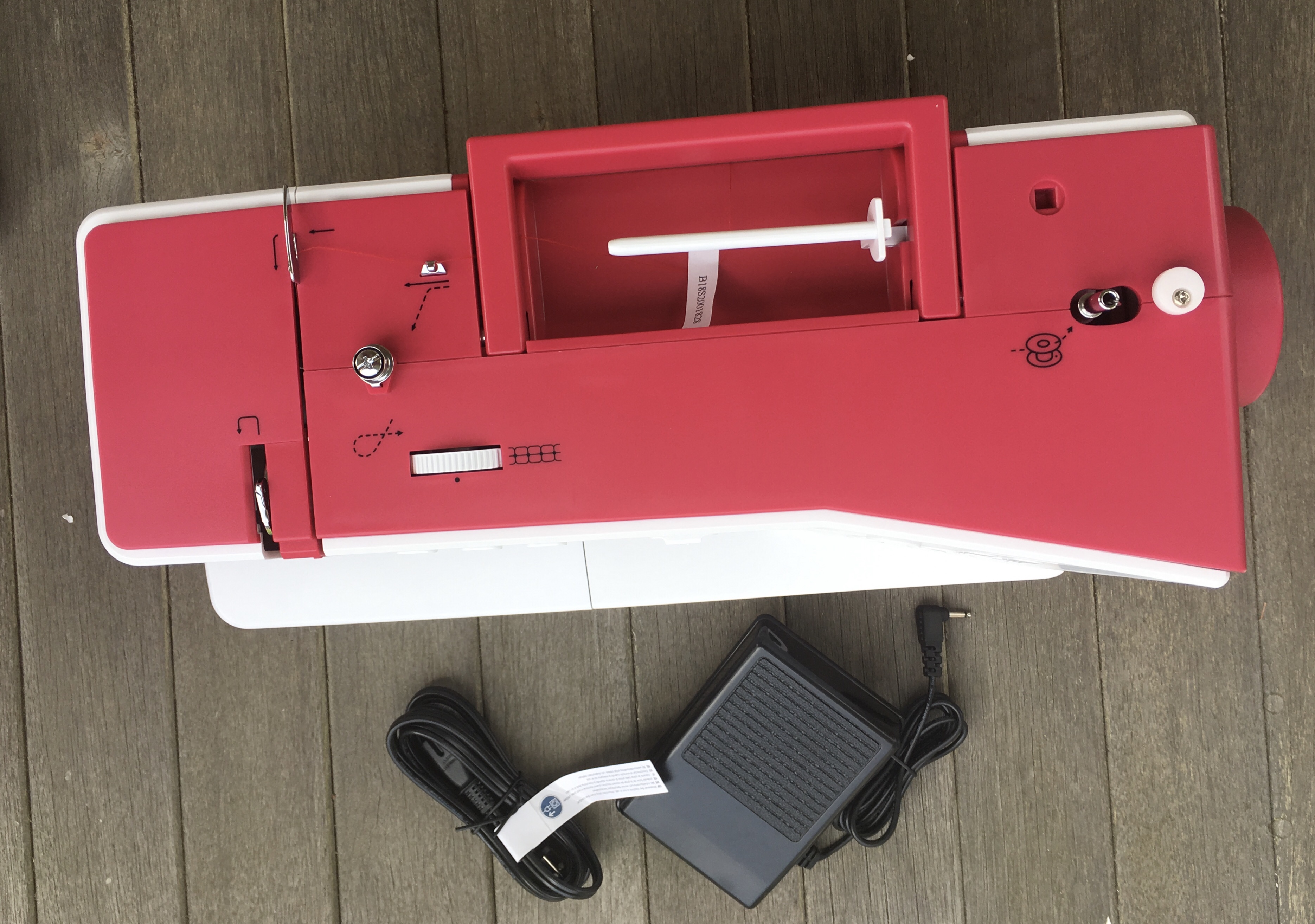
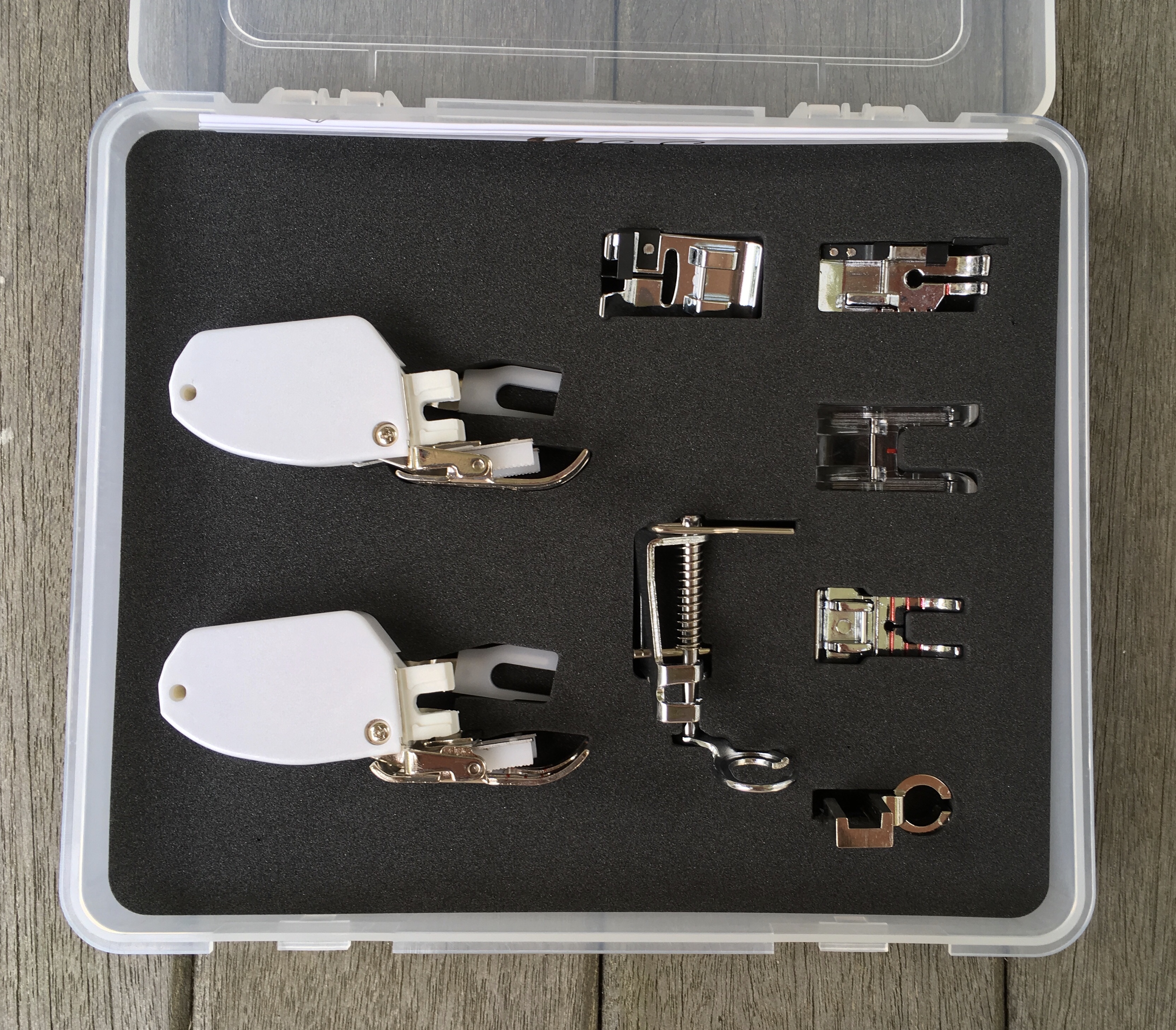
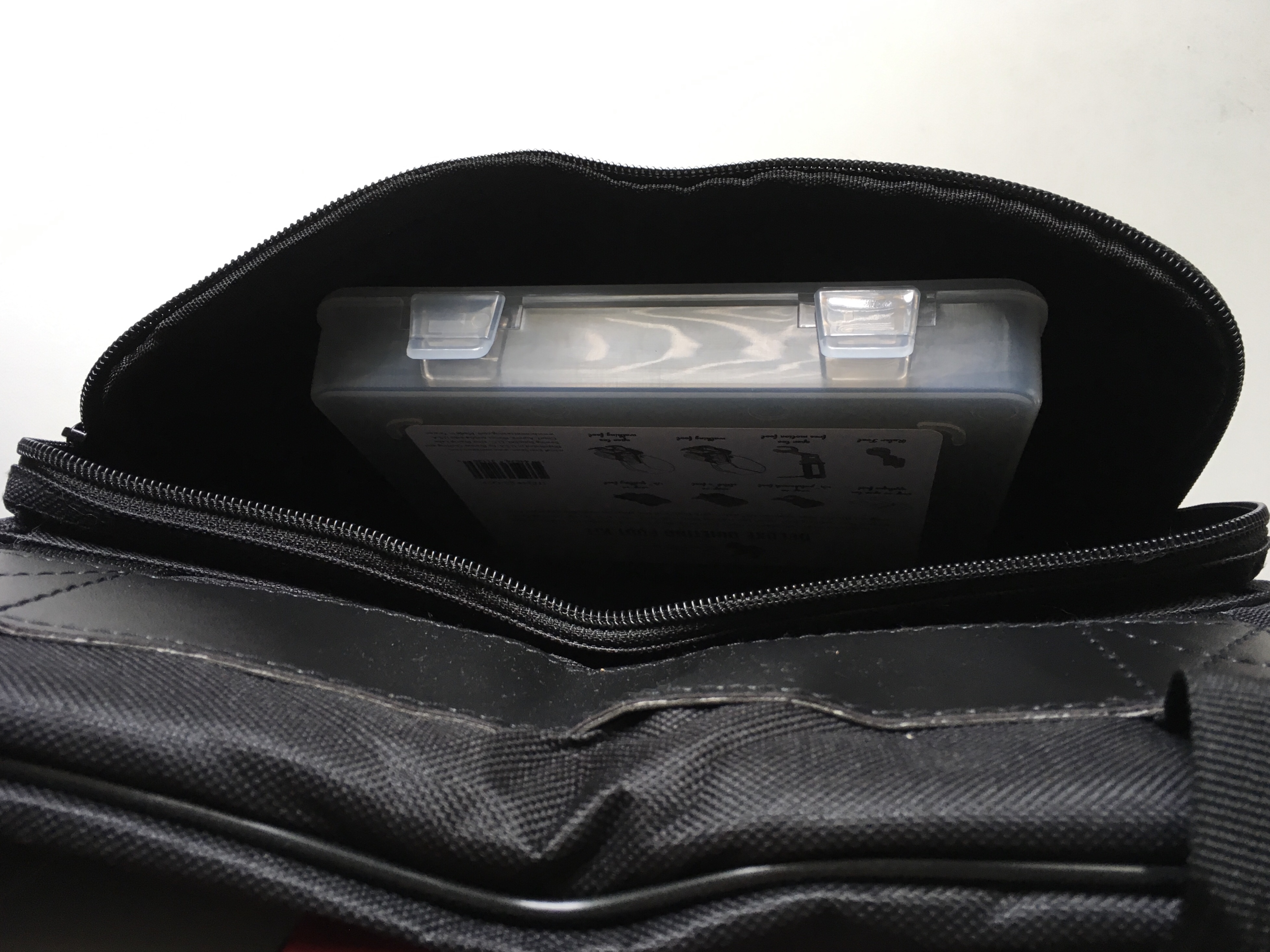
When I first came into the room on Friday morning I was asked if I was going to be doing all hand sewing this time, or if I had brought a machine. I exclaimed excitedly, “Wait until you see what I brought with me!” I explained about how she weighs 13.5 pounds and that I bought her to lug on the train to Lancaster to my Lambertville Ladies retreats. She made a hit with the group when they saw how cute and light she is. And I showed off the extra feet I bought to go with her.

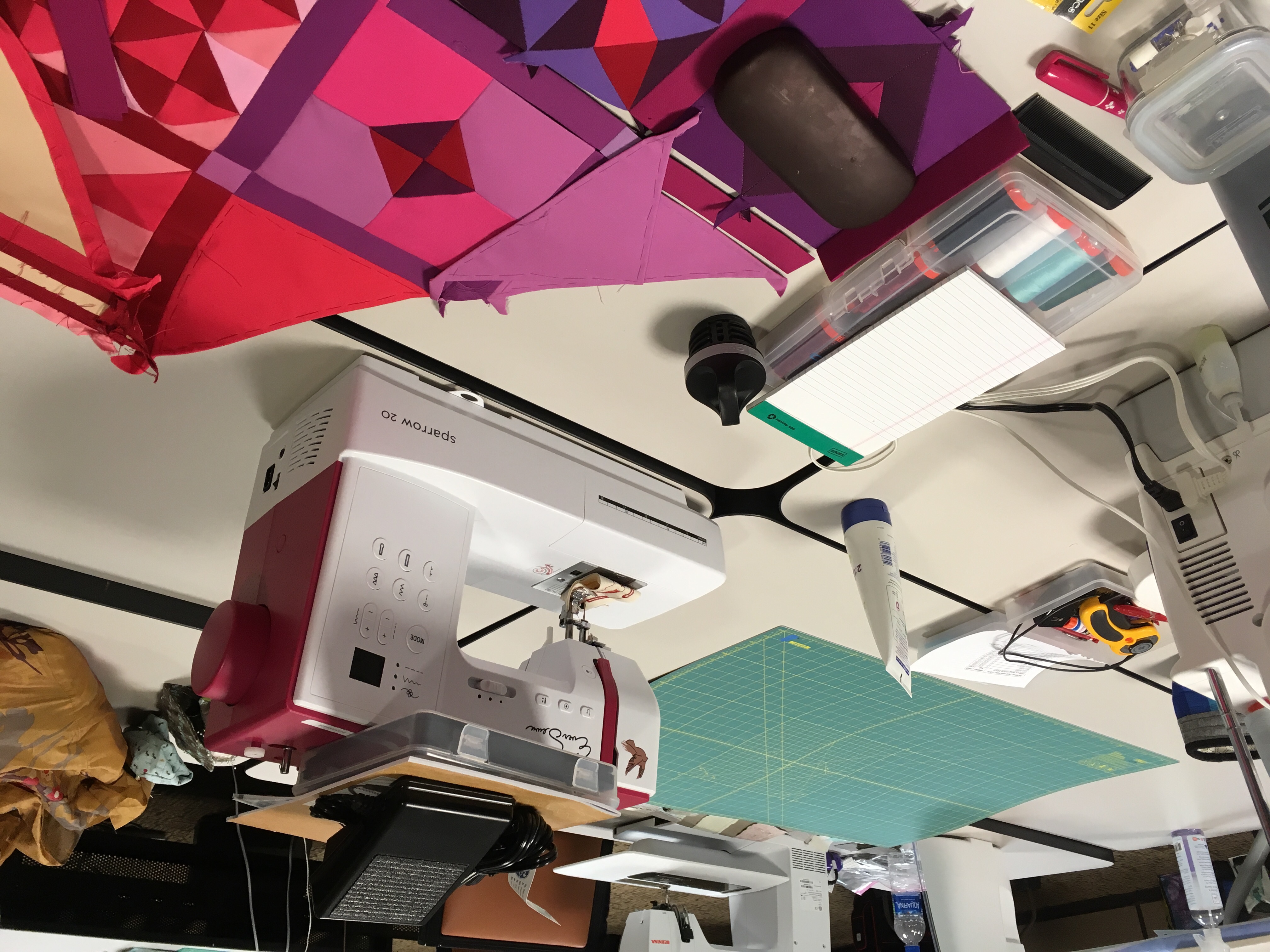
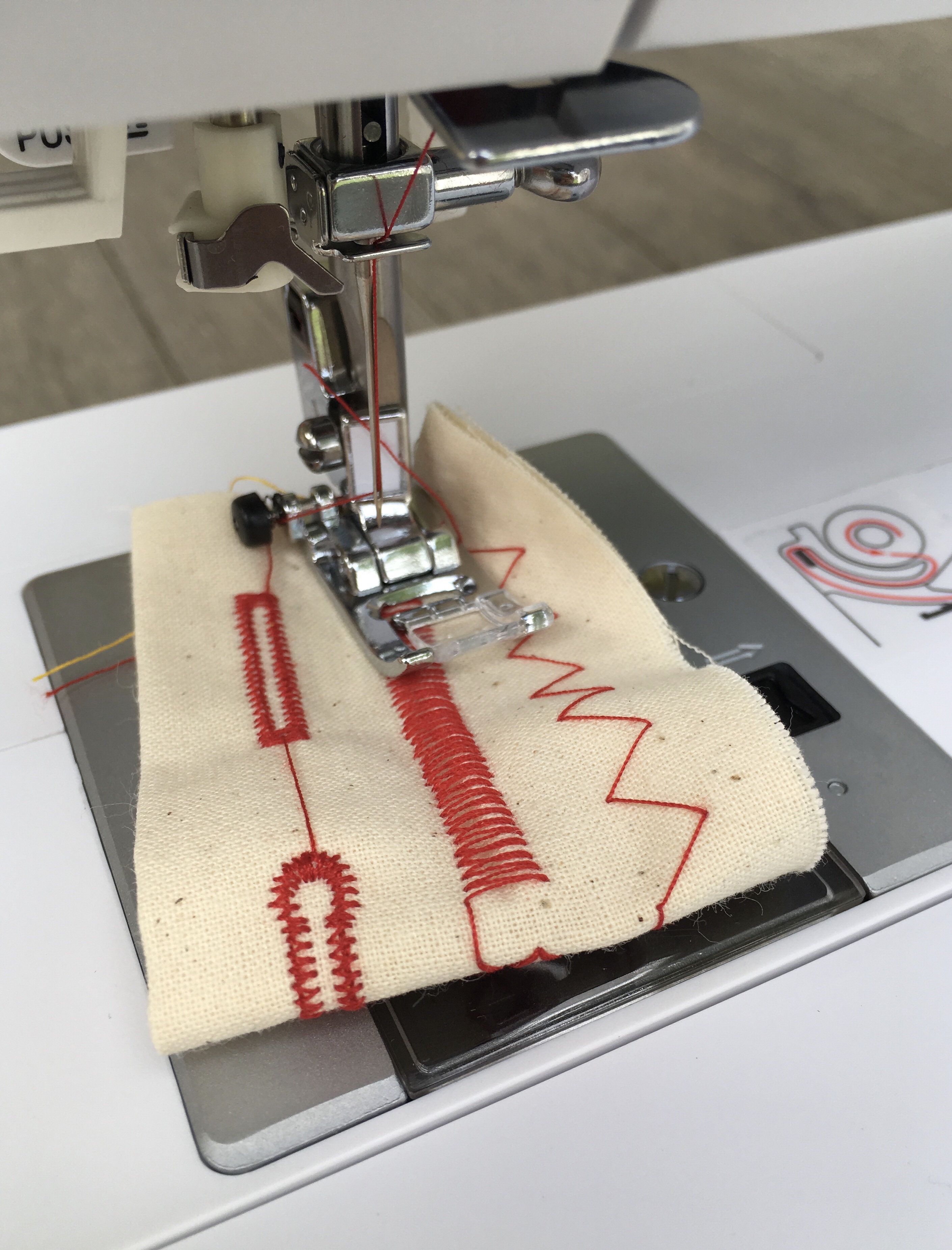
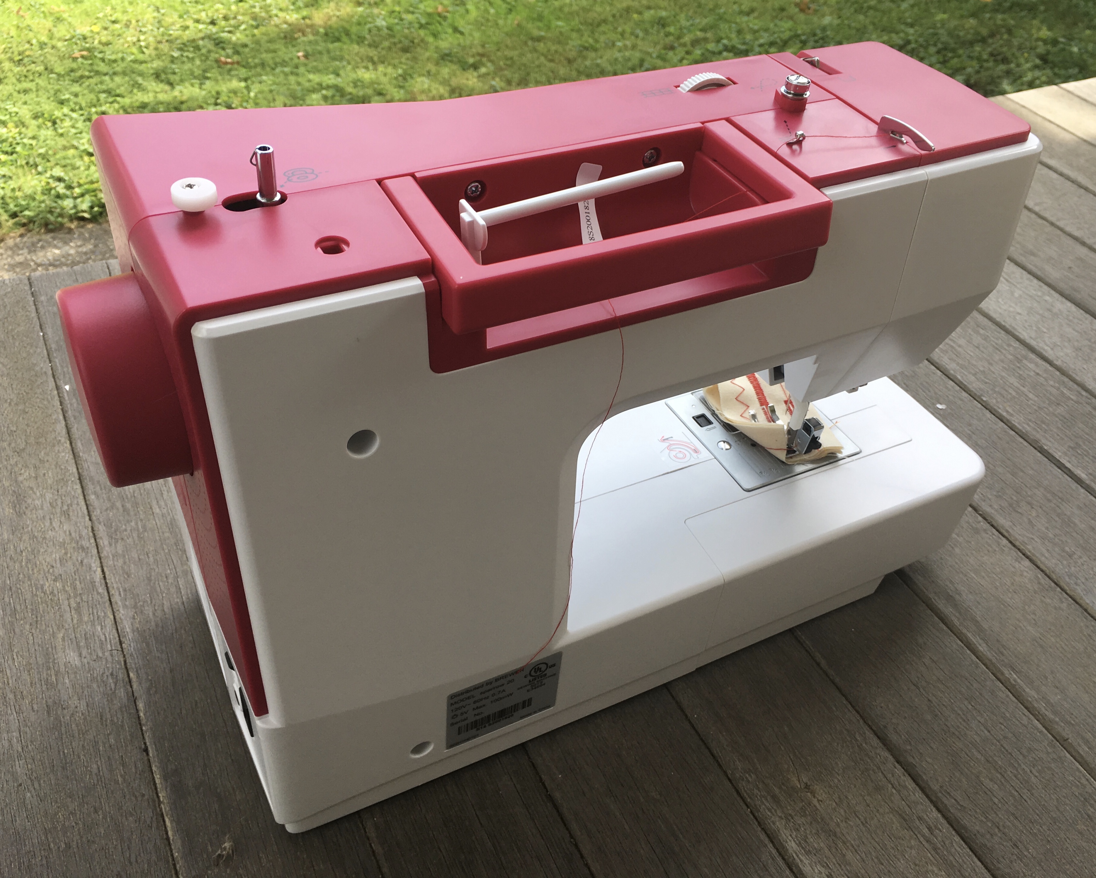
Threading was easy. She came with a full yellow bobbin. So I could get right to work. Doing the straight stitch was easy. I had trouble figuring out how to access the additional stitches, but I finally stumbled upon how to set them up. I considered assembling a small quilt sandwich and trying out the quilting feet, but decided to leave that for another day.

Here you can see some of the stitches I tried out.

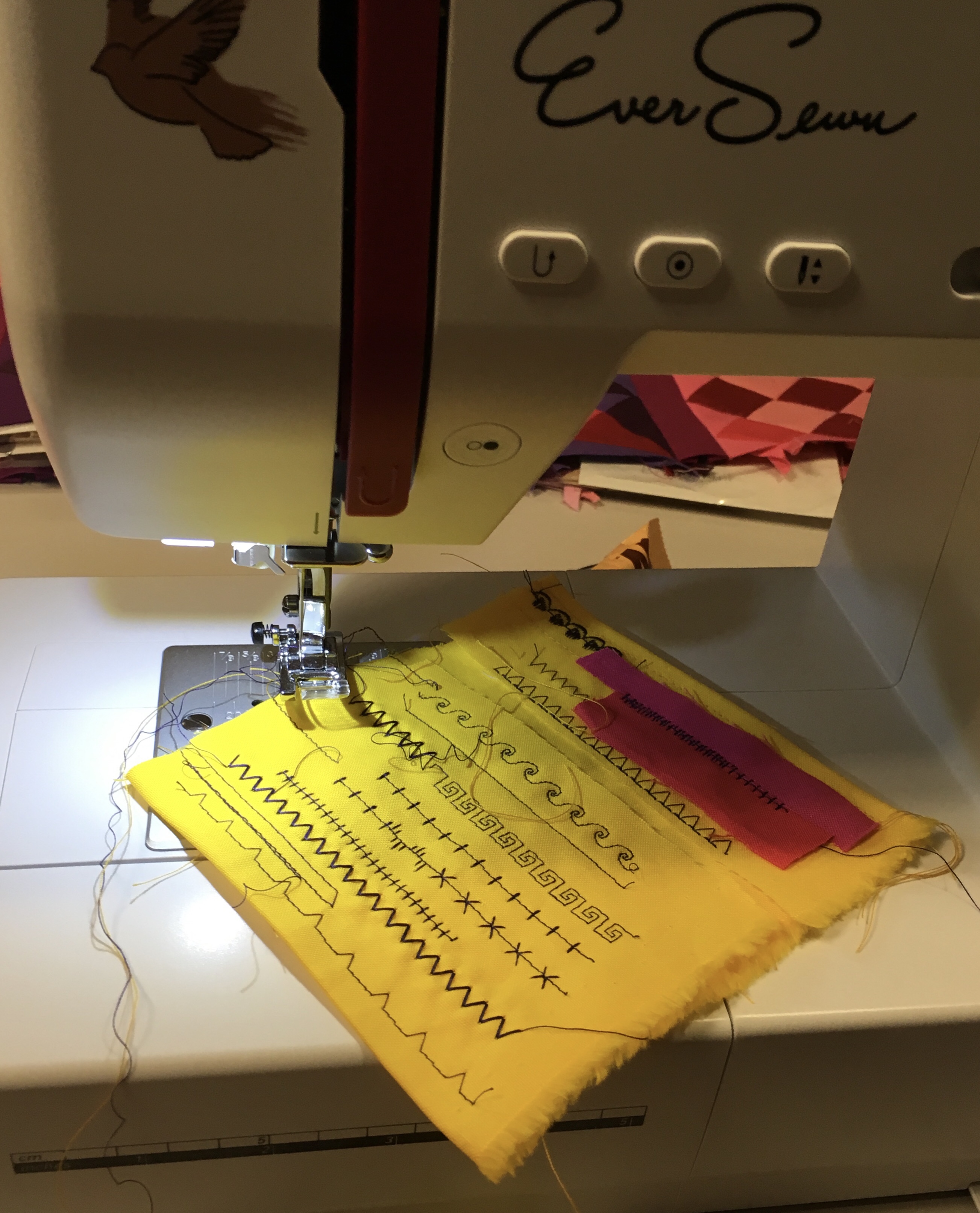
I’m happy I bought her.

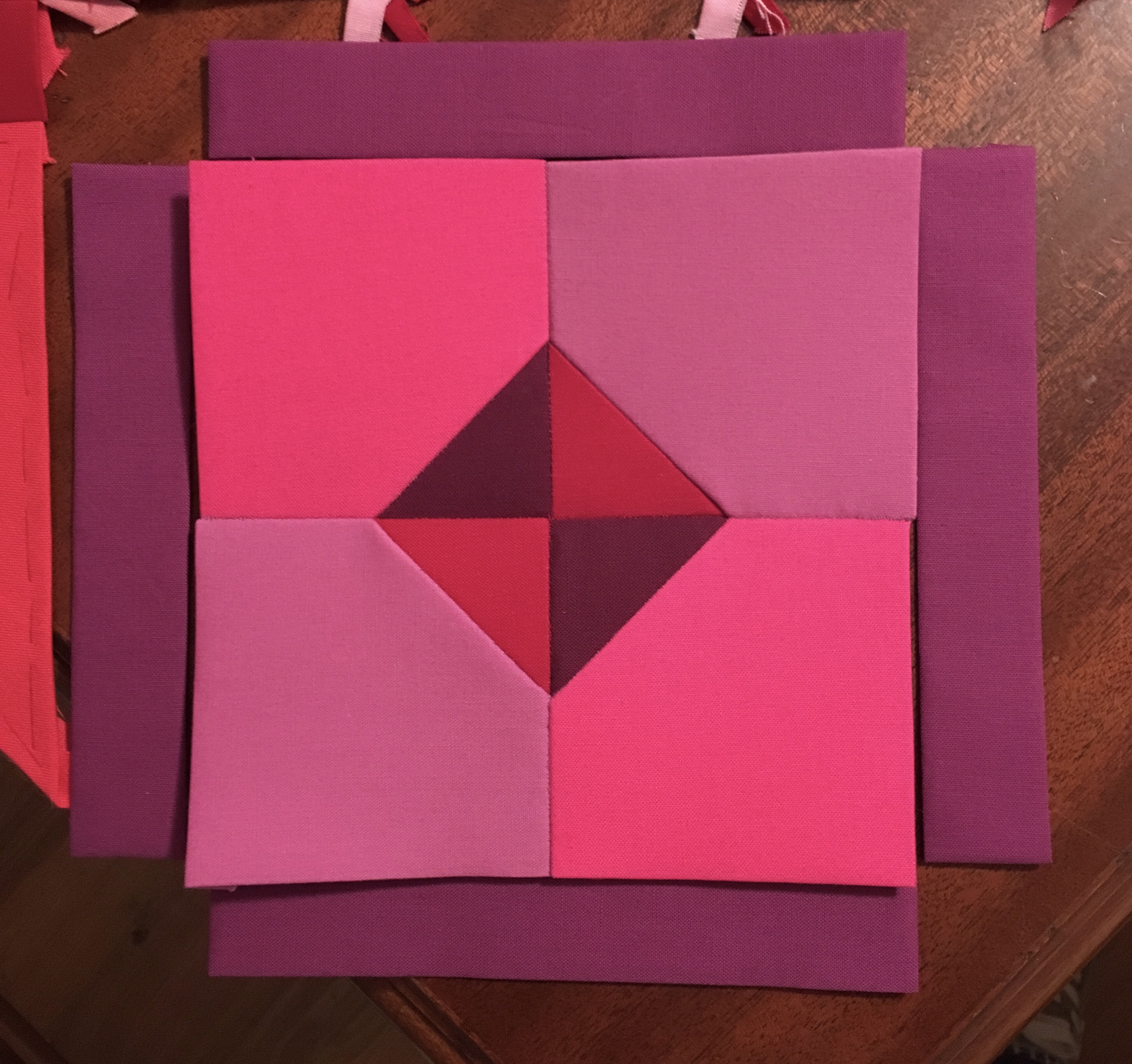
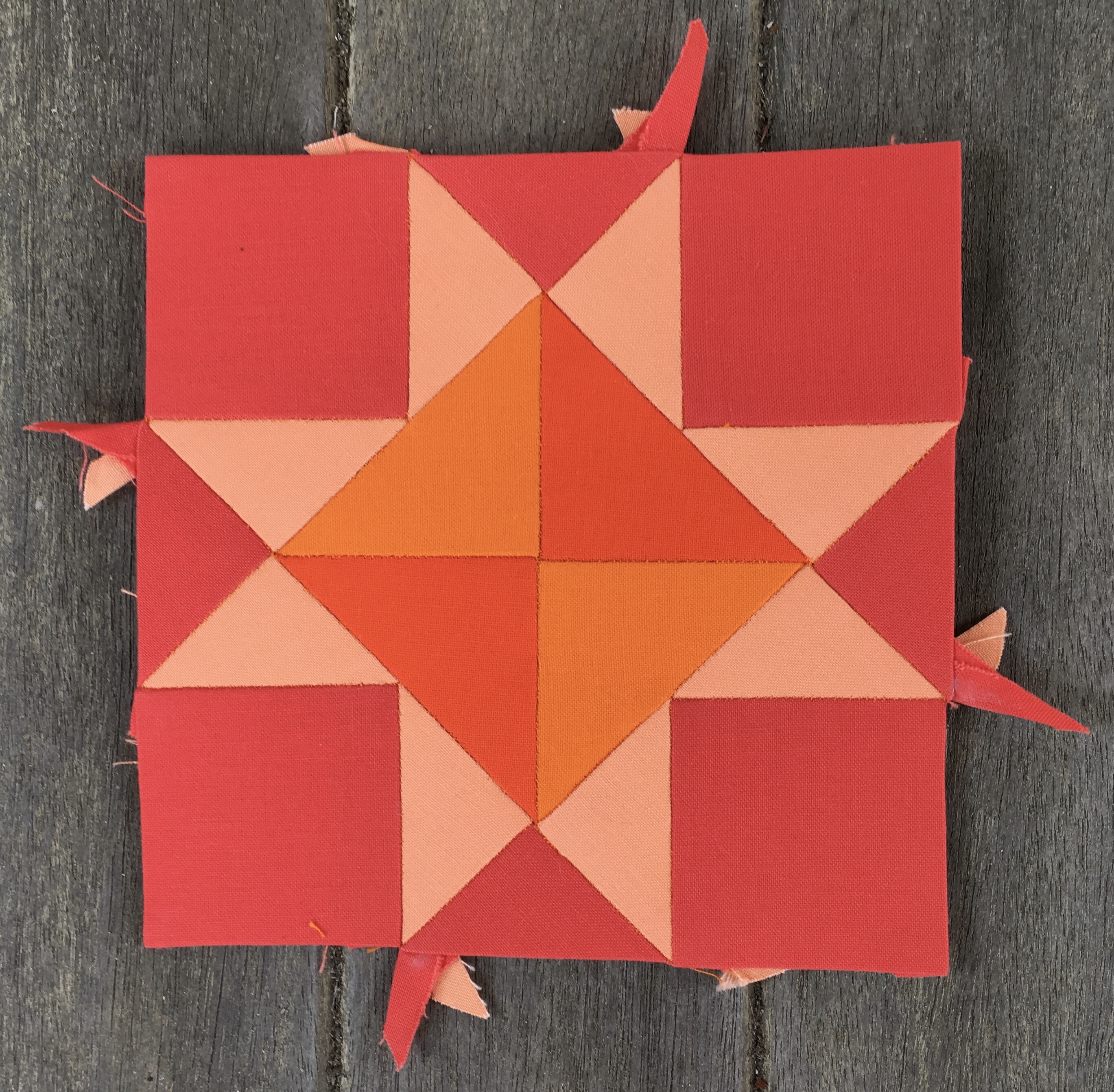
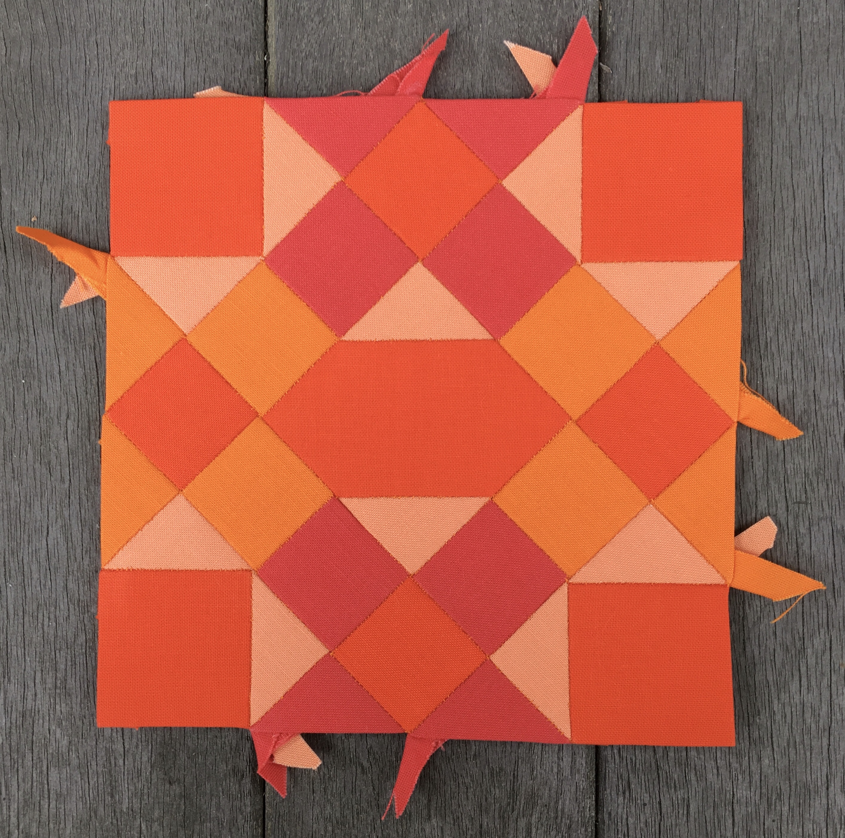
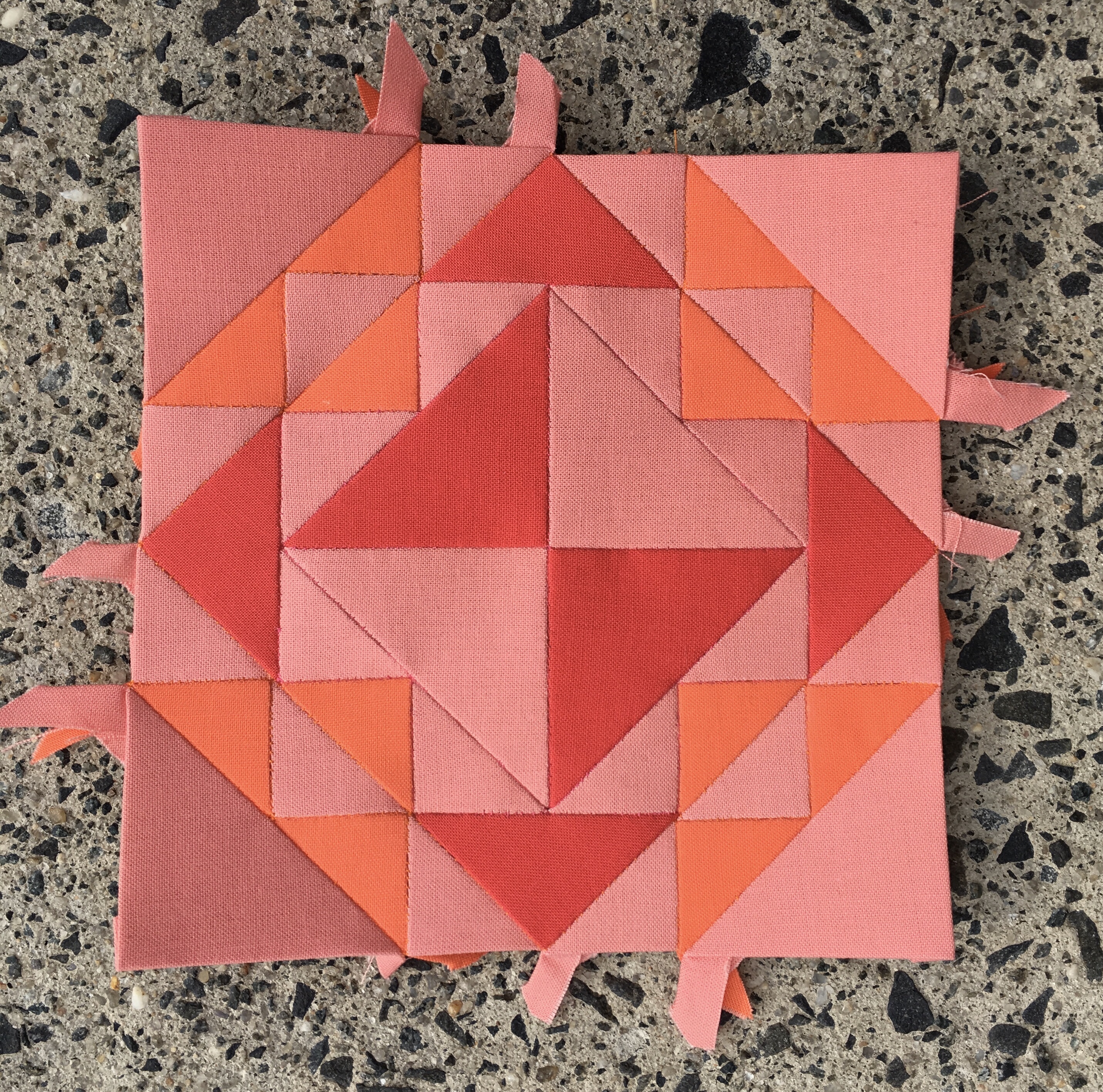
After playing with my new sewing buddy I decided to cut and baste fabric for a new block. I chose #37 Flower Pot. Basting this block turned out to be a bit of a challenge. In order for tails to work out properly on the flower pieces I found it necessary to pull up the corner of the first edge on each piece in order to place the corner of the last edge beneath it. It is really necessary to do that.

I started sewing #37 the evening of the second day, (getting biblical again) and finished her in the morning of the third day. she will get a formal introduction during the next Farmer’s Wife Friday, but she makes an appearance here.

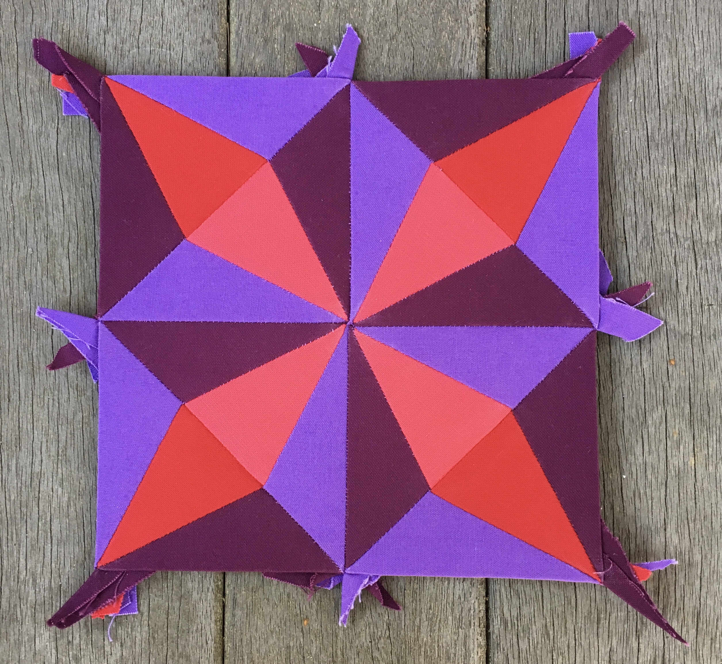
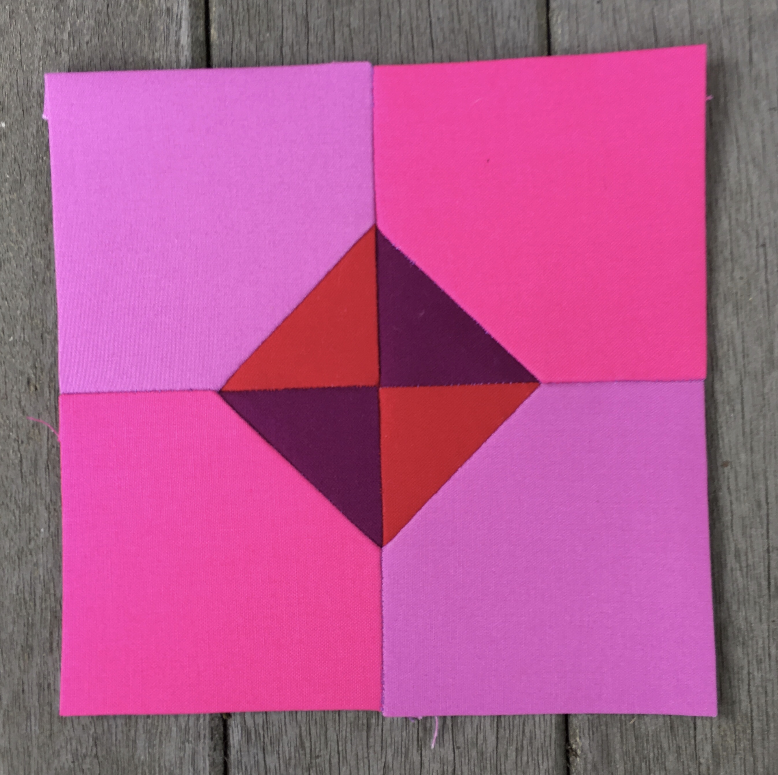
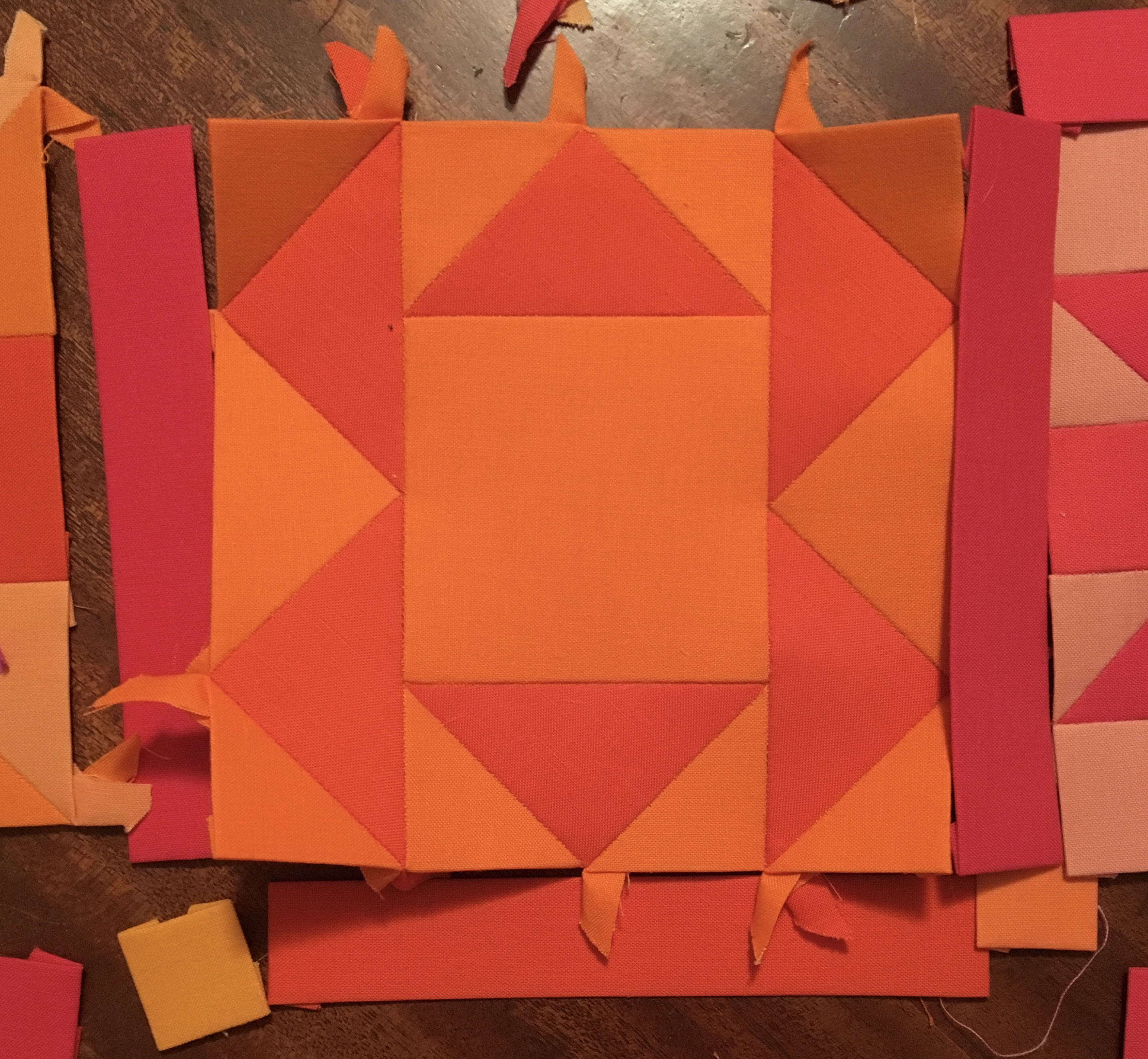
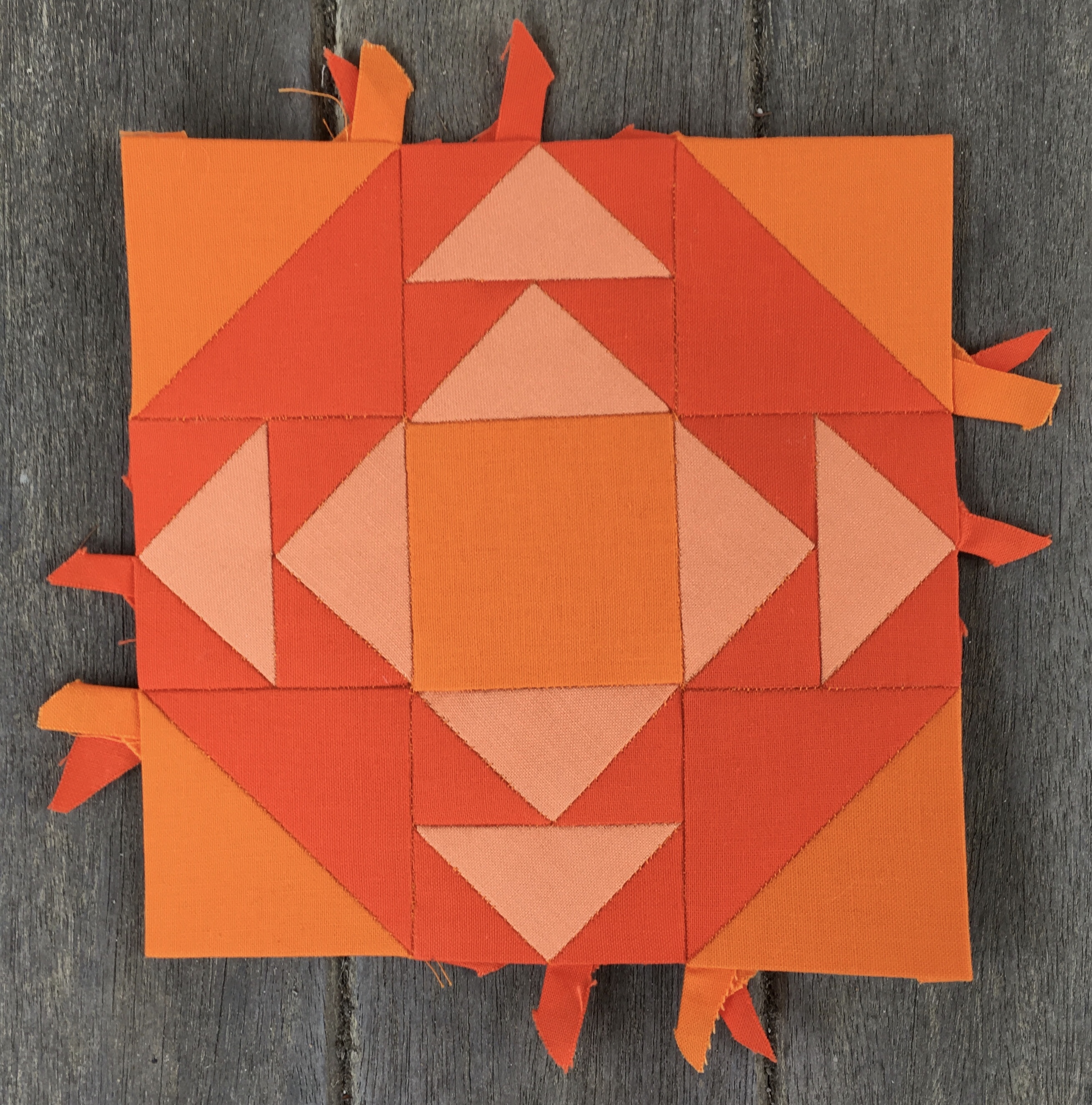
Next, with hours to go, I moved on to #38 Four Winds. It took forever to cut the pieces for this block. There are 64 pieces in this block and they are all either one inch squares or one inch triangles. I glue basted about half of them and then could not resist sewing together the lower right corner. I’m halfway done with this onerous block.

I did not press this block before photographing her. She reminded me of a little crab walking across the sand casting a big shadow because her tails where sticking out the back like legs.

All in all it was a retreat with wonderful ladies creating wonderful projects and talking about everything under the sun.

One topic on which I could offer no input was their common love of Outlander. That will be different next year. I have subscribed to STARZ via Hulu, and will be a part of the conversation next time.

Farmer’s Wife Friday: Week 10

I finished three blocks this week.

#39 Friendship

Kona solids used are Cerise, Dark Violet, and Eggplant.

I made this blocks to take the place of #17 in row five. I felt like I needed a darker block so close to the edge of the quilt. As a reminder #17 had a very light value background. It is pictured below.

Continuing on with row five we have

#18 Century of Progress

Kona solids used are Watermelon, Heliotrope, Rich Red, and Eggplant.

This block called for a different arrangement of values, which I did not like very much, so I made it a little more symmetrical. This block has very high contrast and will definitely pop.

#22 Corn and Beans

Kona solids used are Salmon, Orangeade, and Coral.

You may notice that this block is not pictured in my usual staging area. I am attending a three day quilt retreat with my local quilt guild this weekend, and I struggled to complete this block before I left, but failed. So I had to find a place to take the picture at the retreat when I finished it. I settled on the cement stairway outside the retreat workroom.

#22 was the last block necessary to complete row five. I’m working on putting it together now.

My Sparrow is with me. I have not even test driven her yet. That may happen after row five is assembled.

Farmer’s Wife: Week 8 Blocks Pressed and Ready for Inspection

My new iron arrived a few hours after I published yesterday’s post. I enjoyed using it for the first time to press last week’s blocks. I was really busy last week, and have six blocks to show for my efforts. Here they are.

#10 Bowtie (revisited)

Kona solids used are Bright Pink, Gumdrop, Rich Red, and Berry.

This is a remake. I had failed to locate the previous block I had done, but I really like this one better. I increased the color count in this block from three to four, and stayed true to the piece count, and seam count, of the original block in the process. Not having the paper pieces to work with, I had to draft this block on the drawing board. To increase the odds of it fitting properly I cut pieces for one quarter at a time, basted them, and joined them before cutting the next quarter.

This is the first block in the red/violet area.

#15 Buzzard’s Roost. (Revisited)

Kona solids used are Torch and Tangerine.

She is bright.

I cannibalized the original block to use the paper pieces to make this block. I reversed the values and I went darker overall to make the block fit in better with the surrounding Orange blocks.

#17 Cats & Mice

Kona solids used are Ballerina and Gumdrop.

I really love this block. It is one of my favorites so far, and she looks great with just two colors. It fits in the red/violet area and uses colors which are clearly variations of red/violet. No pure red, nor pure violet, was used in the completion of this block.

#19 Checkerboard

Kona solids used are Carnation, Azalea, Watermelon, and Rich Red.

This block called for a random arrangement of squares. I was not having it. I decided to impose some order on this block, and am very happy with the results. I almost made the central square the Watermelon color used in the corners. I’m glad I went with the Rich Red instead.

#20 Churn Dash

Kona solids used are Carnation, Melon, and Watermelon.

This block is a bit light in value, but I think it will work well with the surrounding blocks. I’ve been deliberately adding Carnation to a number of blocks in the red areas to soften the effect of one of the blocks higher up in the quilts that pops quite a bit due to the use of Carnation. I think this will help with that effort.

#21 Contrary Wife

Kona solids used are Melon, Nectarine, and Bright Pink.

The melon and Nectarine are close in value. They create a background against which the Bright Pink pops.

Now that #10 and #15 have been remade I am ready to join row four and attach it. That is next on the agenda.

Farmer’s Wife: Week 8

About a week ago my husband used my iron to apply adhesive strips to the edge of a kitchen cabinet he is fixing for me. I used that iron to press a skirt and found adhesive on the skirt. I’ve since ordered a new iron, but it has yet to arrive, so my work for the week can’t be pressed and shown off to good advantage. Therefore, my presentation will be a bit different this week.

It’s worth mentioning that I have a new work area which I am enjoying. My husband got tired of my work being scattered about the living room and dining room so he gave me his office with his big mahogany desk. The photo above shows my work near the end of this week. I’ve actually finished quite a bit, and am on the verge of being ready to join rows four and five to the quilt top.

I’ve remade #15 Buzzard’s Roost. I cannibalized the previous block to obtain the papers for the remake. I have an idea of how I might use cannibalized blocks, but that can wait for another blog post.

I remade #10 Bowtie. I continue to be annoyed by the fact that the first version of this block has escaped my notice. I’ve looked everywhere I can think and still can’t find it. In any case, I like this version much better. Once #15 and #10 are pressed I can commence to join row four to the quilt top.

I’ve completed #19 Checkerboard, #20 Churn Dash, and #21 Contrary Wife. They were actually completed in reverse order from the way they appear here. I was working my way down row five from the top to the bottom. I found myself stalled on #22 Corn & Beans. It was not that it was difficult, just that it was tedious. I was once again tempted by the low hanging fruit of easier blocks, and I moved forward to work on them. You can see #22 partially completed in the first photo, and farther along here in the photo below.

She has one corner completed. I’ll get back to her soon; after I finish the block below.

I got excited about the red/violet area, and could not resist starting work on #17 Cats & Mice. It is not completely obvious in the photo above due to the lighting, but these two colors are very clearly in the red/violet category all by themselves. No pure red or pure violet is being used in this block.

This week I made a major decision about how I am going to handle the triangles along the edge of the quilt. In keeping with what I have already done with the upper left corner, I will be doing the three triangles in each additional corner with one color.

Then I will be filling in between corners with colors changing every two triangles. I feel the same sense of comfort about this decision as I did about making the rules about how my sashing would be colored. Imposing order on this quilt makes me feel happier and calmer.

Above you see Orange repeated.

And here you see Watermelon repeated.

I have precut some sashing, using all the sashing pieces in the setting package. Now I’ll have to pull sashing pieces from blocks I have not yet made in order to keep up with my preplanning of sashing colors.

Another big decision about sashing was made this week. I’m going to be inserting a red/violet set of sashing on the left, and a yellow/green set of sashing on the right.

All the new finished blocks will be pressed and introduced with their respective color choices once the iron arrives.

Fabric Friday

I’ve taken a brief break from producing blocks for the Farmer’s Wife Quilt. This week all I have to show is new fabric to expand my color palette. I put in an order for 15 new colors from the Fat Quarter Shop and they arrived yesterday.

I added to my yellow palette with the three colors above.

I added to my Orange palette with the three colors above.

I purchased nine additional colors for my Violet palette which I have divided into two groups.

This first group of four colors clearly belong in the red/violet overlap area.

This second group of colors belong in the Violet area with Morning Glory leaning towards the blue side of Violet.

Having shown my new purchases I will show how the new Yellow and Orange purchases integrate with my existing palettes for those areas.

Here is my full range of yellows. I doubt I will use Butterscotch.

Here is my full range of oranges. The color with no name is Terra Cotta. I happened to have it hanging around from a UFO I am still considering finishing. I am unlikely to use it, but I threw it in the mix.

I have not bothered to show the violets totally integrated, but here is a look at what I already had.

Notice that there is a light Violet that is more blue and one that is more red. In fact Ballerina is so red that I mistakenly used it as a red fabric in my very first block which I later went back to make without Ballerina. It bothered me that much.

Here is the remake.

There is something interesting about this remake. I added the central square of Rich Red after my second purchase of fabrics which added Rich Red, Carnation, and Pink to my Red palette. At that time I had already made a few blocks with my more limited Red palette. As a result I was looking for a way to bring more Rich Red into the quilt to balance out that loud center square. That was when I got the idea to use Rich Red for sashing around that block and around two other blocks as well. That decision brought me to my sashing plan for the whole quilt. It’s funny how one tiny decision leads to a big decision later on.

I was going to try to load this in Photoshop but I went out and bought an eight pack of crayons instead. I am planning to use a bold dark color for some of the sashing in each of the other color areas. Yellow will be bold, but it can only get so dark and still be yellow. So bold is important.

Here is a reminder of how the Rich Red works as sashing.

I might actually stop at three blocks sashed with Rich Red rather than extending down to the fourth block shown in the diagram. If I eliminate that fourth block I will follow suit with the other color areas.

Now it is time to start working on more blocks and get ready to add row four. Unfortunately the first block of row four has mysteriously gone missing.

I know I made this block, but I can’t find her. I might have to make her again.

Farmer’s Wife Friday: Week 6 Blocks

I had high hopes of finishing the Orange area of my quilt today, but I did not manage to recreate #15 Buzzard’s Roost in time to accomplish that goal.

I do, however, have three blocks completed this week to show.

#25 Cups and Saucers

Kona solids used are Mango, Orange, and Tangerine.

This Block took a long time to assemble and has an interesting reverse side.

It has a circular feel to it because of the way the tails nest.

#23 Country Farm

Kona solids used are Cantaloupe, Orange, Tangerine, and Coral.

The back of this block is less busy.

It is worth noting that these two blocks appear to use the same light fabric, but they are actually two different fabrics, Mango and Cantaloupe.

My last block for the week…

#24 Country Path

Kona solids used are Mango, Orange, Tangerine, and Coral.

This is my favorite block so far.

Above you can see my Orange area with my first attempt at #15 Buzzard’s Roost. I think you will agree that, although acceptable, this block is far from optimal for its placement in the color wash. It needs to be darker. I just need to decide what colors to use.

I’m going to take a break from this project for a few days to wait for a new shipment of fabrics, and also to gain psychic distance on this block.

I’ve placed the following order which includes three Oranges, three Yellows, and a staggering nine Violets.

I’ve also ordered more large Clover Clips to hold my labels in place on the fabrics.

It might seem a bit late to order more Orange fabrics, but I still have blocks in the red/Orange area to complete as well as sashing to select.

The Sparrow 20 Flies into My Sewing Room

It’s time for the unboxing. I ordered the Sparrow 20 from Leah Day’s web site last week and it arrived more quickly than I expected. It has been sitting in my living room for a few days patiently waiting to be unboxed. I took photos of all the sides of the box, but decided it would be overkill to display them, so on to the good stuff inside without delay.

Here is my lovely Sparrow with her sewing foot and power cord.

Notice that she comes with evidence of her functionality. Someone has taken the time to see to it that this Sparrow can fly.

Some additional viewpoints…

In addition to purchasing the Sparrow I took advantage of the sale on Leah Day’s site to purchase a set of quilting feet. TWO walking feet are included, one open and one closed.

The Sparrow come with a dust cover.

After purchasing the Sparrow I searched Amazon for a case so I could carry her to retreats. My primary reason for buying the Sparrow was to be able to take her by train when I travel to my yearly retreat in Lancaster. I attend this yearly retreat with a group of women who call themselves the Lambertville ladies because we met in Lambertville in 2015 at the first, and so far only, Slow Stitching Movement retreat. It took us two years to get back together again, but it looks like we are going to keep this tradition going. We’ve spent two years so far in Lancaster.

Here is the case I found on Amazon.

Here is a view that better shows the interior.

I took my Sparrow into the house and weighed her. She is 13.4 pounds by herself. I’d been hoping for 12, but that’s not bad. She is not a big machine, but I think she is more than three quarters size, so her weight is good.

Let’s see her with her dust cover.

She’s getting ready to hit the road.

There is room to spare for fabric to provide padding. The case is not padded, and quite flexible.

The quilting feet fit easily in the front pocket.

She’s all zipped up and ready to to carry with the top handle, or you can sling her over your shoulder. I tried caring her on the left with the strap on my left shoulder, but I found it more comfortable to carry her on the left with the strap on my right shoulder with the strap crossing over my body. She sat nicely against my hip.

This is a lightweight case. It is soft without any real padding, so it isn’t at all suitable for stashing in an overhead bin, but this case will be fine for placing at my feet on the train.

Almost forgot, there is a little chart that you can pull out to see the stitches available to you.

I’m really excited about this machine. I thought a lot about getting a 3/4 size Janome. I also thought about upgrading the Sparrow to a higher model. But it finally came down to having some faith that Leah Day thinks that this machine is good enough. It can do everything she thinks I need it to do, and at $279.00 on sale, the price was right.

It feels good to have my mind made up, and to have a travel machine purchased. If I ever get serious about flying with her I can look at hard shell cases. I’m going to put this girl through her paces and report back in a month or two.

Working Ahead on My Orange Area of FW Quilt

Ordinarily I would be assembling row four of my quilt and attaching it. However, I have decided to work ahead to complete the blocks in the Orange section before I attach my next row. The reason for hesitation is block #15 Buzzard’s Roost pictured below.

I made this block early on in my quilt construction, at a time when I was looking for low hanging fruit, that is, something easy to put together. I foolishly chose two of my Orange colors for this block, and figured it would automatically fit in. That was before I realized that it made sense to stick with the sequence and plan the color selections for each new block based on what I had already done. It was also before I committed to keeping my outermost blocks on the dark side.

I think this block looks out of place where it is. I’ve got two options. I can eliminate it altogether, or I can insert it into the central area of the quilt where I intend to use pastels.

While I am pondering my options I am working on my Orange area. Doing so has forced me to the realization that I have precious few colors that fit clearly into the Orange category. In fact, I have only three. They are…

… Tangerine, Orange, and Mango. It can actually be argued that Tangerine has a reddish hue to it.

While I have another color that qualifies as Orange…

… Cantaloupe is actually so close in value and hue to Mango as to make these two colors nearly indistinguishable from each other. It’s not easy trying to choose colors from the Kona Color Card. Basically I count these two colors as one. I am using both, but not in the same blocks.

This lack of variety for the Orange area is unacceptable. Yet looking at the Kona color chart I don’t see good choices to add that are bright and vibrant, plus I don’t want to take the time away from the project waiting for a new delivery. Therefore, I am looking at what I have in the Orange family that strays a bit to the red or to the yellow.

In the photograph above you will see Peach second from the right. This is actually a color that I could categorize as being fully Orange, but it is too light to consider for the blocks in the Orange triangle along the top of the quilt.

On the far right is School Bus. This is a color that falls clearly in Orange/Yellow overlap area, yet I’ve used it once already to supplement my selection of Orange fabrics when I was looking to create #9 Box with four colors rather than two.

At the far left you see Salmon, which I have used liberally in the Red/Orange overlap area. However, I feel it has too much of a red feeling to it to use it in the Orange area. Second on the left is Coral. I ordered this to use in the Red/Orange area, and it works well there. I’ve decided that I will also use it to flesh out the Orange area. It adds a darker value without adding a muddy feeling because it employs a little bit of the darker value of red.

I was wondering how I ended up with so few clearly Orange fabrics. I think the answer is that the color Orange is light in value in its purest form. Therefore, there are fewer pure values of Orange to choose from. By pure I mean values that derive their difference in value due to the amount of white added to the color. Pure is probably a bad choice of word to describe it because a color with white added is no more pure than a color with black (or the complement) added, but it is certainly brighter and less muddy. I’m all about bright and avoiding muddy in this quilt.

If I had this problem with Orange, I am certainly going to have this problem with Yellow, so it is time to take a look at the colors I have for that color area and get out my Kona color chart if necessary.

At this point I have four colors to use in the Orange area. They are Coral, Tangerine, Orange, and Mango. If I am desperate, and need a fifth color for a block I can reach over to School Bus to lend a hand.

By Friday I might actually have the Orange area finished when I present my blocks for the week two of which have been sneak previewed in the photo at the top.

Farmer’s Wife Friday: Week 5 Blocks

It’s been a busy week with four complicated blocks completed.

#11 Broken Dishes

Kona solids used are Carnation, Melon, Watermelon, and Rich Red.

I increased the number of the colors in this block to four, up from two.

#12 Broken Sugar Bowl

Kona solids used are Carnation, Melon, Watermelon, and Rich Red.

I increased the number of colors in this block to four, up from three. I added the Watermelon along the diagonal for interest.

#13 Buckwheat

Kona solids used are Melon, Azalea, and Coral.

#14 Butterfly at the Crossroads

Kona solids used are Salmon, Watermelon, Tangerine, and Coral.

I increased the number in this block to four, up from two.