
I’ve taken a brief break from producing blocks for the Farmer’s Wife Quilt. This week all I have to show is new fabric to expand my color palette. I put in an order for 15 new colors from the Fat Quarter Shop and they arrived yesterday.
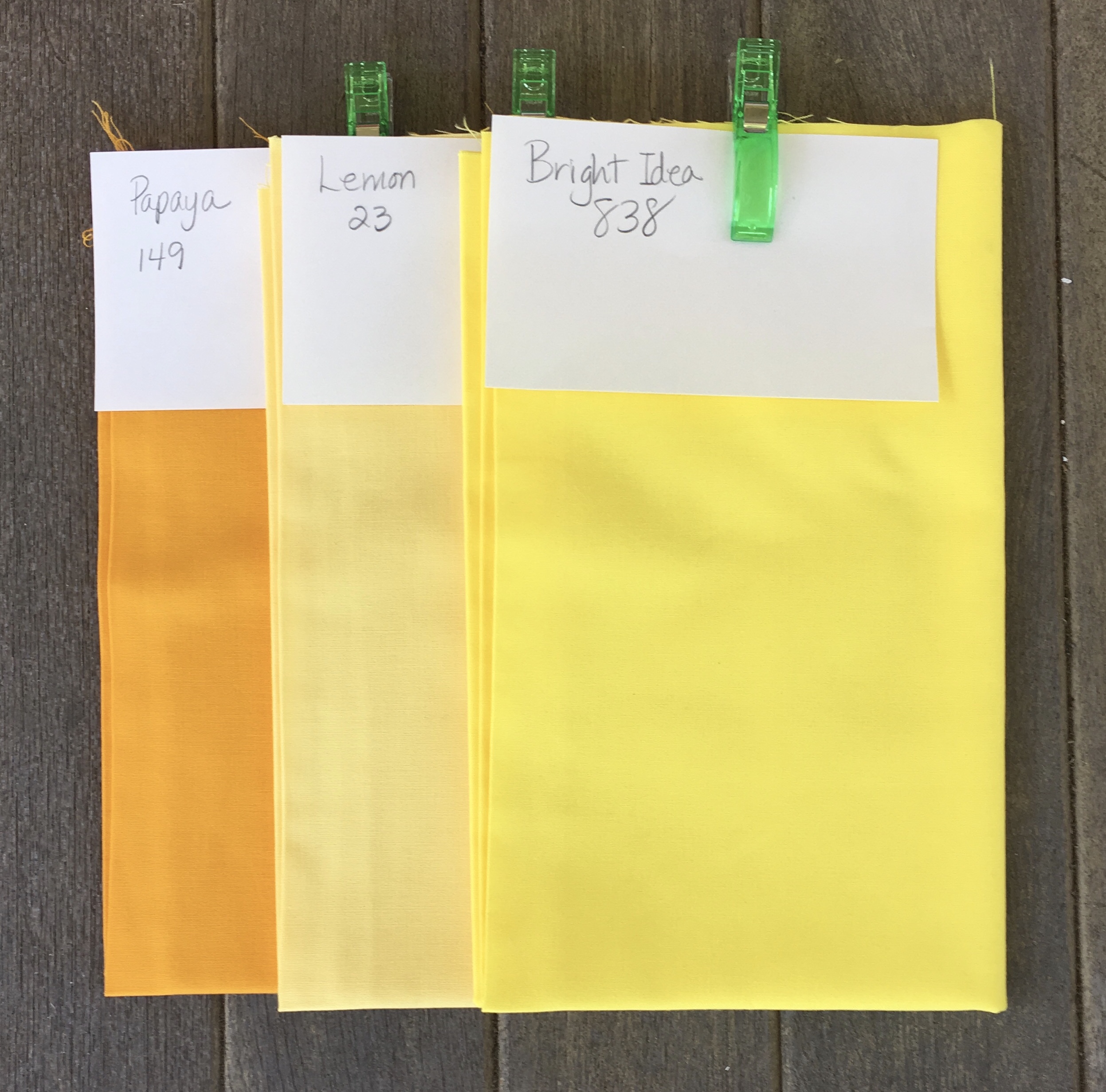
I added to my yellow palette with the three colors above.
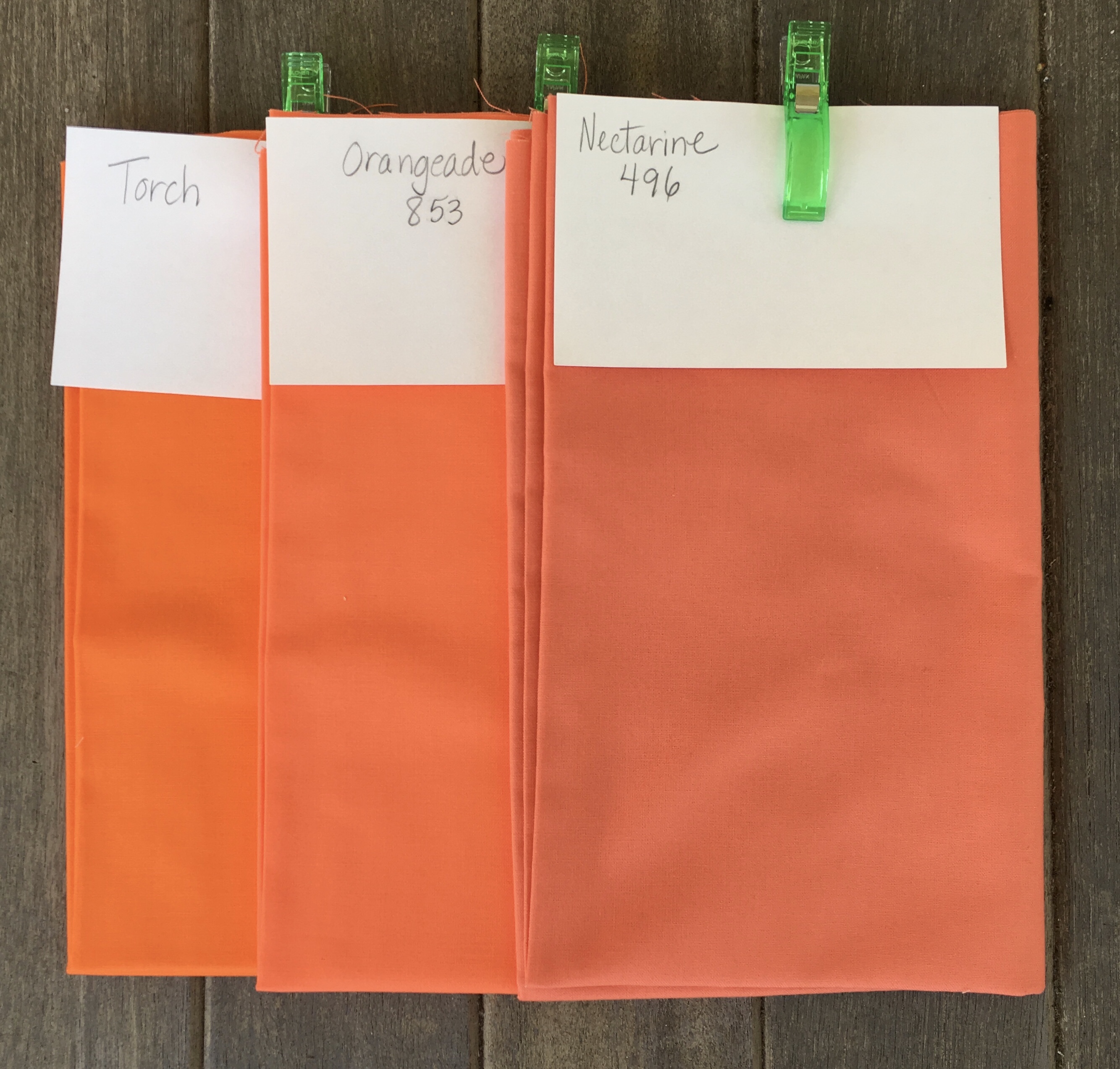
I added to my Orange palette with the three colors above.
I purchased nine additional colors for my Violet palette which I have divided into two groups.
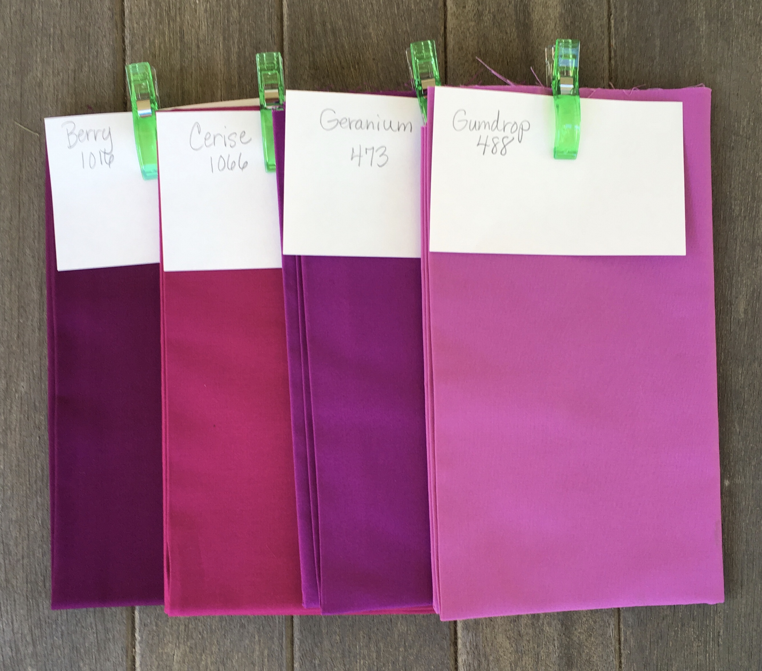
This first group of four colors clearly belong in the red/violet overlap area.
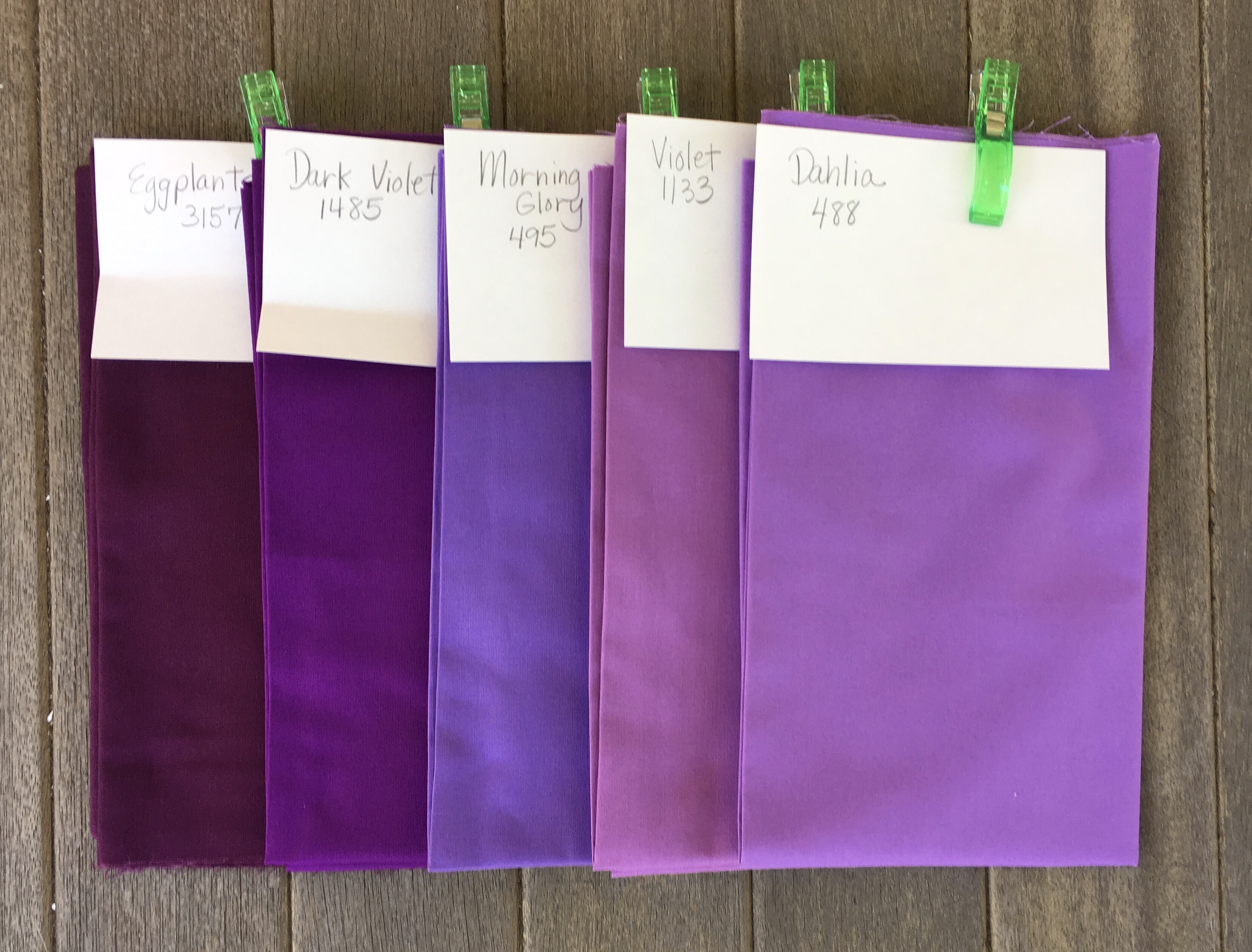
This second group of colors belong in the Violet area with Morning Glory leaning towards the blue side of Violet.
Having shown my new purchases I will show how the new Yellow and Orange purchases integrate with my existing palettes for those areas.
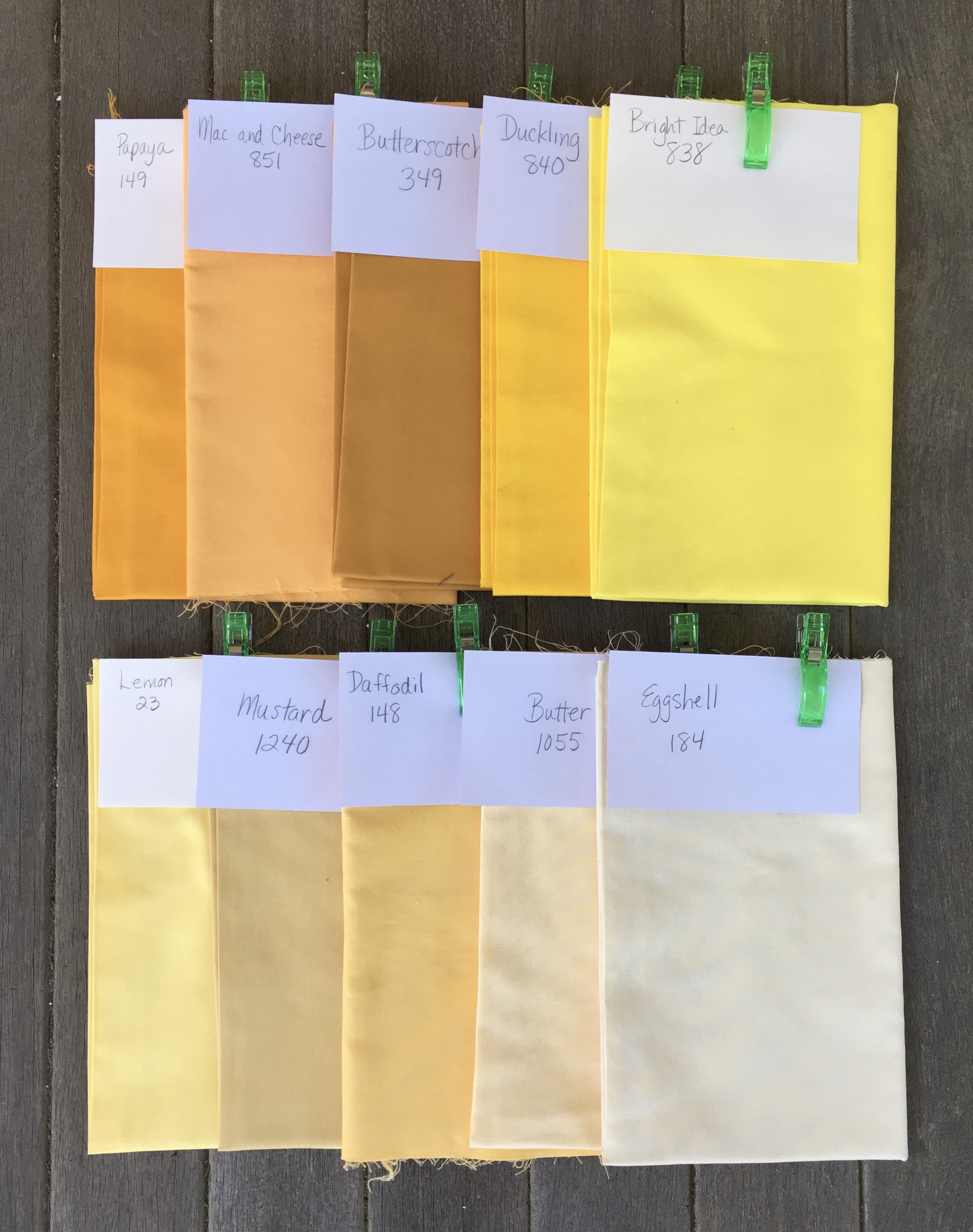
Here is my full range of yellows. I doubt I will use Butterscotch.
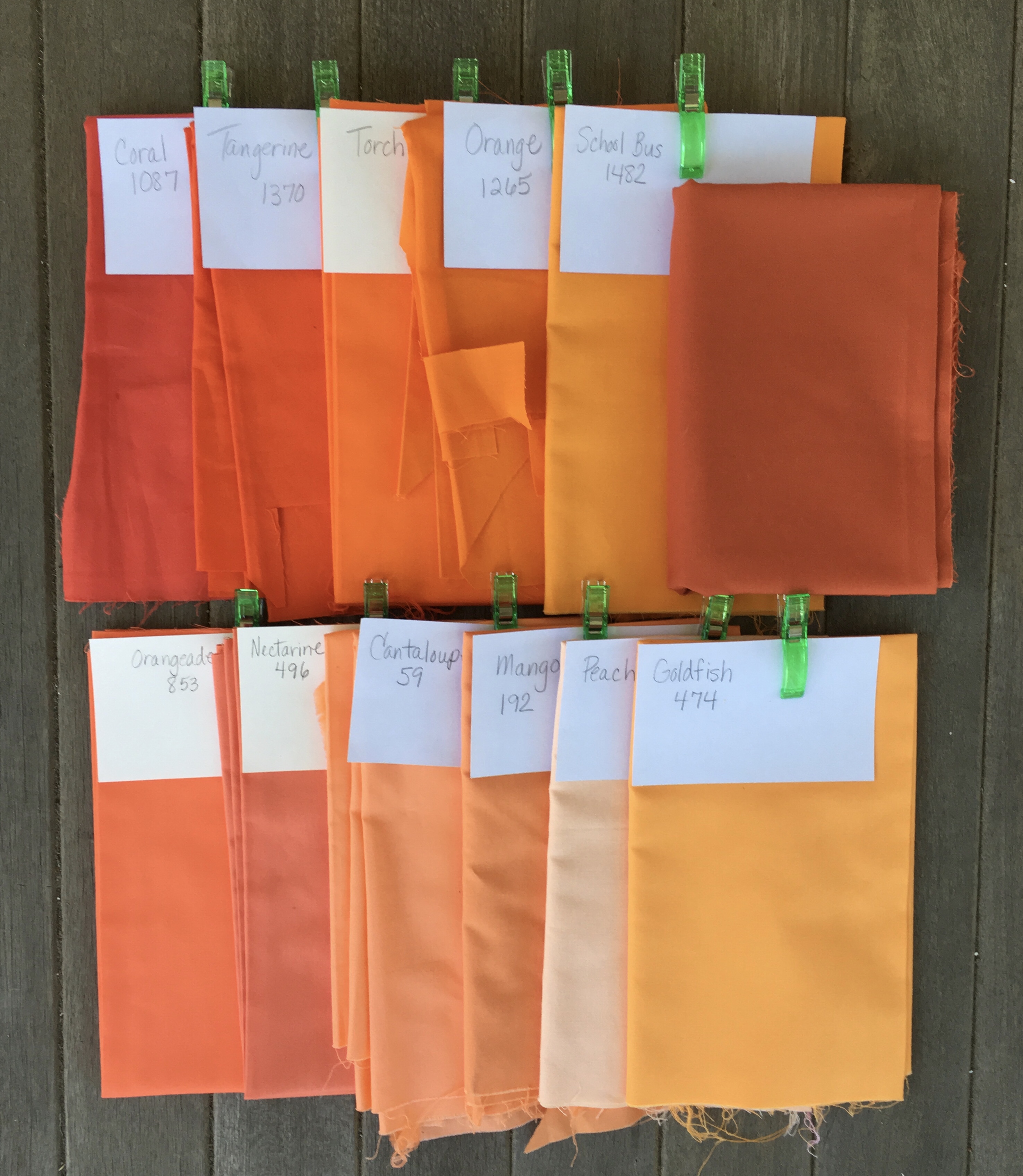
Here is my full range of oranges. The color with no name is Terra Cotta. I happened to have it hanging around from a UFO I am still considering finishing. I am unlikely to use it, but I threw it in the mix.
I have not bothered to show the violets totally integrated, but here is a look at what I already had.
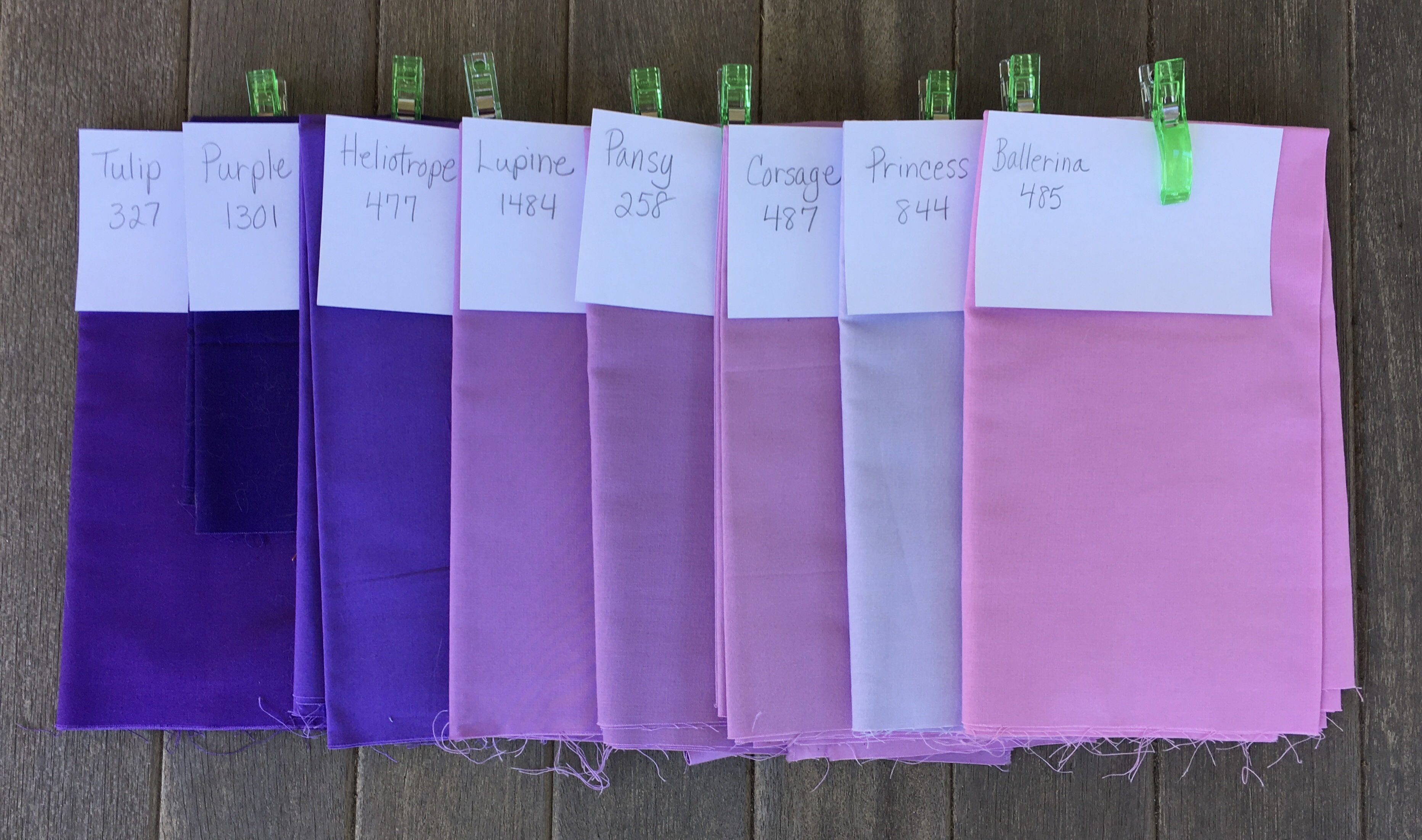
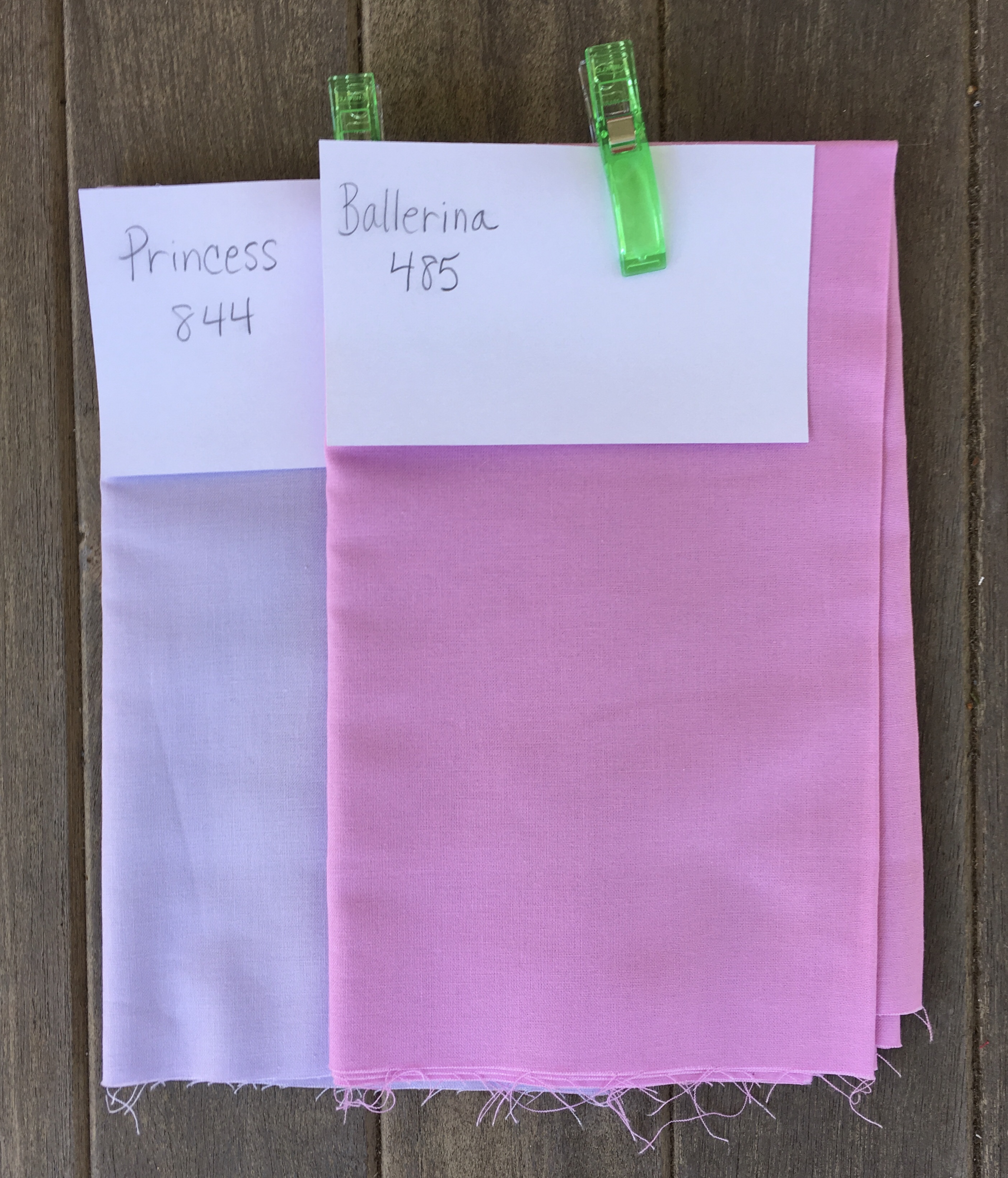
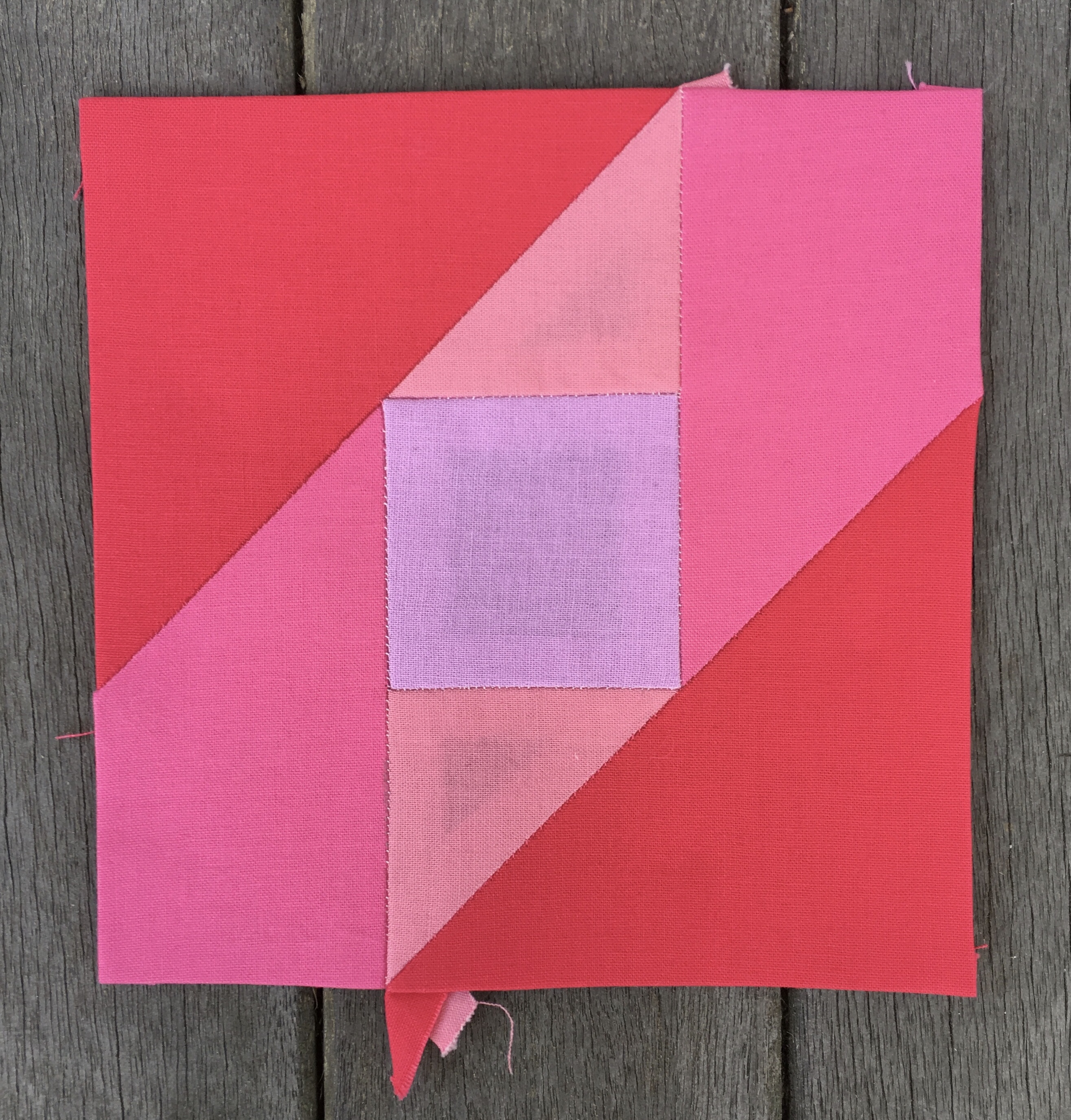
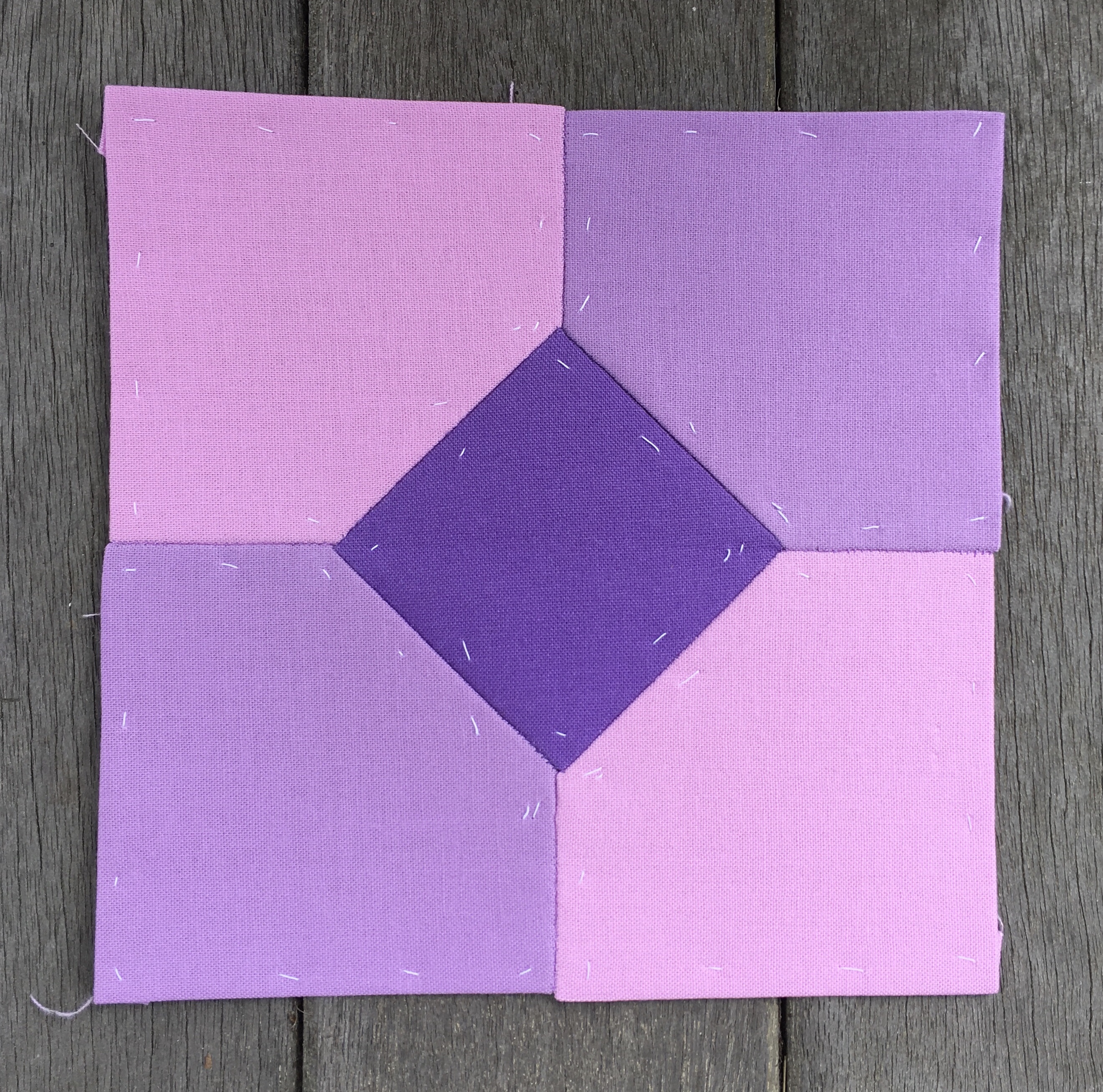
Notice that there is a light Violet that is more blue and one that is more red. In fact Ballerina is so red that I mistakenly used it as a red fabric in my very first block which I later went back to make without Ballerina. It bothered me that much.
Here is the remake.
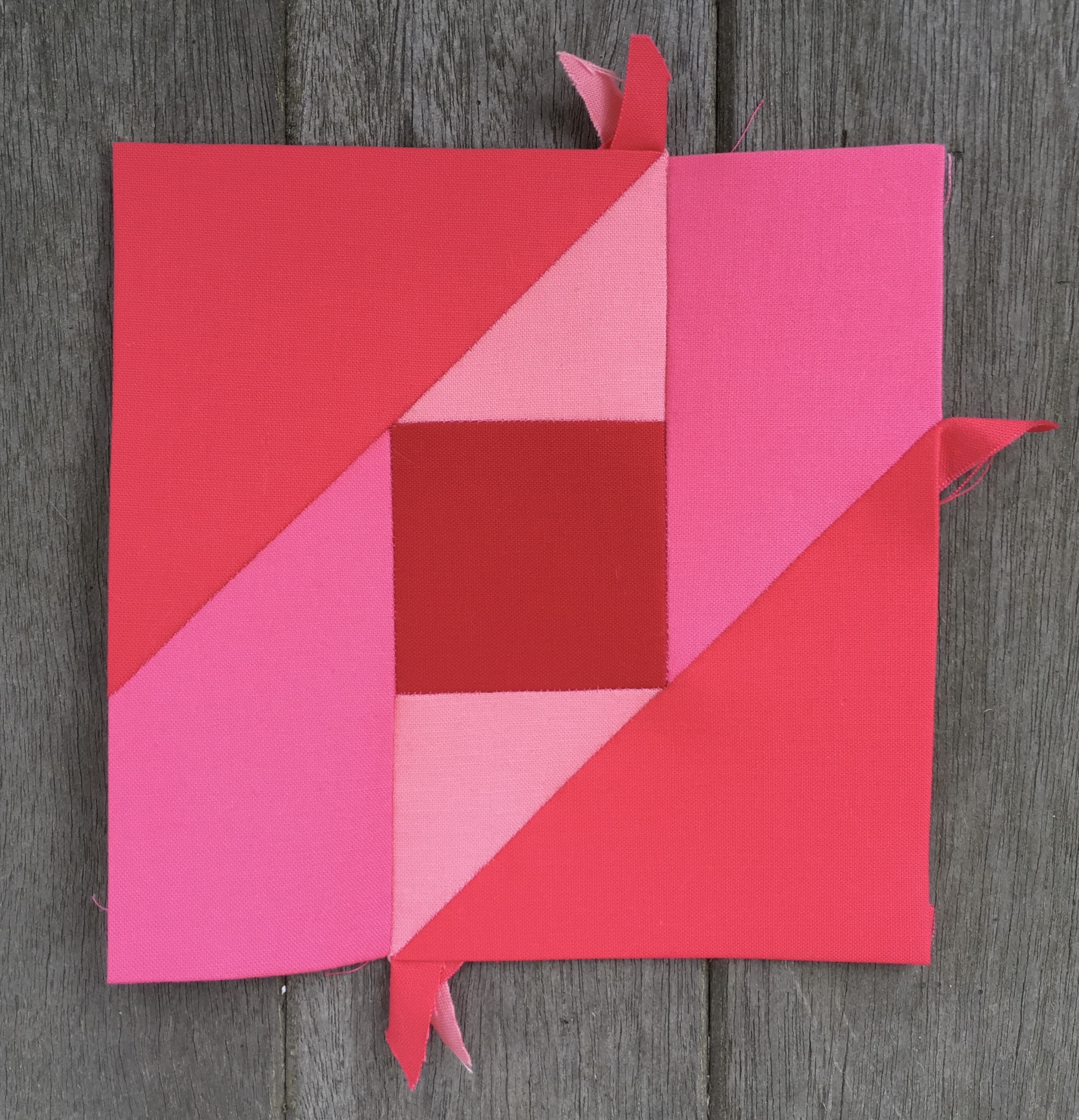
There is something interesting about this remake. I added the central square of Rich Red after my second purchase of fabrics which added Rich Red, Carnation, and Pink to my Red palette. At that time I had already made a few blocks with my more limited Red palette. As a result I was looking for a way to bring more Rich Red into the quilt to balance out that loud center square. That was when I got the idea to use Rich Red for sashing around that block and around two other blocks as well. That decision brought me to my sashing plan for the whole quilt. It’s funny how one tiny decision leads to a big decision later on.
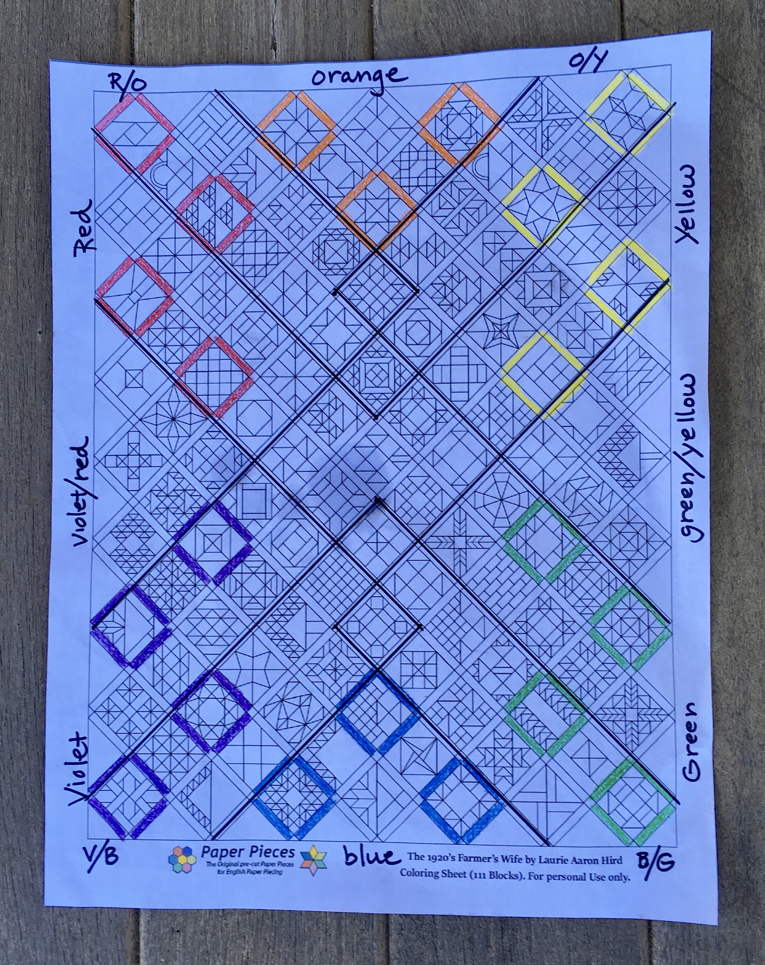
I was going to try to load this in Photoshop but I went out and bought an eight pack of crayons instead. I am planning to use a bold dark color for some of the sashing in each of the other color areas. Yellow will be bold, but it can only get so dark and still be yellow. So bold is important.
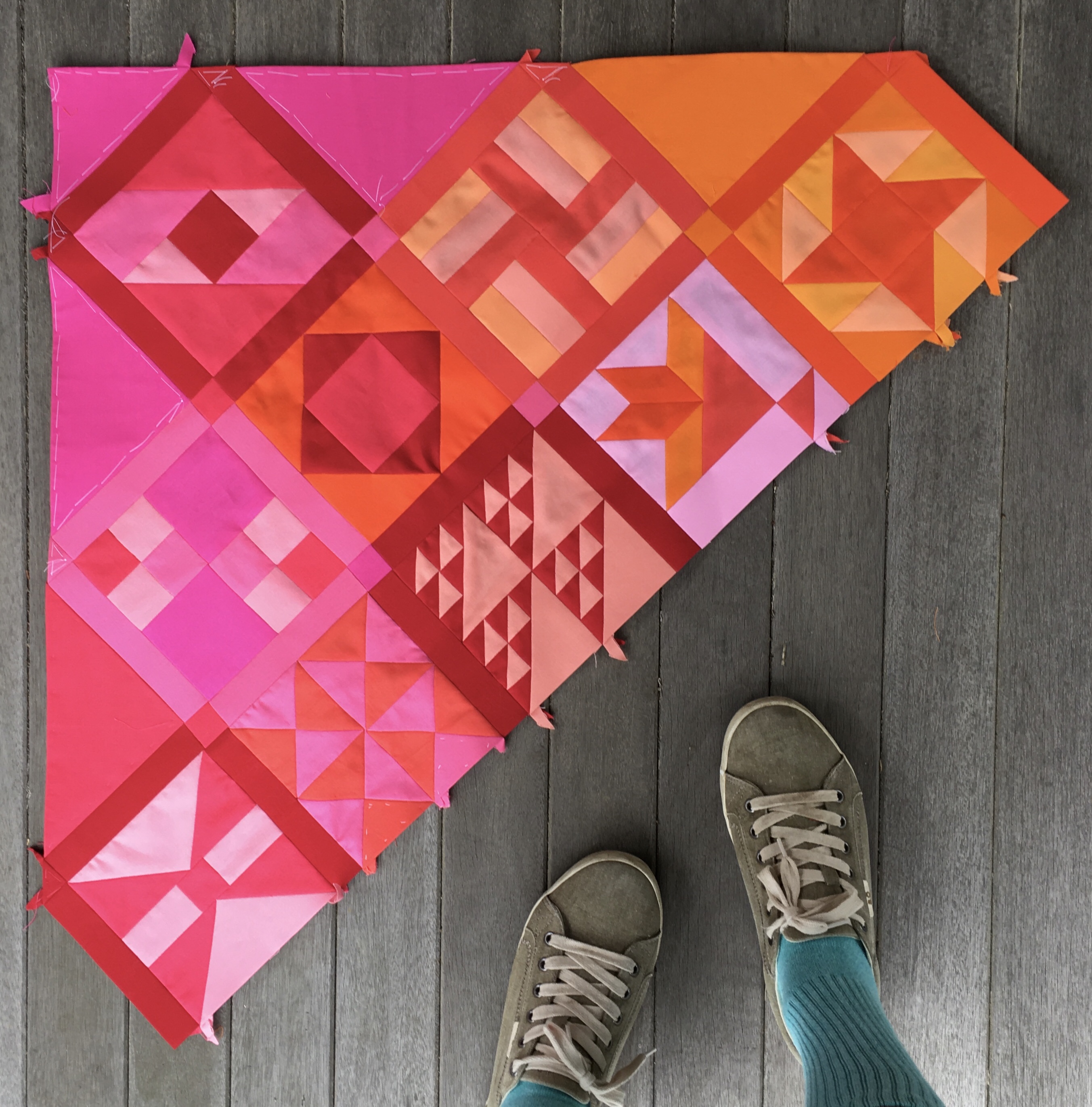
Here is a reminder of how the Rich Red works as sashing.
I might actually stop at three blocks sashed with Rich Red rather than extending down to the fourth block shown in the diagram. If I eliminate that fourth block I will follow suit with the other color areas.
Now it is time to start working on more blocks and get ready to add row four. Unfortunately the first block of row four has mysteriously gone missing.
I know I made this block, but I can’t find her. I might have to make her again.