
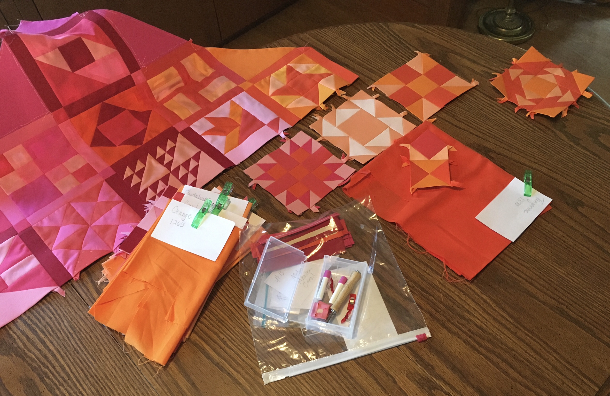
Ordinarily I would be assembling row four of my quilt and attaching it. However, I have decided to work ahead to complete the blocks in the Orange section before I attach my next row. The reason for hesitation is block #15 Buzzard’s Roost pictured below.
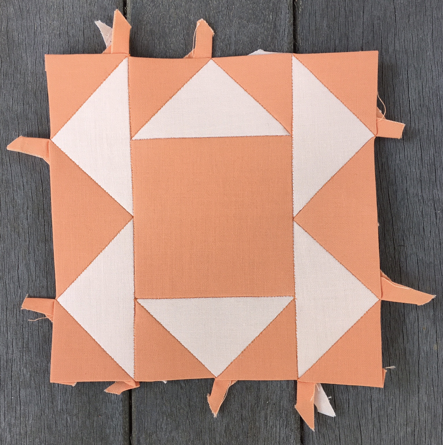
I made this block early on in my quilt construction, at a time when I was looking for low hanging fruit, that is, something easy to put together. I foolishly chose two of my Orange colors for this block, and figured it would automatically fit in. That was before I realized that it made sense to stick with the sequence and plan the color selections for each new block based on what I had already done. It was also before I committed to keeping my outermost blocks on the dark side.
I think this block looks out of place where it is. I’ve got two options. I can eliminate it altogether, or I can insert it into the central area of the quilt where I intend to use pastels.
While I am pondering my options I am working on my Orange area. Doing so has forced me to the realization that I have precious few colors that fit clearly into the Orange category. In fact, I have only three. They are…
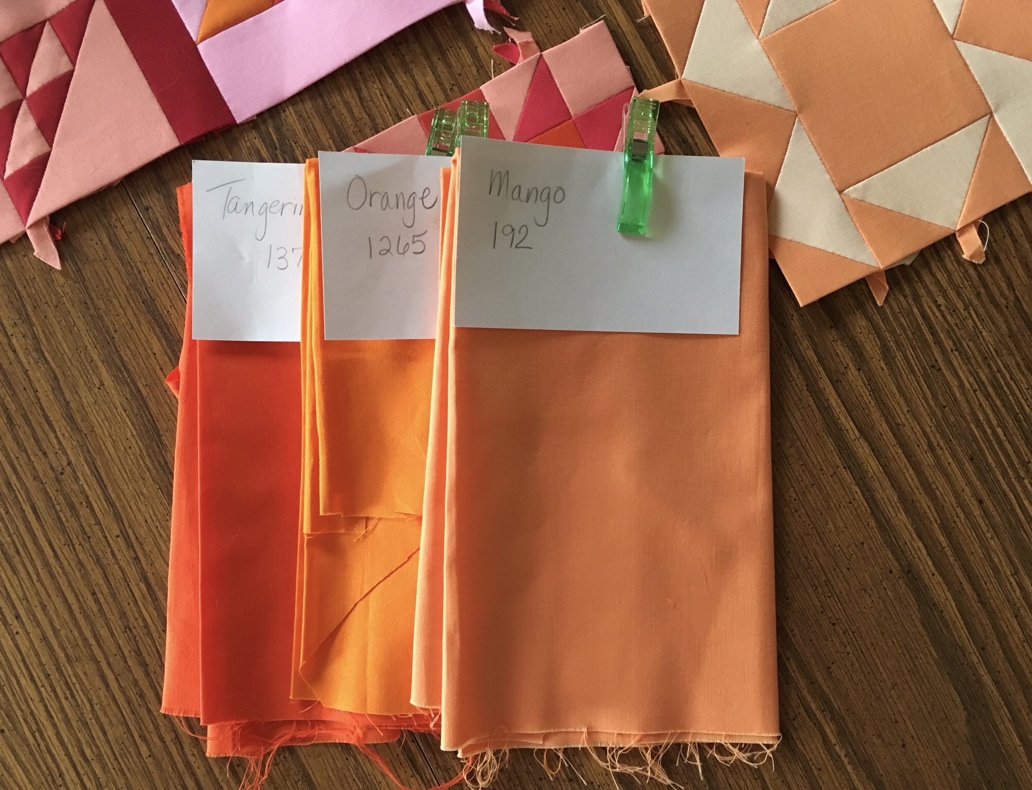
… Tangerine, Orange, and Mango. It can actually be argued that Tangerine has a reddish hue to it.
While I have another color that qualifies as Orange…
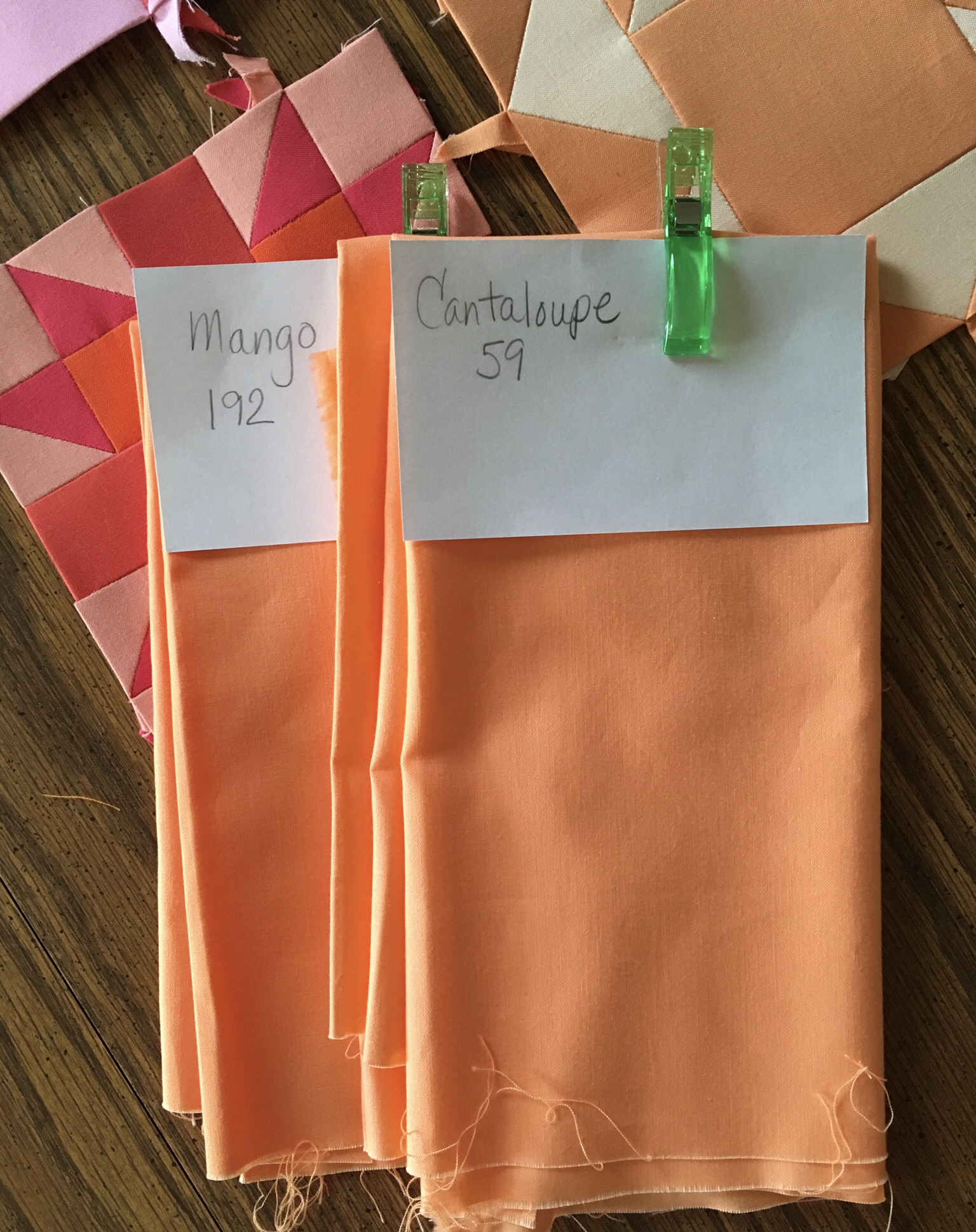
… Cantaloupe is actually so close in value and hue to Mango as to make these two colors nearly indistinguishable from each other. It’s not easy trying to choose colors from the Kona Color Card. Basically I count these two colors as one. I am using both, but not in the same blocks.
This lack of variety for the Orange area is unacceptable. Yet looking at the Kona color chart I don’t see good choices to add that are bright and vibrant, plus I don’t want to take the time away from the project waiting for a new delivery. Therefore, I am looking at what I have in the Orange family that strays a bit to the red or to the yellow.
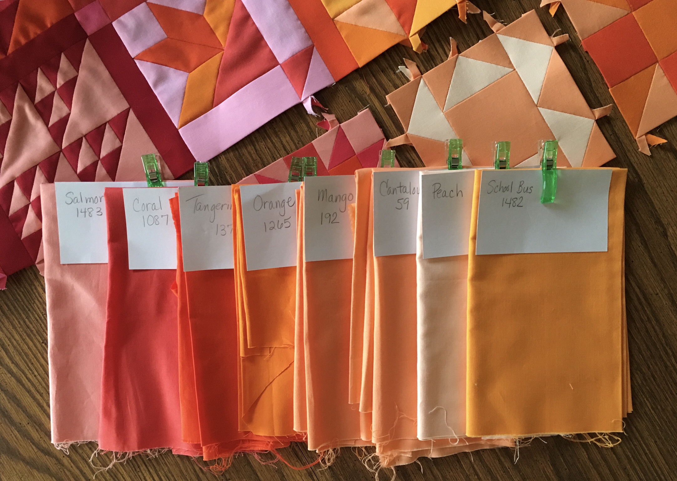
In the photograph above you will see Peach second from the right. This is actually a color that I could categorize as being fully Orange, but it is too light to consider for the blocks in the Orange triangle along the top of the quilt.
On the far right is School Bus. This is a color that falls clearly in Orange/Yellow overlap area, yet I’ve used it once already to supplement my selection of Orange fabrics when I was looking to create #9 Box with four colors rather than two.
At the far left you see Salmon, which I have used liberally in the Red/Orange overlap area. However, I feel it has too much of a red feeling to it to use it in the Orange area. Second on the left is Coral. I ordered this to use in the Red/Orange area, and it works well there. I’ve decided that I will also use it to flesh out the Orange area. It adds a darker value without adding a muddy feeling because it employs a little bit of the darker value of red.
I was wondering how I ended up with so few clearly Orange fabrics. I think the answer is that the color Orange is light in value in its purest form. Therefore, there are fewer pure values of Orange to choose from. By pure I mean values that derive their difference in value due to the amount of white added to the color. Pure is probably a bad choice of word to describe it because a color with white added is no more pure than a color with black (or the complement) added, but it is certainly brighter and less muddy. I’m all about bright and avoiding muddy in this quilt.
If I had this problem with Orange, I am certainly going to have this problem with Yellow, so it is time to take a look at the colors I have for that color area and get out my Kona color chart if necessary.
At this point I have four colors to use in the Orange area. They are Coral, Tangerine, Orange, and Mango. If I am desperate, and need a fifth color for a block I can reach over to School Bus to lend a hand.
By Friday I might actually have the Orange area finished when I present my blocks for the week two of which have been sneak previewed in the photo at the top.