• About Terri Schurter

Hexy Lady

~ my second act in fiber arts

Hexy Lady

Monthly Archives: September 2018

Firming Up My Farmer’s Wife Color Plan

09 Sunday Sep 2018

Posted by Terri Schurter in Uncategorized

≈ 2 Comments

I am a former art teacher. I like to think I know a thing or two about color. Maybe I am overthinking things, but here goes…

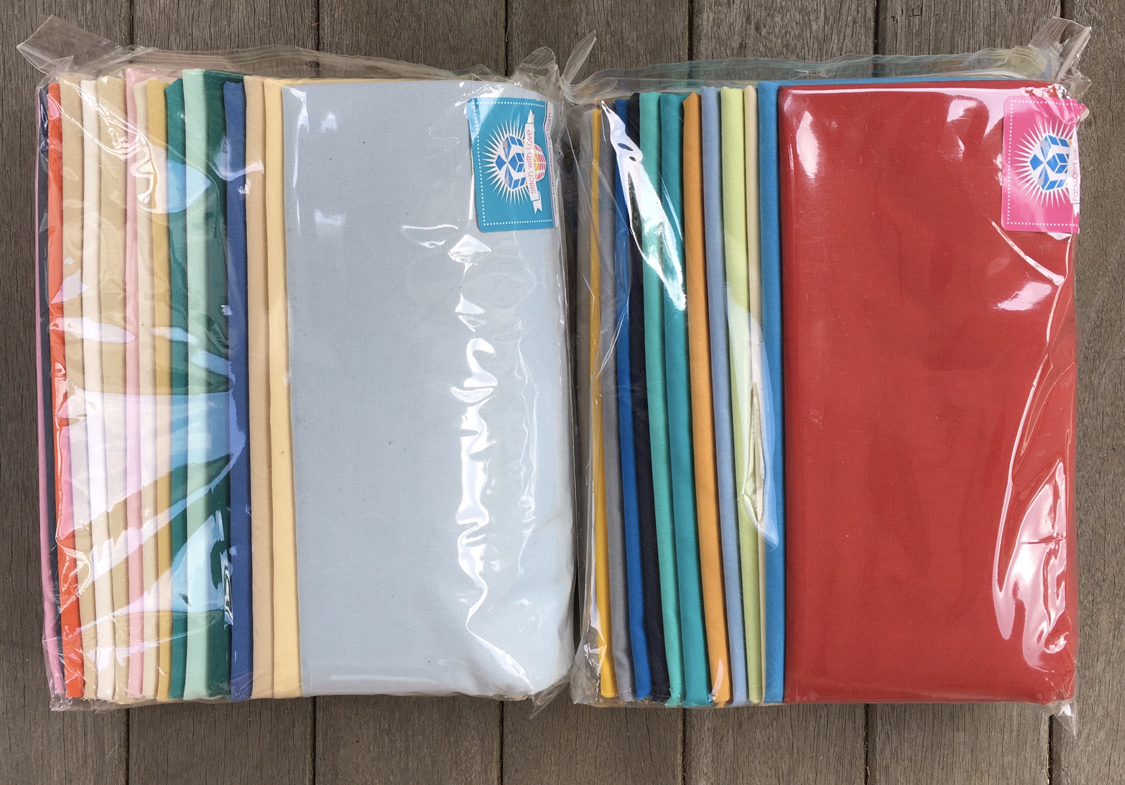
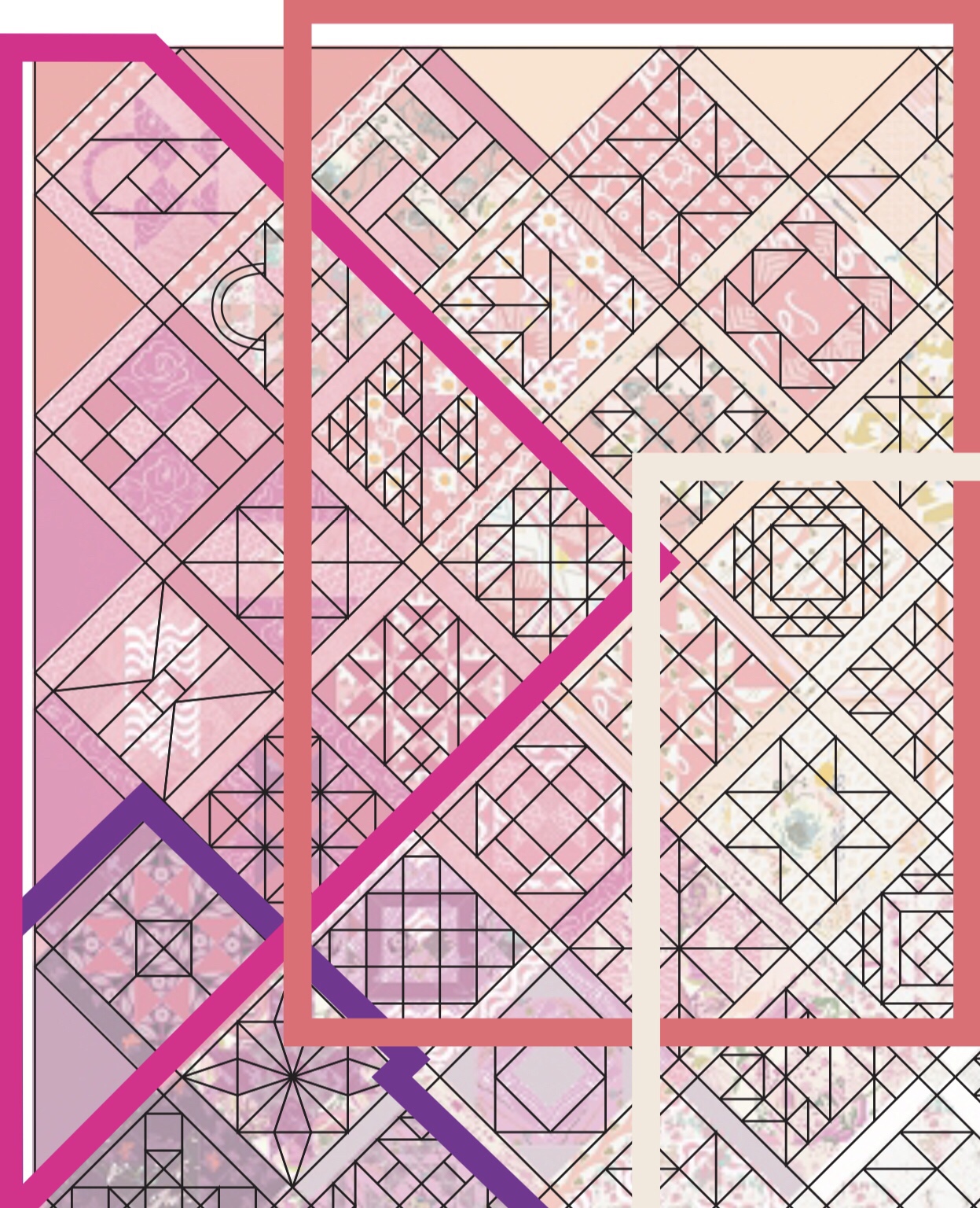
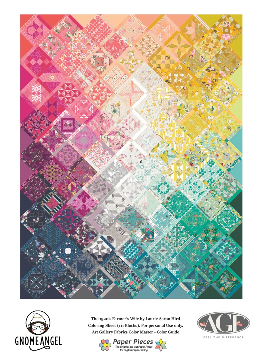
Above is the quilt done by the people at Paper Pieces using Art Gallery fabrics. It employs a color wash. Their color wash is based on the use of 13 boxes of fat quarters divided into color groups. Those groups are shown below with bold outlines.

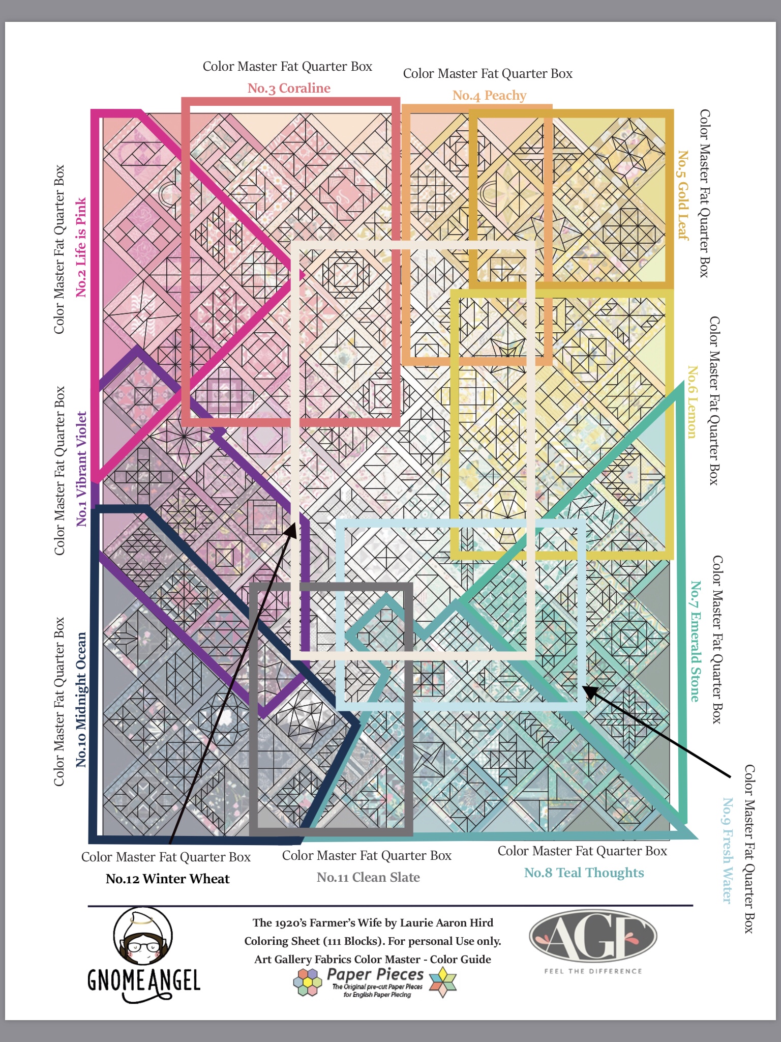
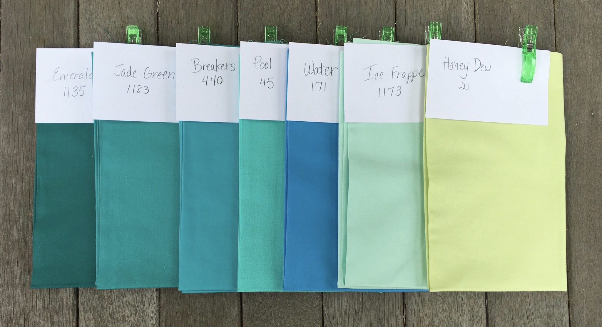
You can see the names of the fabric collections in the edges above.

Groups overlap each other and blocks that are in areas of overlap borrow from two or more color areas. This sounds fairly simple, and it is as long as you are using the curated boxes of fabrics. Once you start choosing your own solids you need to start thinking about whether these groups might be somewhat redundant to the traditional color wheel, and whether you want to use them at all.

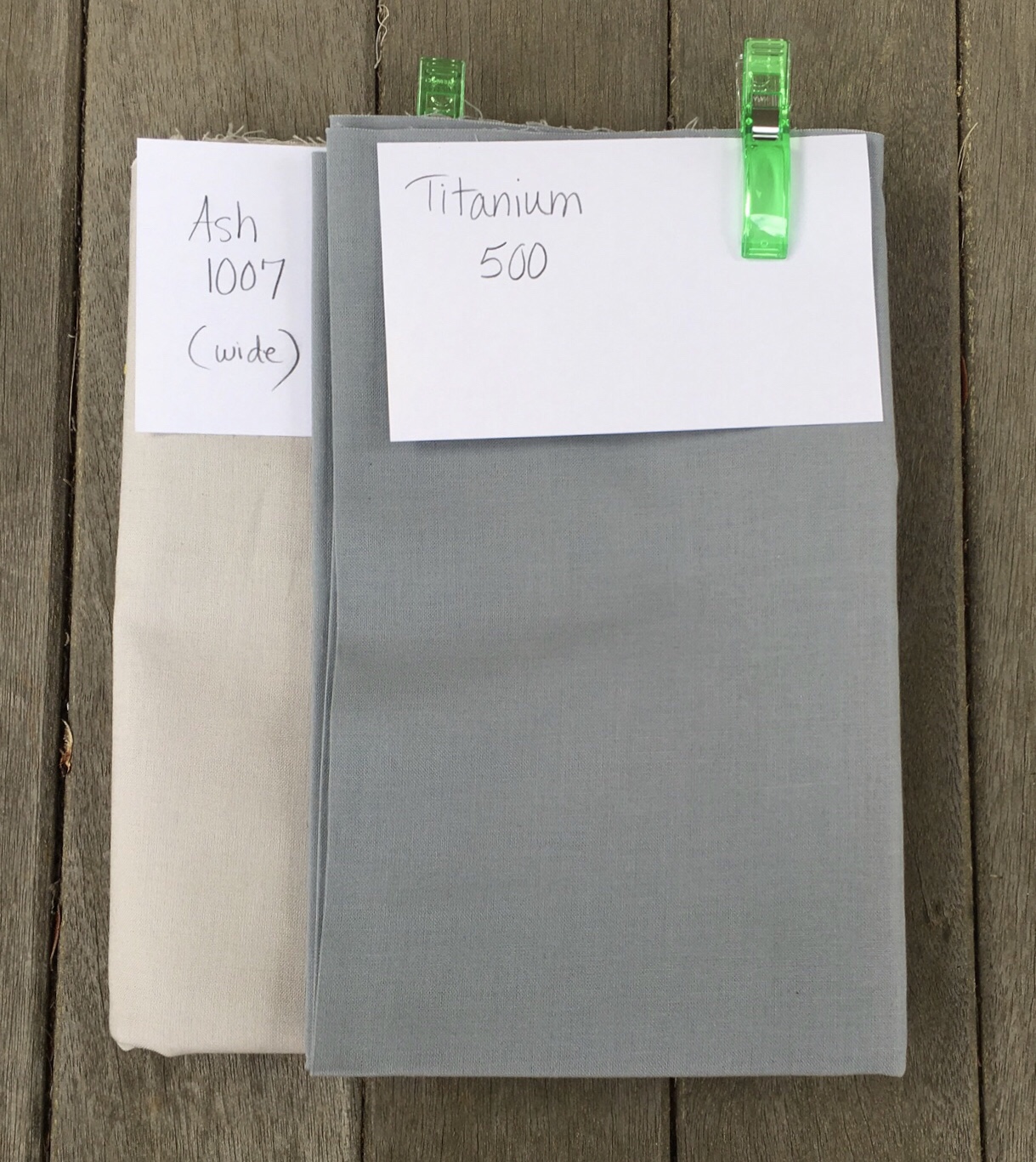
For instance, I don’t have use for a gray color area. It is not a part of the color wheel. It is rather the absence of color, so I’m eliminating it altogether. It is well placed in the sample quilt, however. If I was going to use gray at all I might want to intersperse it through the entire quilt.

Next, why do some intermediary colors get represented while others do not? Coralline equates to Red/Orange. Teal equates to Green/Blue. Where is Violet/Red, Blue/Violet, Yellow/Green, and Orange/Yellow? Isn’t Gold really just “dirty” yellow? Maybe I should just let Gold be Orange/Yellow. And Peach is actually just a light value of Orange.

I decided that moving forward I want to have my color plan in place including a strategy for sashing. I’ve decided to use a light value in each color area for sashing. I might be using multiple colors from each color area for the little squares joining the sashing pieces.

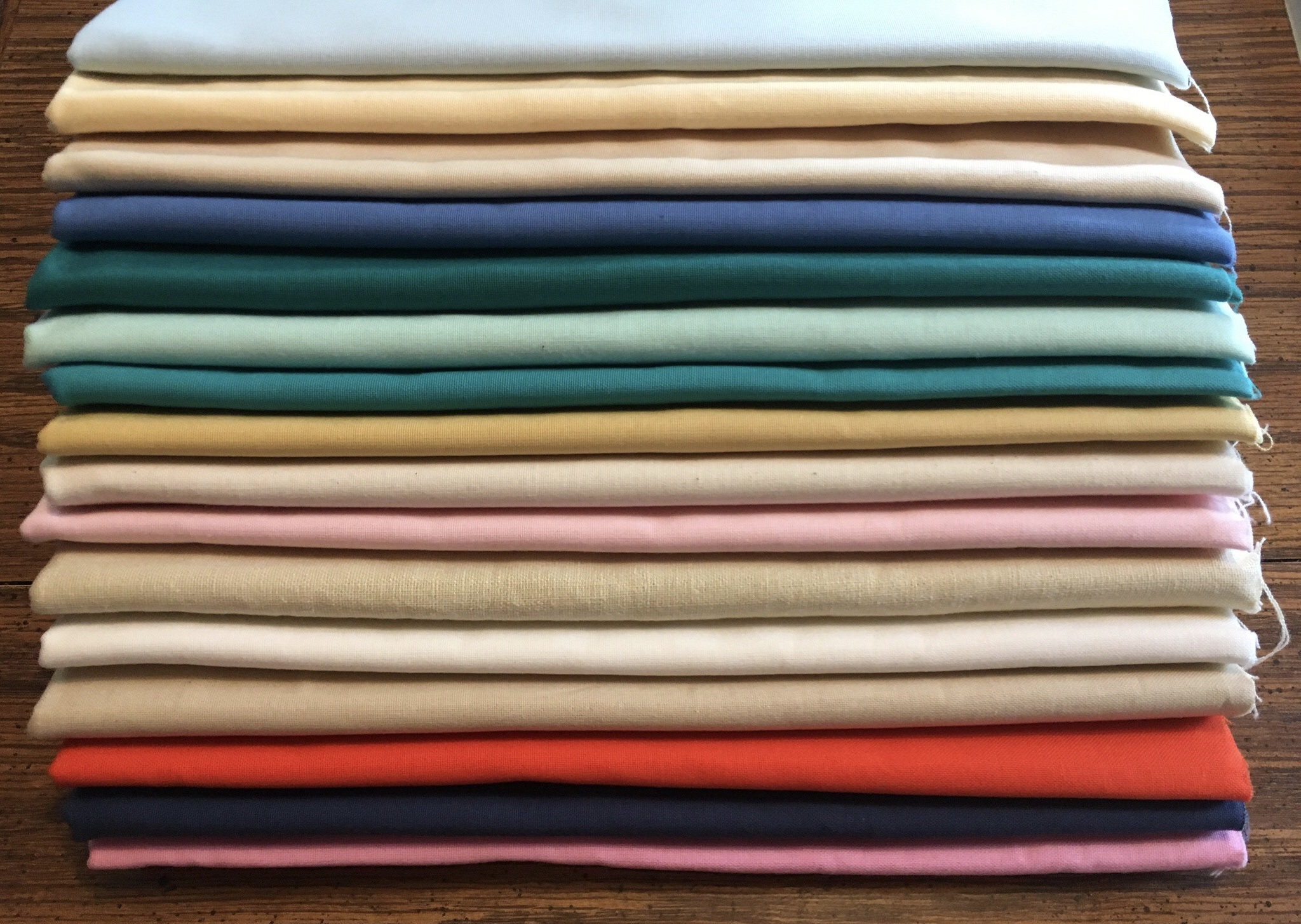
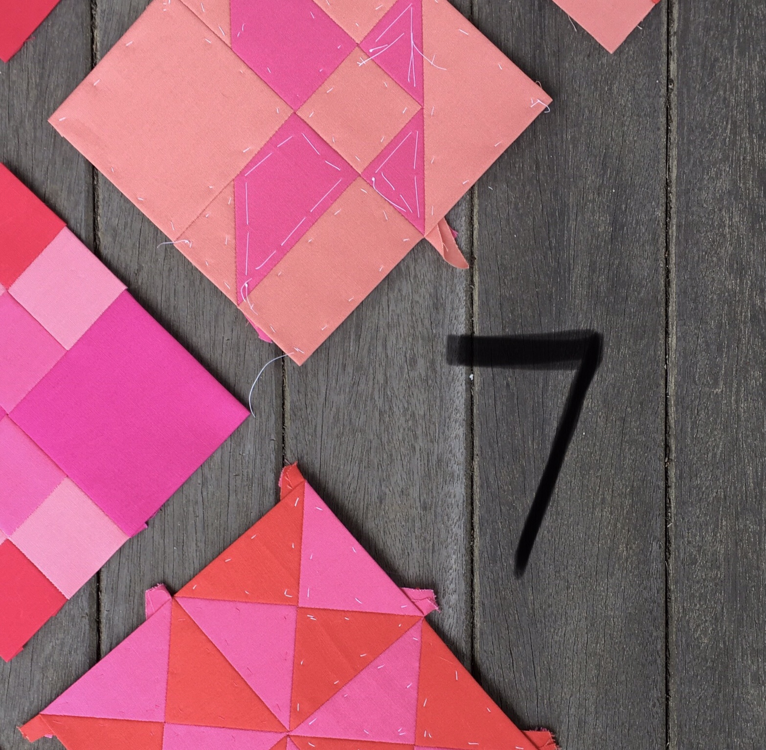
I’ve gathered together the fabrics I have for each color area and will display them below.
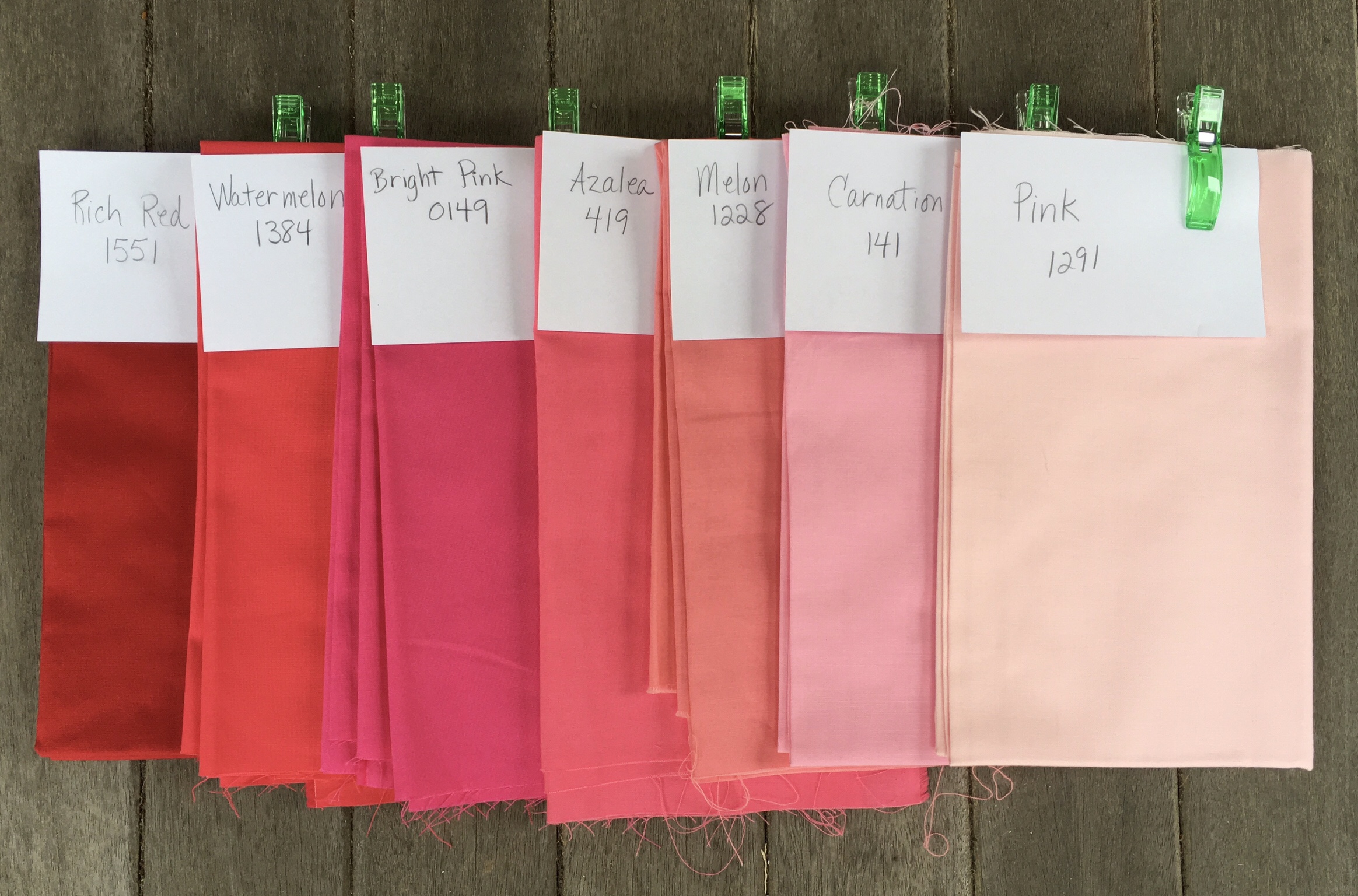
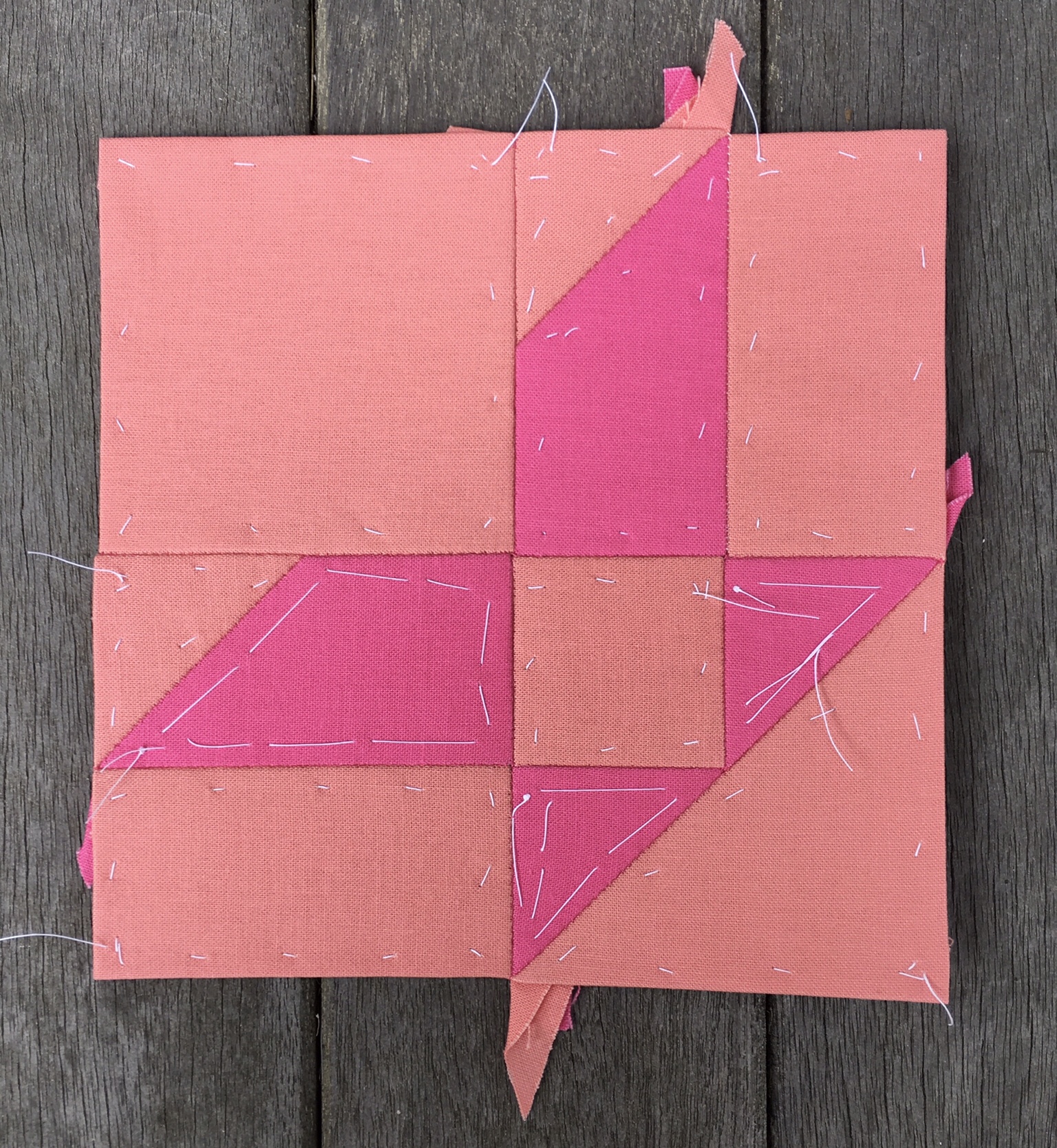
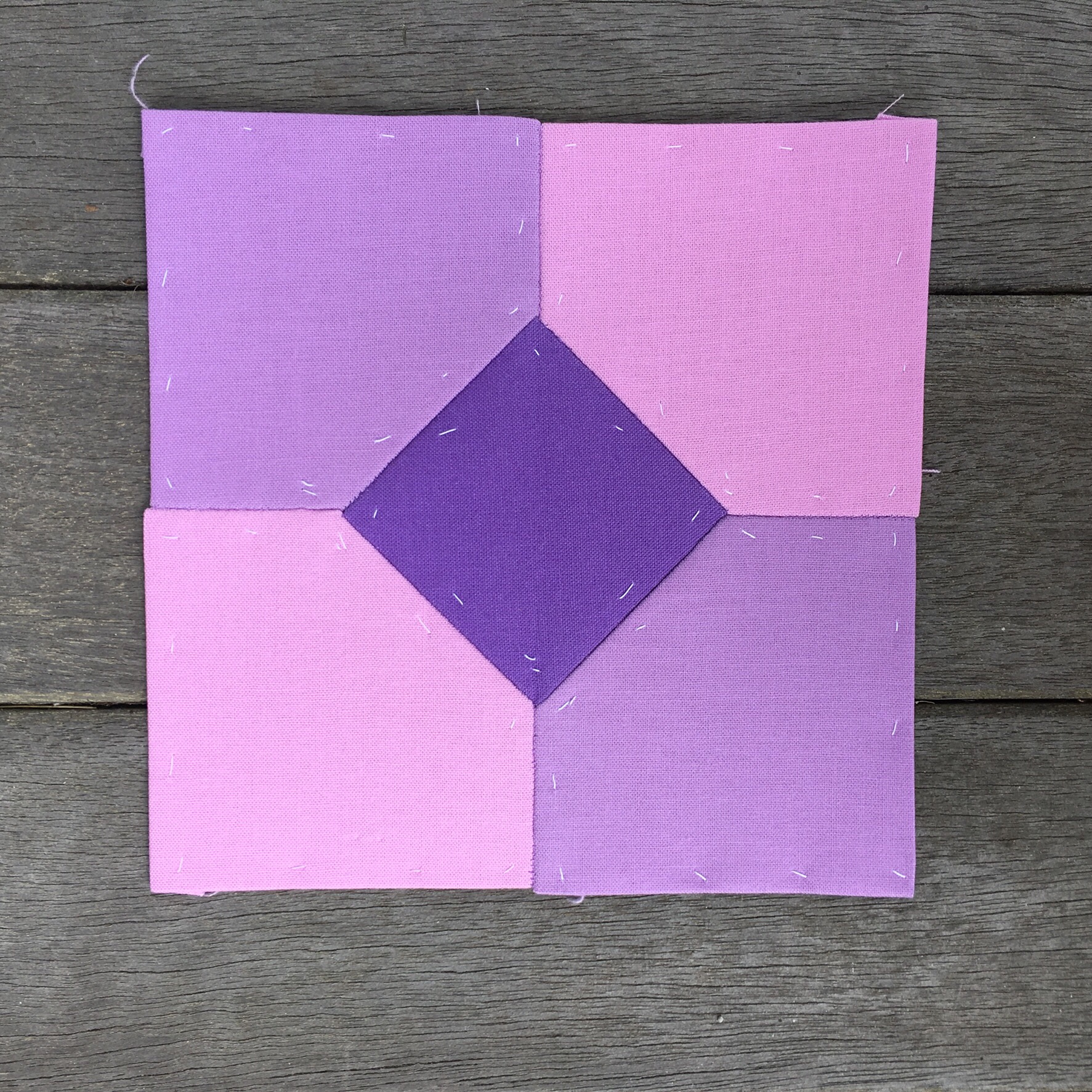
Life Is Pink

I’ve got seven colors for my first color area. I could use either Carnation or Pink for my sashing color.

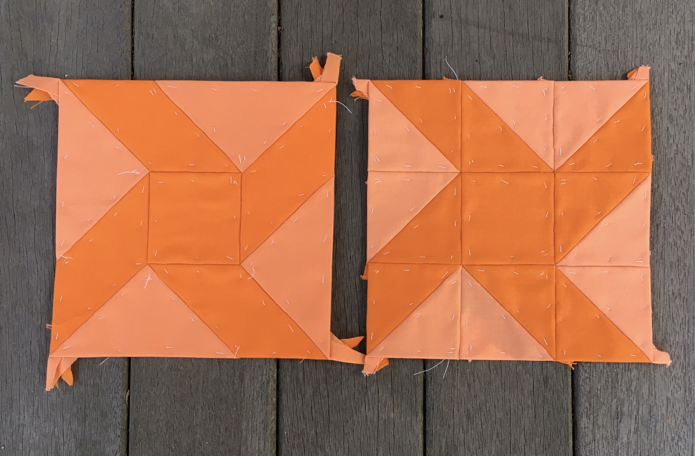
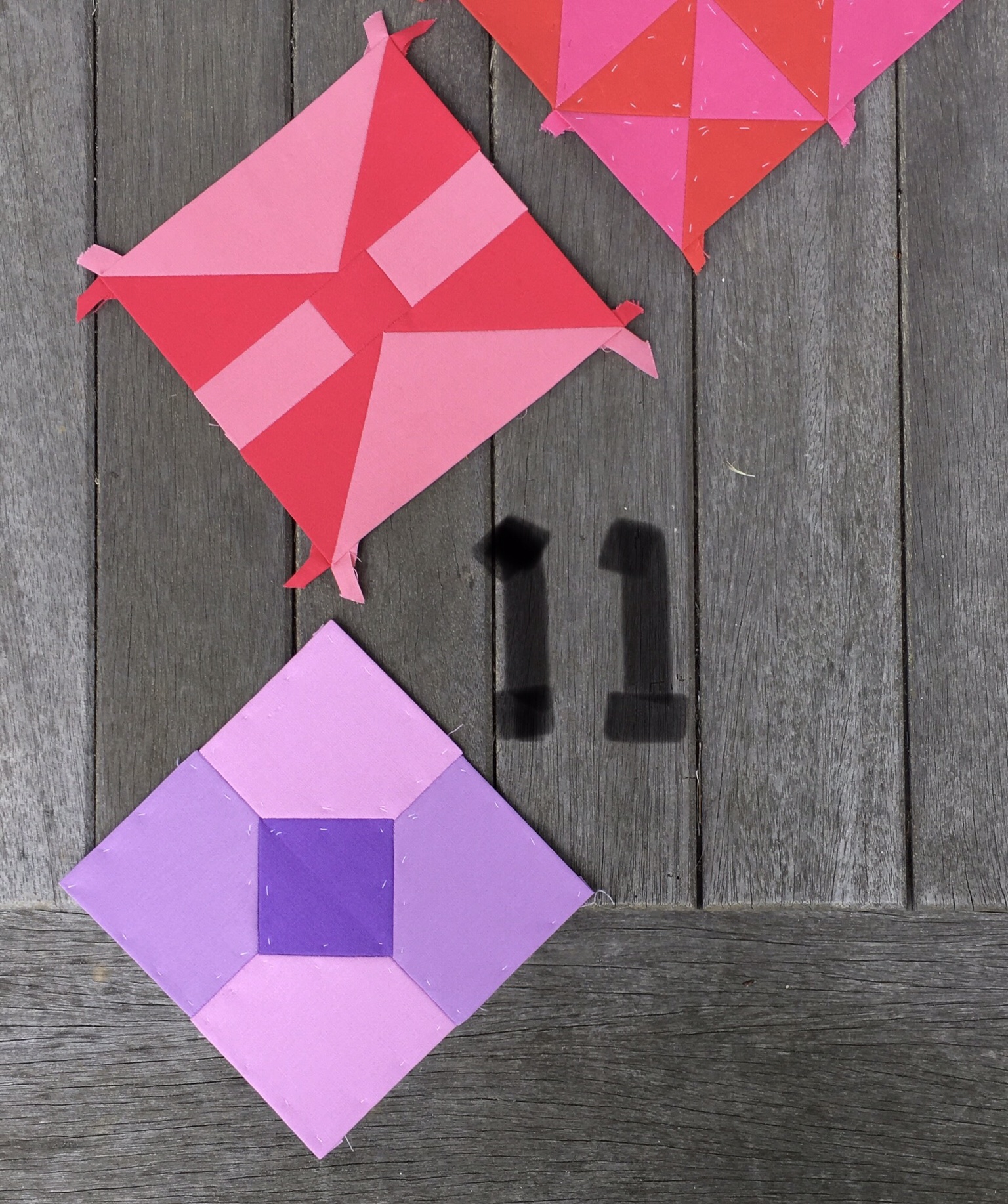
Many of these blocks have already been constructed, but not with as much thought as I would like. For instance, my first block ended up including a color which I later concluded should be part of the Violet area. I will be going back to examine these blocks carefully before choosing my sashing, border triangles, and joining this corner section.
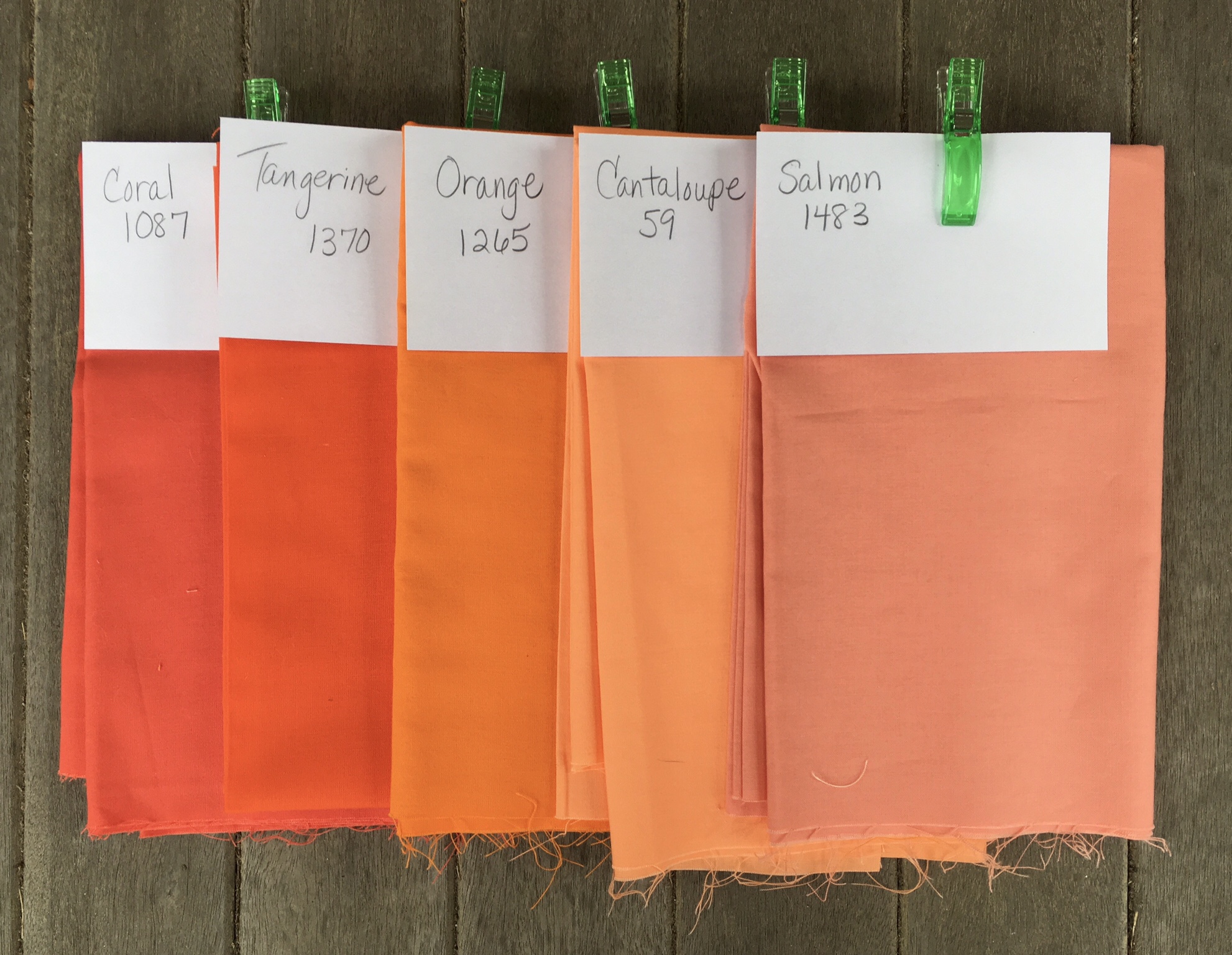
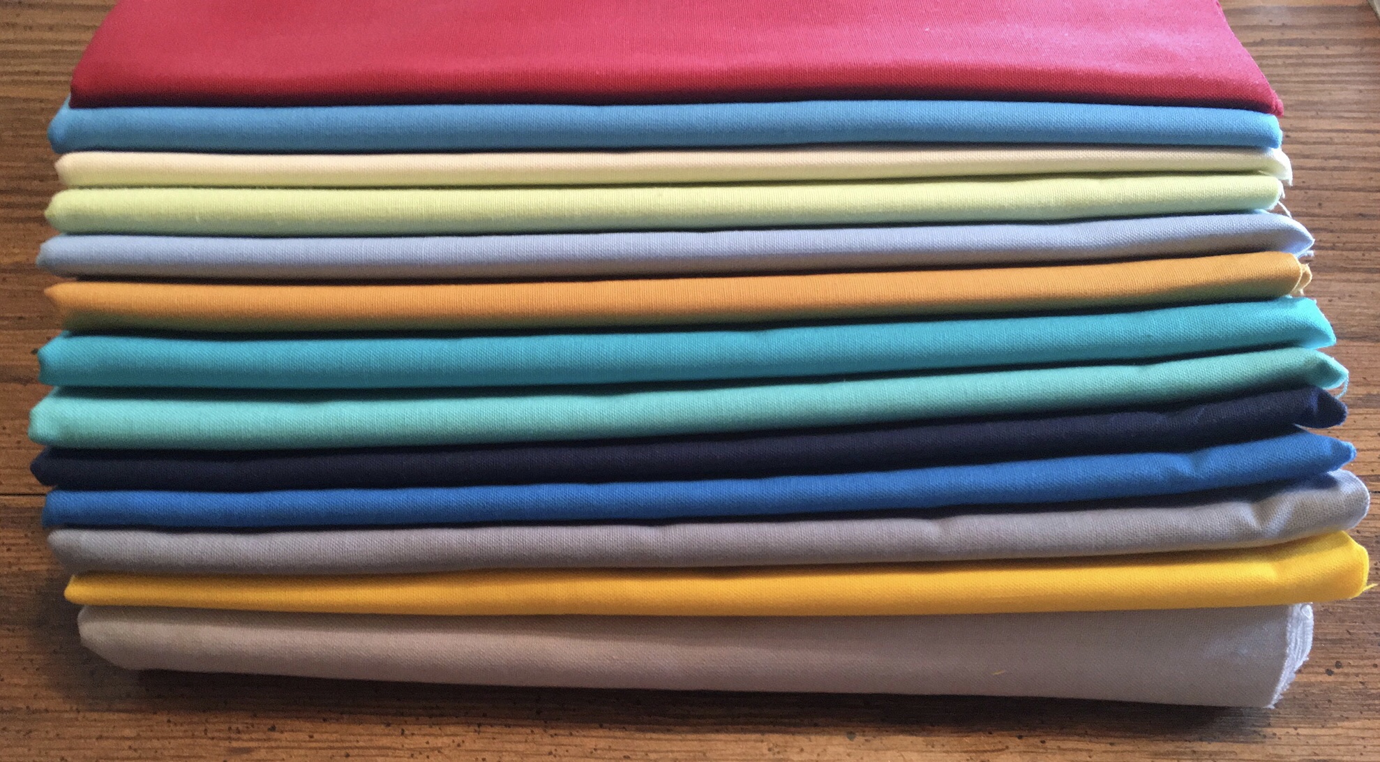
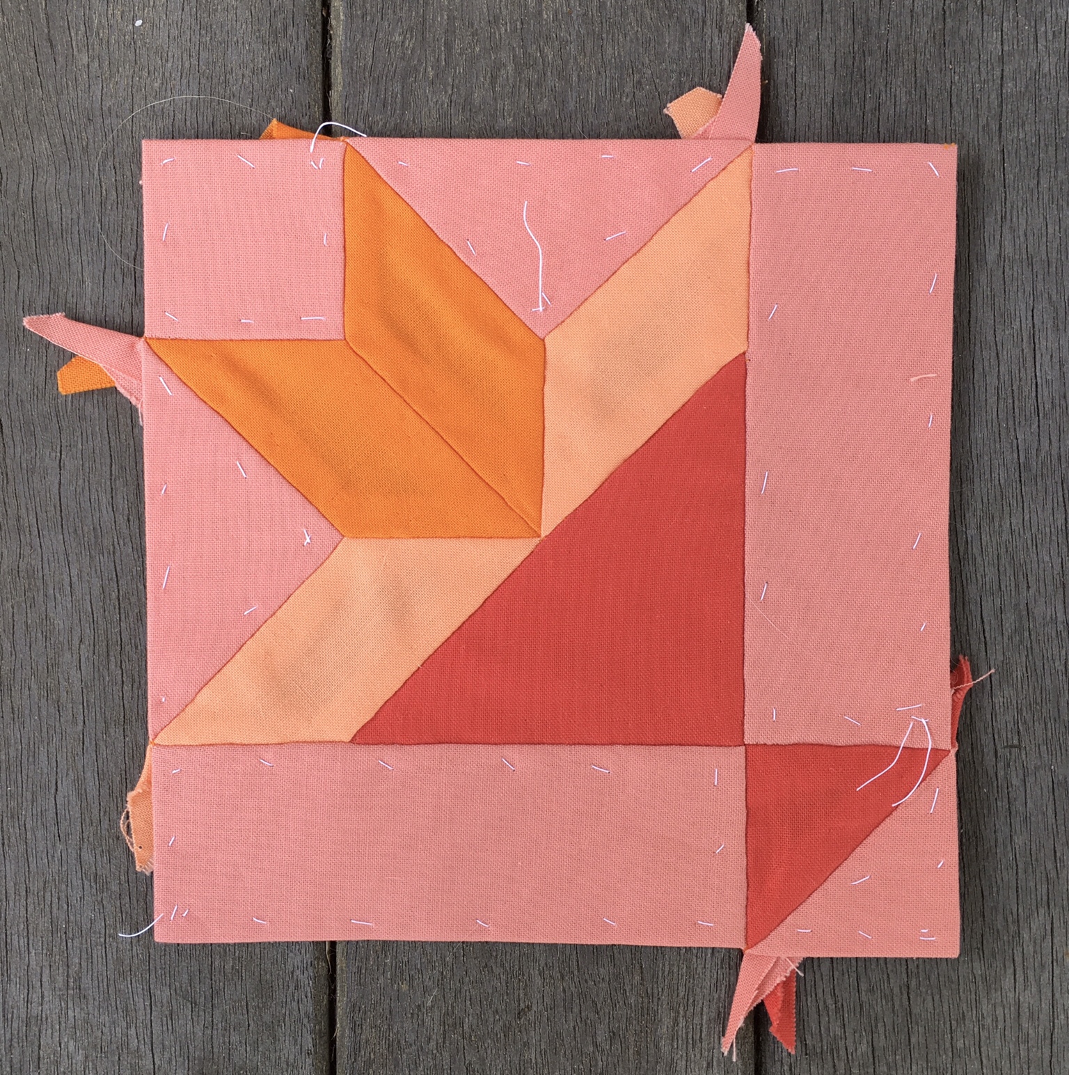
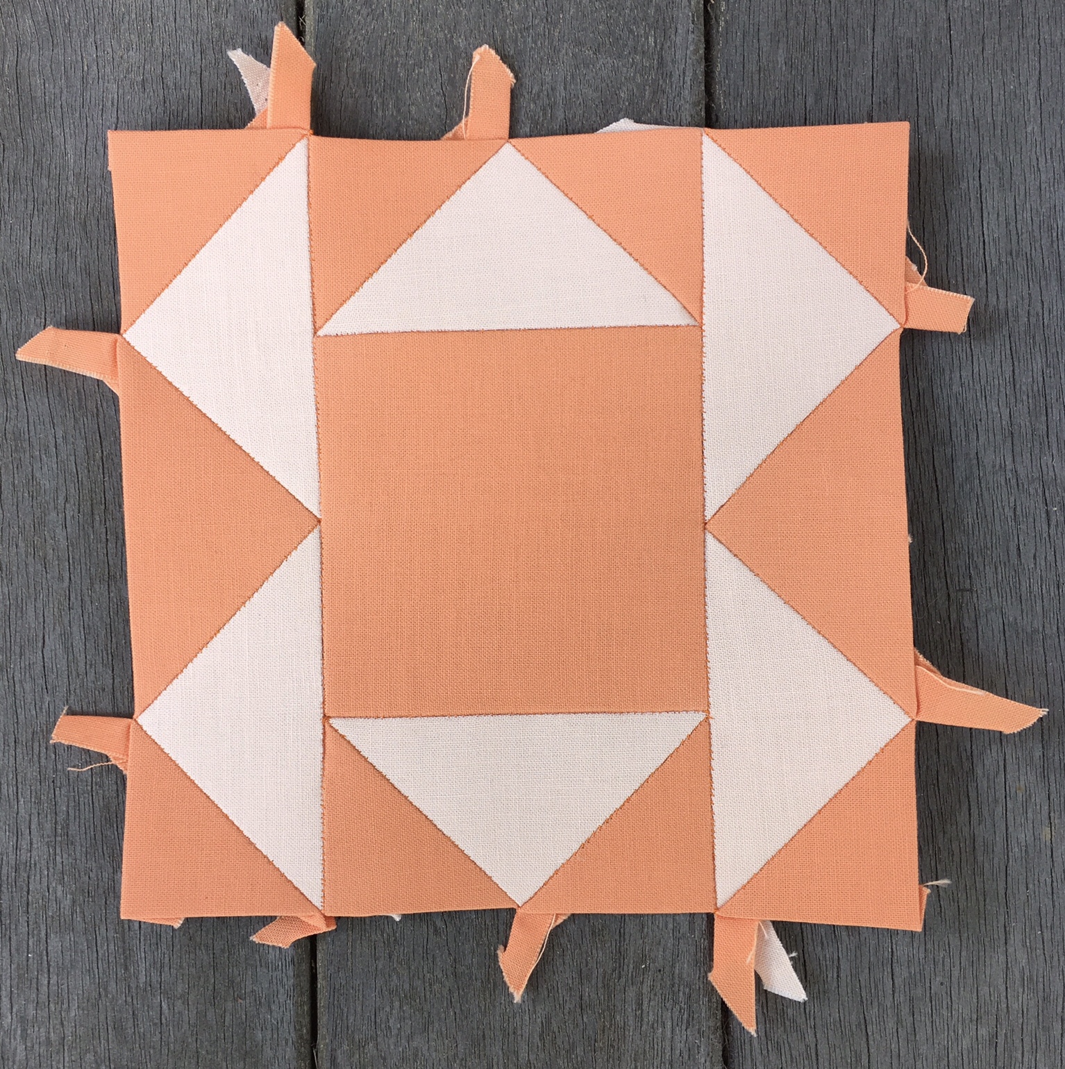
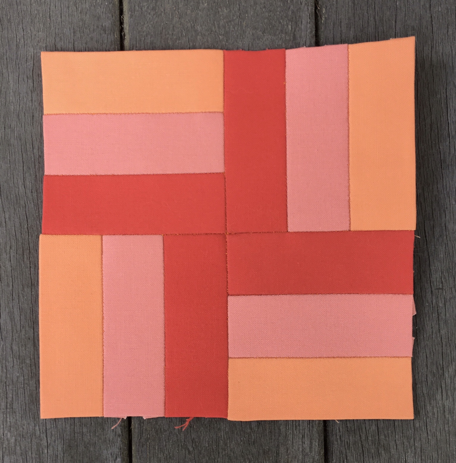
Coraline

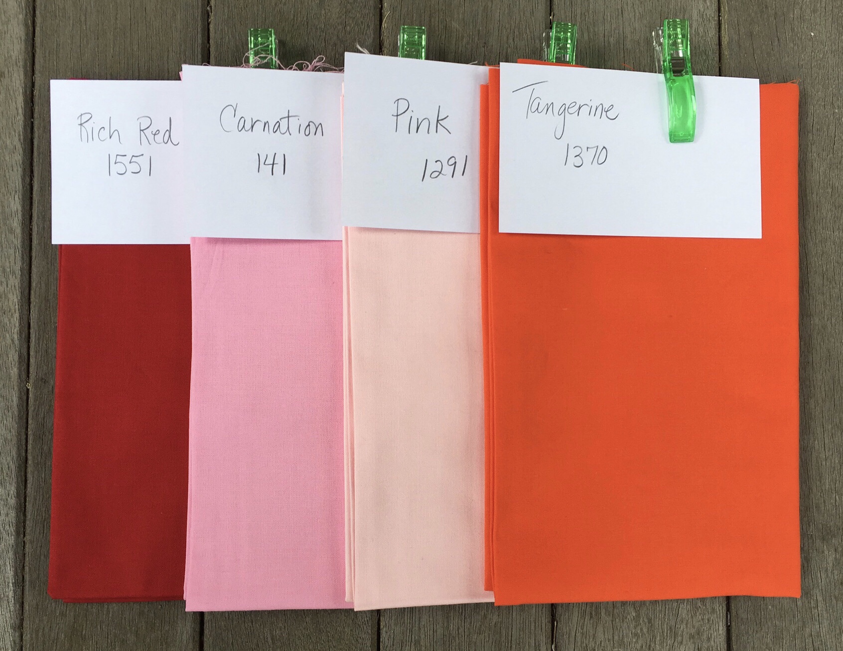
Let’s face it. This area is Orange/Red. So technically the colors in this area should be neither purely Orange nor purely Red. That’s asking a lot from the Kona Collection, and I’m not sure it can be done, so a couple of Orange colors have found their way into this area. Liberal use of Coral and Salmon should make this group read as intermediate between Red and Orange.
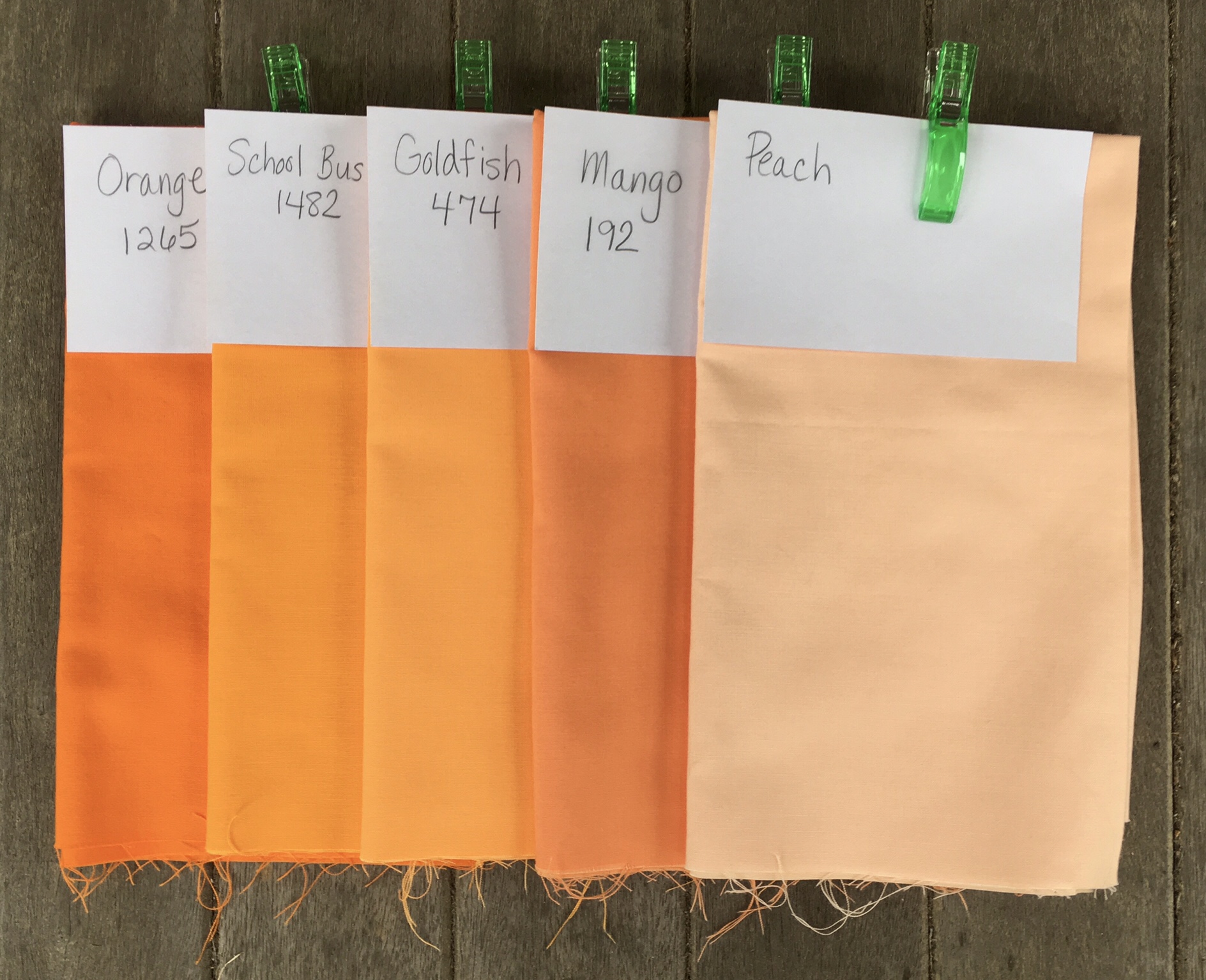
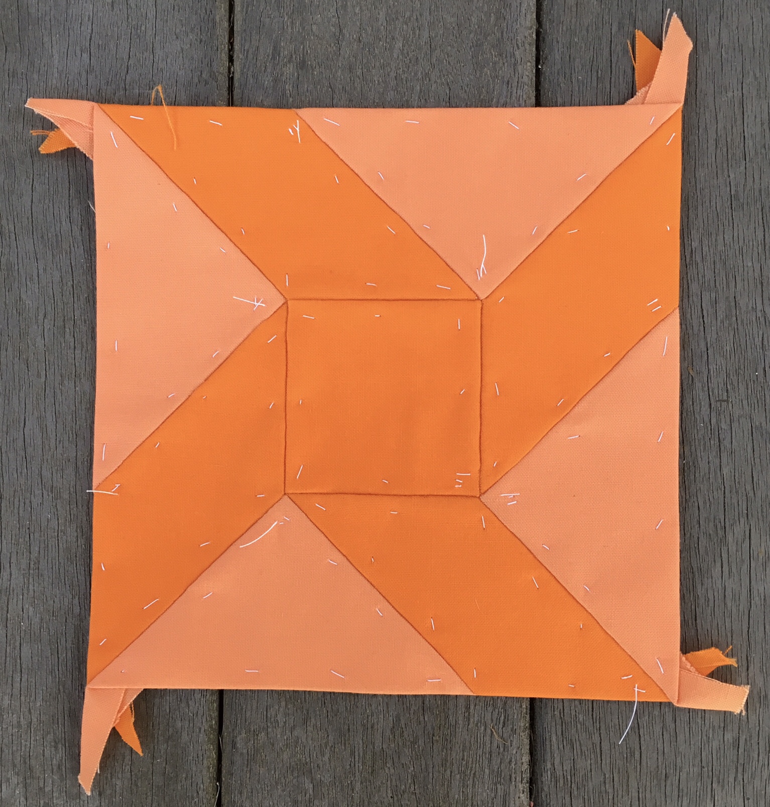
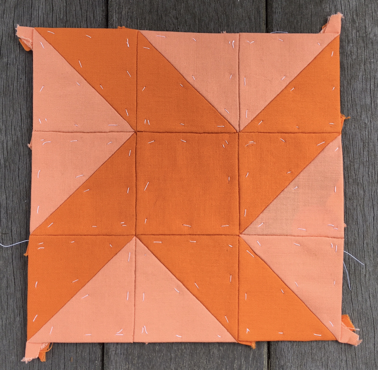
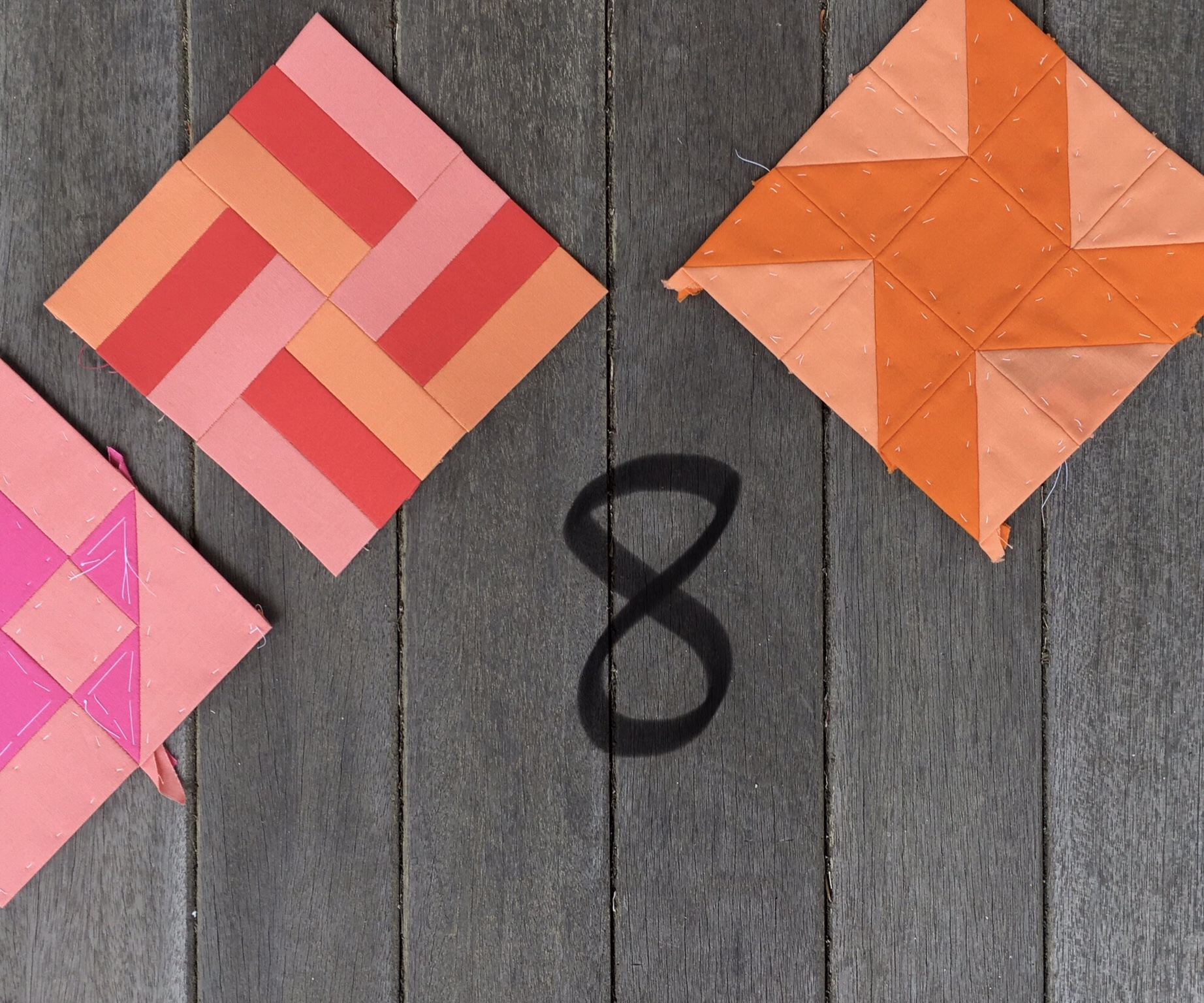
Peachy

Let’s face it. Peachy is Orange.

I’ve doubled up Orange to be used in this group as well as the previous group. (It didn’t even really belong in the previous group). School Bus and Goldfish actually have quite a bit of yellow in them so I’m a bit conflicted about that.
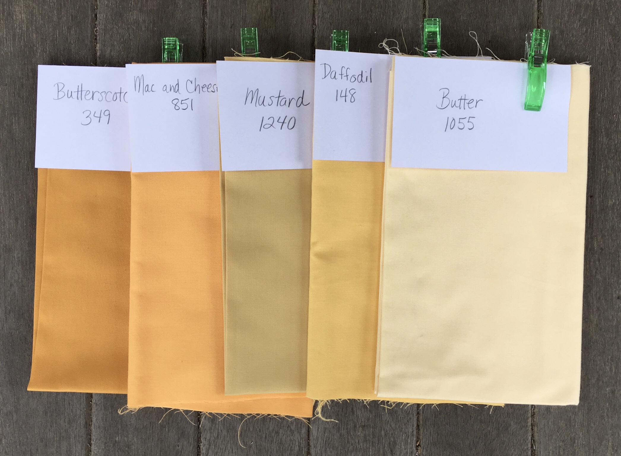
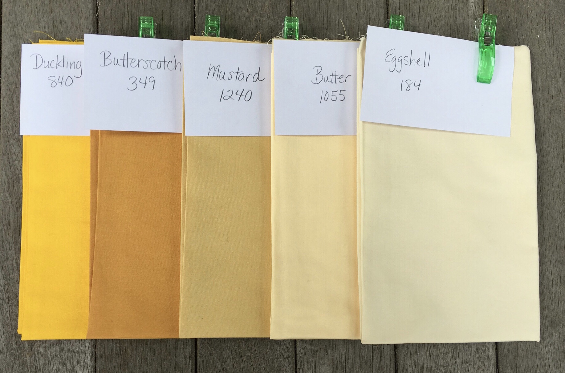
Gold Leaf

Let’s face it. This is dirty yellow, and I am not even sure I like the idea of dirty yellow, and I am not sure that I want to use the dirtiest yellow I’ve got, which is Mustard. Daffodil and Butter are going to find their way into the next section too, but that is enough planning for now.

Above I have only talked about hue (color), but obviously value and intensity come into play. I’ve been troubled by the intensity of the Orange, but maybe if each area has a “screamer” it may read well in the end.

I have plenty to think about revisiting some of my “Life Is Pink” blocks and joining them with sashing. I may be supplementing the color selections in the areas above based on these reflections.

Where did I put that Kona Color Card?

Share this:

  • Email
  • Facebook
  • Twitter
  • Pocket

More Solids

08 Saturday Sep 2018

Posted by Terri Schurter in Uncategorized

≈ Leave a comment

My second order of solids has arrived from the Fat Quarter Shop. I never fail to be in awe of how they package these so beautifully in the exact order as the pieces appear on the invoice.

For fear of disturbing this order I photographed the pieces in the bags in which they came. Then I photographed the piles without trying to fan them out for fear I would drop them and create chaos.

In anticipation of the receipt of this order I bought two bags of large clips to hold the labels in place on the yardage as I worked on the Farmer’s Wife Quilt. I also bought index cards to make short work of the labeling.

I’ve organized my new fabrics into groups representative of the color areas in the color wash plan. Here they are:

The fabrics above are just the new acquisitions. I’ll be combining them with the solids from the first set I purchased to form the complete groups for each color area. I might need to do some additional supplementation for some of the color areas. However, as I did last time, I will want to take a bit of time to gain aesthetic distance before purchasing more fabric.

I started a thread over in the 1920s Facebook Group to see if I could get others who are using solids to come forward. A few did. I came up with a cool hashtag which I will be using when I post there to make it easy to find my work and the work of others who might be inspired to use the hashtag. It is #SOLIDarity .

#SOLIDarity

Share this:

  • Email
  • Facebook
  • Twitter
  • Pocket

Farmer’s Wife Friday: Week Two

07 Friday Sep 2018

Posted by Terri Schurter in Uncategorized

≈ Leave a comment

It is the end of the second week of work on the EPP version of the Farmer’s Wife Quilt. I have five new blocks to display along with a couple of remade blocks. This puts me six blocks ahead of schedule.

I’ve been working out of sequence this week because I have been waiting for my new shipment of Kona solids to arrive. They should be here today. I kind of jumped around the sequence of things as I made these blocks. I will display them here, however, in the order of the number of the block in the book even though I made some blocks earlier in the sequence.

#3 Basket

Kona solids from light to dark are Salmon and Azalea.

I put off making this block until I had seen the video that Angie Wilson posted about completing the handle. She showed a method for making it and suggested waiting until the block is joined to the sashing and the papers come out before sewing it into place. I’ll be following that advice.

Truthfully I am not altogether sure I want the basket blocks in my quilt, so I might be substituting something else for this block when it comes time to begin assembly.

#8 Bouquet

Kona solids from light to dark are Salmon, Cantaloupe, Orange, and Coral.

I’m not really happy with the way the colors work in this block. It seems unbalanced. The Orange doesn’t seem to belong, and the Coral isn’t balanced. I might remake this block.

I used the flat back stitch on this block. I wanted to give that stitch a try because those who use it swear by it. I’m not sure how I feel. I love the way the stitches don’t show on the front. I love the way the points come out perfectly. I dislike the fact that it takes twice as long to sew a seam. Also in this block I found that the Orange pieces, in particular, seemed to be a bit loose. I took out the papers I could remove, and that did not help the situation. If anything it made things worse. I’m thinking that this would not have happened with my whip stitch.

I am thinking of doing this again and switching out the Orange for Coral. I will also whip stitch it.

This block does not follow the seams in the book. I managed to eliminate three unnecessary seams.

#9 Box

Kona solids from light to dark are Melon and Orange.

This is actually the second version of #9 Box. The first version used Cantaloupe and Orange. It also had many more seams and pieces. I decided to redo it by hand drawing the block with drafting tools, and erasing unnecessary lines.

Here is the first version with so many unnecessary seams and pieces.

Both of these blocks were constructed using the flat back stitch. This was the first block on which I tried the fat back stitch.

Here is a photo showing both blocks for comparison.

I like the lower contrast on the block to the left.

#10 Bowtie

Kona solids from light to dark are Ballerina, Pansy, and Morning Glory.

This was actually the first block in which I deviated from the prescribed pieces and seams in the book. It was such an obvious choice. The prescribed Piecing was so obviously anti EPP.

The central square in this block is supposed to be composed of four triangles. This allows the individual triangles to be joined to the adjacent pieces before joining the four quadrants of the block, thus avoiding Y seams. That is great for machine piecing, but is downright stupid for EPP, a method that laughs at the Y seam, or at least embraces it.

I had completed #9 Box using the prescribed method before I caught on that I could cut down on pieces and seams.

#15 Buzzard’s Roost

Kona solids from light to dark are Peach and Mango.

This is a high contrast block, but not nearly as high in contrast as it appears to be here. The Peach fabric looks darker in person. Peach is the lightest value fabric I have in my collection of oranges. I am considering using it for sashing in the peachy color area.

This week’s work has prompted me to look carefully at the construction of the blocks in the book. I wonder how many can be simplified for EPP.

Interestingly, blocks that do not follow the seams in the book are not eligible to be entered for prizes for the sew along. That is fine by me. I’m more interested in living up to the spirit of EPP than I am in winning prizes.

I have one more block to share this week. It is a remake of a block from last week.

#4 Basket Weave (revisited)

Kona solids from light to dark are Salmon, Mango, and Coral.

After viewing Angie’s version of this block I decided to redo mine in a similar configuration. It is much more like a windmill, and less like a Swastika this way.

Share this:

  • Email
  • Facebook
  • Twitter
  • Pocket

My Process for Choosing Fabrics

01 Saturday Sep 2018

Posted by Terri Schurter in Uncategorized

≈ 1 Comment

At the beginning of this journey it was enough to look at the color wash plan and choose from among the fabrics I had purchased for that color area.

However, as my blocks accumulated I decided that it would be necessary to take into account the hues and values of fabrics in adjacent blocks. To do this I arranged my finished blocks so I could take a picture for a visual reference when selecting fabrics for the next few blocks.

I also took close up photos of the location of unfinished blocks and labeled them for easy reference to the book. I’ve been following the relative values of colors in the book.

Share this:

  • Email
  • Facebook
  • Twitter
  • Pocket
Newer posts →

Subscribe to Blog via Email

Enter your email address to subscribe to this blog and receive notifications of new posts by email.

Join 41 other subscribers

Recent Posts

  • Not Sure if I Want To Blog Anymore
  • Annoyed With Bluehost
  • Pandemic Still Life
  • Staying with Bluehost
  • Farmer’s Wife Friday: Week 20

Recent Comments

  • AmandaEcobiab on Not Sure if I Want To Blog Anymore
  • Wynne.price, nz on Not Sure if I Want To Blog Anymore
  • Visionhuq on CJMQG Fall Retreat
  • Deidre Jenkins on Annoyed With Bluehost
  • Wynne on Annoyed With Bluehost

Archives

  • December 2024
  • June 2023
  • June 2020
  • January 2019
  • December 2018
  • November 2018
  • October 2018
  • September 2018
  • August 2018
  • August 2017
  • May 2017
  • April 2017
  • March 2017
  • January 2017
  • November 2016
  • October 2016
  • September 2016
  • August 2016
  • July 2016
  • June 2016
  • May 2016
  • April 2016
  • March 2016
  • February 2016
  • January 2016
  • December 2015
  • November 2015
  • October 2015
  • September 2015
  • August 2015
  • July 2015
  • June 2015
  • May 2015
  • April 2015
  • March 2015
  • February 2015
  • January 2015
  • December 2014
  • November 2014
  • October 2014
  • September 2014
  • August 2014
  • July 2014
  • June 2014
  • May 2014
  • April 2014
  • March 2014
  • February 2014
  • January 2014
  • December 2013
  • September 2013
  • August 2013

Categories

  • UFO
  • Uncategorized

Proudly powered by WordPress Theme: Chateau by Ignacio Ricci.