Rethinking My Color Wash

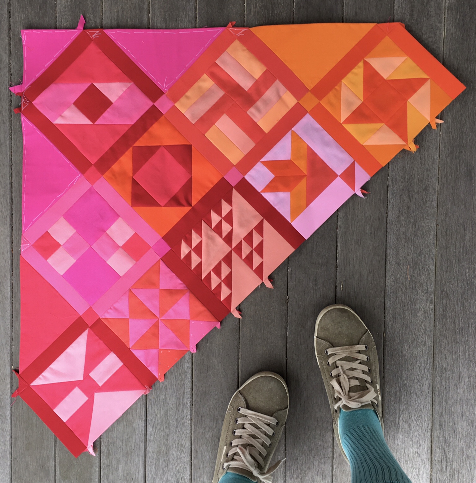
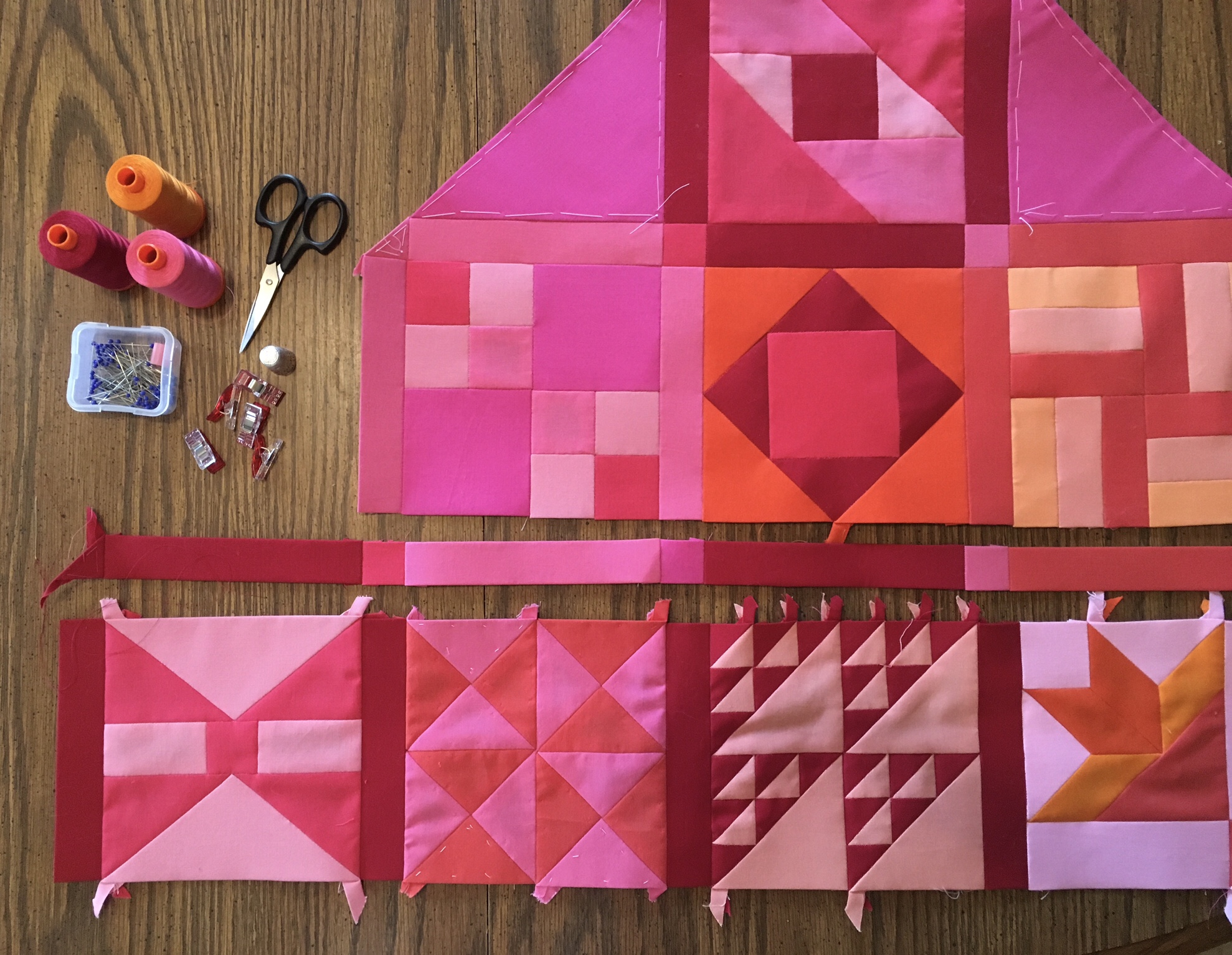
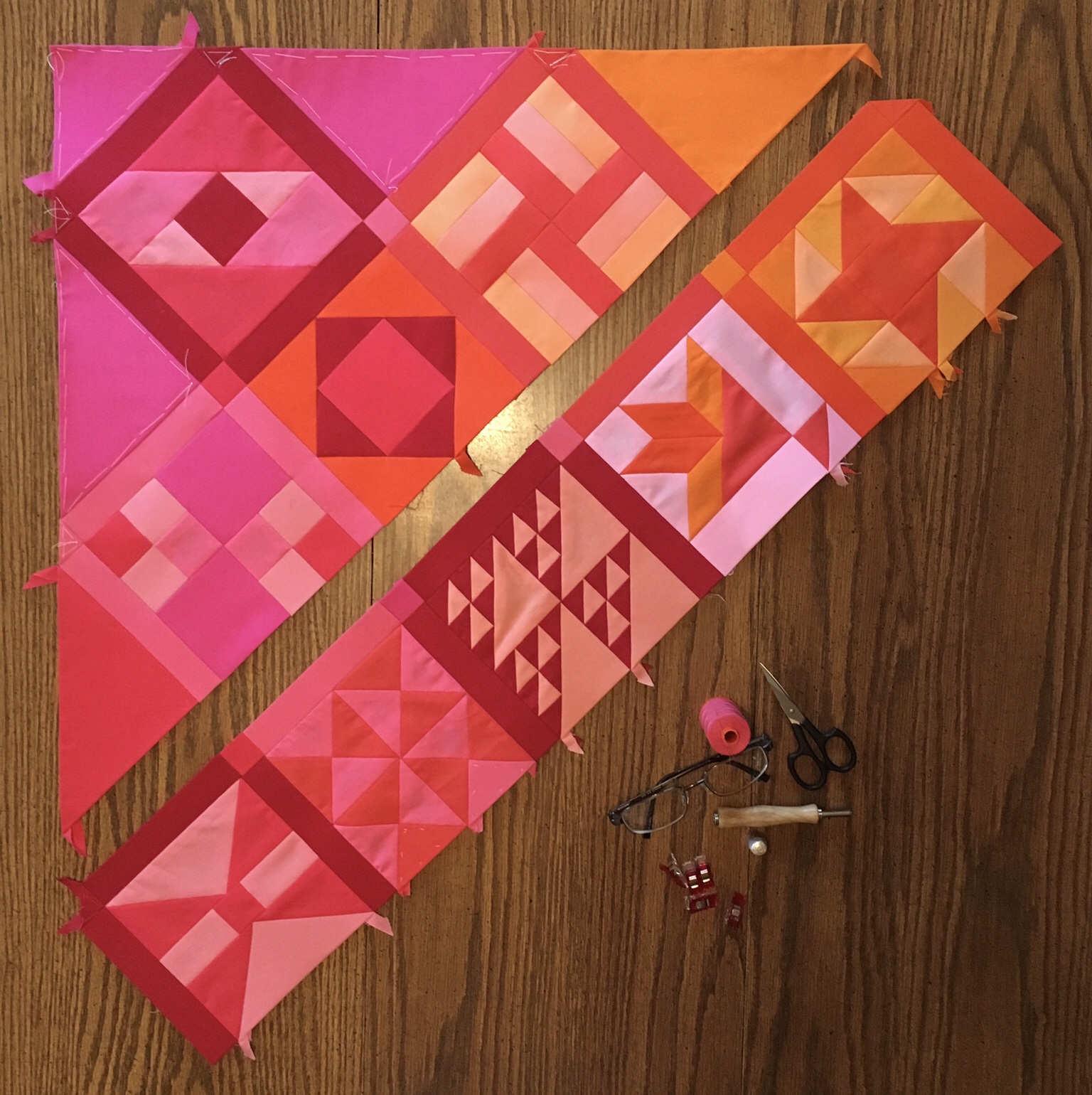
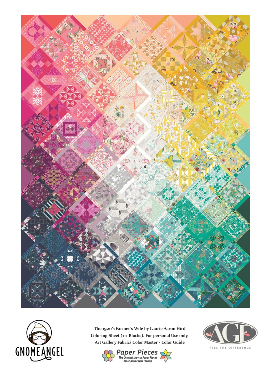
After a month of working on the Farmer’s Wife Quilt I have decided to rethink my color wash concept. Initially I chose my solids to correspond with the color wash diagram provided by Paper Pieces. Even then I thought a color wheel concept might be better for me, and now I believe that to be true.

I’ve decided that the divisions of the Paper Pieces diagram are too artificial for me because they are based on the fabrics from a collection. I decided to redraw my color wash map using the color wheel as my starting point. Having already completed the upper left corner I needed to put red in the upper left of my map. Having used Tangerine in the #3 block position I needed to draw my color areas wide with significant overlap. I believe that this turned out to be a good thing.

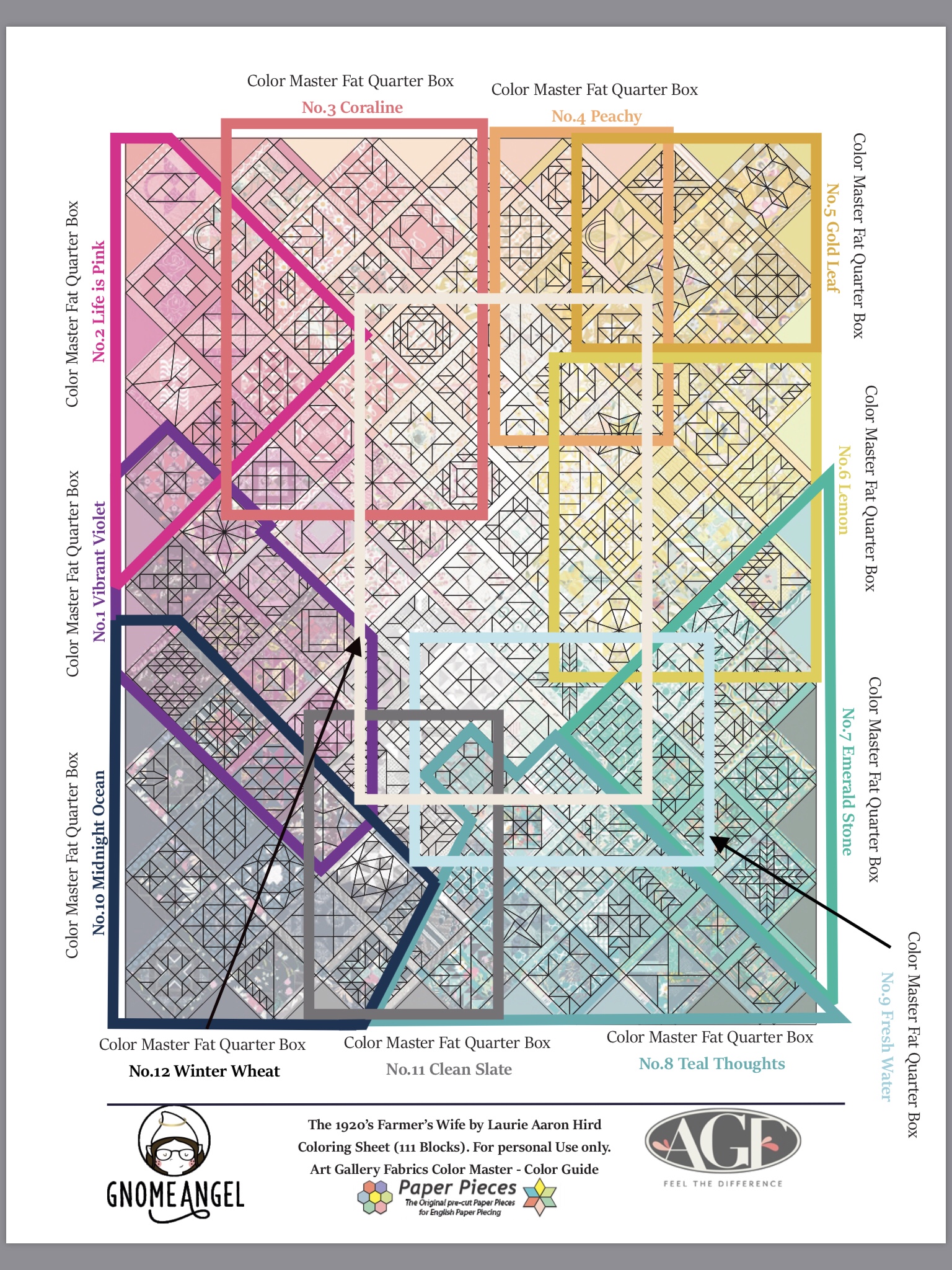
Here is my new color wash map.

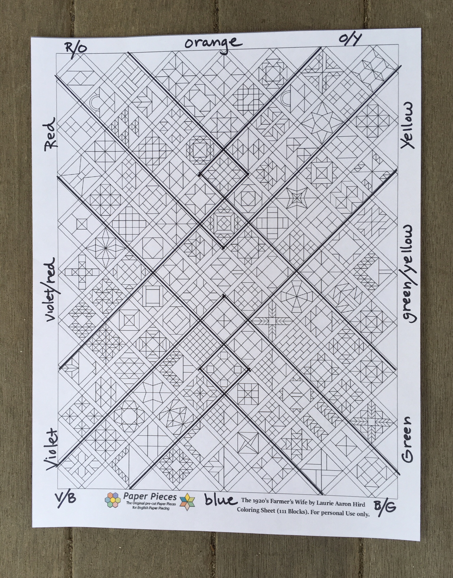
The image above shows both the major color areas and the areas of overlap labeled along the edge of the diagram.

A few images will help to illustrate the meaning of the diagram.

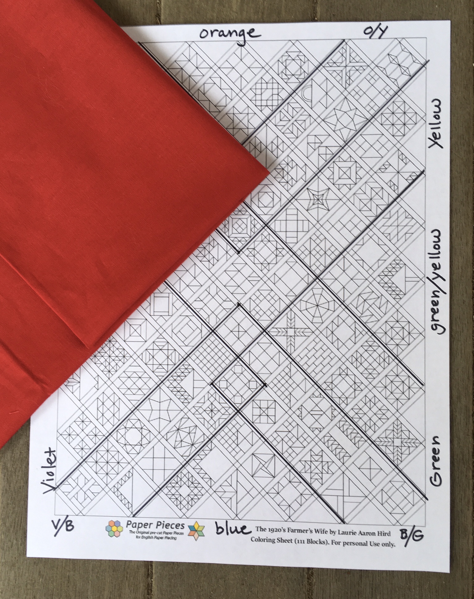
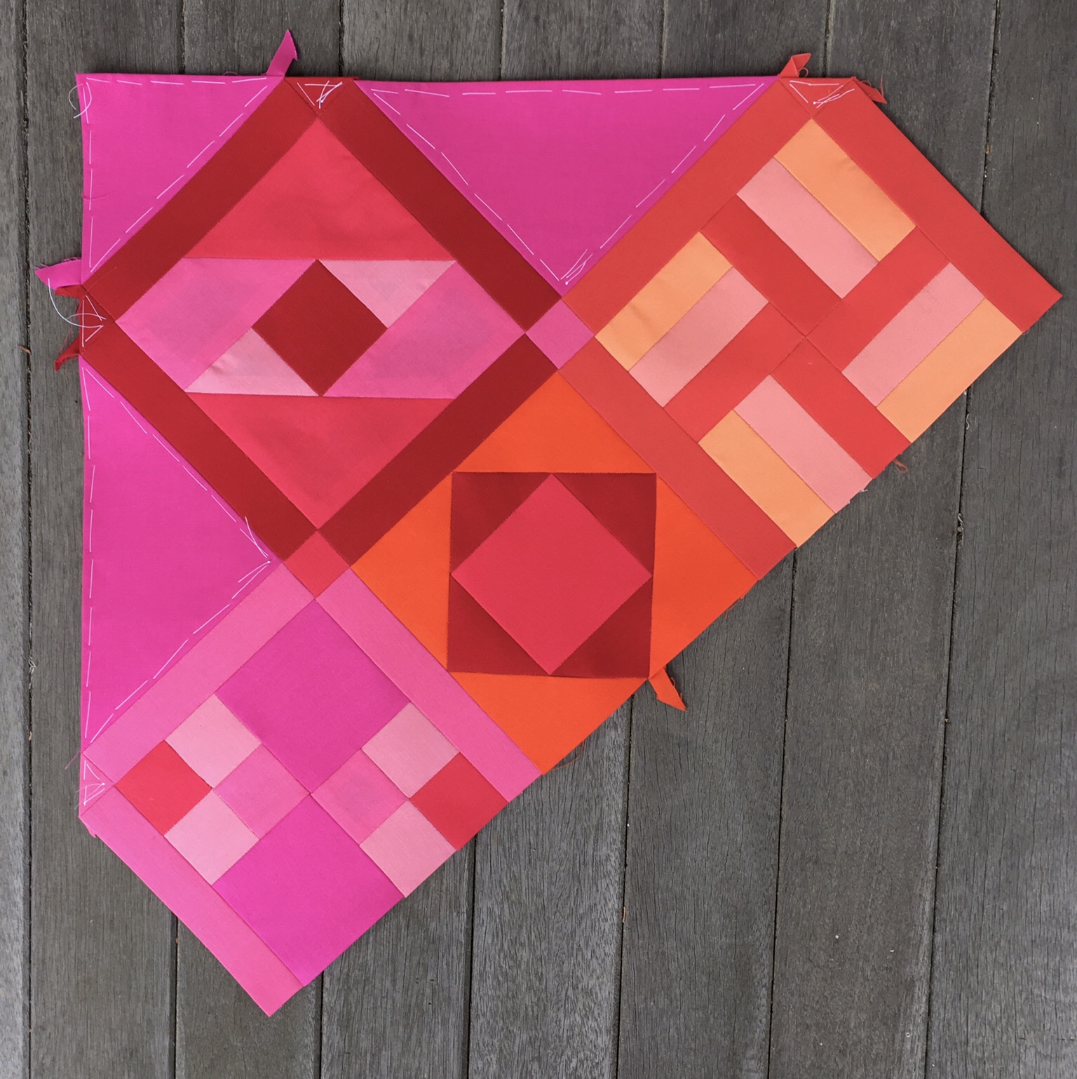
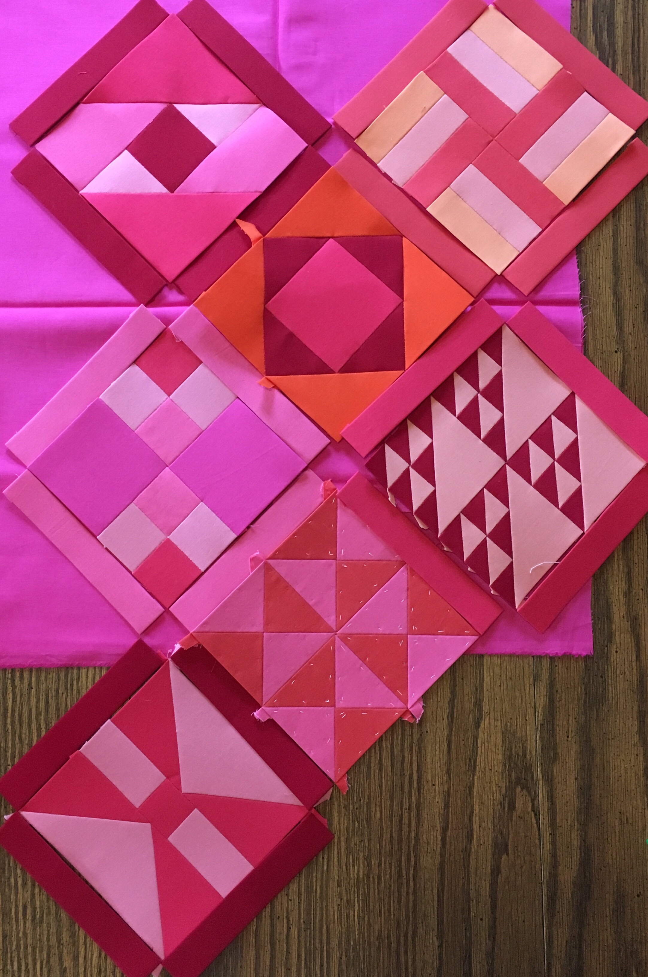
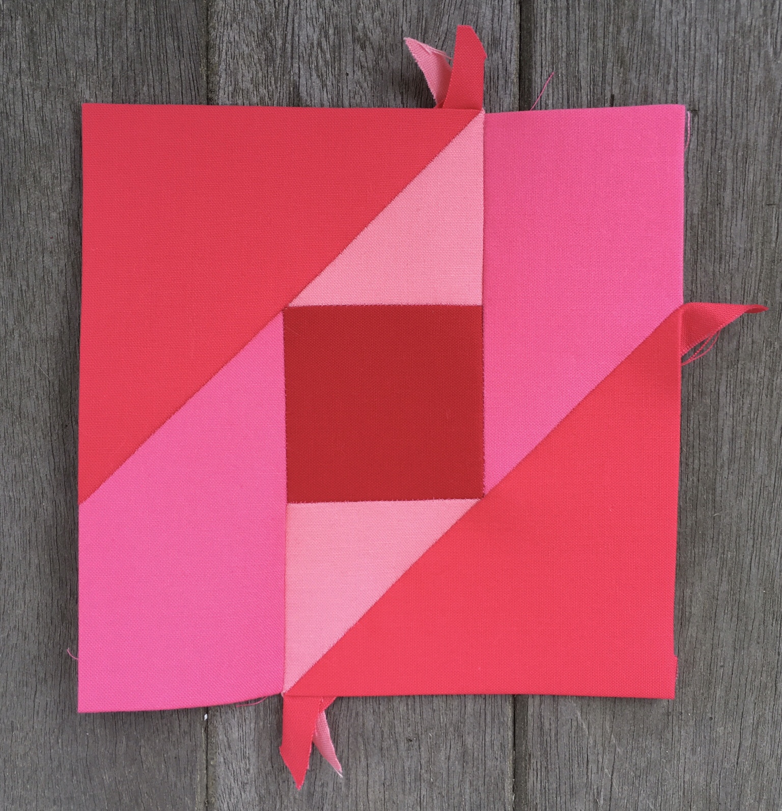
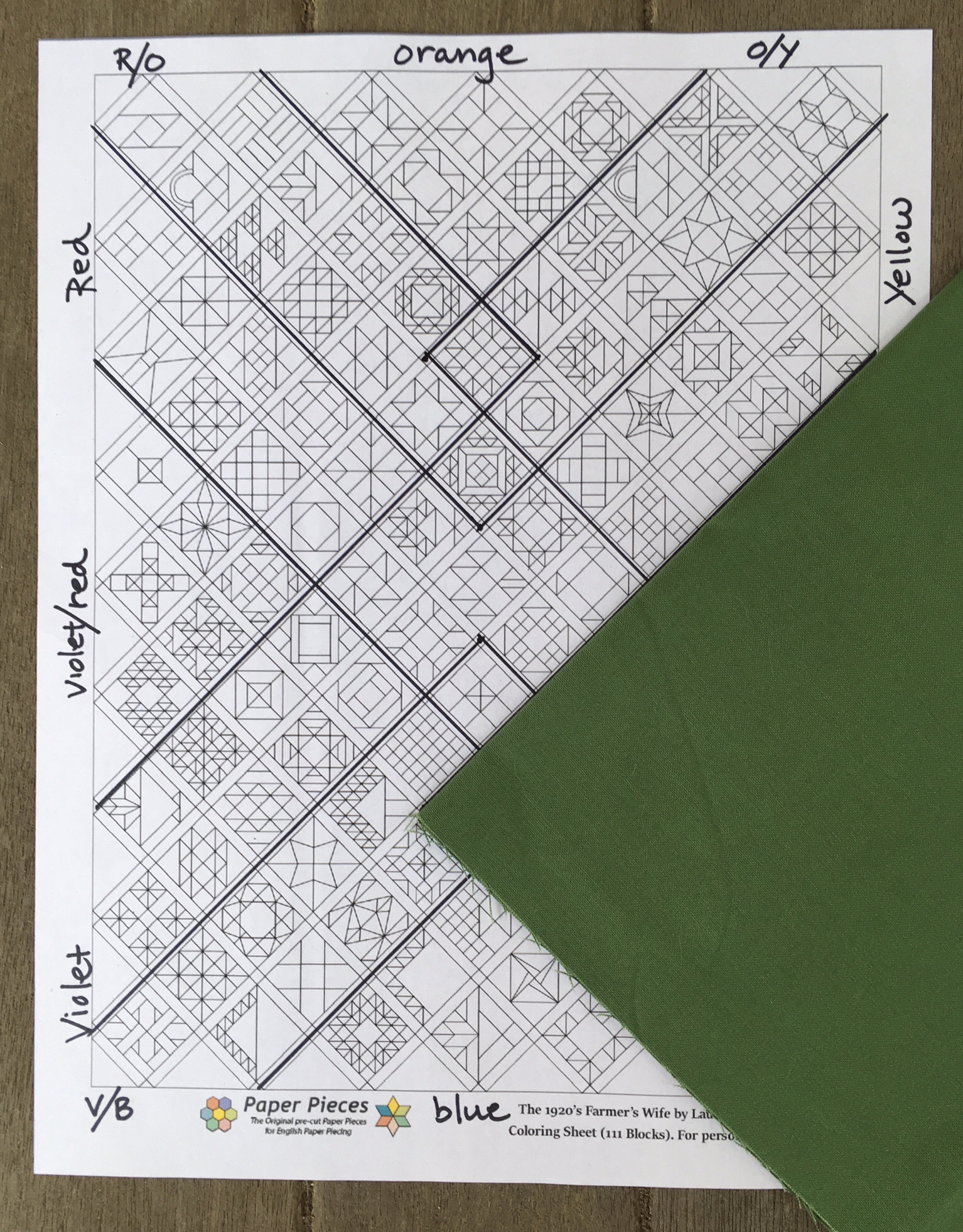
The red area, represented here by Rich Red, extends slightly into the right and descends 2/3 of the way down the left side.

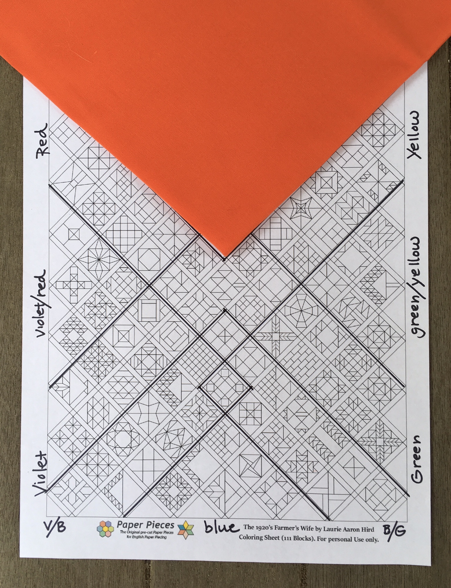
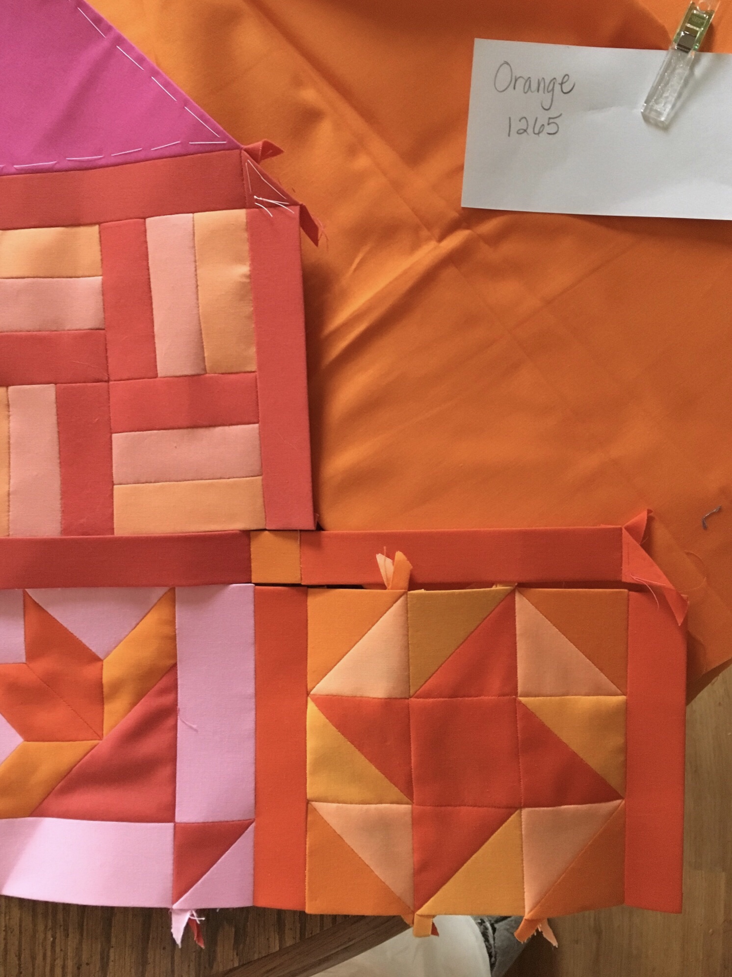
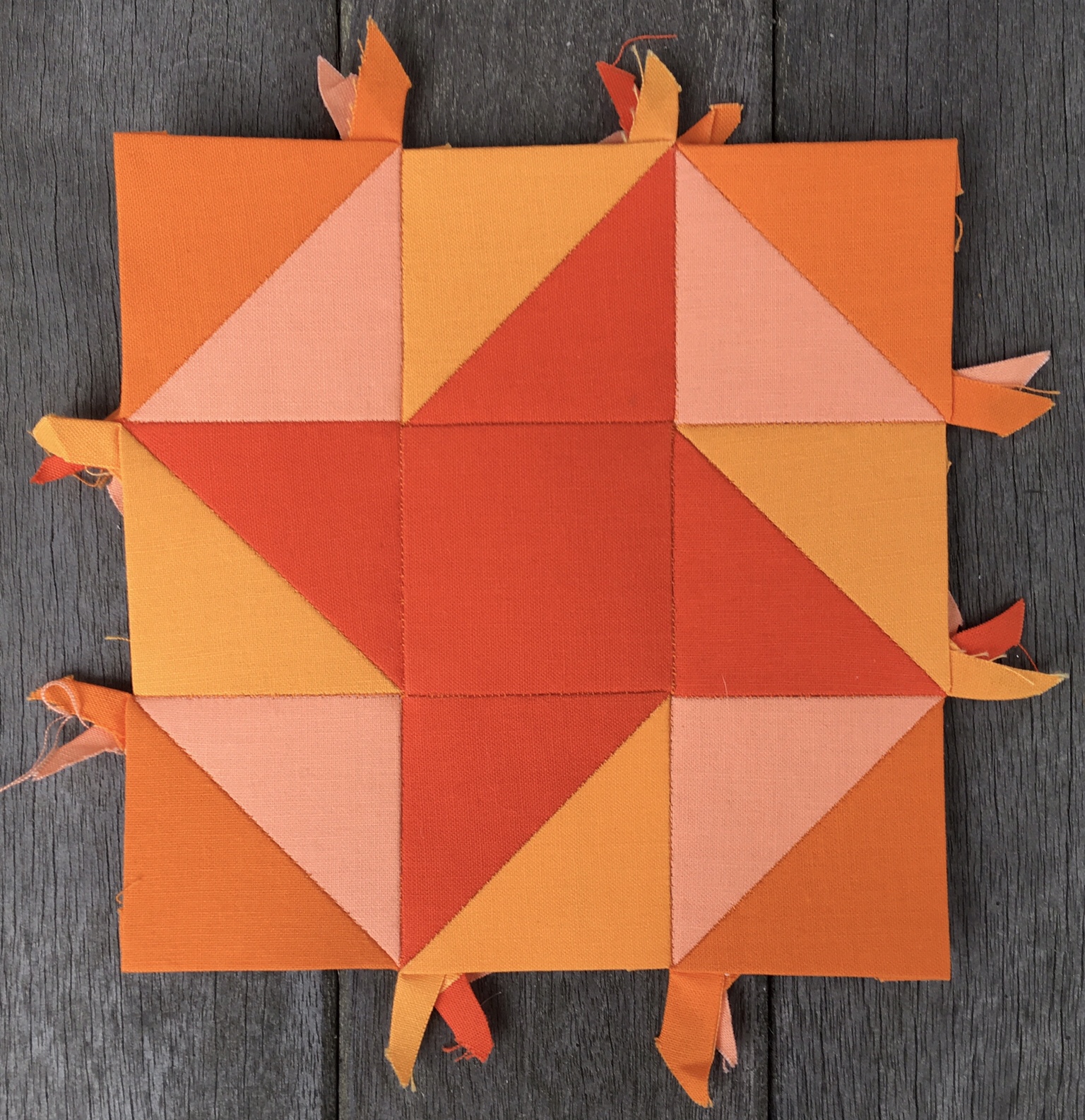
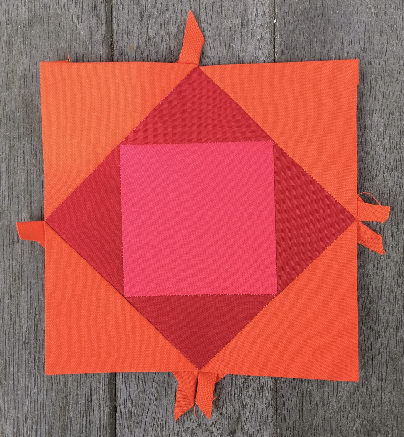
The Orange area, represented here by Tangerine, encompasses the entire width of the upper side and extends to nearly the center of the diagram.

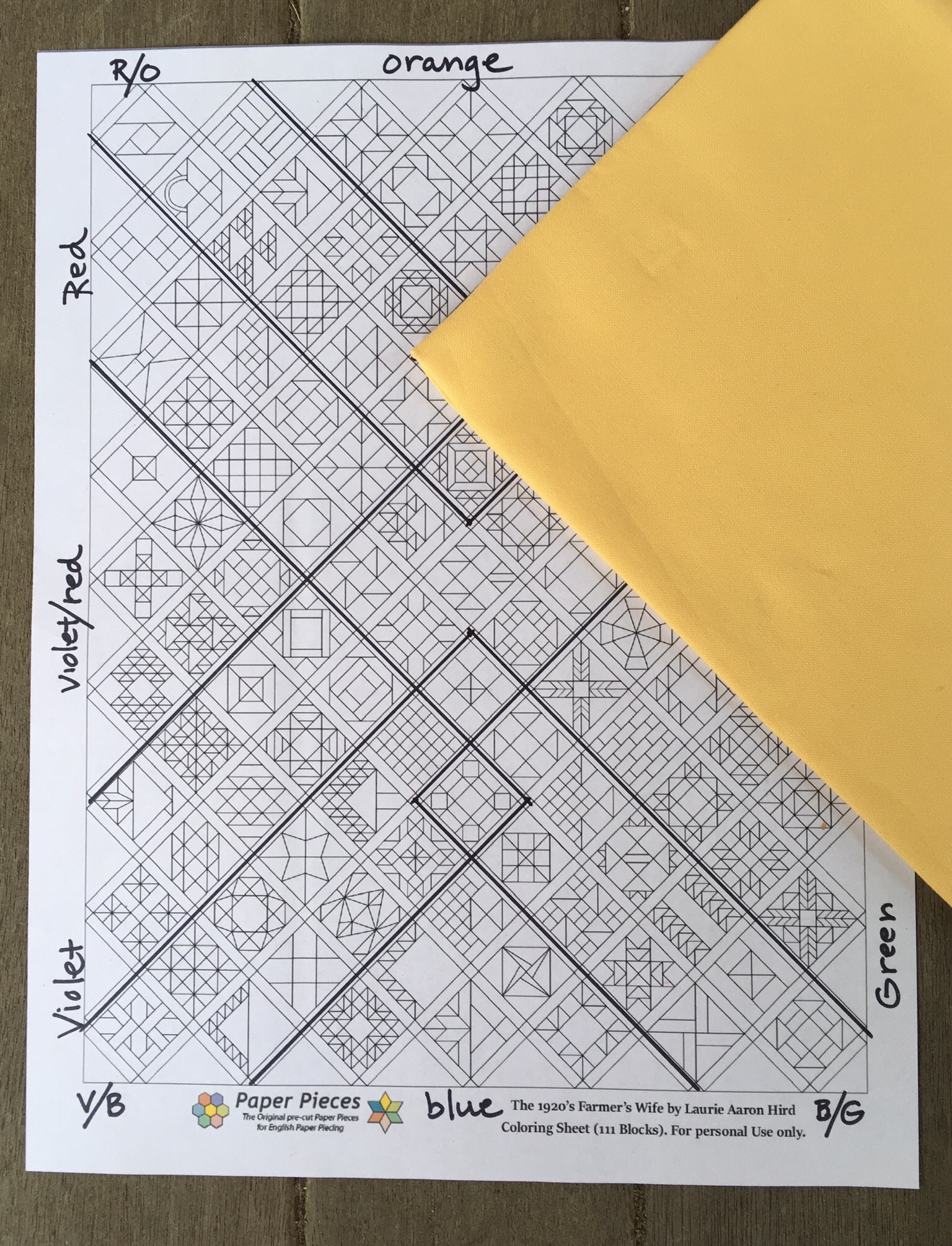
The yellow area, reprinted here by Daffodil, covers the same amount of area as red, but begins in the upper right of the diagram.

The green area, represented by Palm, covers the same amount of area as red, but begins in the lower right of the diagram.

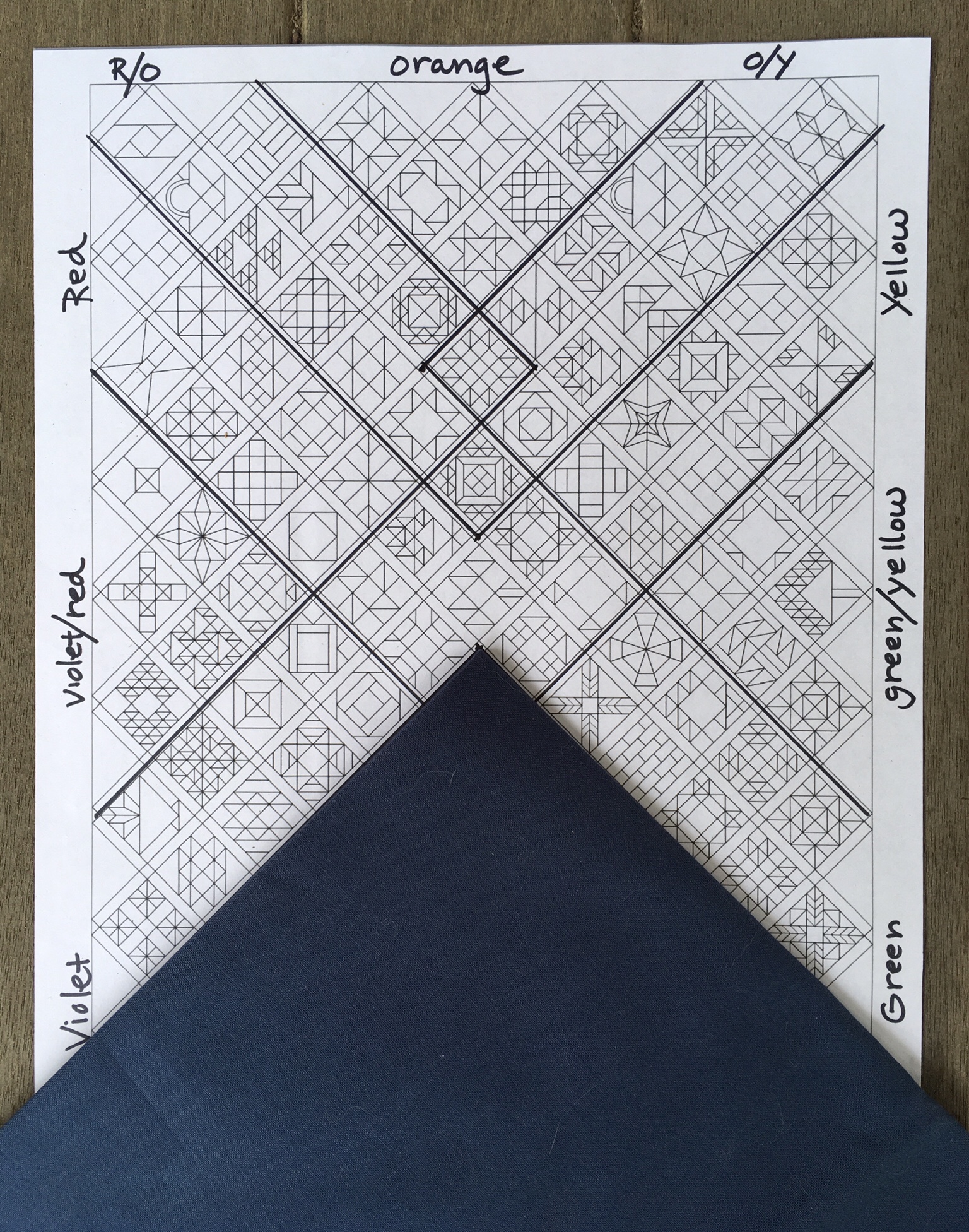
The blue area, represented by Windsor, covers the same amount of area as orange, but begins at the bottom of the diagram.

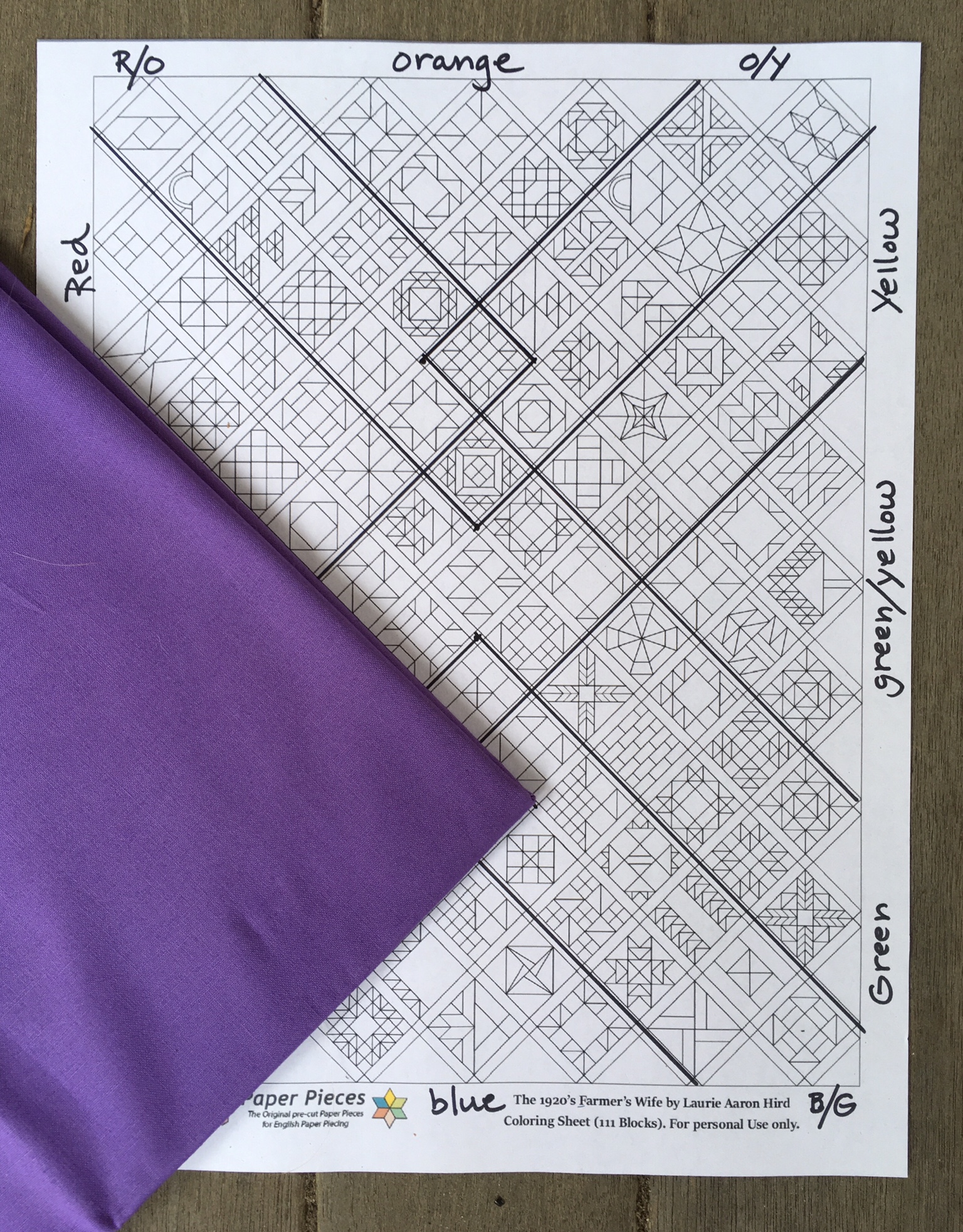
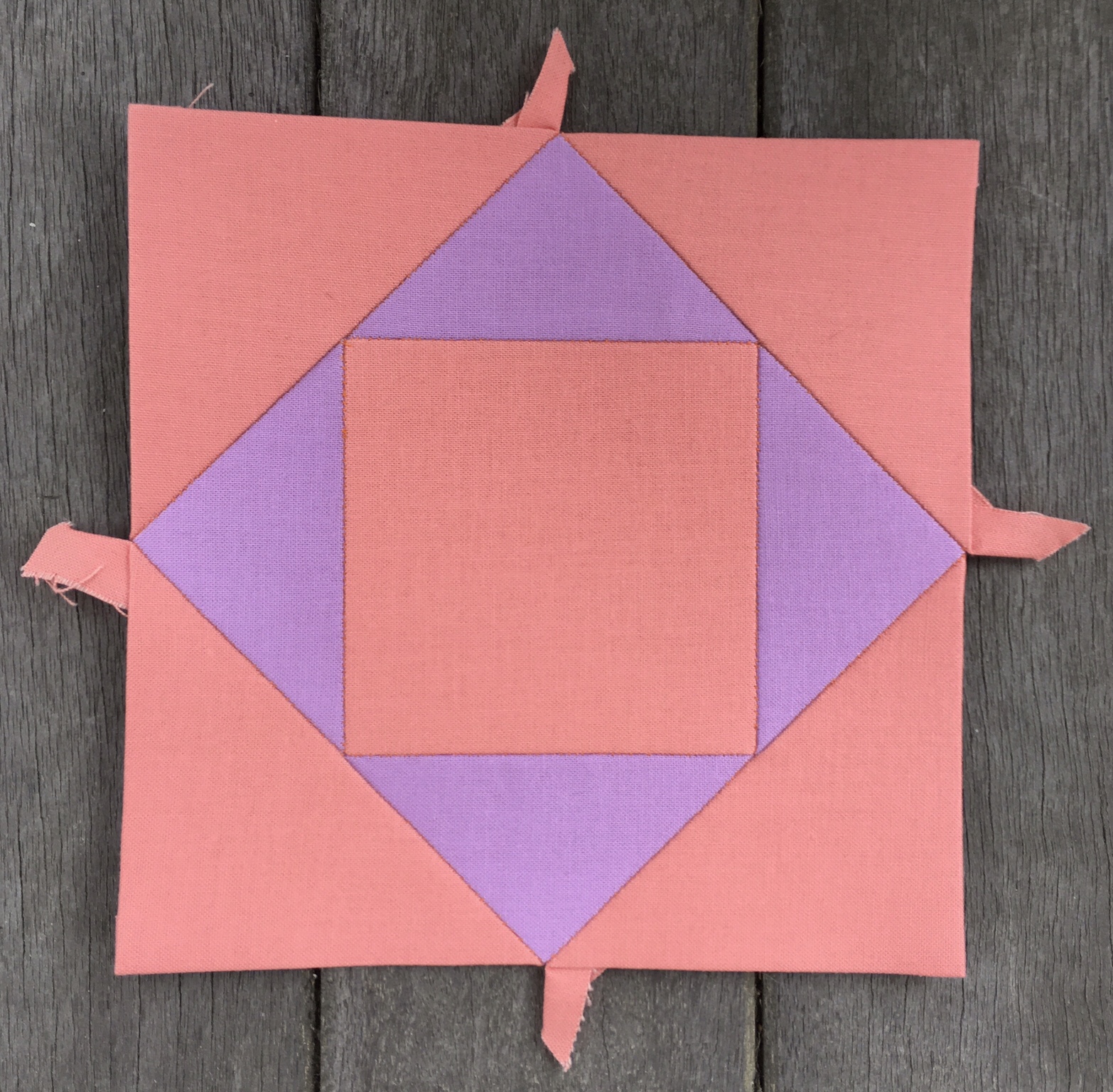
The violet area, represented by Heliotrope, covers the same amount of area as red, but begins in the lower left of the diagram.

If you are on your toes you may have noticed that there is an area in the middle of the diagram where no colors have staked out territory.

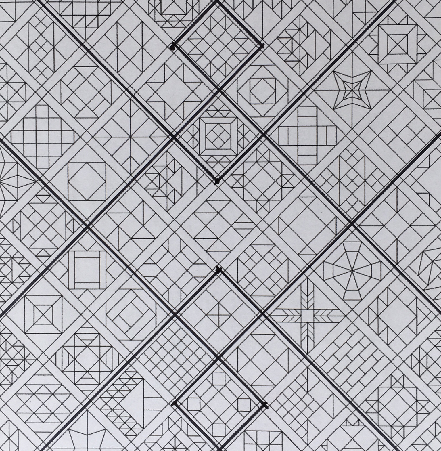
Plans for this area are not etched in stone yet. I like to be a little spontaneous. Well, as spontaneous as one can be with a craft as slow moving as English Paper Piecing. Suffice it to say, for the moment, that this central area may become a mini color wheel area with soft pastels and grays coming into play. I’m just not sure how far to extend the grays or the pastels. As my construction gets closer to this area I will firm up those decisions.

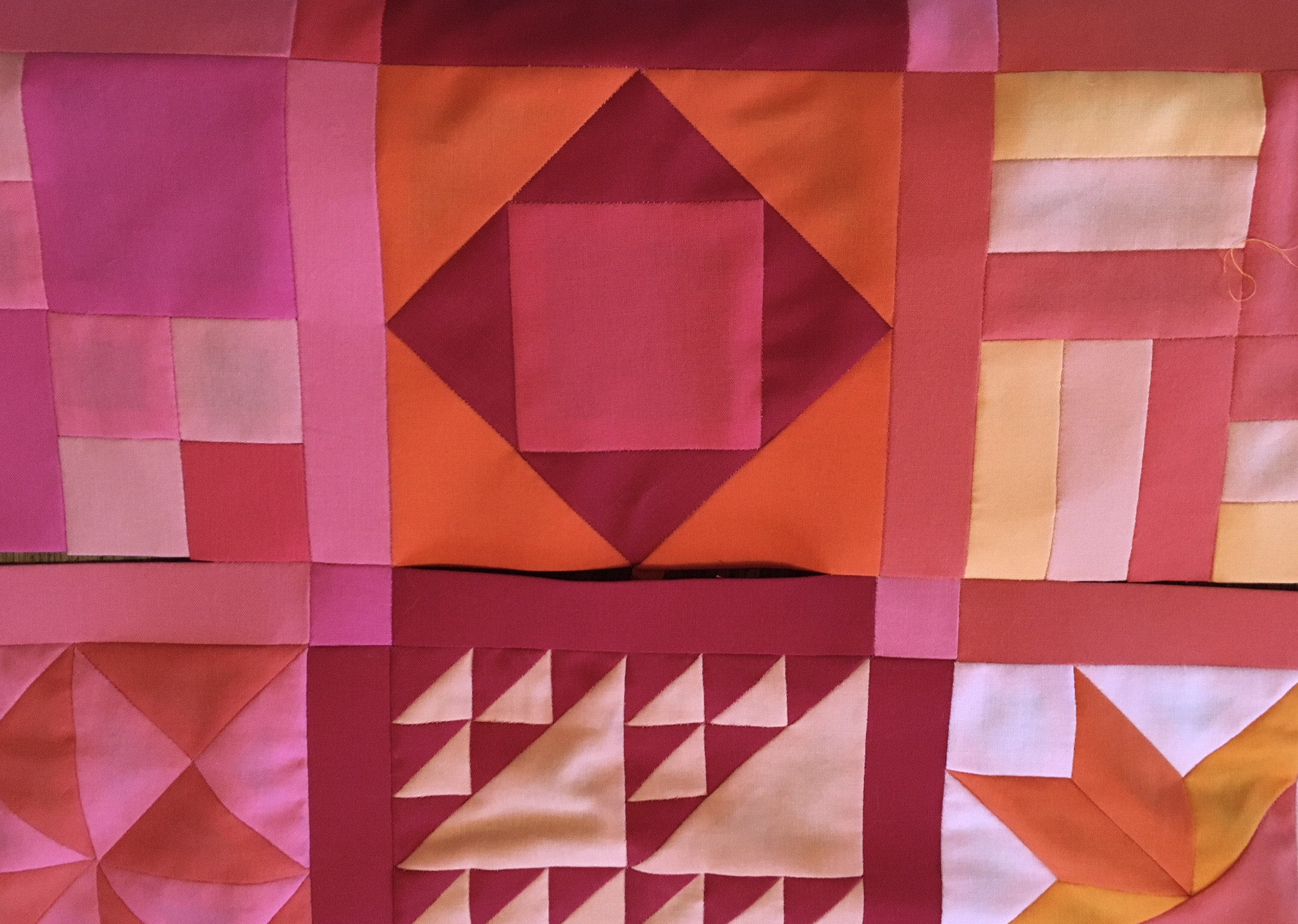
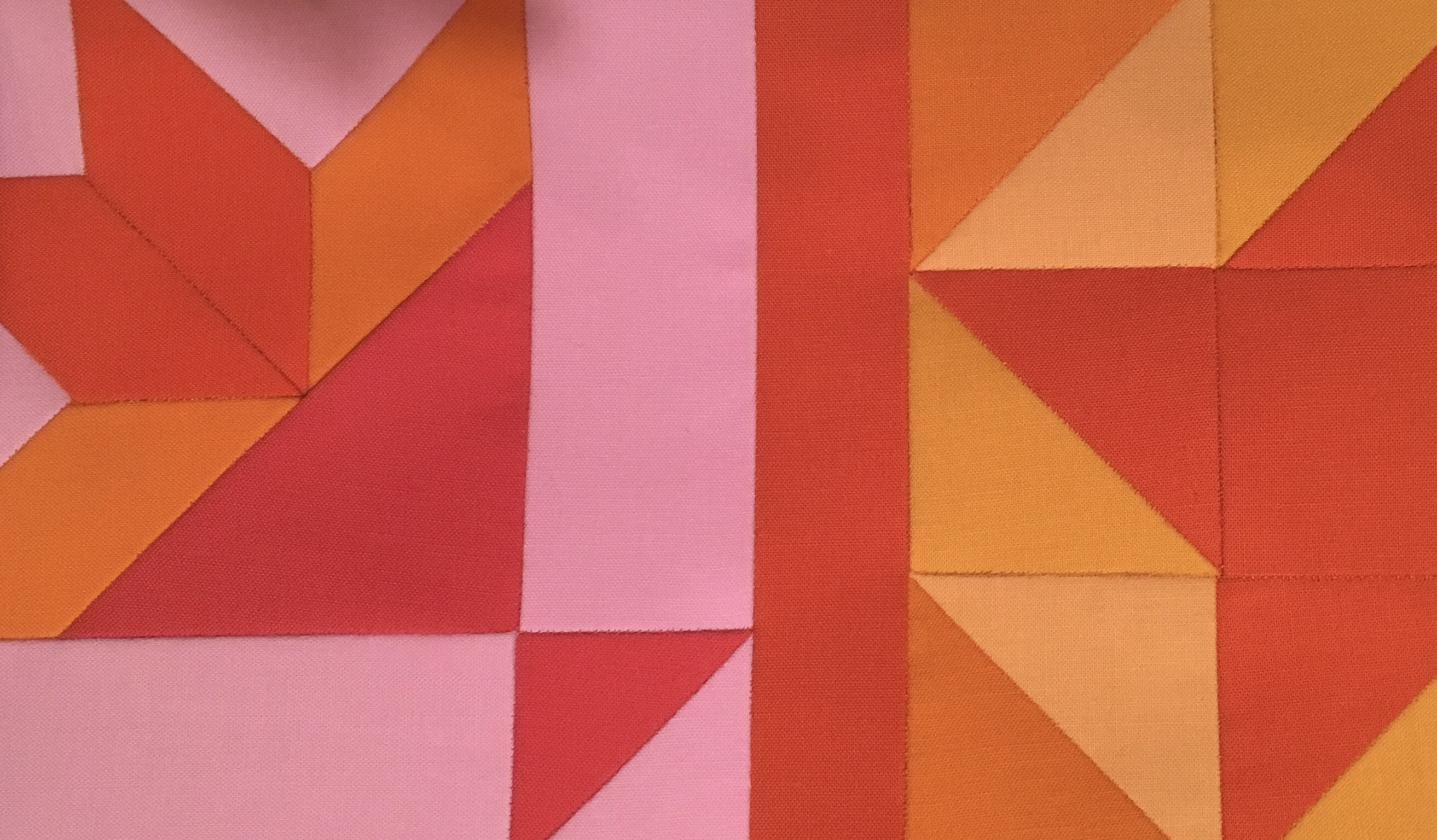
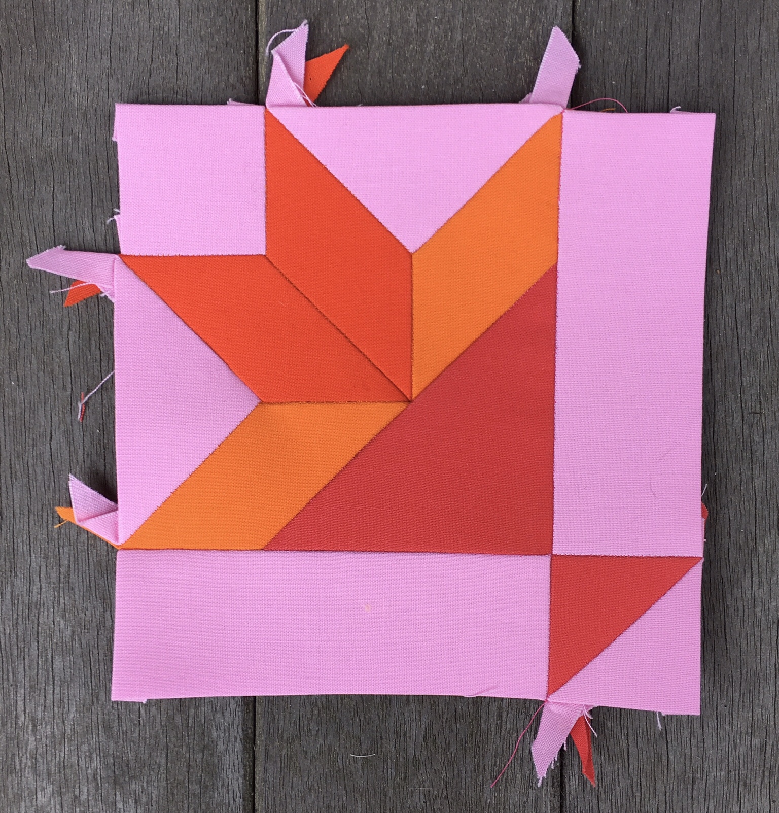
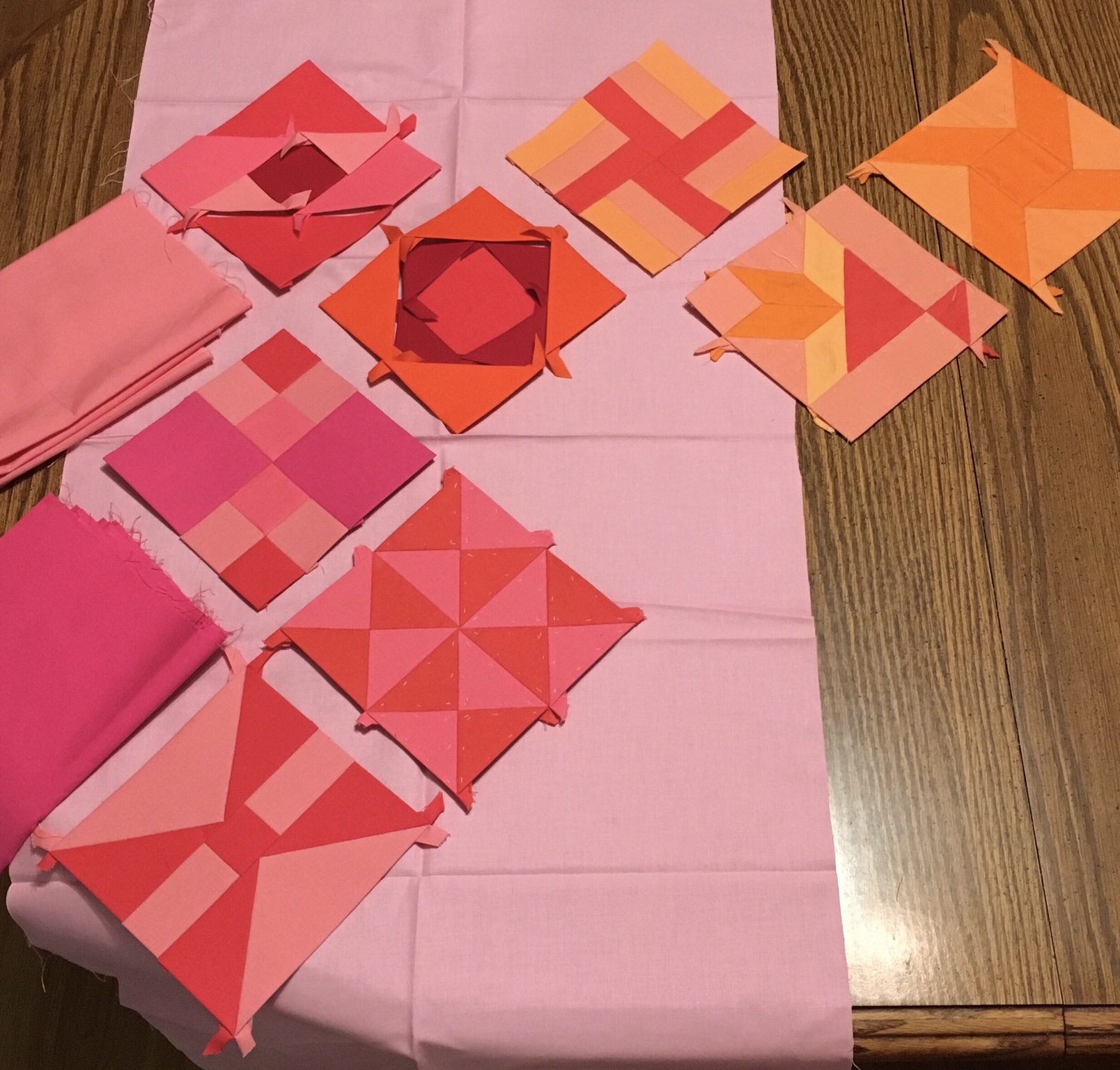
I want to mention that just because a block is in an area of overlap that does not mean that it must include all colors of overlap. It only means that it MAY include all colors of overlap.

Ordinarily I may not have bothered to blog about this, but I’ve obtained a few new subscribers recently, and I feel an obligation to go into more detail than usual.

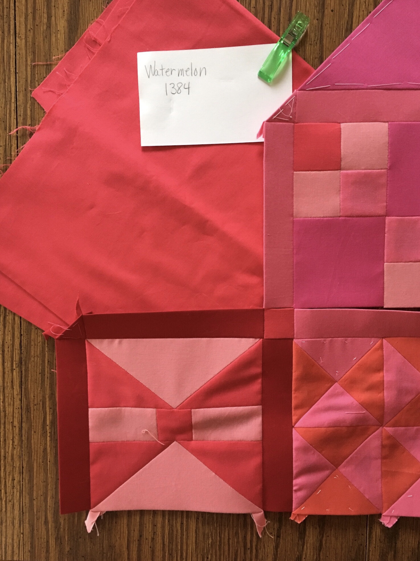
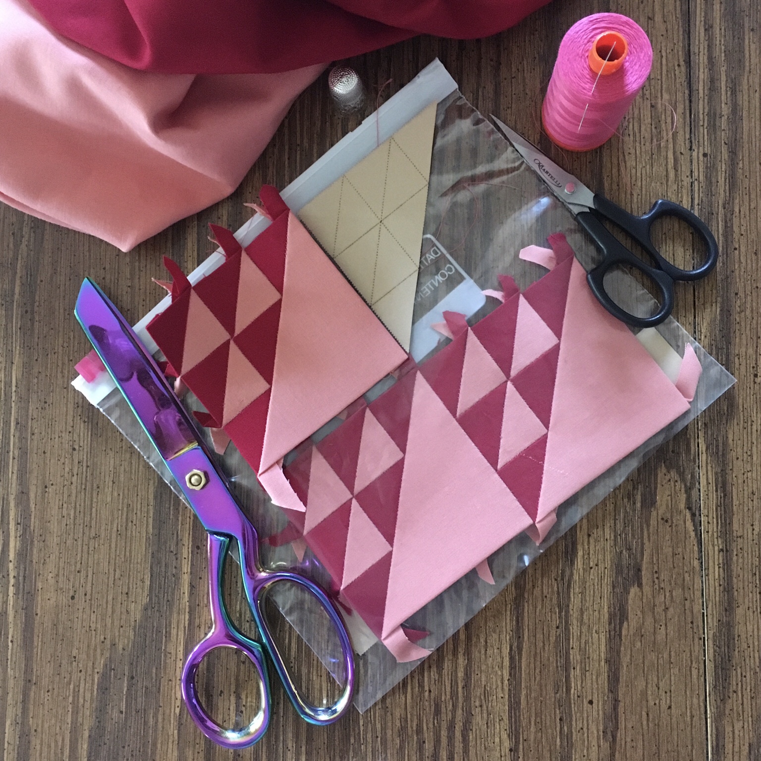
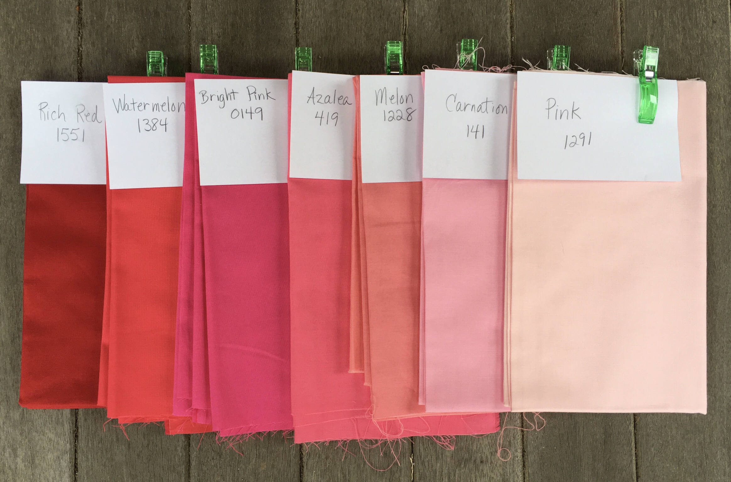
Another thing to mention is that my initial color choices were toward the mid range of values. Fewer darks and lights were chosen. When I put in my second order of fabrics I purchased Rich Red, Carnation, and Pink to expand my value choices for the red area. I proceeded to use a good deal of the Rich Red especially for sashing, and I imagine that I will want to do something similar by adding darker values to the other color areas. However this emphasis upon dark values and high contrast is something I believe that I want to keep within three blocks of the edge of the quilt. I see myself moving toward less contrast in the center of the quilt.

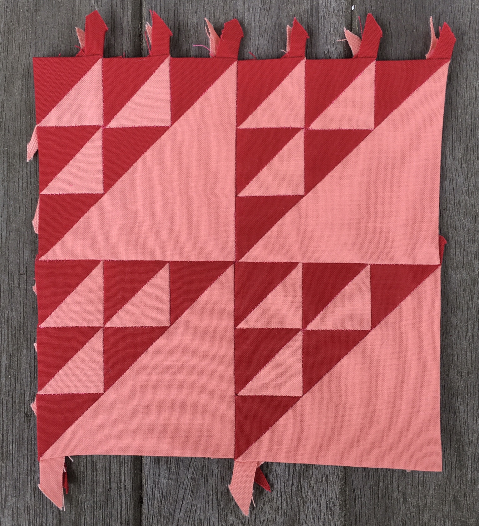
My next task in gaining control of color is going to be to sort the fabrics I have obtained so far into my new color categories. I’m down to six categories now from twelve.

Thoughts on Construction

It is time to add row three, and also time to give some thought my construction methods.

The first step in adding another row will be to lay out the blocks of the new row along with their respective sashing choices. Blocks in the odd columns are being surrounded with one color of sashing. Blocks in even numbered columns get whatever sashing happens to end up next to them. Luckily there is an odd number of columns in the quilt, so my sashing concept can run the full width of the quilt top.

Once sashing has been placed, keystone blocks need to be carefully selected taking into account the need to balance values.

I’ve decided to sew the new row of blocks together first, and then the row of sashing. After that I sew the sashing to the new row rather than to the body of the quilt top. The reason Is so I will be able to add triangles without having to make 90 degree seams.

Why not add triangles as each row is being completed? If I did that I would not be able to audition the color with both rows to which it is adjacent. Therefore, when I display a new row on the quilt it will be absent its triangles.

The sashing has been attached to the new row, and the row/sashing combo is ready to be joined to the quilt body, but first triangles must be auditioned and added to the body.

Watermelon takes the lead at the beginning of rows two and three.

Orange gets to bring up the rear.

In the Farmer’s Wife Facebook Group I’ve been complemented on my accuracy and asked about how I achieve it. So I will address how I join my rows to make my blocks match up so well with my sashing. One of the things I do is to sew a little more than an inch on one side of a block after matching it up carefully with the sashing and clipping it into place. I then knot off the stitching and sew a little more than an inch from the other side before easing the loose portion of the block. This can be done for each block essentially from left to right. However, the rows are getting longer, and I decided to start in the middle of the row and work my way out this time. I will be continuing that way with future rows. The image below illustrates this idea.

Above you see cornerstones joined. The remaining fabric is eased where necessary. Most blocks need to be eased to fit the sashing, and the more pieces they have in them the more they need to be eased.

#7 Birds in the Air is a good example of a block that needs a lot of easing. By the way, I was unsure if I was going to like the Rich Red sashing around this block, but I love the way that the birds appear to fly into the sashing. I’m going to keep this in mind when selecting sashing for future blocks. I may allow some blocks to melt into the sashing by design.

That’s enough for one day. Tomorrow is the big reveal on row three fully attached in all its glory. I think that deserves its own post.

Farmer’s Wife Friday: Week 4 Blocks

If you have been following along you know that I spent a great deal of time this week joining blocks together. See the previous two posts for more on that. Having done all that work I hope to be forgiven for sewing fewer blocks than usual this week. I’m still ahead of the game. Here are the blocks for week four:

#8 Bouquet (revisited)

Kona solids used are Carnation, Orange, Tangerine, and Coral. This is the first appearance of Carnation in the quilt.

I had made this block previously, but did not like the way it turned out, so I went to the trouble of making it again.

#9 Box (revisited)

Kona solids used are Cantaloupe, School Bus, Orange, and Tangerine. This is the first use of School Bus in the quilt. It is also the first use of Orange and Cantaloupe.

I had made two previous versions of this block. The first one used every piece and seam in the book version. The second one reduced the number of pieces and seams. This version increased the colors used from two to four, which created a great many design options when it came time to arrange the pieces. I chose the arrangement above because I want to use Tangerine as the sashing around this block.

I will be devoting my time this week to sewing together the third row of my quilt and attaching it to the upper left corner.

Upper Left Corner

My Farmer’s Wife is coming together. Here is the reveal of the upper left corner as promised.

Putting these pieces together has been an exercise in patience. Each sashing piece needs to be eased because the process of sewing multiple pieces together into blocks adds some length to the sides of the blocks.

Each piece of sashing is sewn about an inch and then tied off. I then match up the other side of that sashing piece to the edge of the block, sew an inch into the length and tie it off before easing the center of the block to match the sashing. It is tedious, but worth it.

I’ve been working on redoing blocks eight and nine and am just about ready to start putting together and joining row three of my quilt top.

I am enjoying this project immensely and having a great time contributing to the Facebook group for the project.

By the way I swapped out block 3 and substituted a version of block 29 in its stead.

Made Up My Mind About Sashing

I gave the subject of sashing a great deal of thought. At first I thought I would use the lightest value of Pink that I have. After laying out blocks on the Pink I decided that I did not like the result. I then tried a darker value called Carnation. I was still unimpressed.

Then I decided to use a variety of the values for the sashing of each area. I was stumped though about how to impose just a tiny bit of order to that potential chaos until I came up with the idea of outlining some blocks with one sashing color. This would be a great way to even out the values in the color area. Then I had a real lightbulb moment when I realized that if I outlined only blocks in the odd numbered columns that blocks in the even numbered columns would simply fall into place between those blocks and have a variety of sashing colors associated with them. This gave me the perfect combination of order and chaos that I was seeking.

In the layout above keystones have not yet been selected. They will most likely be selected with no attempt to relate to the odd numbered sashing on a block by block basis. The selection will appear random, but it will be made in reference to nearby blocks.

Piecing is well under way. Stay tuned for the big reveal of the upper left corner.

Farmer’s Wife: Week 3 Blocks

This week I have been very busy planning my sashing. I’m really excited about what I have decided to do with it, and will be revealing that soon.

In spite of the time spent on sashing plans this week, I still managed to make four more blocks.

#1 Attic Windows (revisited)

Kona solids used are Melon, Azalea, Watermelon, and Rich Red.

This is a remake of my first attempt at this block. I switched out the central square of Ballerina for a square of Rich Red. This makes the block more in keeping with the color wash concept I am following.

#29 Economy

Kona solids used are Salmon and Corsage.

I jumped ahead to make this block. Although #29 does not actually fall in the overlap between the Coraline and Violet areas, it was close enough for me to extend the reach of violet to allow me to include Corsage in this block. I am thinking of extending the violet area overlap even more. I really love the Economy block.

#29 Economy (revisited)

Kona solids used are Tangerine, Watermelon, and Rich Red.

Did I say that I love the Economy block? I like it so much that when looking for a block to replace the #3 Basket, which I despise, I turned to the Economy block. I spiffed it up by using three colors rather than two, and here is the result. I may be calling on this block again if I run into other blocks I care not to include in my finished quilt.

#7 Birds in the Air

Kona solids used are Salmon and Rich Red.

Man this block takes forever. I did not time myself on this, but I estimate that five to eight hours of my life now reside in this block. I broke it into four sessions over the course of four days. Now I feel as if I can manage anything The Farmer’s Wife chooses to throw at me, except baskets. Man, I hate baskets.

I spent so much time working on this block that I halted work to take a progress photo so I could bitch about it in the Farmer’s Wife Facebook group.

I’m off now to do more work on my sashing plan. I can’t wait to start putting together the first corner of this quilt.

Thinking of Sashing for the Farmer’s Wife Quilt

I want to start putting together my “Life is Pink” color area soon. In order to do that I need to think about what color I want to use for sashing in this area. I initially thought that I would use Pink, but after laying out my blocks on the Pink yardage, the Pink started to look more like White in comparison to the blocks.

I decided to try laying out the blocks on Carnation yardage, which is darker than the Pink yardage. I was pretty happy with that. However, I eventually decided that it might be more interesting to do the sashing with a mix of the colors being used in this area.

Using a variety of values for sashing will allow me to emphasize some blocks by outlining them with a complementary sashing value. This will be helpful in balancing the values in the entire “Pink is Life” area.

Below you can see the difference in value between the Carnation and the Pink yardage.

Firming Up My Farmer’s Wife Color Plan

I am a former art teacher. I like to think I know a thing or two about color. Maybe I am overthinking things, but here goes…

Above is the quilt done by the people at Paper Pieces using Art Gallery fabrics. It employs a color wash. Their color wash is based on the use of 13 boxes of fat quarters divided into color groups. Those groups are shown below with bold outlines.

You can see the names of the fabric collections in the edges above.

Groups overlap each other and blocks that are in areas of overlap borrow from two or more color areas. This sounds fairly simple, and it is as long as you are using the curated boxes of fabrics. Once you start choosing your own solids you need to start thinking about whether these groups might be somewhat redundant to the traditional color wheel, and whether you want to use them at all.

For instance, I don’t have use for a gray color area. It is not a part of the color wheel. It is rather the absence of color, so I’m eliminating it altogether. It is well placed in the sample quilt, however. If I was going to use gray at all I might want to intersperse it through the entire quilt.

Next, why do some intermediary colors get represented while others do not? Coralline equates to Red/Orange. Teal equates to Green/Blue. Where is Violet/Red, Blue/Violet, Yellow/Green, and Orange/Yellow? Isn’t Gold really just “dirty” yellow? Maybe I should just let Gold be Orange/Yellow. And Peach is actually just a light value of Orange.

I decided that moving forward I want to have my color plan in place including a strategy for sashing. I’ve decided to use a light value in each color area for sashing. I might be using multiple colors from each color area for the little squares joining the sashing pieces.

I’ve gathered together the fabrics I have for each color area and will display them below.

Life Is Pink

I’ve got seven colors for my first color area. I could use either Carnation or Pink for my sashing color.

Many of these blocks have already been constructed, but not with as much thought as I would like. For instance, my first block ended up including a color which I later concluded should be part of the Violet area. I will be going back to examine these blocks carefully before choosing my sashing, border triangles, and joining this corner section.

Coraline

Let’s face it. This area is Orange/Red. So technically the colors in this area should be neither purely Orange nor purely Red. That’s asking a lot from the Kona Collection, and I’m not sure it can be done, so a couple of Orange colors have found their way into this area. Liberal use of Coral and Salmon should make this group read as intermediate between Red and Orange.

Peachy

Let’s face it. Peachy is Orange.

I’ve doubled up Orange to be used in this group as well as the previous group. (It didn’t even really belong in the previous group). School Bus and Goldfish actually have quite a bit of yellow in them so I’m a bit conflicted about that.

Gold Leaf

Let’s face it. This is dirty yellow, and I am not even sure I like the idea of dirty yellow, and I am not sure that I want to use the dirtiest yellow I’ve got, which is Mustard. Daffodil and Butter are going to find their way into the next section too, but that is enough planning for now.

Above I have only talked about hue (color), but obviously value and intensity come into play. I’ve been troubled by the intensity of the Orange, but maybe if each area has a “screamer” it may read well in the end.

I have plenty to think about revisiting some of my “Life Is Pink” blocks and joining them with sashing. I may be supplementing the color selections in the areas above based on these reflections.

Where did I put that Kona Color Card?