
In this post I am going to “talk out loud” about my thought process in coming up with the right block to use in the central medallion of my Kona Log Cabin Quilt. I’ve been giving a lot of thought to how I might unify the Kona Log Cabin Quilt. One idea is to create a quilt within a quilt. This would consist of a medallion of blocks that would be a 3 x 5 section near the center of the quilt.
I decided that I wanted these blocks to be identical and for my three favorite Kona solids to be featured in the block.
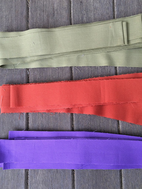
From top to bottom these colors are Sweet Pea, Terra Cotta, and Morning Glory. I had already decided to add Sweet Pea and Morning Glory to the outer repeats of every block in the quilt. Those two colors will make a second appearance in the blocks of this medallion near the center of the block. Terra Cotta will make an appearance immediately after that on both sides of the block to form a square that traverses the light and the dark.
Deciding what else to include was a more difficult decision. I thought that going neutral with the remainder of the block would give a nice contrast between the randomness of the blocks outside the medallion area and the structure of the blocks inside the medallion area. So I chose the following colors to work with.
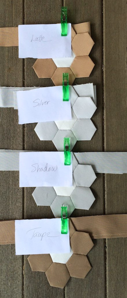
From top to bottom these colors are Latte, Silver, Shadow, and Taupe. I will use the Latte for the small center square of the log cabin block to provide a touch of color. I will use the remaining colors on the light side of the block.
I’ve also chosen:
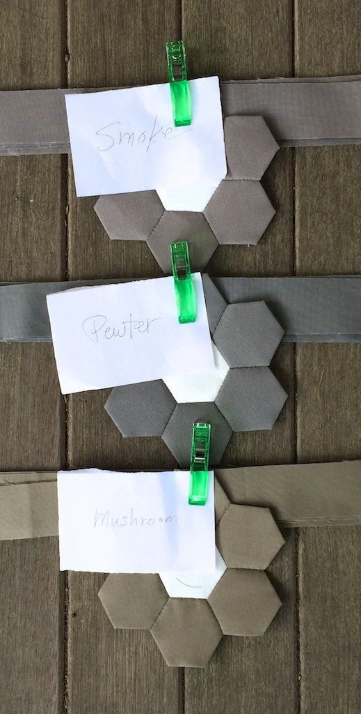
From top to bottom these colors are Smoke, Pewter, and Mushroom. These will be used on the dark side of the block.
And here we have a block (as yet untrimmed) that conforms to the above specifications.
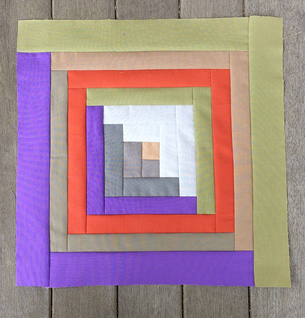
I’m not altogether happy with it. In fact, I have to say I am totally disappointed with the lighter side of the block. The two grays near the center read almost as white when juxtaposed with the other colors. I also don’t like the Terra Cotta traversing the lighter side. I am pretty happy with the darker side of the block though, although I may try to get more contrast between the two darker central gray fabrics.
To fix the lighter side I am going to try Caramel where the Terra Cotta currently is located. I am also going to try some warmer light colors to substitute for the two light grays near the center. I may pull the Latte out of the center location and use it in place of one of the light grays on the light side of the block.
I’ve gathered together some of my Kona flowers to help me with the decision making process.
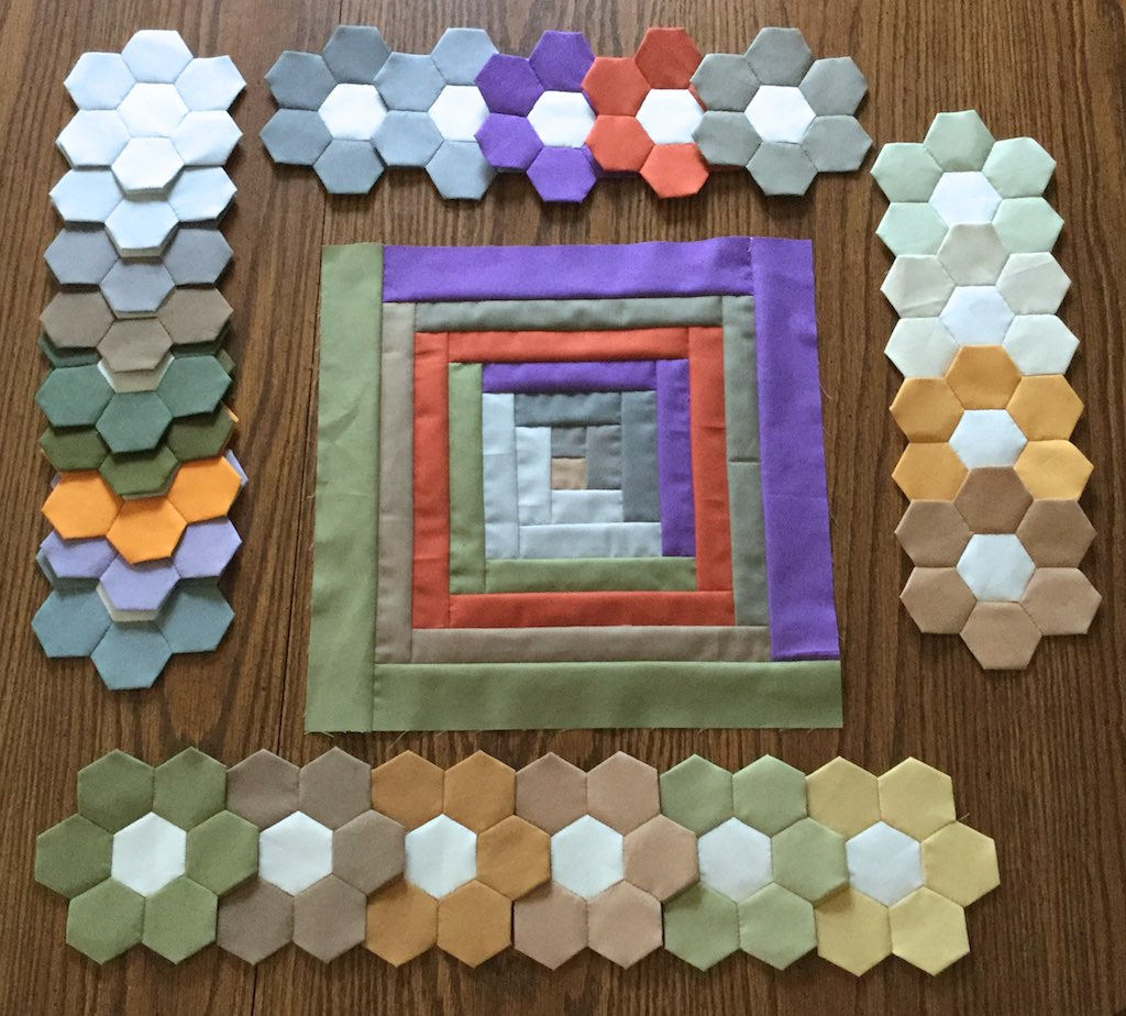
The flowers on the left have been eliminated, as have the flowers on the right. The flowers along the top represent the colors for the dark side of the block, and the flowers along the bottom represent the colors for the light side of the block.
And here is the newly designed block.
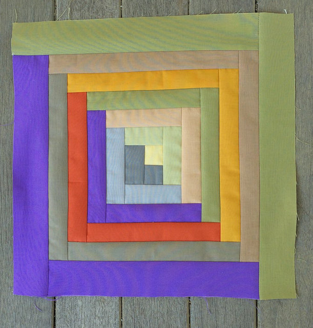
I think it looks a lot better. Yet I am not yet completely sure about the Terra Cotta, though I really want it to be there. I am going to take a couple days to sit on this (figuratively). I may need to make four blocks like this and see how they interact before I make a final decision.
Here are the colors in the order in which they are added to the block starting from the center:

Mustard, Pewter, Parsley, Iron, Latte, Morning Glory,
Sweet Pea, Terra Cotta, Caramel, Taupe, and Mushroom
I think your color selection in the second one is spot on!
I have already made one final tweak. I’ll be revealing it on Wednesday.
Pingback: Quilters Take Manhattan | Hexy Lady